Archive for March, 2010

April Conversations & Events


by

Wednesday, March 31, 2010


Read Comments (11)

I’ll be touring my BodyWorld book in April and doing conversations with different people at some of the events.  I’m hoping to record a few of these, like the ones with Paul Karasik and Chris Ware and Frank Santoro, to post here on Comics Comics.  It depends on how embarrassing they turn out. 

Info under the cut…

(more…)

Labels: , ,

Jack Rules


by

Wednesday, March 31, 2010


Read Comments (6)

Coming May 1, 2010: “The House That Jack Built”. Over one hundred pieces of art by Jack Kirby (and co.) from the 1940s to the 1980s on display at Fumetto in Lucerne, Switzerland. I put this exhibition together with Paul Gravett and we’re both extremely excited about what we believe is the largest Jack Kirby retrospective ever mounted, and his very first in Europe. Among the treasures on display: A complete Fighting American story; stories from the unpublished Soul Love comic, a complete Fantastic Four story, numerous covers and splashes, pencils, remarkable character sketches from the 1940s, paintings, and a lot more. And yes, the credits will be fully visible, as will a brief essay on his past (and his estate’s present) difficulties with Marvel. I’ll say more on this later, but I want to publicly thank Rand Hoppe and the Jack Kirby Museum for so much help. That museum web site is a wonderful overlooked resource. Check it out.


Labels: ,

THIS WEEK IN COMICS! (3/31/10 – Human War! Robot War! FORMAT WAR!!)


by

Tuesday, March 30, 2010


Read Comments (5)

Last week I picked up another fine artifact from the centuries-spanning Fantagraphics empire, this time on the sound recommendation of Milo George – Doofer: Pathway to McEarth, a magazine-sized 1992 comic book primarily written and illustrated by the late Paul Ollswang, working with Taft Chatham & James Carpenter, all authentic “Oregon Hippes,” goes the back of the book. I’d say they don’t make ’em like this anymore, but they barely made ’em at all back then, unless I’ve missed some rich vein of socio-political-sci-fi satire-by-way-of-’60s-underground-homage-by-way-of-early-20th-century-Sunday-funnies running circa the Image Revolution. This actually might be the all-around least fashionable comic of ’92, which naturally makes it an eminent candidate for revisitation.

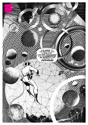
And what a strange and compelling thing it is: an ostensible prelude to a four-issue miniseries titled McEarth, Fast-Food Planet (never published in any form, as far as I know), the book compacts a hodgepodge of verbally fussy, philosophically digressive pun-laden strips from as far back as 1982 with a text-heavy comics ‘documentary’ on the mundane-fantastical Doofer, OR, from the pages of Fantagraphics’ own Graphic Story Monthly, sealed up with radio commentary from high above space-time and cruised-through by town mayor Obie Jacoby, a possible Ollswand stand-in. We’re told with winning prescience that by far-off 1997 an “information revolution” had united Earth into an interconnected mind that somehow got collectively dumber, and a tipping point was reached with the introduction of “Google-Ooh’s”(!!), the advertising jingle for which became a terrorist weapon capable of holding a listener forever in its catchy thrall, not very much at all unlike the titular amusement of the late David Foster Wallace’s 1996 novel Infinite Jest.

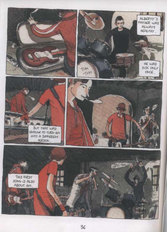
But while Doofer is likewise dense with concern for the overload of manufactured narratives that is its parodic future, it’s more than happy to hang above the real strife, positioning itself as a fond, scatterbrained account of something that used to bedevil blinkered humans as well as less pliable funny animals, like fast-talking heron Slocni and ex-Weather Underground pup Rube, who grow misty over the revolutionary potential of the ’60s while under educational film surveillance. They seem even older, in that Ollswang (who credits Carpenter with “all of the difficult drawings”) works in a mannered, cohesive style suggestive of some lost-to-time gang of Hearst players dragged into a twilight of crosshatched silhouette. And dig the lettering!

As I mentioned above, nothing more was seen of Doofer, although Ollswang put out two issues of a separate series titled Dreams of a Dog with Rip Off Press, along with various anthology contributions and small works. I can’t say the saga had much (really any) time to take off, but what we’ve got is endearing in its off-handed ambition wedded to a distinctly regional flavor and, sure, a definite nostalgia for things, cast more as fuzzy recollections from well outside of dictated history. So, out of style.

Now for some current well-hyped selections. “It’s gonna be okay – & everything is going to be made completely out of electricity!!

(more…)

Labels: ,

Jesse Marsh by Tom Oreb and also…


by

Monday, March 29, 2010


Read Comments (2)

As Art in Time gets closer to the big reveal I thought I’d begin to post some extra images I have by or of the cartoonists included. Here’s a rare photo of Jesse Marsh (with pipe) out for a day of sketching with animator Tom Oreb sometime in the late 1940s.

On another note, I stopped by Thirty Days NY, the space/shop that David Kramer and Sammy Harkham are curating in Tribeca (sponsored by Absolut Vodka and TBWA/Chiat/Day) opening April 8. It’s going to be a knock out.

Labels: , , , ,

The Kinkiness of Russ Manning & Other Notes


by

Friday, March 26, 2010


Read Comments (29)

Who Wears Short Shorts? Robot Fighters, That's Who.

More notebooks, mostly relating to The Comics Journal:

Panter as Talker, Manning’s Kinkiness. Gary Panter was in Toronto last night speaking at our local art’s college and of course I went to hear him. Among his many other talents, Panter is, along with Lynda Barry and Art Spiegelman, one of the greatest talkers in the comics world, indeed one of the world’s great talkers period. He’s lived a great, rich life and has a storehouse of stories but more importantly he can, like Barry, talk about creativity with a directness and honesty that forces you to rethink all your fundamental assumptions. And, like Spiegelman, Panter knows more about the history of art than the entire faculty of your typical Ivy League university. During the talk, Panter mentioned that as a kid he was attracted to Magnus, Robot Fighter in large part because of the kinky short shorts (or was it a proto-mini-skirt) Russ Manning had the hero wear.

This reminded me of the great Arn Saba interview with Manning which ran in the Comics Journal #203. During the interview Manning asks Saba if he’s read the Tarzan novels. Saba says no and the following exchange occurs:

Manning: It is a superb novel. And in it, Jane is about to be raped by the big ape and that’s just the theme he used all the way through it.

Saba: I was aware of that from reading the comic versions of it, yours included. Yeah, I think it’s a fantastic thing, that imagery, because in this primeval jungle you can take primeval sexuality and symbolize it through all these various creatures: the women with the hairy brassieres and all these things … [laughs] I’m embarrassed to say I notice these things and react to them.

Manning: Well, I hope my readers do.

Saba: The fact that all the women in Opar have these strange, long, pendulous, fur things hanging down between their legs – they’re very penis-like things! [laughs] That’s what they look like to me, anyway.

Manning: Just cloth.

Saba: Cloth, but they’re so long and sinuous. [laughter]

Manning: I don’t know if that came out in just a design sense or instinctual or what. They probably look right, so I drew it that way.

  (more…)

Labels: , , , , , , , , , , ,

THIS WEEK IN COMICS! (3/24/10 – Snow, Swedes & Orcs)


by

Tuesday, March 23, 2010


Read Comments (11)

From A Drifting Life

No messing around – the book I’m most excited to see this week is Drawn and Quarterly’s annual Yoshihiro Tatsumi release, Black Blizzard. I’m always glad to see further Tatsumi in English, although I wonder if my enthusiasm for the the raw nerve agony of his in-the-thick-of-it gekiga work is especially transferable. I’m reminded of a short, critical piece Bill Randall, my choice for the best manga critic writing in English, did on D&Q’s 2008 story collection Good-Bye; he cites the deluxe format lavished on the work by its North American publisher, a real whiff of prestige given to obscure-in-their-time comics, mostly forgotten in Japan and “as subtle as pissing in someone’s face.”

Yes! Exactly! That’s why I like Tatsumi’s work: it’s unrefined, maddeningly dank stuff, the work of an early comics pioneer staggering bleary-eyed into a terrifying, uncertain future and lashing out nervously at every envisioned hell in a titanically blunt manner. One of the best things about 2009’s autobiographical doorstop, A Drifting Life — as lulling and-this-and-this-and-this-and-this a steady rolling comics memoir as one can imagine — is how it contextualizes Tatsumi’s status as a comics innovator as coming much earlier: a post-war, post-Tezuka appreciative reaction from longing for bigger, stronger comics, mostly ‘darker’ genre things like crime and mystery stories. Only at the very end of the book (which is apparently still continuing in Japan) do we get a hint of where Tatsumi’s dramatic picture obsessions might take him, and from that we can infer a most idiosyncratic development from slightly-more-mature genre comics into punch-to-the-mush city terror and perpetually radiating war.

Funny how American and Japanese comics seemed to link up just a little bit in the ’50s – two takes on a medium gradually maturing by way of increasingly harsh genre comics, albeit with manga a little ways behind. I think a close examination of some actual Japanese work of the time will nicely emphasize the substantive differences in formal approach, not the least of which was Tezuka’s fascination with cinematographic principles, inspiring I think an especially potent visual emphasis on early manga that facilitated the decompressed, atmospheric style Tatsumi develops (as a character) in A Drifting Life. Or, if comparative studies isn’t your thing, at least the speculation can become more informed as to how Tatsumi’s own crime/mystery/adventure comics mutated into… Yoshihiro Tatsumi as introduced to North American readers, as opposed to the sleeker genre stuff of peer Takao Saito’s Golgo 13, which started up in 1969 – the same year as the work collected in The Push Man and Other Stories.

This is why Black Blizzard may prove to be the most valuable ‘classic’ release of the year, even though some will regard it as plain juvenilia. It’s an old crime comic from a young Tatsumi, who blew through its 100+ pages in the space of 20 days in 1956, while also working on the monthly proto-gekiga anthology Shadow. A pianist is falsely imprisoned for murder, and escapes while shackled to a more dangerous man, all in the midst of highly inclement weather. Expect many slashing diagonal lines and cinematic techniques, and a perfectly handsome $19.95 softcover treatment. A few sample pages are here.

And there’s plenty more where that came from.

(more…)

Labels: ,

Word Balloons in Visual Space


by

Monday, March 22, 2010


Read Comments (13)

Clowes' "Wilson", from The New Yorker

Joe’s excellent post on thought balloons got me thinking about comics balloons (or text frames) in general: not just thought balloons but also word balloons, narrative boxes, and labels (like the famous arrows in Dick Tracy which diagrammatically call attention to two-way-radio-watches and other items of interest). It would be great to have a history of text frames in comics. There have been stabs here and there by scholars. Thierry Smolderen’s “Of Labels, Loops, and Bubbles” in Comic Art #8 is a good start.

About thought balloons: When did they emerge? I know Harold Gray was very chary of using them: he only used thought balloons a handful of times in his 44 year run on Little Orphan Annie. I think this was deliberate. While his characters where gabby they were also secretive – this is true not just of Warbucks but even Annie, who never says all she knows. Gray wanted to keep his characters mysterious, hence he avoided thought balloons.

(more…)

Labels: , , , , , , , , , , , , ,

Russ Manning on Dell


by

Monday, March 22, 2010


Read Comment (1)

Russ Manning, one of the great California cartoonists whose work, like his mentor Jesse Marsh‘s, stands apart as a West Coast alternative to the more chaotic New York-based artists, made a case for Dell as a key 20th century comic book publisher in Richard Kyle’s brilliant Wonderworld #9, (1973). The two-page article is below. One thing I enjoy about Wonderworld is that it offers an entirely different point of view on comics history — mostly avoiding superheroes and advocating for other genres and approaches in comics. Some of the artists who loomed large for Kyle, like Dan Spiegle and Hermann (whose two-volume Survivors album series was an early Fantagraphics project), seem largely forgotten today, but the samples published in Wonderworld offer a look at another course for character-based comics in the 70s. By the way, you can see an entire early issue of Wonderworld, when it was called Graphic Story World, over at the Jack Kirby Museum. Look closely for the amazing photo of Jaunty Jim Steranko.

Russ Manning text copyright Estate of Russ Manning.

Russ Manning text copyright Estate of Russ Manning.

Labels: , , , , ,

Edward Tufte’s Presenting Data and Information Seminar


by

Sunday, March 21, 2010


Read Comments (11)

I went to the March 18 Edward Tufte seminar on “Presenting Data and Information” in New York. He tours around doing these one-day courses occasionally.  This latest tour continues into Pittsburgh (April 9) and Arlington, VA (April 12,13, and 14.)

Edward Tufte wrote and self-published four ridiculously beautiful books on information design: The Visual Display of Quantitative Information (the first and probably most famous one), Visual Explanations, Envisioning Information, and Beautiful Evidence. He’s also a sculptor and does a million other things. He was recently appointed by Obama to the American Recovery and Reinvestment Act’s Recovery Independent Advisory Panel and he spoke at the seminar about working on the design for the forthcoming website where you can see how the Recovery Act is using its funds.

What does this have to do with cartooning? Well, his books are primarily about presenting visual evidence as truthfully and clearly as possible. He told me that his two latest books, Envisioning Information and Beautiful Evidence, are the most relevant to cartoonists. Besides that, if you’re just into incredible books or self-publishing they’re definitely worth looking into.  He writes in the introduction to Beautiful Evidence:

My books are self-exemplifying: the objects themselves embody the ideas written about. This has come about, in part, because my work is blessedly free of clients, patronage, or employers.

At the seminar they give you a box with all four of his books and a pamphlet about his sculpture works. I don’t know who the majority of the people there were, but I suspect they were mostly business people who have to give a lot of presentations. There was a lot of talk (and jokes) about PowerPoint, which Tufte hates and said should be used only as a projector. But I got a lot out of it.

Here were some of the repeating themes:

(more…)

Labels: ,

Garage Band by Gipi


by

Saturday, March 20, 2010


Read Comments (10)

This appraisal of Garage Band by Italian cartoonist Gipi, first appeared in Windy Corner Magazine.  Thanks to Austin for letting me run it here on CC.

————–

Garage Band  by the Italian cartoonist Gipi is a remarkably deceptive comic. Originally titled Five Songs when it was released in Italy a few years back (2005), it’s a breezy read, quite enjoyable – arguably the most beautiful of his available works in English. Soft watercolor tones and thin contour lines that unite with marvelous energy and skill. Gipi has an amazing ability to capture the essence of each scene, to articulate all the important details without overwhelming the reader with such details. Yet, it’s a relatively “empty” read if one is looking for a solid story in the traditional sense.  And this is what I mean by it being a deceptive comic.  It’s 114 pages of strung together notes, poetic silent passages and bursts of energy. In that sense, it’s sort of like watching a great band practicing their songs. We see the stops and starts, the rehearsal of new material and the easy way in which some old songs are played effortlessly.  It’s all there, but somehow, I’m left wondering if the real show in front of an audience will be better and I’ll get to see, hear these songs played to perfection. And then I wonder if that really matters, and that maybe, seeing the band practice, hearing the demo tape is closer to some sense of perfection.

(more…)

Labels: ,