


Edward Tufte’s Presenting Data and Information Seminar
by Dash Shaw
Sunday, March 21, 2010
 I went to the March 18 Edward Tufte seminar on “Presenting Data and Information” in New York. He tours around doing these one-day courses occasionally. This latest tour continues into Pittsburgh (April 9) and Arlington, VA (April 12,13, and 14.)
Edward Tufte wrote and self-published four ridiculously beautiful books on information design: The Visual Display of Quantitative Information (the first and probably most famous one), Visual Explanations, Envisioning Information, and Beautiful Evidence. He’s also a sculptor and does a million other things. He was recently appointed by Obama to the American Recovery and Reinvestment Act’s Recovery Independent Advisory Panel and he spoke at the seminar about working on the design for the forthcoming website where you can see how the Recovery Act is using its funds.
What does this have to do with cartooning? Well, his books are primarily about presenting visual evidence as truthfully and clearly as possible. He told me that his two latest books, Envisioning Information and Beautiful Evidence, are the most relevant to cartoonists. Besides that, if you’re just into incredible books or self-publishing they’re definitely worth looking into. He writes in the introduction to Beautiful Evidence:
My books are self-exemplifying: the objects themselves embody the ideas written about. This has come about, in part, because my work is blessedly free of clients, patronage, or employers.
At the seminar they give you a box with all four of his books and a pamphlet about his sculpture works. I don’t know who the majority of the people there were, but I suspect they were mostly business people who have to give a lot of presentations. There was a lot of talk (and jokes) about PowerPoint, which Tufte hates and said should be used only as a projector. But I got a lot out of it.
Here were some of the repeating themes:
 Prespecifying a mode is a trap. Use whatever it takes. A lot of the examples in Tufte’s books use different modes- arrows, graphs, charts, whatever, to communicate what it needs to communicate. Don’t pick the data display mode in advance. If you decide HOW you’re going to display something before WHAT you need to display accurately, it (obviously) causes problems. You have the content first and then you think: what’s the best way to display/explain the content? Answer: Whatever it takes.
The content doesn’t care what the mode is. The evidence doesn’t care. The mind doesn’t care. The goal should be to maximize content and minimize format. There shouldn’t be any puzzling about the form. It shouldn’t be about the form. He said something like (I’m paraphrasing from memory) “It’s unsettling that saying ‘content is king’ today is an insight.”
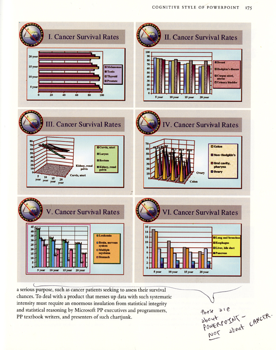
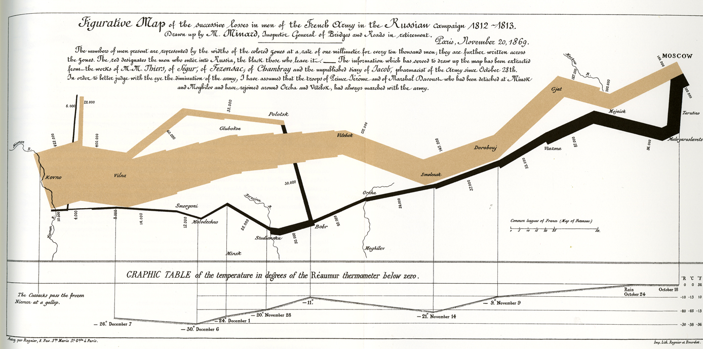
Clutter and confusion is a problem with the design, not a problem with the information. He talked a lot about this map of Napoleon’s Russian campaign of 1812. This displays so much different information accurately and clearly. You can do a lot.
What is the strongest visual activity? Is it an accident, or is it content? Oftentimes people put boxes around things in charts, and that activates the space around the boxes, and so the strongest visual activity is what? Competing boxes. Just get rid of the boxes and let the words float. It’s not about boxes.
If you think too much about your audience, you’ll usually end up underestimating them. Have people suddenly gotten stupid looking at your work? Think about how successfully people sort through a million things (he gave examples like Google News, or the New York Times sports page) every day.
He also talked a lot about older books- like ninth century manuscripts, Durer, Galileo- and how words and images were more integrated before the printing presses divided the systems used to print text and pictures. He compared this to computer programs that divide tasks (like, you go to Word to write and Paint to draw- and compile everything together later if you can figure it out) instead of an ideal program where you could create something and all of the options were integrated. He showed this page by Galileo explaining how the rings of Saturn look: (how he just drew in the middle of the text to explain the rings- “whatever it takes”)
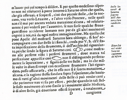
Galileo made engravings of the moon because the other option (woodcuts) would draw too much attention to the form- rather than the information (woodcuts have a distinctive look that draws attention to itself-it looks woodcut-y.) Also he’d place the moon images on facing pages of a book so that they can easily be compared, rather than on a page-turn which requires memory and is “temporal” (like film, or slides.) Print allows information to be adjacent in space and is of a higher resolution than slides or a computer screen.
Comics, to me, is a lot more than just information presentation. Sometimes a cartoonist is expressing confusion itself, or a mood or atmosphere- things that aren’t supposed to be entirely clear. Or maybe it isn’t clear to the cartoonist and they’re thinking about something on the page, recording contradictory thoughts. Anyway, I enjoyed the whole presentation.
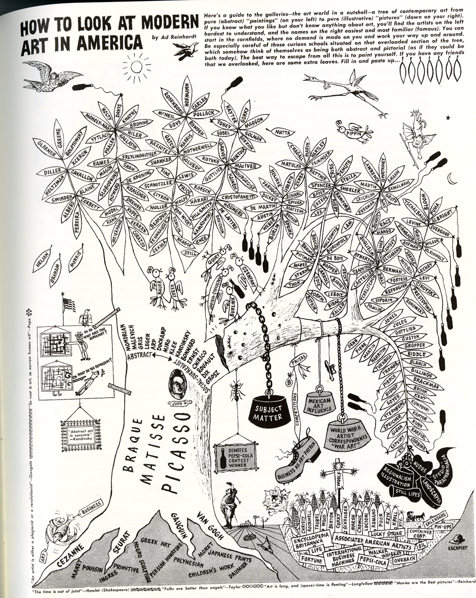
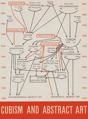
To tie this into Comics Comics a bit more, here’s a predecessor to Frank’s tree sketch, by Ad Reinhardt in 1946- reprinted by Tufte in Beautiful Evidence– which is a reaction to a 1936 MoMA graph called “Cubism and Abstract Art” by Alfred H. Barr Jr.
Labels: Edward Tufte, graphic design


Tufte’s books are lovely, yes, because of the samples he’s collected — but they often fail to communicate their ideas because they don’t read clearly. I no longer own any of them, so I can’t provide specific examples, but I say a little more here:
http://www.goofbutton.com/2007/01/maps_charts_1_12.html
Also, at the time of their original publication, and for some time afterwards, their outrageous price tags reeked of academic exclusivity. Thankfully, his titles seem more readily available and reasonably priced now.
Tufte was just on NPR’s On The Media, complaining about cluttered websites and his design for a government site tracking the spending of Stimulus money. His segment begins about 8:15 into:
http://mediasearch.wnyc.org/m/29892831/march-19-2010-on-the-media-friday-19-march-2010.htm
Thanks for this post, Dash. I think informational graphics can teach cartoonists and comic book makers a lot about their craft. I worked in newspapers for several years as an informational-graphic designer. Tufte was revered in that world. One of my bosses had that info-graphic of Napoleon’s Russian campaign on the wall as a sort of beacon for standard of quality (but it was hard to apply to creation of location maps for highway traffic or house fires). It’s still probably the best info-graphic ever made. Now I work in new media design, trying to streamline data into an easy, visually-digestible order. I believe it all aids the way I approach comic book page design and communicating ideas through the synthesis of pictures and words, though I probably don’t even realize it.
Hey Dash,
This was great. A few years ago I was kind of obsessed with the connection between comics and information design, and collected some of my thoughts, here:
http://www.austinkleon.com/tag/comics-and-information-design/
I also drew up a map on the subject:
http://www.austinkleon.com/2007/01/18/comics-information-design-a-two-way-street-pt-1/
And as Jeffrey noted, sometimes it’s a little hard to narrow down the main points of Tufte’s books, so way back when I tried to map two of them, Beautiful Evidence, and Envisioning Information:
http://www.austinkleon.com/2007/07/08/envisioning-information/
– Austin
Great post. I especially like the hand-drawn note on the page of power-point slides. He’s right, haha.
In my day job, I do statistics for medical research. When I learned how to use Excel a million years ago, I initially started to go crazy with all the kinds of flourishes you can throw into such charts. Then a doctor I worked with gave me a copy of VISUAL DISPLAY to read, and I was converted. I actually echo Jeffrey in that his argument wasn’t necessarily well-argued in a rhetorical sense, but his examples and basic theory just seemed intuitively correct to me. In other words, it just looked “right”. I have to say that this aesthetic turnaround affected the way I look at art (and comics in particular) as well.
There are definitely many under-explored connections between information design and comics. Just to pick out one recent example, consider how many exceptional cartoonists of the past decade have worked for Xplane in St. Louis. I’m sure that employment influenced the comics of people like Zettwoch, May, Huizenga, et cetera, in any number of ways.
Not to mention the designer of this very website, Mr. Mike Reddy!
I’ve used Tufte’s Envisioning Information and some excerpts from Beautiful Evidence as texts in my comics class at Rutgers for the past few years, usually with mixed results. (I’ve also used mock-informational comics by Zettwoch and Huizenga with better results.) A few students started using lots of linking arrows and labels in and between their panels. One student started incorporating sparklines as emotive signals in her word balloons. Another applied Tufte’s “macro/micro” idea to designing a better large-scale fight scene (although I was never sure if he was being serious). Still, these were probably better results than when I used Jack Kirby in an information design class — although I still plan to give that another try.
“The content doesn’t care what the mode is. The evidence doesn’t care. The mind doesn’t care.”
If I understood well, another difference I find with comics: The mode is what sets the space where the mind gets to, when you are reading a comic.
I believe the mode creates a mind set in comics.
So, the mode becomes as important as the content.
really rad post, but I like the caveat at the end where you’re essentially saying that with comics the information you’re trying to present is sometimes oblique. Often, the most fluid way to achieve your goals is to not separate form and content in some diagrammatic way, but to scrumble them up together into a more organic form/content hybrid. Unless, of course, you’re making a strip commenting on that schism.