


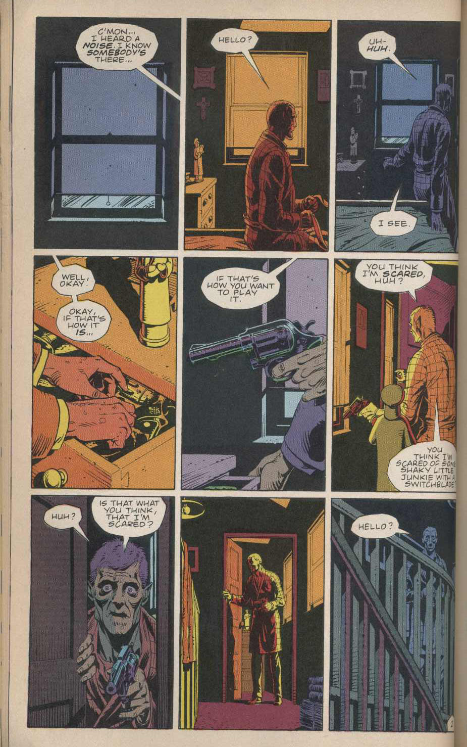
9-Panel Grids
by Frank Santoro
Saturday, October 23, 2010
IF 6 WAS 9
Gibbons
If I flip randomly to a page of Watchmen and let my eyes scan the page, usually I look straight at the center – and often that center panel is representative of the whole page. It’s like an anchor. Also, the artist (Dave Gibbons) never gives up the center of the page when he uses a different layout. Never! He never has a center tier that has a vertical gutter in the direct center of the page. I really think this is part of Watchmen‘s visual power. When I flip through the book, my eyes just go from center of page to center of page and I feel more enveloped by the story and by the world created.
I feel less connected to the story when Ditko switches his layouts up in Spider-Man. But I feel very connected to the flow of the action and my reading adapts to the changing layouts. Nine-panel gridded pages are often crowded so it’s pleasant when the space opens up in wider, bigger panels during action scenes. The same thing happens in Watchmen, but since the center is never given up, my eye doesn’t fracture and split my focus; I’m not looking on both sides of the center vertical gutter line – a line that may go through two tiers which further accentuates the split down the middle of those two tiers. When the center vertical gutter is used in the top tier and it leads to a center panel it works better for me than when the middle tier has a center vertical gutter and either the top or bottom tier does also (see diagram below).
Adapting to changing layouts can be as tiresome as a fixed grid that goes on for pages and pages. A 6-panel grid that is “fixed” for the entirety of the story may be boring but it has the natural rhythm of two squares in tension (see this post for “two squares in tension” riff) . The nine-panel grid’s checkerboard look can be suffocating because it allows for more text and details. There are more panels but also the panels are tall – which accommodate word balloons at the top very well (see Ditko scans below). Yet in Watchmen, Gibbons does a great job of keeping it interesting. He balances the details with wider views but always manages to stay “on the grid”. There are lots of double page spreads with 9 panel grids on each side – but there are also lots of spreads with pages that have wide full tier cinemascope panels. But it’s all still “on the grid” of nine panels (three tiers always except for full page splashes). There’s a natural rhythm to his pages because he holds the center at all costs. There is not a single page in all twelve issues of this comic book where Gibbons allows the center of the page to be a matrix of gutter lines. There is a center image focus on every page. (Ok, there is one spread in issue 7 where he breaks down page into an 18-panel grid and that gives up the center.)
The 9-panel grid also seems to be well suited for “talking at the reader” stories. Chester Brown’s “My Mom was a Schizophrenic” is a good example. There’s a lot of text and talking heads and 9 tall thin panels per page really lets the author pack in the dialogue. And it doesn’t look too crowded. If it was a 6-panel grid, I think the balloons would be too big because of the wider square panels and it would feel like a chore to read. Here the faster “beat” of the 9-panel grid works well.
Another 9-panel grid comic that I came across while gathering material for this post is David Mazzucchelli’s Batman Year One collection Afterword(s) story. It’s a four-page “What Batman means to me” story essentially that is Mazzucchelli’s riff on the making of Year One. Anyways, it’s another sort of “talking to the reader” story that has a lot of info to divulge. There’s a really pleasant rhythm to these packed pages. To me, there is a center panel in each page that sort of focuses the eye. Still, it feels more like reading prose not just because it takes longer to read these pages but also because the drawings are reduced to symbols. The text is the “focus” really. The images are not sequential but more like lecture slides.
NEXT WEEK: Can people who don’t read comic books make sense of changing, organic layouts? Or do they statistically prefer fixed grids that read more like comic strips? Did David Mazzucchelli organize Asterios Polyp so that there is a rarely a long passage that reads strictly as “comics?” The way the chapters never begin with any sort of comics grid but always with an open page that smoothly transitions into “comics” and then back out again at end of each chapter could been seen as a device that keeps non-comics readers interested in reading a long form graphic novel.
(Also, notice how all the pages in the gallery below have a center focus.)
FYI: In the next couple weeks I will explain how the center of a page can have gutter lines as a focus – how the center can be a matrix of lines and still “work” – a center image focus helps I think but the fracture lines can build solid balanced pages. Until then I suggest to anyone interested in this stuff to just start messing around with page layouts on their own. Go buy a compass and a 3,4,5 triangle. Get the book “Sacred Geometry” by Robert Lawlor and do the workbook exercises inside.
Labels: Chester Brown, Dave Gibbons, David Mazzucchelli, layouts, Spider-Man, Steve Ditko, Watchmen


Interesting read!
i’d be interested to see (sorry if you already have) a riff or some examples of comics you think work that have given up the centre. if there are any that is. i guess Polyp will cover a bit. i think that maybe strips with ‘landscape’ panels, with less dialogue, can afford a bit of space in the centre. makes the reader ‘work’ around the panels rather than settling on the centre.
this is coming from someone without a huge comics background though so i may be talking nonsense. and to preempt the next class; i did like Polyp for that reason.
Yah, in the next couple weeks I will riff on center matrix of lines in certain grids that “work” and why.
It makes sense that the grid nexus center causes our eye to keep moving along (since the white gutter is basically a directional line forcing our eye off the page) while the “center hold” image keeps the eye on the page.
I’ve always had trouble getting into some comics that I thought I would like and wondered why- I will have to pay attention and see if it might be in part from comic artists giving up the center.
“Can people who don’t read comic books make sense of changing, organic layouts?”
This sounds like it “should” be true but I’m not sure it passes the smell test. How many people’s first comic was by Neal Adams or Rob Liefeld or was a manga book with crazy layouts (backwards-reading pages, even!) and yet they kept reading comics, sometimes even going “backward” to grid comics. But I guess I should wait a week before laying out that argument…
Chalk one up for Rob Liefield here. I’ve since learnt this is a cardinal sin but I was only wee so feel absovled of any shame.
So panel five is the fifth inning? or the number five hitter?
Yes the number five hitter. Very important!
You mean Berkman?
I could read your thoughts about this stuff for ever, Frank, more so than your “colour riffs” even though those are really interesting to me, too.
If you’re going to talk about Mazzucchelli and a nine panel grid, it seems like City of Glass is the book to discuss.
You could even compare his pre-grid trial pages:
http://www.indyworld.com/indy/spring_2004/mazzucchelli_interview/index.html
with the final ones.
I always thought page 8 of City of Glass has a pretty interesting center panel (if you can call it that).
Good call, Alex. Thanks for the heads up. I will pull that one off the shelf and take a look.
yeah! this is exactly what I was going to mention… I like looking at Mazzuchelli’s progression up to Asterios Polyp and I think that his work with 9 panels on City of Glass is key to how Polyp turned out, flowing in and out of the 9 panels. I love where he breaks apart a large image into 9 panels and essentially creates ‘a splash page with beats.’ Also relevant to how 9 panels reads more like a novel, since City of Glass is an adaptation…
I just read Moore’s “League of Extraordinary Gentlemen:1910” issue where he uses the 9-panel grid system (it’s been a few years since I read the other LoEG issues, but I’m guessing he used it in those books as well). One thing I noticed is the symmetry that’s gained when he switches between scenes/locations panel-to-panel. So the page ends up looking like this, fluctuating between two different scenes (1 and 2):
1,2,1
2,1,2
1,2,1
I think the 9-panel grid system is more flexible than the 6-panel grid but at times the narrative information (in books like Watchmen) feels, to me, so dense, rigid and claustrophobic it needs to let some air and space in often. My eyes, absorbing the story, can’t run across the page and are restrained by the amount of panels, words. Whereas when Moore used the more traditional, 6-panel system Kirby pages in the “1963” series, my eyes bounded through the pages. Maybe a marriage of the two grids is the optimum?
That leads me to question when does the story determine the grid (or panel size) and when should the grid influence the story? I think that’s a blurry, intuitive line. Should the grid be based on what information is necessary to tell the story? Or should the story succumb to the system used consistently throughout the pages in the book?
I don’t consider the center vs. gutter lines you’re talking about when I think of layout, either in construction or when reading comics, so it’s interesting to read your ideas. I’m trying to assess how I absorb comic pages. I think I take in each page differently. I’m not sure how my eyes behave the instant they’re presented with a new page, since they probably do things I’m not consciously aware of, but I do think they react differently to different pages. Hazarding a guess, I think they take in the page as a whole, singular, equal unit and then zero in on the top left of the page. I don’t know if they naturally gravitate to the center of the page initially. It’s possible they do. It would be interesting to conduct an science experiment with a group of people and survey how they digest comic book pages and panels. Maybe you’ve already done this.
“Should the grid be based on what information is necessary to tell the story?”
Yah, I think it helps. A 9 panel grid to convey lots of dialogue may work better than a six panel grid.
Interesting post. But is it really true that Ditko sticks to a 9-panel grid for Spider-Man, even just “for the most part”? I just flipped through my copies of The Essential Spider-Man vols 1 and 2, and it looked to me like he used a 6-panel grid just as often. But I didn’t count them, so maybe you’re still right.
It’s most of the time. “For the most part” – Ditko definitely switches it up. I just read a Romita interview in an old Journal and when Romita characterizes Ditko’s Spideys he mentions the 9 panel grid. So I think it’s a fair thing to say that he stuck to 9 panel grids as his default mode. Especially for the school and Daily Bugle scenes where lots of dialogue between multiple characters happens more often.
Hey Frank, how does this focus on the center, and symmetrical layouts, compare with the canonical rules for page layout in prose books?
http://en.wikipedia.org/wiki/Canons_of_page_construction
Those can often be quite asymmetrical.
Although nowadays, since we don’t write in margins much, it seems that prose books now place wider margins in the gutter, so they get swallowed by the binding and the result is a sort of optical symmetry. But in technical books and textbooks you still often see wacky margins.
Actually, from my readings, old page layouts for books was based on the golden section. So even though it looks asymmetrical – the angles are very specific. The image in the wiki link you provided is of a book with two text columns. – those columns are determined by lines that come from the corners and the “square” of the page. See here for something similar:
http://coldheatcomics.blogspot.com/2010/10/old-world.html
Oh sure – I didn’t mean they were irrational or improvised, just the opposite! But your focus in this series has been the single page in isolation, with everything oriented around the exact center, and I was wondering about other ratios and optical points of focus. I’m not educated enough to know what they are and how they work, just enough to ask.
Interesting that this trad (text) page design stuff should come up, i was just reading about it recently.
(btw: those two “columns” are actually facing pages.)
As i was reading, it occurred to me that traditional layout-design utilises the page’s dimensions* as the sources (or “germs” according to Lawlor?) of the geometrical structure.
*More accurately: the dimensions of 2 pages taken together.
This leaves a lot of open ground around the text (using the conventional formulae), especially at the foot,
whereas comics pages, most often, leave a minimum marginal space, which i would assume is for purely economical reasons.
I would say Chester Brown was probably the first comics artist i noticed who was prepared to relinquish large areas of page in the interests of design/storytelling.
At the time, i thought it somewhat extravagant, considering how slim the comics were.
Maybe that’s a strategy that is best suited to larger, perfect-bound volumes.
Well said. Thanks. I do indeed think Chester may be first to fully exploit margins. Newsprint comics had wide margins because webpress trims are not super accurate – imagine a giant webpress of newsprint like in an old filmreel cutting pages at a clip. The “live area” just floated in a margin that could be off by a whole inch. Full bleed comics with no margins began when there was a switch to smaller offset runs and better technology for webpresses.
It’d would be better to focus on the spreads but for clarity I’m just writing about single pages.
And yes, I am aware that the columns in the link I provided are facing pages. I was referring to the two columns on the single page in the link Leigh provided. Forgive the confusion.
Oh, yeah, i didn’t notice that double-column page.
Down below it are constructions like the one you linked (Van Der Graaf) and one based on the Golden Section that may be familiar.
I’m thinking (in a wooly sort of way) that Brockmann and his grid-based layouts were a Modernist backlash against this sort of thing. Simply divide the page into twelfths, rather than all the classical idealistic (sacred geometric) stuff.
And the grid-based approach seems to be most at home in mags, pamphlets, posters, brochures and other commercial ephemera, rather than weighty tomes.
Well, rather than novels anyway.
Ah, a penny has dropped: divine order; the first books Gutenburg printed were Bibles.
Anything but a strict devotion to applying classical principles wherever possible would have been uncouth, to say the least.
Actually, if supported by a convincing argument , it would have been a hanging matter, in those times.
Thanks, Briany – I guess that’s what I’m really getting at. The symmetrical grid approach is a modernist thing, but it’s not the only theory of page design. There are classical theories involving the golden ratio, plus the rule of thirds (where the key features should actually be located NOT at the center but at precisely the points that Gibbons gives up) and a ton of others, some of them listed here:
http://en.wikipedia.org/wiki/Composition_(visual_arts)#Compositional_techniques
Of course, I’m sure Gibbons knew exactly what he was doing (he was a surveyor and his dad was an architect).
I just like the idea that comics can use any theories of composition ever developed for any art form, restricted only by the need for sequential clarity (which is one advantage of simple grids – you always know which panel to read next). What Frank may see as “giving up the center” could be seen as obeying the rule of thirds, or building a triangle composition, or whatever. Or allocating panel space intuitively, in proportion to the emotional importance of each panel, like many mangaka do… Töpffer does something similar here:
http://www.fanofunny.com/topffer.gif
Loving the visual structure posts, Frank. Was just talking with a friend of mine the other day who’s doing graduate work in interpretation of comics. His main focus is on the actual visual construction, pacing of panels, etc., and he was lamenting that most of the critical writing about comics that he has to converse with is based around literary themes and theory as opposed to engaging the shape of the page. I’m sending him links to all these panel posts of yours…
[…] Over at Comics Comics, Frank Santoro discusses the nine panel grid. I especially like this idea: If I flip randomly to a page of Watchmen and let my eyes scan the […]
My absolute favorite use of the nine panel grid is Keith Giffen’s late 80’s Legion of Super Heroes relaunch(with the Bierbaums scripting). Whether it made for a smoother tale I can’t say cause I barely knew what the fuck was happening it was confusing as hell but man oh man those were/are gorgeous books.
Yah, those Legion layouts by Giffen really move. I will pull that out of the “L” box. Thanks, B!
That run is a favorite of mine. It’s too bad it fizzled hard once giffen stopped drawing it. Love the issue with Matter-Eater Lad in Hell.
[…] Grid and bear it: Frank Santoro on the nine-panel grid in America comics. […]
Anyone recall TCJ #105 where Mark Burbey showed Giffen was swiping not only his “new style” from Carlos Sampayo, but whole pages?
Is the Pope a Catholic?
L’Association’s L’Eprouvette v.2 has an article about that in a section on plagiarism. Also an interesting piece on an album by one Jesus Cela where the whole book was plagiarized from various sources.
Jose Muñoz, not Carlos Sampayo.
wow. I had not heard about this. Would love to see this article. I knew Giffen slipped off of Justice League with a lot of Kevin Maguire’s bag of tricks(specifically facial expressions) but beyond that I thought he was inventing something.
Yah B Giffen was inventing on Legion. The biting they are talking about is stylistic. Not structural so much.
Some low-quality research suggests that article from TCJ 105 would be referring to earlier Giffen work, before the 1989 nine-panel-grid stuff.
I’m working from memory here, but the whole page samples weren’t nine panel grids. And, again working from memory, there was an Amazing Heroes interview with Giffen which he credited “Watchmen” for his idea to use the 9 panel grid. His take on it was in keeping with Frank’s, namely that the layout could accommodate more information. Later he complained about negative fan reaction, expressing surprise that people were complaining about getting more bang for the buck.
Oh yeah, the layout works well for comedy also… see Giffen’s “Heckler” for proof.
Frank, I’m curious about your thoughts on the page layouts in Japanese comics, where grids are pretty rare but where it seems to me that fewer panels, more dynamic layouts, etc allow the center is ‘lost’ much more rarely than in American or European comics. I know you mentioned in a previous post that this comes in part from the need to accommodate vertical Japanese text, but perhaps it also helps to make manga more appealing/accessible for a young comics reader that might be intimidated by the density of Watchmen et al?
That about says it, I think.
The problem with using Watchmen as a reference is that, as others have pointed out, tends to be rather rigid in its use of format. While there’s the occasional rare page, such as the zoom-out of the first page, when the majority of panels are viewed from a distance, all you get is an incoherent mesh of images, which don’t connect well visually. Not to mention that looking at the center panel doesn’t really help you absorb the theme of the page as a whole. You need to read the dense words to be able to understand what’s happening here.
I suspect that you get more enjoyment out of American comics than most people, who’ve moved on to comics with less words. Oftentimes, when reading these old comics, I can’t be bothered to read everything because so much of what is narrated or said is ultimately redundant. I never really bothered to read the captions that cluttered the majority of comics, because they were impeding with what the characters were saying. As it turned out, I didn’t miss out on much.
Probably the best use of the 9-panel grid that I really liked was how Epileptic (another autobiographical comic) used it, but wasn’t entirely devoted to the layout. There would be large panels that took up 2/3rds of the page, wide panels, and innovative imagery. The entire thing is a visual tour de force, and recommended reading.
The best example I can think of is this page where he talks about his brother with abstract panels, but each is part of the whole. It would’ve been even better if each image fit with what he was talking about, but it’s impressive enough that I’m willing to overlook this slight.
http://www.metabunker.dk/wp-content/uploads/ascension_visage_t.gif
(If that hotlink doesn’t work, use this instead, and scroll all the way to the bottom)
http://www.metabunker.dk/?p=2558
Despite your claim that people graviate to the middle image, in the sample above, I’m always drawn towards his brother’s buck teeth at the bottom.
“whereas comics pages, most often, leave a minimum marginal space, which i would assume is for purely economical reasons.”
In some comics production offices, I’ve heard the page referred to as “real estate.” The artist is expected to fill all of the available space with storytelling “architecture.” So white space is avoided, unfortunately. That’s why we have so many colliding full bleeds, I suppose.
[…] The great cartoonist and critic Frank Santoro is once again tackling grid-pattern panel layouts, and this time he’s talking about arguably the most famous nine-panel grids of all: Those used by Alan Moore and Dave Gibbons in their stone-classic superhero dissection Watchmen. Here’s a sample that includes an insight about the art in that book that had never occurred to me before: Let’s look at 9-panel grids in North American comics. When I think of the 9-panel grid I invariably see Steve Ditko’s Spider-Man page layouts in my mind. Then I see Watchmen. Both stuck to 9-panel grids for the most part. And I think the center panel – the panel that doesn’t exist in a 6-panel grid – is where some of the power comes from in these works. […]
[…] If you haven’t already heard, Frank Santoro has been holding comics class over at Comics Comics. This week he talks about 9-panel grids. […]
I picked up Grant Morrison and Klaus Janson’s “Gothic” arc from Legends of the Dark Knight in the 50 cent box this weekend. The last part of the story #10, had a nice 3 pg 9 panel sequence.
http://img.photobucket.com/albums/v325/blake4000/batman1-1.jpg
http://img.photobucket.com/albums/v325/blake4000/batman2-1.jpg
[…] traditional three-by-three, nine-panel page layout. One of Isaac’s arguments (borrowed from Frank Santoro) is that the nine-panel page has a center, the middle panel of the second tier, which attracts the […]