Posts Tagged ‘color’

Brecht Evens


by

Saturday, November 20, 2010


Read Comments (13)

When I was in Angoulême last year, the best looking book I found at the festival was Brecht Evens’ The Wrong Place. It was in French, but that was okay; it was just so beautiful, I didn’t care that I couldn’t fully understand the story. I read it backwards and somehow I got it. I think. Something about friendship. Painted in watercolor, this book really grabbed my attention. It was soft, but very powerful. Charming, but without too much fancy. Very direct drawing, painting, and proportions. Very skilled.

So, it was with great pleasure I read the new translation of the book in English and loved it. I was hoping the story would match the execution of the art.

Thankfully, there is a match. Art and story content are both on equal footing.

The story concerns a group of friends and their attachments to each other. Specifically everyone’s attachment to Robbie – who seems to be a heroic dancing fool who can charm the pants off anyone. There’s a party at a boring apartment owned by Gary, the boring party host. Everyone, including lots of cute girls, wanna know where Robbie is. So after sitting around we switch scenes to the Disco Harem where Robbie hangs out. Robbie is indeed there and the story takes off. (more…)

Labels: , ,

THIS WEEK IN COMICS! (10/20/10 – Veterans United)


by

Tuesday, October 19, 2010


Read Comments (14)

This scene comes courtesy of WildStorm-affiliated colorist Jonny Rench, who died this past weekend at the age of 28. I recalled him easily from the work pictured above, the 2007-08 miniseries The Programme, written by Peter Milligan and drawn by C.P. Smith. I can best describe Smith’s art as ‘heavy realism’ in the shadowed, deliberately posed manner of Jae Lee, whose own work typically divines much impact from its interaction with colors by José Villarrubia or June Chung; Rench colored Smith on the first five of twelve issues. In keeping with the broadly satirical nature of Milligan’s drug-kissed scenario — seeing literal Russian superpowers rise up to gift an uncertain terrorism-era America with the certainty of national competition — Rench blasts most all displays of superhuman force with garish, fuzzy, sickly colors. Otherwise, Smith’s photo-still figures are bathed in one or more hue.

It’s one of the more peculiar-looking longform series to see release from DC/Marvel in a while, enough so to wedge the visual team’s names in my memory. And it’s unfortunate my recall should be sparked again by such sad news, but there you go.

Onto the upcoming works:

(more…)

Labels: , , , ,

Advertisement For Myself


by

Sunday, September 12, 2010


Read Comments (14)


I was interviewed by Sean T. Collins over at Marvel.com about my Silver Surfer story for the Strange Tales II series. Check it out!

Labels: , , ,

Rerun


by

Sunday, September 12, 2010


Post Comment


Hey hey hey. What’s happenin’? SPX is what is happening and there’s no time for me to continue my series on romance comics and naturalistic drawing. So here is a related post from last summer. It’s about P. Craig Russell’s color work from the early ’80s published by Pacific Comics. Last week in the comments section to my weekly post there was a mention of these comics and I thought I’d rerun the post I made about them. Check it out if you haven’t already. Over and out.

Labels: ,

Thinkin’ bout inkin’


by

Sunday, September 5, 2010


Read Comments (46)

Manuele Fior - 5000 kilometres per second

Hey there, True Believers, welcome to Comics Comics Sunday edition. For those of you still following along, we’ve been talking about romance comics and also naturalism in comics. So, hopefully that all set the table for you, dear reader, and you will appreciate this week’s post before we get back into studying ye olde American romance comics during the coming weeks.

Manuele Fior’s 5000 Kilometres per Second was one of the most interesting comics that I found at last year’s Angouleme festival. I don’t know much about Mr. Fior and I think I’ll let him stay mysterious to me for awhile. Feel free to google him. Personally, I like to think of him as one of the artists whom I “discovered” while in France. I had never heard of him, no one had told me to check him out, he was completely off my radar. I searched and searched at Angouleme to try and find some artists that didn’t subscribe to what I call the dominant “Canniffer” style of European comics. It took days. I swear. There are so many books (they call them albums) to look through at Angouleme that it can be depressing when they all start to look alike. I’d search all day and not really find anything I really liked. I swear. Then one day I found Brecht Evens. The next day I found Bastien Vives. And on the last day I found Manuele Fior. These three artists – for my own personal taste – provided an oasis of sorts. They all felt, feel, current and conversant in a living language whereas many of their peers seem occupied with speaking in an older, distant language. Simply put, they aren’t “Canniffers” or “Blutchies” or “Girs” and I found that interesting. Still do. (more…)

Labels: , , , , , ,

The Comics Comics “Know Prize”


by

Thursday, July 15, 2010


Read Comment (1)

That’s right, this is the first ever Comics Comics “Know Prize.” We ask you, the Comics Comics readership, to re-color this picture (also below) from the Thor movie. Just click on the image for a larger version. Put your Photoshop skills to the test! Or be like Frank and hand-color 17 layers of color separations and have some poor guy scan them for you. Whatever. Not just for Thor fans! Professional artists: We are calling you out. That means you and you and you!

Here are the rules:

-All submissions are due by Wednesday, July 21.

-72 dpi RGB jpegs only.

-Email to: knowprize (at) comicscomicsmag (dot) com, subject line: Know Prize; please include your full name and mailing address.

-Selection process will be based on strictly frivolous opinions.

-The winners receive: Vast exposure on this, the internet, AND a Thor comic book of variable quality mailed directly to you by Frank Santoro.

-On Friday morning, July 23, the day of our sure-fire Eisner Award win, we will post the top 10 submissions.

Labels: , , ,

Bruce Timm color guides


by

Friday, May 28, 2010


Read Comments (3)

hand colored marker guide for the colorist

This one is for all you color nerds out there. I was leafing through the Batman Animated book and found a few color guides by Bruce Timm from his Mad Love comic. There are some notes for the colorist from Timm and I think they’re worth sharing. Remember this was 1994. Timm’s notes read:

“Basically, I wanted to keep the color as simple as possible. I feel a lot of the new, computer-separated books are way over-rendered, the “Image” books being the worst offenders. In particular I really hate that “hard-edged” gradation that Oliff & Chiodo use so often. Please try to keep gradations as smooth as possible & “air-brush”-y as possible.”

Hunh. Pretty interesting to think that Timm in ’94 was reacting against Image Comics coloring. Also interesting to think that his way of thinking, that his reaction has had its own influence on comics and on animation.

And beyond that the Batman Animated book by Chip Kidd seems to me to be a big influence itself. Dash never stops talking about it. Jim Rugg too. Something about identity or something. Bodyworld, Afrodisiac… seeing around a character, a setting, a story. Hunh. I feel like Joe Pesci in JFK, “It’s a mystery wrapped up in a riddle…!” What does it all mean? It means, the pledge drive is over, dear readers, thank you for your support.

Welcome back to regular programming.

Bruce Timm's color guide for Mad Love

Labels: , , , ,

Steve Oliff rerun


by

Friday, April 2, 2010


Read Comments (4)

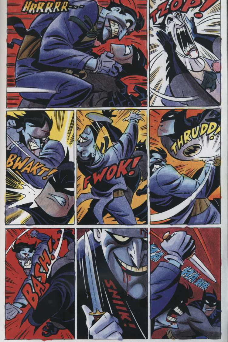
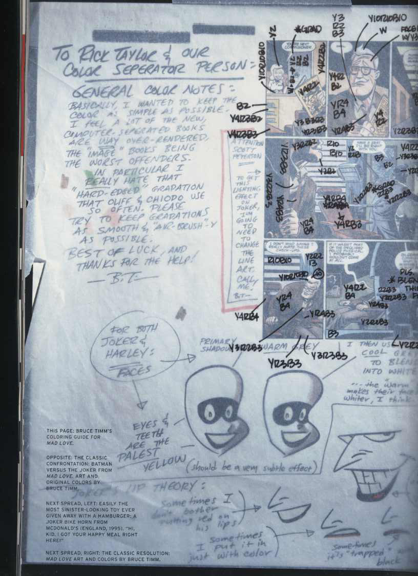
Hey everyone. I just remembered that today, Friday April 2nd, there is going to be a Steve Oliff moderated panel at WonderCon in San Francisco.  Full details here.

The panel is about how computers took over coloring in comics. A subject close to my heart. And it reminded me that maybe some of our newer readers may have not read the interview I did with Mr. Oliff awhile back. He’s a really interesting figure in comics because he spans such a rich history. From four color to full color to computer color, Steve has done it all. Read what he has to say if you haven’t already. And go see that panel! Today!

Steve Oliff interview

Labels: ,

Garage Band by Gipi


by

Saturday, March 20, 2010


Read Comments (10)

This appraisal of Garage Band by Italian cartoonist Gipi, first appeared in Windy Corner Magazine.  Thanks to Austin for letting me run it here on CC.

————–

Garage Band  by the Italian cartoonist Gipi is a remarkably deceptive comic. Originally titled Five Songs when it was released in Italy a few years back (2005), it’s a breezy read, quite enjoyable – arguably the most beautiful of his available works in English. Soft watercolor tones and thin contour lines that unite with marvelous energy and skill. Gipi has an amazing ability to capture the essence of each scene, to articulate all the important details without overwhelming the reader with such details. Yet, it’s a relatively “empty” read if one is looking for a solid story in the traditional sense.  And this is what I mean by it being a deceptive comic.  It’s 114 pages of strung together notes, poetic silent passages and bursts of energy. In that sense, it’s sort of like watching a great band practicing their songs. We see the stops and starts, the rehearsal of new material and the easy way in which some old songs are played effortlessly.  It’s all there, but somehow, I’m left wondering if the real show in front of an audience will be better and I’ll get to see, hear these songs played to perfection. And then I wonder if that really matters, and that maybe, seeing the band practice, hearing the demo tape is closer to some sense of perfection.

(more…)

Labels: ,

Klaus Janson colors part 1


by

Tuesday, December 15, 2009


Read Comments (12)

I’m trying to pull together a nice, well rounded article on Mr. Janson. But it’s just lots of notes at this point. So until I get it together, here are some fragments:

St. George by Klaus Janson. I’m just gonna write about the art. The story is unreadable. Awful. But the art is really interesting to me. This was after Janson’s Punisher run in the late ’80s. And long after his fabled run with Frank Miller on Daredevil and also on Dark Knight.

He was doing art and colors at this stage in his career. Pencils, inks, and colors. Well, color guides; he wasn’t making screens or cutting film. What’s interesting to me is the way Janson used the available palette at the time to get such rich “dark” colors. In St. George I like how he mixes and matches bright “block out” colors next to layered browns and greens. Plus there is something about the black panel gutters and margins that really adds to the mood.


                                                                  St. George 

Check out how different the mood is in an issue of Daredevil from years before. Black pages were uncommon then because most comics didn’t have the option of full bleed printing processes. The tone of the newsprint lightens the colors and makes the whole composition read differently than the examples above.

                                                                  Daredevil

Janson was one of the few artists at Marvel who did his own colors. There is a real synthesis of his linework and the colors themselves. It’s a very sophisticated system for such a limited color process. In St. George, I can tell that he’s drawing for color. There are “open” containment lines and lots of elements in the backgrounds that are not delineated, I think, because Janson knows that he will color those elements accordingly. That is a very different thought process than most cartoonists who are strictly thinking in black and white.

Anyways, Janson’s comics stick out. I come across his St. George and Punisher comics a lot in bargain bins, and they’re always good. Solid drawing, solid color. Too bad the stories are inane garbage. Still, they’re worth a look. Janson seemed to understand what was possible in color comics. And he did this at a time when the processes were really changing. Pretty cool.

More soon.

Labels: , ,