Posts Tagged ‘Marshall Rogers’

THIS WEEK IN COMICS! (9/1/10 – Wild Dreams)


by

Tuesday, August 31, 2010


Read Comments (16)

Above we see Marshall Rogers, among the ‘star’ superhero artists of the late ’70s/early ’80s, at his most transformed. This is from Cap’n Quick & A Foozle, his one and only longform project as a writer/artist, although Rogers actually took the credit of Director; this was, I suspect, partially in homage to the Warner Brothers cartoons that provided no small inspiration, but it also highlights Rogers’ understanding of himself at the head of a band of collaborators, including scenarist/colorist Chris Goldberg, and additional colorists René Reynolds & L.J. Chapin. As you might guess, there’s a lot of emphasis on color in this thing, ranging from odd, hazy translucent effects to washed-out blue & green over pencil shading, to – ah, see above. I don’t think Eclipse would publish anything quite so anxious and out-there again until Floyd Farland, Citizen of the Future.

(more…)

Labels: , , , ,

THIS WEEK IN COMICS! (8/4/10 – Still No Rand Holmes Retrospective…)


by

Tuesday, August 3, 2010


Read Comments (10)

…and I’m a year older.

My birthday was last weekend, so I thought it’d be fun to page through some comics from around the blessed date; ’81 was an odd and busy time in comics, days where Creepy, Heavy Metal and RAW shared space in the form as the Direct Market grew. One magazine-styled creature of the new distribution was Eclipse, a b&w comics periodical from the publisher of the same name, not yet three years from its release of Sabre, the Don McGregor/Paul Gulacy comics album famously targeted at comic book specialty retailers. Above you see the star of the show, from the July 1981 issue #2: Marshall Rogers, then fresh off a McGregor-written album of his own, the staggeringly portentous Detectives, Inc.: A Remembrance of Threatening Green.

Ah, those precision headlights and draftsman’s rays – like François Schuiten and Tsutomu Nihei, Rogers was exposed to architectural composition before he became professional in comics, and his inevitable cityscapes are the stillest and coldest of the group. This panel is apparently intended to contrast with a lonely desert vista at the top of its page, but Rogers’ hills and plants are so sharp and precise you’d think you could cut your finger on the page, causing “the strip” to register as less a response to the wilds than an explosion of organic growth. Which could just mean a cancer, but what control!

Rogers was in every issue of Eclipse, mostly (as above) via the Steve Englehart serial Coyote, though to my mind the same team seemed far more relaxed and effective in Slab, a self-contained piece from issue #1 initially written as a Superman/Creeper story for DC Comics Presents and revamped by Rogers into something else entirely, chock-full of gleaming sci-fi structures and oddball character designs (the Creeper becomes a talking cartoon bird, for instance), then re-scripted atop by Englehart when appropriate, tongue presumably in cheek.

Still, this speaks to the makeup of Eclipse, a self-positioned mainstream-underground bridge running through comics retailers, mixing Marvel/DC veterans with Trina Robbins and Harvey Pekar and mystery prose/Dick Tracy writer Max Allan Collins, everything very sedate and straightforward, the occasional appearance by the likes of Kaz notwithstanding – you could have told me half this stuff was drawn in 1975 and I’d have believed you. That’s not exactly a criticism, but it maybe speaks to the ease with which publisher Eclipse felt its way into the delicate market, certainly without a lot of money. The magazine ended with issue #8 in 1983 to convert into a color comic book, Eclipse Monthly.

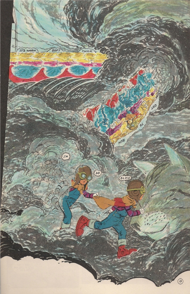
Meanwhile, no less a well-financed comics entity than Marvel was releasing issue #6 (June 1981) of Epic Illustrated, a big fat color magazine squarely positioned as a reaction to Heavy Metal. An establishment response, but god damn if those early issues in particular didn’t throw themselves into the work, oozing with paints, seared with airbrushes, and occasionally teetering on the brink of comprehensibility. Granted, much of this particular issue is taken up by Ken Steacy’s adaptation of Harlan Ellison’s Life Hutch, one of those arch separations of copious words and illustrative pictures I mentally associate with Byron Preiss (maybe I should be thinking Jim Steranko), but even that seems of a restless piece with a five-page Rick Veitch epic — intended as a  double-sided foldout and reprinted as such in his 2007 Shiny Beasts collection — concerning the psychic fusion of a starship and a dude with hoses in his eyes forming a gigantic nude humanoid space weapon that has cosmic sex with a feminine Earth protector/science goddess and boils the flesh off corpulent galactic warmakers.

That’s not the melted face above, mind you; Mike Saenz was still a few years off from the digital inquiries of Shatter and Iron Man: Crash when he and writer Roy Kinnard (who’d scripted him Creepy that year too) did Flash Sport, a typical ‘guy controlled by awful people in a deadly game’ scenario unique for its video game subtext: two bratty kids putting Our Man through violent paces for laughs. An appropriate context for the computer-inclined Saenz, triumphantly depicting a bad little boy’s getting shot open all over the page at the story’s close. And then there’s Kultz, a veritable double-down by Stephen R. Bissette & Steve Perry in which the rowdy trash film-loving teen consumers at a futuristic mega-mall fall prey to a terrible film that feeds their energies back to them until they tear each other to pieces at the surreptitious behest of the store management. You might not want to take it as an allegory for the Epic Illustrated situation, but maybe it works as a nightmare of corporate control of underground and foreign energies obliterating the young and enthusiastic – a real hazard.

Yet when I look at these rackmates of 1981, it’s the Marvel magazine that seems hungry and dated and reckless – inspiration and desperation in the face of competition, while the smaller magazine shows prudence and care, that old craftsman’s quiet. Of course, they shared contributors: P. Craig Russell, Jim Starlin. They both afforded their talents ownership of their original works. They were both very traditional in the face of RAW – but their differences are fascinations of the pliable era. And anyway, reading magazines from when I was born breaks up the monotony of googling my name and gazing into mirrors.

Oh right, new comics:

(more…)

Labels: , , , , , , , , , ,

Word Balloons in Visual Space


by

Monday, March 22, 2010


Read Comments (13)

Clowes' "Wilson", from The New Yorker

Joe’s excellent post on thought balloons got me thinking about comics balloons (or text frames) in general: not just thought balloons but also word balloons, narrative boxes, and labels (like the famous arrows in Dick Tracy which diagrammatically call attention to two-way-radio-watches and other items of interest). It would be great to have a history of text frames in comics. There have been stabs here and there by scholars. Thierry Smolderen’s “Of Labels, Loops, and Bubbles” in Comic Art #8 is a good start.

About thought balloons: When did they emerge? I know Harold Gray was very chary of using them: he only used thought balloons a handful of times in his 44 year run on Little Orphan Annie. I think this was deliberate. While his characters where gabby they were also secretive – this is true not just of Warbucks but even Annie, who never says all she knows. Gray wanted to keep his characters mysterious, hence he avoided thought balloons.

(more…)

Labels: , , , , , , , , , , , , ,

Two Pages That Prove Marshall Rogers’ Greatness


by

Monday, April 20, 2009


Read Comments (30)

He had a remarkable sense of flow

…even when the page is crowded with information. That, to me, is why he’s great. All of the information in the above pages reads clearly. It’s not “crowded” nor is it hard to quickly absorb. It’s clear, and that allows me to then linger on the drawing. I’m not trying to decipher the page. It’s just there. Each page above has a very pleasant, well organized sense of space.

Labels:

C.F. Makes It Big!


by

Tuesday, December 23, 2008


Read Comments (10)


Our man (er, one of them) in Providence, C.F., has finally made the big time. Here is his interview in Vice. I like this interview for how business-like it is. I never get to talk to him that way, so for me it’s revealing and good.

I also want to present my very own Top Five of 2008:

Top Five Hilariously Dumb-Awesome Comics Frank Pushed On Me This Year:

1) Slash Maraud “It’s a complete set! Paul GuLAAACY!”
2) Kick-Ass “C’mon man, it’s AWEsome!”
3) Random issue of The Shadow “It’s the MARSHALL ROGERS issue, dude!”
4) Robotech (Something unintelligible)
5) Marvel Fanfare #40 (“It’s all Mazzuchelli! It’s his loose, arty style!”)

Bonus number: The Bill Sienkiewicz New Mutants issues!

And that’s my list for the year.

Labels: , , , , , , , , ,

Diversion


by

Thursday, April 24, 2008


Read Comments (25)

I found the comic pictured above for 25 cents today. Am I the only one out there who didn’t know that Steve Ditko drew an FF Annual? And inked himself? In 1981? I haven’t read it yet but it looks amazing and, well, I’m that much of a comics fan that this was a big find. For a quarter!!

Marshall Rogers is a better artist than you. I also found this today. For a dollar. And I printed this upside down on purpose. No-Prize to whomever can guess what comic this is…

message to all auto-bio comics / art comics lovers out there, this post is for you: Read more old school super-hero comics.

Labels: , ,

Marshall Rogers


by

Thursday, January 10, 2008


Read Comments (53)

I found this convention sketch in a box at my mom’s house the other day. I’d forgotten all about it. I paid 15 bucks for it back in ’87, and I remember thinking that was a fortune. Too bad I barely remember anything about my interaction with Marshall Rogers himself. I only remember watching in amazement as he made these little marks on the paper when he started, little dashes that I quickly realized were for figuring out proportion. As soon as he had those marks down he was off to the races, and the drawing came to life literally in a matter of minutes. When he tore it out of the pad and handed it over to me, I do remember feeling a little gypped — but looking at it now, I think, good grief, it’s awesome, how did he knock it out that fast?

I showed this drawing to my friend Jim Rugg and we started talking about the sort of stylized naturalism that Rogers was known for. And then Jim said, “Y’know, the hackiest hack who worked for Marvel in the early ’60s had a better sense of basic figure drawing and naturalism than almost any contemporary cartoonist.” We both wracked our brains trying to come up with a modern equivalent to, say, Don Heck. And we couldn’t! Who draws in a non-photo-referenced, natural, realistic style? Okay, Jaime Hernandez. But who else? Everyone we came up with didn’t seem to fit. Michael Golden? No, too stylized. Beto? No, too cartoony. Jason Lutes? No, too stiff. There isn’t this sort of basic non-photo-ref’d style that’s in widespread use anymore. I’m sure if I really thought about it I could find an artist and point to their work and say, “Here, this guy.” But the fact is styles change, tastes change, and so do abilities and schools of thought. Photo-referencing rules the roost these days in “realistic-looking” comics, and I hate it. Gimme Don Heck instead. Or Rogers. He might’ve used some photo-referencing here and there, but he had it down and didn’t have to take photo after photo of his friends posing and then thinly disguise it as comics. I mean, have you read Coyote? What? You haven’t? What are you waiting for?

Labels: , , , , , ,