Posts Tagged ‘Wally Wood’

Wood and Clowes


by

Wednesday, January 19, 2011


Read Comments (3)

A photo you can stare at for hours.

Daniel Clowes has never made a secret of his Wally Wood fixation. Wood’s life and career, in all its lurid glory and splendid squalor held a particular fascination for Clowes when the younger cartoonist was starting out, a fascination that continues to this day. One example worth calling attention to: compare Gil Ortiz’s amazing photograph of Wood sitting by a typewriter (found here)with the back of the cover Clowes did for Ivan Brunetti’s An Anthology of Graphic Fiction, Cartoons, and True Stories, volume 2. The large panel with the cartoonist sitting on his bed is clearly inspired by the Ortiz photo.

The entire cover, a fine example of Clowes’ recent move into fragmented storytelling, calls out for a Parille-ite close reading. Briefly, the large panel with the cartoonist on the bed is, I think, the central scene. All the major graphic elements for the front cover and the various smaller fragments are taken from stuff the cartoonist sees in his room. The whole page is about the relationship between the limited physical space a cartoonist works in (the squalid room) and the products of his imagination. This relationship shows elements of both discrepancy (the images the cartoonist draws are more romantic than the reality) as well as linkage (the graphic elements of what the cartoonist draws are taken from stuff around him). Especially interesting is the fact that the cartoon Ivan Brunetti is nothing like the actually existing Brunetti: the cartoonist only deals with the editor through the phone and has an unreal (and hyper-exaggerated) image of what the editor is like.

Clowes cover.

Labels: , , ,

Wally Wood Should Have Beaten Them All


by

Thursday, February 18, 2010


Read Comments (16)

Weird Science 16, 1952 (original art)

Wally Wood’s life and art exist in the space between two comic book stories. The first, “My World”, published in Weird Science no. 22, 1953, was written by Al Feldstein as a tribute to the 26-year-old Wood, who drew it. In the story, an unseen narrator describes his daily experience of reality juxtaposed with panel after panel of spectacular fantasy scenes, consisting “. . . of great space-ships that carry tourists on brief holidays to Venus or Mars or Saturn . . . My world can be ugly . . . Landing at night and entering my cities and killing and maiming and destroying . . . My world is what I choose to make it. My world is yesterday . . . Or today . . . Or tomorrow . . . For my world is the world of science fiction . . . conceived in my mind and placed upon paper with pencil and ink and brush and sweat and a great deal of love for my world.” The final drawing of the comic has Wood smoking a cigarette at the drawing table and looking a bit wan. It’s an evocation of the celebrity of Wood-the-cartoonist published by William M. Gaines’ EC Comics, home of Mad, and the publisher for which Wood did his most famous work.

Twenty-two years later, Wood, having long since broken with Gaines and Feldstein and by then a cautionary tale to his peers, wrote and drew “My Word” for Big Apple Comix. It is again a breathless narrative complemented by stunning drawings, but this time it’s a trip through a hellish New York. A furious Wood closes his introductory monologue with “Anyhow, since I have three pages in this mag, I’d like to comment briefly on the universe.” And off he goes. After some muggings, some light S&M and the requisite pile of shit, Wood, apropos of nothing, leaps on art: “That mysterious process by which one’s fantasies enrich the lives of others… and the pockets of publishers. But it is worth it, for there are the fans.” And here we see a naked boy prostrating himself saying, “Do what you want with me! Kick me! Fuck me! Shit on me! I love you! By the way, your old stuff was better…” Wood closes with a distorted version of “My World’s” final panel: A squat alien at the drawing board, smoking and saying, “My word is the word I choose to make it, for I conceive it in my mind and put it down on paper with a lot of sweat and love and shit like that, for I am a troglodyte. My name is spafon gool.”
(more…)

Labels: , , , , , , , , , , ,

The Romance


by

Sunday, January 17, 2010


Read Comments (17)


Alex Raymond (1909-1956) made a certain kind of drawing that drove the boys wild. His Flash Gordon strips are the height of lush eroticism in comics (lush as compared to Burne Hogarth’s spiky cocks and taut flesh in his highly sexed Tarzan strips), his lines not finding any form, but creating it – becoming the substance of the image itself. Like a pulpier Franklin Booth, he seemed like he couldn’t help but draw the air that swept around his characters. Sometimes criticized as not being great comics qua comics, his stuff nevertheless worked best on the comics page, where sequences of drawings forgive the occasional clunker and where he could push even further than was commonly done in the pulps.

A gloss on his biography finds Raymond’s initial break in 1934, when, he debuted an astounding three strips: Dashiell Hammett’s Secret Agent X-9 (he only stayed on until 1935) and the more successful Sunday-only Jungle Jim and Flash Gordon. Flash, of course, would make his name, and he carried on until 1944, when he joined the Marines and served as an artist and designer until 1945.

Meanwhile, King Features had assigned Austin Briggs to Flash Gordon, so the company offered Raymond a strip of his own. Conceived and written with editor Ward Greene, Rip Kirby was born in 1946. Kirby is a gentleman detective complete with a golf hobby, a butler, and a bespectacled gal Friday who is not quite a lover. Kirby is moral and stern, but not without a wry sense of humor and, of course, a weakness for dames. None of the pulp madness of contemporaneous crime novels lurks within his psyche. Nope, he’s the public side of the post-WWII world: cosmetically sound and mostly sexless, all the better for him to be able to move through his various storylines while remaining mostly unruffled.


Anyhow, as you may know, IDW recently released the first volume in a comprehensive Rip Kirby reprint series. Some 300 pages of seriously high quality work reproduced beautifully. I’ve been waiting a while for this book, having only recently come to Raymond via Wally Wood, really, and following on my sudden, distressing, and then comfortable, and then soothing conversion to the many virtues of Hal Foster. It’s kind of like rediscovering the Grateful Dead as adult. You’ve passed through an unfortunate period of rejecting things your adolescent brain thinks aren’t appropriately “sophisticated” and then you come back around and realize that none of that fucking matters and your standards were mostly specious. Meanwhile you’ve made an ass of yourself rejecting all this great stuff. Well, fuck it, that doesn’t seem to be a problem for the younger kids out there (and lots of other older smart people), bless them. And I’m sort of mortified it was a problem for me. But we’re all idiots sometimes, even if those times last years.

Back to Raymond. With Rip Kirby he introduced a drawing style highly influenced by the classy illustrations found in Good Housekeeping and elsewhere – a moderate, well crafted realism that emphasized solidity and modesty without the flash and drama of the pre-War generations.


Foster was dramatic and stagey and Caniff overtly filmic and grotesque. Raymond wanted to bring a sense of fidelity (and here I mean something akin to a hi-fidelity audio recording – a highly polished simulacra of the “real” but without all the messiness of actual palms-in-the-dirt realism) into the mix – he relies on standard close-ups, over-the-shoulder shots, and crowd set-ups and avoids expressive angles and obvious dynamism. He keeps the figures rooted in the kind of photos you’d find in magazines. Nothing too far out. It’s a kind of media-based realism rooted more in images of America than any kind of documentary impulse.

For the first month of the strip Raymond uses his Flash Gordon fine line style, but a month later the art gets thick and brushy. Not Caniff brushy, but more like Al Parker brushy, and that’s where it gets really interesting.

Fine line and then brushy…


Raymond the aesthete (though not Raymond the storyteller) always seems like a hedonist, and these ink-heavy images look like they were fucking fun to make – big, juicy strokes like long honks on a saxophone (side note: I’m currently reading Larry Rivers’ autobiography, in which he has much to say about honking, which is a subject I think Frank relates to more than me, but I find interesting nonetheless) and in stark contrast to the rather pallid stories.


So, here is also where I can see Raymond’s profound influence on comic books – minus his finicky fine line style, this stuff has a surface sheen and a visceral feel that I can imagine comic book guys (many of whom hoped for strips) imitated. No hysterics here, but lots of detail and respectability.

The middle panel looks like every villain in every 1950s comic book. Except drawn to utter surface perfection. Not a line out of place. Not a move made without consideration. And dig that background stroke.

Of course, the comic book guys were saddled with lurid stories – so there you have a powerful combo: Attempts at “respectable” drawing in service to the down-and-dirty. I can see all of 1950s Ogden Whitney unfold, and Wally Wood baroque compositions, as well as John Romita, not to mention Russ Manning, and so many others. Those guys understood in a way that I bet Raymond did too, that taking that kind of technical drafting facility and cutting out the showiness of it – forcing it into the time and space constraints of a daily strip – can make it work as cartooning. The less Raymond put in – the more he feinted at realism but dove at cartooning – the more successful he is.

This realism is stunning in its facility, and the marks are beautiful, but the far more rushed drawing below kinda reads better as cartooning (um, Toth anyone?).

I haven’t said much about the stories. After all, it’s a comic. There is a blackmail storyline, there’s one about counterfitting; there’s a missing model in London; there’s even a kind of island adventure. The villains are stock and so are the situations. Kirby himself isn’t too interesting. But they move right along – I can happily sit and read them as the strips move through the basics of a plot. But really, that doesn’t matter. Rip Kirby isn’t a classic – not in the way that Mary Perkins on Stage is, or Terry and the Pirates is. I get the feeling Raymond wasn’t that interested in the “literary” end of things, so you can’t go looking for the kind of visionary experience you might have with Chester Gould or the feeling of a unique voice from Caniff. It’s an oddly impersonal strip, really. It’s all in the drawing – and that in itself is enough in this case. It gives me everything I need from the strip. The pleasures derived from Rip Kirby are unique and worth pursuing.

Judging by this first volume, Raymond’s greatest success with Rip Kirby was, in a way, inspiring the likes of Stan Drake (who was with Raymond the night of his fatal crash) and Leonard Starr, both of whom would marry Raymond’s “realism” with a sense of melodrama straight out of Douglas Sirk and snappy, well observed stories filled with moral ambiguity and undercurrents of fear and sex. The two ongoing Drake and Starr reprint series, The Heart of Juliet Jones and Mary Perkins on Stage, respectively, are my favorite finds of 2009 (the best source for info on these guys is the now defunct web site. The Look of Love). More on all of this another time.

Labels: , , , , , , , , , , ,

Wally Wood And Jack Kirby


by

Friday, November 13, 2009


Read Comments (18)


I read Jeet’s post about Jack Kirby and Dave Sim and thought about Kirby in the early ’70s. Specifically, his transition to DC from Marvel. So, I went down into my basement and dug out a DC comic from 1971. It’s a “Super DC Giant” reprint of all the Kirby Challengers of the Unknown material inked by Wally Wood. When were they first published, the late ’50s? And then I tried to imagine Wood being part of the Fourth World material, just inking one of the books like Vince Colletta did for Forever People. And then I smoked a cigarette. Man, that would have been amazing. For me, anyhow. They could have really turned up the romance angle. Look at those girls. Hubba Hubba.

Can you imagine Big Barda inked by Wood? Oof.

Labels: , , ,

Hal Foster, Cartoonist


by

Sunday, September 6, 2009


Read Comments (10)


At 29, Hal Foster bicycled from Winnipeg to Chicago. He was in search of a new market, having already achieved the dubious title of most popular illustrator in Winnipeg. Seems like the stuff of a Guy Maddin film, but, nope, it was just Foster, one of our sportier cartoonists (there are apocryphal stories of the artist shooting wildlife out his studio window.) That was in 1921. Ten years later he became the regular artist on the Tarzan comic strip, and six years after that began publishing his masterpiece, Prince Valiant.

I came to Foster and Prince Valiant just recently via Wally Wood. Wood’s trees, the artist long maintained, were Foster’s trees, and Wood’s sense of composition and figures in motion was heavily influenced by Foster’s balanced and graceful panels. Sure I’d read Foster before, but I’d never found a way in. Fortunately, Fantagraphics recently released Prince Valiant Vol. 1: 1937-38, and I was able to absorb the material in a wholly new way. After doing some reading I dug up a copy of The Comics Journal 102 (1985), which features a fascinating interview by Arn Saba (also look for her Caniff and Gottfredson interviews in other issues) with a then-retired Foster. He comes across as a melancholy man but confident man, as humble about his work as he was sure of his abilities. Asked about his inspirations, Foster replies, “I would say inspired by the beauty of my own work, and the loveliness of the stories that I stole from better authors. I always worked alone.” On more cartoony strips: “I don’t know why it is that some fellows can draw a little kid like, what’s his name, Charlie Brown, with just a round head, a round nose, and no particular body, and yet give the thing a personality. I still can’t understand that, and where the little things he says, and the funny little illustrations, are more real than some of the best drawn strips, the adventure strips.” Yes, that’s the master of comic strip realism talking about the virtues of a simpler approach. Or at least the virtues of Schulz. Intangible authenticity and emotional “reality” are not the first things one thinks of when approaching Foster, but as Saba so eloquently explains in her long introduction to the interview, in many ways they are the crux of what his work. In Prince Valiant, “Foster created the quintessentially American interpretations of the King Arthur legends, complete with a nuclear family, the democratic ideal, and the man-child hero whose boyish hi-jinks often lead to high adventure.” Saba tightly defines Americana here, and to that list I might add “idealism tinged with tragedy”, as the strip begins with the boy Prince losing his mother and embarking on a solo quest to find himself. Foster imbues this and all of the other strips I’ve read with a modest humanity. Where Foster’s illustration heroes N.C. Wyeth and J.C. Leyendecker tended towards grandiosity and dynamism Foster emphasizes the human scale of these adventures and keeps things relatively quiet.

I can see where readers might cringe at Foster’s idealism and, well, cleanliness. There is nary a hair out of place, no nod to the dirt, grime, and grotesqueries of the time. Even when Val skins a goose and wears its skin as a mask — a mask later swiped by Jack Kirby for his character The Demon — it’s bloodless. But Foster’s sensibility is so wonderfully innocent and immersed in depicting virtue and honor that to let anything else in would have polluted a clear, defined well of ideas. Prince Valiant is a perfect pre-angst fantasy in which rational justice wins out.

Foster’s artwork completely reinforces the ideal order. The page above is arranged with larger set-up and concluding panels sandwiching a middle section of rapid action, expertly choreographed so that readers can follow Val in and out of a room, and then savor the ultimate conclusion in the last couple panels. A demonic but playful Val, a terrified Ogre, and finally a clearly victorious hero. The figures, while well posed, are never stiff — they have an inner life and animation. Also, Foster, while a stickler for detail, knew when to leave it out: Most of the action plays out against solid colors — yellows and blues expertly rhyming with one another to create a unified page.

This page is remarkable for its wide range of approaches, settings and emotions. In the beginning Val make an emotional proclamation (swiped from a film still, perhaps?) and then Foster races him off to the forest. Look at that bottom left panel. After a couple panels of plain backgrounds, Foster immerses us in the forest (A damn straight Wally Wood forest) with great detail and then, with some flourish, exists Val onto a plateau above the “sinister castle” a skull perched just behind him. Val is on the cusp, and the weight of his adventure is made evident by the panel size and velocity of the action. Meanwhile, the yellow of Val’s shirt picks up his cloak, while the various browns of the woods and cloth are all delicately arranged for maximum readability.

Both of these pages also reveal a key part of Foster’s appeal: He shied away from the chiaroscuro and noir angularity of the Caniff-ian school of adventure comics and instead kept his spaces fairly level, colorful and enticing. These are comics that look accessible but contain a tremendous amount of quiet sophistication. Foster’s sense of place, color, and body language is just stunning. But again, he was never showy. It’s a realism that never calls itself “realistic”.

And the story itself? I thoroughly enjoyed it. Foster himself seemingly didn’t have great ambitions besides to write something that satisfied him and entertained his readers. I found this first book completely engrossing. Prince Valiant opens up a world that I wanted to stay in — a wide-eyed early 20th century approach to fantasy with a now-vanished sincerity and wholesomeness. It’s an all too rare pleasure in comics. I now understand why so many cartoonists after him sought to regain that Foster magic, despite the futility of such an anachronistic exercise: It’s a near-perfect distillation of purity (the high moral pulp sought by mid-century guys like Gil Kane and Alex Toth), skill (inarguable drawing ability), and success. Wally Wood chased it his entire career, and was asked to try out to be Foster’s replacement on the strip, but was not given the gig. But everyone from Russ Manning (who was an heir to Foster on Tarzan) to Charles Vess to Ryan Sook (his Wednesday Comics Kamandi) have tried to claim a little bit of Foster’s legacy. And of course the comic strip itself continues under different hands. But it is not so much the characters I’m attached to, but rather Foster’s masterful spell.

I confess to not having anything terribly profound to say about Foster. I suppose I’ve been surprised by and taken with the sensitivity, grace, and fluidity of his work, as well as what a fine comic strip Valiant really was. Foster understood page design and the interplay of color and form about as well as anyone I can think of in the 1930s, but recently he tends to be relegated to illustration rather than comics history. Certainly I’ve made that mistake. The recent reprint publishing activity has had all sorts of interesting effects, particularly in the way certain artists are re-contextualized. The revival and re-packaging of Valiant is particularly significant, as it no longer seems like an oddball project in the Fantagraphics catalog, but rather a prestige item that takes it place alongside other relevant books like Love and Rockets and, dare I say, Prison Pit (in terms of cartoon clarity and craft, the two have something in common. I also loved Prison Pit). This new project gives Valiant something it was long missing: currency. And I’m looking forward to exploring more of it in the years to come.

Labels: , , , , , , , , , , , , , ,

The Gender of Coloring


by

Sunday, August 2, 2009


Read Comments (22)

Among the many juicy tidbits in the Trevor Von Eeden interview in The Comics Journal #298, is the story, which was news to me, that the cartoonist was dating Lynn Varley, who served as the colorist on his groundbreaking Batman Annual #8. Varley would go on, of course, to date and marry Frank Miller, and color many of his works as well.

This got me thinking about the relationship between gender and coloring in commercial comics. Although comics have been very much a boy’s club, it is noticeable that there a number of women have carved out a niche for themselves as colorists. Many of these women had personal relationships (as sisters, girlfriends, wives) with writers and artists.

Examples would include: Marie Severin (sister of John Severin), who was also course an accomplished artist; Glynis Wein (first wife of writer Len Wein), Tatjana Wood (first wife of Wally Wood), and Richmond Lewis (who is the wife of David Mazzucchelli, and did an amazing job coloring Batman: Year One). In some of the classic newspaper comics as well, cartoonists used their wives to help do the coloring. Outside of mainstream comics, Lewis Trondheim’s work has occasionally been colored by his wife.

The reasons for these women becoming colorists vary, of course. Lewis, as I understand it, is a special case because coloring was a sideline from her main career as a painter, and occurred mainly because Mazzucchelli wanted to bring Lewis into his world of comics (she also collaborated on editing Rubber Blanket).

I’d like to see someone do a good gender analysis of why women went into coloring. I’m inclined to see this as something more than mere sexism or the creation of a pink-collar ghetto. One factor at work is that for much of the 20th century, women were more likely to be associated with the decorative arts than men; in commercial comics coloring is often seen as a decorative. I’m not a gender essentialist so I don’t think women have an innately better color sense than men. But for historical and cultural reasons, women in our culture are more likely than men to be raised with color sensitivity.

There is also the fact that a cartoonist’s studio often resembles an old fashion artisans shop, with the main master being assisted by apprentices and family members. Again the classic newspaper strip provides examples, with many cartoonists taking on sons (and sometimes daughters) as assistants.

For at least some of the women we’re talking about (I’m thinking here particularly of Severin, Varley, and Richmond), coloring was clearly an expression of their creativity. They all had a major impact on the history of comics. As Mazzucchelli once suggested, the last person who works on a page of comics art, whether it’s the editor or colorist, often has the biggest impact.

Labels: , , , , , , , , , , , ,

Dave Stevens and Nostalgia


by

Sunday, April 26, 2009


Read Comments (53)

For weeks now I’ve been trying to wrap my head around Brush with Passion: The Life & Art of Dave Stevens. Because this is a blog, and because I think this is now part of a larger project, I’m going to indulge myself by rambling on for a little while. I picked up the book out of idle curiosity while staying at Sammy Harkham’s house in L.A. (fitting, since the book is mired in the kind of illusions and disappointments so well entrenched in that city) and have been fascinated with it ever since. It’s a deeply sad autobiography, left unfinished upon Stevens’ death and wrapped in the cloak of a “celebration” of his artwork. Stevens was the ultimate professional fan artist—pulled into comics and popular entertainment because of his love for both, and a rock star in a hermetically sealed world where San Diego Comic-Con is the nexus of the universe, Frazetta is considered one of the great artists of the 20th century, and everything is about “fun”, criticism and progress be damned. It’s the kind of universe that can be wonderfully supportive, very fun, and also severely limiting. For Stevens it was all three. All he wanted to be was some awesome amalgamation of his heroes Jim Steranko, Frazetta, Jack Kirby, Russ Manning, and Alberto Vargas. But by the time he was of age, there was no room left for that kind of work: too labor-intensive for comics, no longer fashionable in fantasy art, no pulps left to publish it… He was a nostalgist with nowhere to channel his fannish obsessions and no interest in transcending them.

I suppose I was drawn to the Stevens book as a lens through which to look at many of the same artists he admired. Guys like Manning, Wally Wood, Gil Kane, Alex Toth, and others are deeply intriguing both for the lives they lived and the idiosyncratic visual worlds they created. Somehow, studying Stevens in the context of this book is helping me think about the work of his predecessors and mentors.

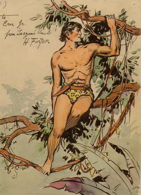
So let’s back up for a moment. There was this thing that happened in the 1960s: Incredibly skilled, visually ambitious artists like Wood, Manning Toth, et al—men who were raised on pulp imagery and the classic American illustrators like Wyeth and Pyle—decided they wanted to do something “sophisticated.” They realized that despite the still-somewhat plentiful outlets (fewer than in the ‘20s and ‘30s, but still a few) for their work, they were never going to be free of the “juvenile” implications of their subject matter. These were guys who wanted to draw comics, but, given the circumstances (generational, financial, etc.), had nowhere else to go. They were, in essence, the last true work-a-day fantasy artists of the 20th century—still basically working for the pulps, at a high level for low pay. And it was a job—they were visionaries in a journeyman’s business. The work they tried to make on their own, like Wood’s Witzend material or Kane’s Savage, met with varying degrees of aesthetic or commercial failure. In any case, they certainly pointed the way so that the fantasy/adventure artists following them, aware of some notion of independence and certainly cognizant of the example of Crumb, et al, had some kind of choice in the matter.

Sort of. Ironically, the guys that came after Wood and Kane and Toth, like Bernie Wrightson, Mike Kaluta, Barry Smith, and Jeff Jones, followed them right down the manhole, dabbling in independent publishing but basically choosing to be pulp artists at a time when the pulps no longer existed. They chose to be willfully anachronistic. That helped make their work popular to a generation of guys who’d been children (if that) when the ECs came out and were now 20-something fanboys eager for more of the same, but, with the exception of Smith, who really brought a new kind of ferocity to his mark-making, it also severely limited the work. There was nowhere for it to go except for further wallowing in nostalgia – it would never transcend its nostalgic origins. The idea was to just make the best version of Arthur Rackham or Joseph Clement Coll as possible. There’s nothing wrong with that, really—it’s just rather limited.

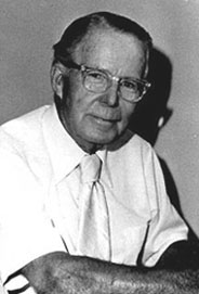
Anyhow, back to Dave Stevens. Here was a guy who didn’t just come after Wood and Toth, but after Wrightson and Kaluta. So, we’re dealing with someone who grew up aspiring to the success of the second-generation stuff as well. But Wrightson and those guys at least had Creepy, Eerie, and other faux-EC mags; by the time Stevens hit his stride there was nothing but lower rung gigs doing storyboards and movie poster comps. And while he was a wonderful nostalgist and decent technician, Stevens was not a visionary. And he knew it. He broke no new ground or created anything very notable, really. His career seems divided between storyboarding, drawing pin-ups, and creating a readable throwback comic The Rocketeer, which became a fun but unsuccessful movie. His career never moved beyond the comfortable boundaries of mainstream fantasy fandom. And throughout his book he constantly seems trapped or burdened by his chosen professions. When his Hollywood dreams turn sour with The Rocketeer, he writes, “No good deed goes unpunished, especially in Hollywood.” And of the constant stream of “sexy girl” drawings he produced to earn a living: “While I do enjoy it and will probably always create pin-ups in some form, I don’t want to be defined by it.” But of course he was defined by it—by his revival of Bettie Page in the pages of The Rocketeer and by the oddly un-sexy women he drew throughout his career—all sinewy, inelegant line and no character. There is no mystery in his drawings—they look forced and labored over, with none of the grace of his contemporary, Jaime Hernandez, for example. And Stevens, so adored by his community, never had a chance to move past it. After all, he was giving a certain group of people exactly what they wanted: instant, safe nostalgia, “innocent pin-up girls”, an independent comic that felt exactly like a 1950s adventure comic. Something contemporary that Jim Steranko and Harlan Ellison (both contributors to the book and both brilliant as young men and then, like Stevens, trapped in their own “cool guy/king of the nerds” self-image and lionized by a lazy fanbase) could get behind; and, for nerd-dom, the all-important illusion of technical proficiency (here defined as a late 19th century notion that conveniently ignores 20th century art history).

And, by all accounts, he was a very nice guy. I mention this because it comes up again and again in the book. There are numerous testimonials from other professionals, and the editors themselves seem completely enamored of their subject. Stevens was loved in the way only this kind of fandom can love someone. What the book puts across is a world in which success if partly based on just getting close to the outside world–film, TV, “famous” actors or models. Success is getting do some throwaway storyboards for Raiders of the Lost Ark. This is a book that lovingly reproduces storyboards from Godzilla: King of the Monsters in 3-D and contains non-ironic jokes about the sexuality of characters from Jonny Quest, and, of course, prints numerous images with which Stevens himself seems dissatisfied. It’s all so insular.

Stevens struggled with depression throughout his last two decades, and, he writes, “By the late 90s I’d become wholly dissatisfied with the caliber of work that I was producing. My technical skills were limited and my ‘style’ seemed nothing more than a vague pastiche of others whose works I admired and had tried to emulate throughout my developing years.” He goes on later in the book to regret lost time and abandoned projects and to describe his own talents as limited: “My progress as an artist has indeed been slow and ponderous. My growth and potential has largely been limited only by my own lack of foresight and commitment.” I suppose these passages could be read as simple modesty, but I found them tremendously moving. Here’s a guy, ill with Leukemia, regretting parts of his life. That’s not unusual in literature, but extraordinary in fan culture, which is all celebration and good will. In the halls of San Diego and in your local comic shop you’re supposed to pretend that these guys are giants of culture, impervious to criticism as they march forward toward development deals and oil paintings for the latest Shadow revival. It’s all very earnest, but completely dishonest. But where else could he ruminate except in the pages of his very own fan-produced book? It’s as though at the end he needed to break out of the mystique, out of character, and just be human.

Now, it would be easy for someone reading this to make a good case that I’m ignoring all the fun Stevens obviously had and the fact that he entertained tons of people, and was clearly loved. All of that is true and all of that is valuable. And I’m not saying that Stevens should have regretted anything. To each his own and all that. But what a thing – to create a book of his own work and then, in his way, publicly disavow or regret so much of it. In that sense, Stevens really did become one of his idols–just like reading an embittered interview with Alex Toth, Gil Kane, or Wally Wood, all of whom were burdened by the knowledge that there was more to do, just out reach. Except that Stevens had a choice–unlike those guys, who loved comics but had nowhere outside of the mainstream to make them, Stevens made a conscious choice to marginalize himself, to live within the bubble of fandom. He was a willful anachronism, frustrated by his chosen intellectual and artistic world but unable or unwilling to see beyond it. Brush with Passion illustrates that conflict in vivid, sad detail.

Labels: , , , , , ,

Five Images That Prove Wally Wood’s Greatness


by

Saturday, April 18, 2009


Read Comments (9)

Oh, just for fun, or maybe to get some mileage out of my distracting obsession with Wally Wood. Pretty much what the title says it is: A tiny sampling of why Wood is such a compelling artist.

He understood physical grace (and he was a great costume designer).


He could organize space in a way that made it seem infinite and STILL teeming with “stuff”.


His hyper-detailed, baroque inking style gave aliens and technology a solid, complex dimensionality.


He was funny.


In his later years he figured a wonderfully airy sense of space — his figures no longer stiff or contorted, and his pen line (or assistant’s line) smooth and minimal.

That’s it.
Labels: ,

Wally Wood Question


by

Monday, March 23, 2009


Read Comments (6)
(Unrelated eye-catching image by Ethan D’Ercole)

A question for the peanut gallery: There’s a great two-page Wally Wood comic from EC that has him describing the worlds he draws and ends with a self portrait in the last panel. Does anyone remember where and when that first appeared? I can’t find my source for it.

Thanks.

Labels: ,

The Best of 1968, or, Scorpio Rising


by

Saturday, March 14, 2009


Read Comments (9)

Since just about all the best of 2008 lists have been presented now I thought I’d rip off follow in Dan’s footsteps, and share the “outstanding graphic stories” of forty years ago, as presented in Graphic Story Magazine 11:

“Who is Scorpio?”
Written, told and drawn by Jim Steranko
Nick Fury, Agent of S.H.I.E.L.D. 1, June 1968

“Mind Blast”
Written, told and drawn by George Metzger
Graphic Story Magazine 9, 1968

“Whatever Happened to Scorpio?”
Written and told by Jim Steranko
Drawn by Jim Steranko, with John Tartaglione
Nick Fury, Agent of S.H.I.E.L.D. 5, October 1968

Honorable Mentions:

Equal Time for Pogo
Written, told and drawn by Walt Kelly
Simon & Schuster, 1968

“The Pipsqueak Papers”
Written, told and drawn by Wallace Wood
Witzend 5, 1968

“Dark Moon Rose, Hell Hound Kill”
Written and told by Jim Steranko
Drawn by Jim Steranko, with Dan Adkins
Nick Fury, Agent of S.H.I.E.L.D. 3, August 1968

“Today Earth Died”
Written and told by Jim Steranko
Drawn by Jim Steranko, with Joe Sinnott
Strange Tales 168, May 1968

“The Junkwaffel Invasion of Kruppenny Island”
Written, told and drawn by Vaughn Bode
Witzend 5, 1968

“The Adventures of Fritz”
Written, told and drawn by Robert Crumb
Cavalier, February through October, 1968

Another big year for Steranko, obviously. It’s kind of fun to see the undergrounds start to sneak their way onto the list…

Graphic Story 11 is a terrific issue otherwise, too, by the way, with a great Will Gould interview, and even a fan letter from the infamous Dr. Wertham himself, congratulating the fanzine on its recent interview with Alex Toth, and attempting to claim the artist as a fellow spirit:

The point that interests me most, of course, is what he says about the artist not showing the realistic details of horror in a story, but having it take place offstage, as it were, as far as the picture is concerned. I agree with him entirely on that … because I have found out through long clinical studies that it may have adverse effects on the immature mind. For that I have been blamed often, and I’m glad to read the technical opinion of Alex Toth.

This didn’t prevent the editors from publishing a lengthy, vehement denunciation of Wertham on the preceding pages, of course.

Which is awesome, and one reason I like reading old magazines.

Labels: , , , , , , , , , ,