


The Romance
by Dan Nadel
Sunday, January 17, 2010
Read Comments (17)

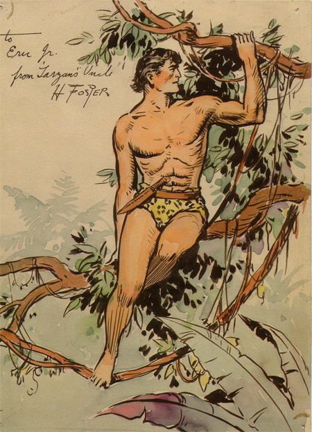
Alex Raymond (1909-1956) made a certain kind of drawing that drove the boys wild. His Flash Gordon strips are the height of lush eroticism in comics (lush as compared to Burne Hogarth’s spiky cocks and taut flesh in his highly sexed Tarzan strips), his lines not finding any form, but creating it – becoming the substance of the image itself. Like a pulpier Franklin Booth, he seemed like he couldn’t help but draw the air that swept around his characters. Sometimes criticized as not being great comics qua comics, his stuff nevertheless worked best on the comics page, where sequences of drawings forgive the occasional clunker and where he could push even further than was commonly done in the pulps.
A gloss on his biography finds Raymond’s initial break in 1934, when, he debuted an astounding three strips: Dashiell Hammett’s Secret Agent X-9 (he only stayed on until 1935) and the more successful Sunday-only Jungle Jim and Flash Gordon. Flash, of course, would make his name, and he carried on until 1944, when he joined the Marines and served as an artist and designer until 1945.
Meanwhile, King Features had assigned Austin Briggs to Flash Gordon, so the company offered Raymond a strip of his own. Conceived and written with editor Ward Greene, Rip Kirby was born in 1946. Kirby is a gentleman detective complete with a golf hobby, a butler, and a bespectacled gal Friday who is not quite a lover. Kirby is moral and stern, but not without a wry sense of humor and, of course, a weakness for dames. None of the pulp madness of contemporaneous crime novels lurks within his psyche. Nope, he’s the public side of the post-WWII world: cosmetically sound and mostly sexless, all the better for him to be able to move through his various storylines while remaining mostly unruffled.

Anyhow, as you may know, IDW recently released the first volume in a comprehensive Rip Kirby reprint series. Some 300 pages of seriously high quality work reproduced beautifully. I’ve been waiting a while for this book, having only recently come to Raymond via Wally Wood, really, and following on my sudden, distressing, and then comfortable, and then soothing conversion to the many virtues of Hal Foster. It’s kind of like rediscovering the Grateful Dead as adult. You’ve passed through an unfortunate period of rejecting things your adolescent brain thinks aren’t appropriately “sophisticated” and then you come back around and realize that none of that fucking matters and your standards were mostly specious. Meanwhile you’ve made an ass of yourself rejecting all this great stuff. Well, fuck it, that doesn’t seem to be a problem for the younger kids out there (and lots of other older smart people), bless them. And I’m sort of mortified it was a problem for me. But we’re all idiots sometimes, even if those times last years.
Back to Raymond. With Rip Kirby he introduced a drawing style highly influenced by the classy illustrations found in Good Housekeeping and elsewhere – a moderate, well crafted realism that emphasized solidity and modesty without the flash and drama of the pre-War generations.

Foster was dramatic and stagey and Caniff overtly filmic and grotesque. Raymond wanted to bring a sense of fidelity (and here I mean something akin to a hi-fidelity audio recording – a highly polished simulacra of the “real” but without all the messiness of actual palms-in-the-dirt realism) into the mix – he relies on standard close-ups, over-the-shoulder shots, and crowd set-ups and avoids expressive angles and obvious dynamism. He keeps the figures rooted in the kind of photos you’d find in magazines. Nothing too far out. It’s a kind of media-based realism rooted more in images of America than any kind of documentary impulse.
For the first month of the strip Raymond uses his Flash Gordon fine line style, but a month later the art gets thick and brushy. Not Caniff brushy, but more like Al Parker brushy, and that’s where it gets really interesting.


Raymond the aesthete (though not Raymond the storyteller) always seems like a hedonist, and these ink-heavy images look like they were fucking fun to make – big, juicy strokes like long honks on a saxophone (side note: I’m currently reading Larry Rivers’ autobiography, in which he has much to say about honking, which is a subject I think Frank relates to more than me, but I find interesting nonetheless) and in stark contrast to the rather pallid stories.

So, here is also where I can see Raymond’s profound influence on comic books – minus his finicky fine line style, this stuff has a surface sheen and a visceral feel that I can imagine comic book guys (many of whom hoped for strips) imitated. No hysterics here, but lots of detail and respectability.

The middle panel looks like every villain in every 1950s comic book. Except drawn to utter surface perfection. Not a line out of place. Not a move made without consideration. And dig that background stroke.
Of course, the comic book guys were saddled with lurid stories – so there you have a powerful combo: Attempts at “respectable” drawing in service to the down-and-dirty. I can see all of 1950s Ogden Whitney unfold, and Wally Wood baroque compositions, as well as John Romita, not to mention Russ Manning, and so many others. Those guys understood in a way that I bet Raymond did too, that taking that kind of technical drafting facility and cutting out the showiness of it – forcing it into the time and space constraints of a daily strip – can make it work as cartooning. The less Raymond put in – the more he feinted at realism but dove at cartooning – the more successful he is.

This realism is stunning in its facility, and the marks are beautiful, but the far more rushed drawing below kinda reads better as cartooning (um, Toth anyone?).
 I haven’t said much about the stories. After all, it’s a comic. There is a blackmail storyline, there’s one about counterfitting; there’s a missing model in London; there’s even a kind of island adventure. The villains are stock and so are the situations. Kirby himself isn’t too interesting. But they move right along – I can happily sit and read them as the strips move through the basics of a plot. But really, that doesn’t matter. Rip Kirby isn’t a classic – not in the way that Mary Perkins on Stage is, or Terry and the Pirates is. I get the feeling Raymond wasn’t that interested in the “literary” end of things, so you can’t go looking for the kind of visionary experience you might have with Chester Gould or the feeling of a unique voice from Caniff. It’s an oddly impersonal strip, really. It’s all in the drawing – and that in itself is enough in this case. It gives me everything I need from the strip. The pleasures derived from Rip Kirby are unique and worth pursuing.
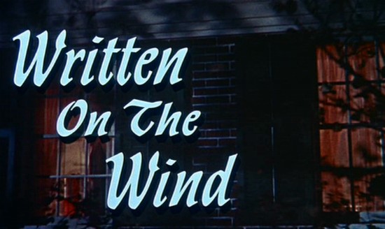
Judging by this first volume, Raymond’s greatest success with Rip Kirby was, in a way, inspiring the likes of Stan Drake (who was with Raymond the night of his fatal crash) and Leonard Starr, both of whom would marry Raymond’s “realism” with a sense of melodrama straight out of Douglas Sirk and snappy, well observed stories filled with moral ambiguity and undercurrents of fear and sex. The two ongoing Drake and Starr reprint series, The Heart of Juliet Jones and Mary Perkins on Stage, respectively, are my favorite finds of 2009 (the best source for info on these guys is the now defunct web site. The Look of Love). More on all of this another time.


