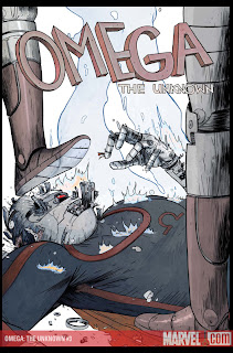
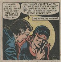
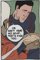
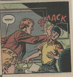
It may not seem like it, but the three of us here at Comics Comics are hardly monolithic in our tastes. In order to prove it, we’ve decided to introduce something which may or may not become a recurring feature here: a way to present no-holds-barred arguments about comics and comics-related issues about which we don’t quite see eye to eye. First up: The new version of Omega the Unknown, written by Jonathan Lethem and Karl Rusnak, and drawn by Farel Dalrymple. Rules: I’ll put up some thoughts, and sometime in the near future, Frank will add his. We’ll keep going until it feels like we’re done. Oh, and Dan, feel free to jump in at any point if you want to, whether you want to take a side, egg us on, act as an impartial referee, or sucker-bash one of us on the back of the head with a metal folding chair. Readers are welcome to throw tomatoes at us through the bars in the comments. (Oh, and if you haven’t read the series yet and don’t like spoilers, you may want to skip this one.)
LET THE BATTLE BEGIN!
 TIM: I’ll start by saying that I like this series a lot more here at the issue 3 mark than I did when I’d only read the first issue. As I wrote at the time, I was initially unsure whether or not Dalrymple’s art was really appropriate for the story, and compared it unfavorably to the surreal effect achieved in the original through the juxtaposition of Steve Gerber & Mary Skrenes’s bizarre plot with Jim Mooney‘s almost generic superhero pencils. Since that time, Dalrymple’s style has really grown on me, and as Lethem & Rusnak’s script has started to diverge from the 1970s original (the first issue, aside from the Mink storyline, was nearly a beat-by-beat remake) and the story’s themes have become more clear, it’s started to seem like an inspired choice to me. Don’t get me wrong, despite a lot of beautiful pages, I still think you find the occasional sloppy or half-assed composition, but overall, I’m really liking it. And the series has begun to achieve its own kind of surreal tone, different from the original, but nearly as effective: I like the quiet atmosphere of it all, the way a horrific image like a severed-finger-topped fast-food burger almost reads subliminally, without being turned into some overblown two-page spread. But I know you have some problems with the art, Frank, so before I go on, why don’t I give you a chance to pile in?
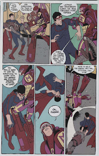
 FRANK: I actually really like this comic, too, but I have one big problem with it, so my comments are kind of “tough love.” Here goes: The everyday scenes are impeccable. Everything about the staging and narrative flow, in each issue so far, is excellent until the action begins. Take this page from #2 as an example. It is, essentially, the only action sequence in the issue. The sequence begins from the POV of the main character, who sees the action unfolding on the street below from his window. The everyday scenes of daily life have been interrupted by the FANTASTIC. There is a moment of tension; the view of Omega doing away with two robots seems “correct” in tone. Here is this fantastic event unfolding in front of the character’s deadpan gaze, but it’s still completely “everyday” in tone. Then, when the POV switches back to the action outside, there seems to be little or no tension between the FANTASTIC and the EVERYDAY.
The page is all too flat. I don’t expect it to look like a normal Marvel comic with extreme camera angles and speed lines, but I do expect it to convey a sense of something bigger than life. And in the context of this issue, the two pages of action pale in comparison to the attention to detail and nuance in the EVERYDAY scenes. This may be a strategic move on Lethem and Dalrymple’s part to downplay the action and weave it tighter to the everyday, I don’t know. If the way that action and “the fantastic” are meant to be portrayed in a muted fashion is intentional, then they’ve succeeded. But my guess is that it isn’t intentional. I’m sorry, it just comes off like, like … a Vertigo comic.
DAN: Well, thanks for letting me know, you guys! Jeez, what does a guy have to do around here to feel included? Well, I’ll fight through the emotional pain and attempt a brief response now followed by a lengthier one tomorrow after I’ve re-read the comics. Overall, I’ve found the series compelling and very well executed. The quiet, static fight scenes work for me because they help maintain the focus on characters. That is, it’s almost like the fights are surreally incidental to the main person-to-person action. I’m waiting for Lethem to reveal that they’re not really happening at all. Though that would be too easy. Seems to me that Farel has come up with some rather remarkable here — using Frank Miller-style comic book drawing to delineate place and character in a way that, well, Miller hasn’t done in 20-plus years. And the characters are wonderful. Unlike so many comics that substitute tough talk and snappy dialogue for real characterization, Omega is giving us fully formed, sympathetic protagonists that I find myself invested in. Plus, it’s genuinely suspenseful in the “I don’t know what is going to happen next” kinda way. Lethem is writing discreet comic book units that have their own narrative arcs while building in, I suspect, devices that will become important in later issues. That’s my take on it for now. Who’s next?
 TIM: Huh. I could’ve sworn both of you guys disliked this book, but I guess I misunderstood. Our first cage match may not end up being a particularly vicious one. Anyway, there’s still some stuff I disagree with you both about, but I think I’m going to need access to a scanner for my response, so I’m out until later tonight.
DAN: It’s a cage love fest! Tim, stop trying to get us in trouble.
FRANK: The action scenes “help maintain the focus on character”? What does that mean? For me, they’re too much in line with how everything else is delineated. There’s no TENSION, despite its focus on character, as you put it Dan. What I mean by tension is that Omega himself, the title character, is easily the least defined (which of course may be on purpose). However, the character “The Mink” has a much larger “larger than life” appearance, regardless of whether or not it’s supposed to be his media shtick. Anyone following me? Omega, to me, should have a PRESENCE, and the way he’s drawn doesn’t give me that feeling.
TIM: Well, maybe I won’t wait until I have access to a scanner before replying after all. I’ll just hope I’m remembering the comic correctly, and post the images later if I am. [UPDATE: I wasn’t, at least not exactly, and the following is slightly revised.]
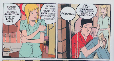
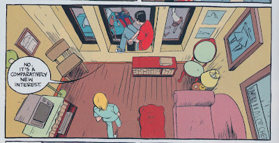
First, I think what you’re talking about is exactly right, Frank. There is little to no effort made in the art to draw a distinction between the fantastic and the mundane. Where I disagree with you is that I think that effect is entirely intentional, and ironically, I had originally planned on using exactly the sequence you point out to say so. The way we are introduced to the fight makes this pretty clear, I think. A few pages earlier than the one you uploaded earlier, we see Alex, the kid protagonist, having a discussion with his roommate while he looks out the window. He sees something, but we don’t know what…

…until we get to the next tier on the page, which looks exactly like a normal New York apartment scene, if you don’t notice the small figures battling down on the street outside.

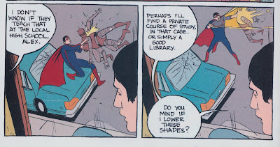
You’d think the reaction to seeing this pretty crazy fight between a superhero and a bunch of robots in the middle of the street would provoke a strong reaction in Alex, but it doesn’t. Instead, he seems almost annoyed.

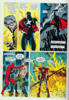
On the next page, he still doesn’t seem anxious, and doesn’t even bother mentioning the fight to his roommate, but simply walks to a different room to continue his conversation. To me, it seems like this sequence of panels is intended not only to draw attention to Alex’s lack of reaction, but also to highlight exactly the lack of tension you sense — which paradoxically, creates an entirely different kind of narrative tension: why isn’t he reacting the way we’d expect him to? And it’s not just Alex, either. The fight continues outside, and the Mink ends up getting into the action, but the streets don’t erupt into panic. The authorities and a news van arrive, but everyone behaves basically like this is business as usual, just another day in Marvel Manhattan.  This approach is more or less the direct opposite of the one used in the well-known scene from Frank Miller and David Mazzucchelli’s Daredevil: Born Again where the Avengers make a very memorable brief appearance, appearing almost like gods, and striking awe and fear in all who behold them. In fact, Miller’s text explicitly draws attention to their god-like natures. In Lethem’s Omega version of the Marvel universe, however, a fight between super-powered beings and robots is itself an everyday experience, no more impressive than any other story you might see any weekday on the local evening news.
I also take your point about the character of Omega himself — he’s a total blank, with almost no dramatic presence at all. Some of this comes from the original, where Omega was also more or less a mute cypher, but in Mooney’s original drawings, Omega was still an impressive physical force. Dalrymple draws him so that he looks like nothing more than an ordinary, beefy guy in tights. Again, I think this is intentional.
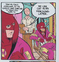
At this point, I start getting into conjecture, but one of the main themes of the book seems to be the relationship between children and superheroes. Obviously we have the Alex (Alpha?)/Omega relationship, but I think there’s also something going on here with the Mink. As I pointed out before, the Mink’s civilian name, Mr. Kansur, is Omega co-writer Karl Rusnak’s surname spelled backwards. We know that Rusnak and Lethem were childhood best friends, and shared a passion for talking and arguing about Marvel comics. (Lethem in a 2003 interview: “[Karl] and I shared a lot of these fascinations. Particularly Marvel Comics. He and I read them together very avidly.”) Now here’s where the speculation starts: doesn’t the Mink seem a lot like the kind of superhero a kid would come up with as a comic-book-obsessed child growing up in New York?  You’ve got the weird, sort-of-lame animal-related alter ego, the connection with your own name (Kansur/Rusnak), unlimited financial resources, the secret hideout complete with labyrinth on a small, deserted island off of Manhattan — I don’t know, it all seems to fit to me. In any case, my point is that mirroring the Alex/Omega child/superhero relationship, we get the Rusnak/Kansur child/superhero relationship. The “good” superhero is basically an unimpressive blank canvas, and the “bad” superhero is a media-savvy, greedy, manipulative guy with only his own interests at heart: the cynical version of what a childish ideal might really be like in the adult world. It’s too soon to say where it’s all going, but if I’m right, I think the comparison is telling.
Anyway, you’re still right, Frank: the action sequences are quiet and lack tension. It will be interesting to see if at any point in the series, they go for one of those god-like Frank Miller Avengers moments — I’m betting that if it happens at all, it won’t be until closer to the end of the series. I also think it will be interesting to see how they end up integrating Gary Panter‘s guest art in upcoming issues — I don’t know if he could draw an undynamic fight scene if he tried.
 FRANK: It’s not fair to compare a remake with the original but what can I do? I’m familiar enough with the original series that I can’t help but look at the new Omega and compare. The TENSION between the everyday and the fantastic that I wrote of earlier is there in the original but not so much in the new series. I wish that I could accept the way Omega is depicted in the current series, but I’m having a hard time with it.
You may be right, Tim, that Lethem and Dalrymple are intentionally “grounding” Omega and making him more of a blank slate for the reader (and Alex) to project upon. It’s working apparently. But my difficulty with it is that in the original series Gerber and Mooney played off of the conventions of the Marvel universe.  The school scenes in the original seem so different from the battles Omega is fighting — in tone and in execution. For a Marvel comic in the ’70s, this was a pretty forward-thinking take on the way the public interacted with heroes. The current series levels the playing field and Omega’s presence is diminished, both literally and figuratively. In the original series, by issue three Omega had already fought the Hulk and Electro. (God, I can’t believe I’m writing this…) The current series may be just as refreshing a take as the original, but, man I just wish Lethem and co. would take advantage of this narrative device, this tension.
And as far as Miller’s depiction of the Avengers in Daredevil: Born Again — that’s a perfect illustration of what I expected. I expected Omega to be depicted as a “god” and for his PRESENCE to be felt, not ignored. Maybe in Lethem’s New York, a guy in a costume like that goes unnoticed, but I don’t buy it really. It feels off-type. But again, maybe it is intentional. I just don’t like it. And it’s the only thing keeping me from really loving this comic book.
Who knows? Once Omega and Alex “unite” all the pieces may come together.
DAN: I think Tim has provided the most insightful commentary here. His speculation, whether it pans out or not, gives a really fascinating grounding for the whole saga, and makes me really eager to read and decipher more. One last thing: Re-reading the issues last night I tripped over an odd subplot that I’m quite excited about: objects attaching themselves to human flesh. Happens with the book in issue 2 and then again with the gold chain in issue 3. Hmmm. These are rich, rewarding comic books.
FRANK: I’m “tapping out” on the submission hold.
TIM: Okay. I guess it looks like we’re winding down here. Obviously, being only three issues into a ten-issue miniseries makes it difficult to say anything for certain. It could be all downhill from here, and what look like promising developments could turn out to be red herrings, false leads, or massive mistakes. And I also want to say that your last point is an important one, Frank: just because an artist intends a certain effect doesn’t necessarily mean we have to like it. It could still be a bad decision, whether or not it’s an intentional one.
This was fun. We’ll have to do it again. Only one rule infraction that I’m aware of, when Frank briefly fled the cage for the safety of the comments pit. If anyone has any ideas for future Cage Match topics, please e-mail us or leave a suggestion in the comments if you’d like.
 I don’t think there’s any obvious decision that can be called here, but clearly we are all losers.

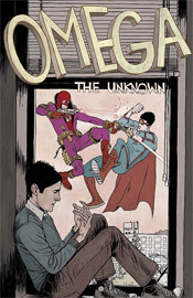
 (This one in particular doesn’t work in the same way without its title, which essentially functions as a caption.)


