This month has seen the publication of two anthologies of pre-Code horror comics. One was put out by Abrams, a prestigious art-book house of long standing, and the other was published by a small comics publisher named after the result of mashing together the words “Fantasy” “Fantastic” and “Graphics.” Covering similar territory, both books include several of the same stories, but follow very different presentation strategies—and possibly not the strategies you would expect, at least not based on the previous information.
Last night, it was clear to me which book’s visual aesthetic was preferable, and the contest wasn’t even close. This morning, I am not quite so sure that the matter is a simple matter of right and wrong. But, using images from Basil Wolverton’s classic story “Nightmare World”, why don’t I let you decide? Which do you think is a better way to publish a comic story more than a half-century old? This?:
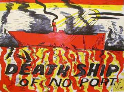
Judging from Frank’s most recent posts, he’s spending this month swimming and drinking, which is the way to play it in August. Sadly, I have no pool and I get drunk really easily, so I went to art galleries instead. Lucky for me, though, I discovered a small show of lithographs, woodcuts, and linocuts by the great and massively influential H.C. Westermann at George Adams Gallery. In addition to a few superb color works, such as Red Deathship, from 1967 . . .
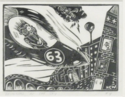
. . . the show includes his “Disasters in the Sky” series, small black-and-white linocuts that depict futuristic cities and horrific plane crashes.
The mask-like faces, like the one above, resemble Basil Wolverton’s grim, rubbery caricatures. Some from this series seem to suggest a narrative, and I thought of wordless novels, like Laurence Hyde’s Southern Cross and any one of Lynd Ward’s books. Westermann, Hyde, and Ward all wrote/drew tales with a political, antimilitary stance. The city’s undulating architecture and elevated, snaking roadways made me think of Jimbo‘s La Bufadora, which would be a great place to spend the summer—poolside clambakes, robot fights, special group rates. (more…)
Robert Crumb is a great synthesizer, a great adopter of other people’s stylistic conventions which he cunningly redeploys for his own ends. Any in-depth analysis of Crumb has to come to terms with the way his art is not only great in itself but also serves as a veritable museum of 20th century cartooning. Most comics criticism tends to have a literary bias, so this visual aspect of Crumb has gone under-discussed. But I don’t think we can understand Crumb’s art without reference to his many allusions to earlier cartoonists (not to mention painters and illustrators).
Here are a few notes that might help future research:
1. Wolverton. Crumb has often talked about his debt to Basil Wolverton, going back to the sacred cover of Mad comics #11. Interestingly, Wolverton and Crumb both adapted the Bible. I’d like to know how familiar Crumb was with Wolverton’s religious art (now available in the great Fantagraphics book The Wolverton Bible).
Above is a scene from Wolverton’s rendition of the Noah story.
And here is a panel from Crumb’s The Book of Genesis Illustrated. Notice that in both Wolverton and Crumb, the choppy waves have an oddly static look, as if they were sand dunes rather than water.
2. Billy DeBeck. I’ve never heard Crumb talk about Billy DeBeck but Crumb’s big-nosed style, especially in the late 1960s and early 1970s, had a strong touch of DeBeck’s bounciness.
Above are two excerpts from Billy DeBeck’s work, one showing the character Bunky (the very eloquent baby) and the other Lowzie, the bonnet-wearing hillbilly.
And here is Crumb’s Big Baby (from Big Ass #1, 1969).
3. E.C. Segar. The creator of Popeye is much loved by Crumb.
Here is a panel from a Segar Thimble Theatre page (July 19, 1931). Pay close attention to the crowd, a jumble of noses.
And here is Crumb’s cover for Weirdo #14, where he pays homage to Segar’s crowd of fools.
[TIM: After coming to the uncomfortable realization that it has been more than a year since our last Cage Match, Dan, Frank, and I decided it was time to get back in the pen and fight it out over some recently released comic book. Unfortunately for the format, the book we chose as a topic, Al Columbia‘s Pim & Francie, turned out to be a bad subject for a no-holds-barred, drag-out fight, mostly because we all really enjoyed it. But giving up would be too easy.
So here is the first installment of a new, buttoned up, and possibly less exciting feature, the Round Table, wherein we discuss a comic without coming to blows, though with any luck, we will still find a few things to disagree about to at least somewhat interesting effect. No strict rules here, just an online discussion taking place over real time. Readers should please feel free to participate in the comments section. This is a first time thing, and we haven’t really thought it through, so maybe the event will turn out to be a joyless affair, quickly sputtering into sad banalities. But maybe it won’t! If you believe, clap your hands!
In any case, welcome to the Round Table. Dan is starting the conversation, and will take the lectern shortly.]
DAN: I suspect each of us will have a very different interest in Al Columbia’s Pim & Francie: The Golden Bear Days. Rather than attempt a comprehensive statement, I’m going to look at it from a couple of different angles.
A one line explanation of this book is: Pim & Francie is a book of drawings and stories about two cartoon children. What is resembles is a stack of fragments, sequenced to indicate a few suggestive narrative threads. But its surface is deceptive.
If I didn’t know the back story of Columbia’s career (the starts and stops, the destroyed work, etc.) I would assume that the book looks the way it does intentionally. That the artist’s intent is to convey disintegration and ennui through the physicality of the drawings themselves. Images are torn, taped together, burnt, wrinkled, and water damaged. When a character disappears into pencil lines, or is obscured by ink blots; when a scene is interrupted by white drafting tape or a massive tear, the characters seem to come to life. That is, the imperfection of the page, the process of the drawing, drives the characters. So, I don’t read these pages as “sketches” but rather as full blown drawings akin to something like Robert Rauschenberg’s “Erased De Kooning” in which absence animates the page.
The distress is so thorough and consistent that simple coincidence seems impossible. But, then, maybe it’s just unbelievably good editing. And then I got to thinking, what if Columbia is so aware of his mythology and such a good cartoonist—such a master of surface effects to indicate sub-basement meanings—that he wants us to believe the P&F is “just” a collection of scraps so that it quietly engulfs us? What if this doubt, this underestimation, is part of his intent? Then I happened on Sam Anderson’s review of Nabokov’s The Original of Laura in which he suggests much the same thing about that just published fragment. It’s wishful thinking, of course—but it speaks to the power of the author to even make us long for some over-arching master plan.
I am also reminded of a much younger cartoonist’s new book: Josh Cotter’s Driven by Lemons. Lemons is a very different animal, though it also is a brilliant, virtuosic work, and one that needs repeated reads. It as well allows a look at the marks and tones that comprise a cartoon drawing—wiping away the cleanliness of cartoon reality to foreground the process. It’s also a young man’s book by a cartoonist who still has faith in the kinetics of cartooning—in motion, enthusiasm, and outlandish physics. Cotter may be investing in process, but he’s also building his cartoon language, adding new tools and new ideas as he goes.
Columbia, however, has been through it all. This is a book only an older artist could create. His process is up front and part of it is destructive. Reading Pim & Francie is an apocalyptic experience—as if Columbia is demolishing both his own work and the idea of “cartooning” in general. I found it exhilarating and terrifying.
A word about the subject matter: A lot of cartoonists have trod the “inverted comics” general territory. Most brilliantly, Chris Ware used Quimby to convey despair, anxiety, and grief by employing the lyricism of 1920s cartoons. Other, more recent cartoonists have had a lot less success. It’s rather easy to use the form or characters and then blow their brains out. It’s much harder to create something that is empathetic. Columbia isn’t aping an old style—he’s taken the building blocks of 1920s cartoons and rearranged them entirely (in some places I am reminded of the frightening clown of Monkey Shines of Marseleen.) His static figures, sepia backgrounds and faux-happy waltzes are thoroughly redesigned and made his own. There are also no easy pratfalls here. Nothing is predictable. As I watched knives glint and faces warp into horrific grins the furthest thing from my mind was nostalgia. Instead, as with Ware, I was deeply moved by the experience.
And that’s where I’ll stop for now. Next?
=====
TIM: Well if I knew this was going to be that kind of party…
Huh. That’s a nice idea, Dan, that Pim & Francie only looks like a collection of unfinished stories and pieces, but I don’t know if I quite buy it. (I definitely don’t buy the New York magazine Nabokov theory you linked.) But I also don’t know that it matters, because Columbia makes the “unfinishedness” work for the story, just as you and previous critics have indicated, and the resulting book has its own otherwise perhaps unattainable power. It’s difficult to know whether or not these stories would have worked better if Columbia had completed them more traditionally, just as it is to conclude whether or not David Lynch’s Mulholland Drive would have worked better as the television series he had originally intended. In the end, you have to read the book you hold in your hands.
It’s definitely interesting, and telling, that the text of the book itself draws almost no attention to its own raw state, other than in the spine’s parenthetical “Artifacts and Bone Fragments.” As you said, Dan, knowing Columbia’s career history inevitably shapes the reader’s response, and it’s fun and fruitful to (attempt to) read the book as if you aren’t aware of it.
In either case, the fact that so many of these grotesque stories and vignettes don’t really resolve contributes to the reader’s growing sense of unease. It’s almost like a 12-bar blues song (or an intensifying series of songs) that never returns to the tonic chord: your nerves get a real work out.
Of course, in another way, the fact that so many of these funny-animal-like characters are horribly mutilated only to be resurrected, seemingly unharmed, a few pages later only points back to traditional cartoon tropes of endlessly recurring death, dismemberment, and escape. As if Wile E. Coyote’s tortured existence wasn’t played for laughs. (Grant Morrison’s celebrated attempt to capture something similar looks lame and obvious compared to Columbia’s infinitely more subtle work.)
I’ve said it before in another context, but I’m really beginning to believe it: “In a way, every comic depicts a phantasmagoric dreamscape: Squint just right, and everyone from Spider-Man to Dilbert is revealed as a nightmarish figure.” When I was a child, for reasons I can’t even now articulate, I remember feeling a irrational fear looking at Minnie Mouse’s oversize high heels engulfing her strangely shaped feet. Francie wears the same shoes in this book, and now I find them scary as an adult. That’s a big part of what I get out of Al Columbia’s comics in general: they really bring out the surreal terror already buried within cartoon imagery.
That’s it for me for now. You got anything, Frank? And Dan, I guess there’s nothing stopping you (or anyone) from jumping in again at any time, either.
TIM: Also, is it my imagination, or does Cinnamon Jack remind anyone else of Alfred E. Neuman?
=====
DAN: You’re wrong, Tim! Cinnamon Jack looks NOTHING like Alfred E. Neuman. Phew. Had to get that one bit of Cage Match energy out of my system. Sadly, yes, Hodler, you’re right, they do look alike. Which means I’ll never look at either the same way. Tim’s blues analogy is a good one: I’m reminded of John Fahey or something like that—ultra tense, repeating patterns that don’t allow for a satisfying payoff. But, I have to say, the life & death cycle of cartoon characters, as well as their lurking grotesques don’t interest me that much on their own. I almost take it for granted. It’s more like what Columbia does with subtly “off-model” versions, like his repeating Goofy/Lena the Hyena figure. It’s more than bringing out the horror in an extant design, it’s taking components of that design and refashioning them all together. The highly individual result is the scary thing. It’s not like I’m arguing, dear Tim, just expanding.
Also, one thing I forgot to mention before: P&F is also a wonderful demonstration of the cartooning and animation process: The insane amount of drawings produced that have just subtle differences or mistakes. The maddening repetition. Ironically, I have to sign off until late this evening as I have to go teach comics at SVA! I should just have a group reading of P&F, I suppose. Below: A version of the Phantom Blot?
=====
TIM: Well, I take Robert Rauschenberg erasing de Kooning for granted, so we’re even! (It’s probably unwise of me to admit that.)
And I knew that image reminded me of something, and you’re right: The Phantom Blot! So many memories just opened up. Time Regained.
=====
FRANK: I read straight through like a narrative. Like a detective, I put the clues together and read the images attentively as they sped by. I could feel the collage of all these fragments, clues assemble and tell a very clear story to me. I’ve read this story before, have felt the same emotions. Pim and Francie’s adventure struck a chord in me that’s been dormant for a long time. A haunting wonder, perhaps? A curiosity of the unknown that, when found, rattles one to the core?
Does that all sound too heavy? Insincere? Not to me. Like Dan, I felt really moved by the book. I don’t feel the need to explain the “unfinished-ness” of the book at all because I see it as “finished.” Notes, fragments, whatever. I read it slowly, turning each page like I was watching a film that had me riveted. Does that make sense? And then I would go back to certain section I wanted to re-read and watch that unfold again and again.
I also wanted to find a way to gauge the “timing” of the author’s delivery. Columbia’s progression of two-page spreads and how the spreads folded into the next in sequence is truly beautiful. I read each spread as a pairing of the left and right pages. And as I would turn the pages I could feel the changes in tone and how it affected the “loose” narrative. I wanted to be able to feel the changes and mark them so I could return to these transitions and re-read them like chapters.
The way I did this was to determine the first spread in the book, which is this:
Spread #1
The page on the left is, technically, not the first image in the book. That would be this image which is very important:
First Image
The above image of the sun and the torn curtain is, to me, the beginning of the “play” as it were. It feels like it’s part of a proscenium stage.
I numbered the remaining spreads as “Spread #2, #3,” etc. I then would put a post-it every ten spreads to mark the “time” for me. I could see the rhythm of the images, watch how they played off each other. And most importantly it let me appreciate it as a whole even though I was inserting breaks. But these breaks were just so I could get my bearings, a sort of time code for this world outside of time.
Spread #10
Spread #20
There are 118 spreads by my count. To me, the fragments are expertly pieced together and a sort of “hyper-text” is created. I read it up, down, and sideways, using the symbols of the characters as links to other spots within the story fragments.
I would like the reader to enjoy the first twenty spreads without my description. It’s a marvelous fable, a poetic onslaught of images that will deposit you, the reader, into the rabbit hole. And you will find yourself with Pim and Francie, lost in the haunted forest.
And then Grandma appears. She finds you, and all is well. And then, at Grandma’s house, we know real fear. A succession of images terrorize our heroes, and like a nightmare, they find themselves on a dream street in a bad part of town. A cartooned detective appears chasing a killer. On the opposing page, a smiling, long-snouted, gap-toothed visage of fear with piercing eyes is depicted. Turn the page and there are severed limbs on the left hand side of the spread. And on the right hand side is an old man smoking a cigar. The words in the balloon are difficult to make out because there is tape and corrections. The one phrase that is readable is, “They enjoy killing! It makes them happy!”
When we turn to the next spread, we see Pim speaking to this older gentleman. Pim refers to him as Grandpa. This is the first time we understand within the order of the images that this character is Grandpa. The representation of Grandpa, like Pim and Francie, is reduced to a symbol, so when we encounter this symbol, we, the reader, bring so much to the table already. Just the word Grandpa and any cartooned image of a pleasant-looking gentleman, fused together, evoke a very particular feeling in me as a reader.
Spread #25
Spread #26
So when Grandpa reveals to Pim what the murderer does, it also sets up the reader to feel for Pim as he goes down the rabbit hole. On the opposing page, the grotesque, exaggerated visage of a few pages ago is replaced with it’s “flipped image” double. Only now it is hacked to pieces, dead or dying and still smiling. A haunting mad image that bears the text, “Sonny Blackfire had returned.”
When we turn the page again to spread #28 we meet “the Bloody Bloody Killer.” His face, the angle of how it is drawn, all match the “grotesque visage” of the previous spread which of course, rhymes with the original spread. It is this phrasing that interests me a great deal. Spread to spread, Columbia directs my eye to see, in succession, more than the images reveal singularly. It reminds me of how a musical chord progression is built out of single notes, played together in time.
Break.
=====
TIM: Good one, Frank. I feel like we’ve barely begun to get anywhere, but I have to bow out for the rest of the evening, and do some stupid parenting. Maybe you and Dan will come up with more tonight—either way I’ll rejoin the conversation tomorrow morning.
=====
DAN: Top of the morning to ya! A few responses: To the anonymous comment below: The reference to Wolverton’s MAD cover is mentioned above: Columbia merges Lena Hyena with Goofy. And, I’m not pulling art from the book, necessarily. Comics Comics HQ doesn’t have little helpers scanning books so I just grabbed stuff from the vast internet. So, you can stop searching for these images in the book (except for Frank’s spreads. Those ARE in the book). Finally, I wanted to add to Tim’s thoughts on the object-ness of, say, Minnie’s shoes. If, as in a previous post, one could make a list of invented comic strips within fictional narratives, one could also perhaps make a list of invented comics museums within stories. There is a brilliant and haunting spread of a ballroom filled with cracked cartoon visages frozen in song. P&F enter the space wearing their Mickey hats—fresh blood in a toon graveyard. It’s the only literal depiction of these old icons (Snow White, Mickey, the Ducks, et al) and it’s a great disruptive moment. Two other cartoon museums come to mind immediately (and there must be a ton more): Francis Masse’s brilliant “The Museum of Natural History” in Raw Vol. 2 #3 and Spiegelman’s own satirical museum drawn as a poster to benefit Danny Hellman.
=====
FRANK: I think Columbia’s approach points the way to a more intimate reading of the text. The fragments, the feel of the paper, grant us access to the material in a way that is more tactile than we get from most who employ this “style;” there is an almost uncomfortable intimacy. Partly because of the violent imagery but also because of the torn and shredded pieces of paper themselves. The humor and the horror and the presentation do not feel contrived at all, but authentic, sincere—REAL in every sense. The approach, the style of drawing interests me but I don’t feel repelled by the treatment. Meaning that it could be read as “cold” somehow. There’s a seduction to the drawing, the style, the pencil, the stages of development. The “behind the scenes” look can be startling.
I must sound like a broken record to those who know me but here goes: This book makes me think of Be-Bop. Notes, chords but skirting the melody. Playing up and down the scale. There’s a beat (page spreads, rhythm of turning pages, the architecture of the spread—two fixed pages—and the architecture of the page; how it’s presented as illustration, as symbol, as comic strip, as movement, as march), and there are notes, chords, but the melody line comes in and out like Charlie Parker playing a standard from The Great American Songbook.
I listen to Charlie Parker everyday on WKCR in NYC. While writing the above paragraph I heard a live recording of Parker where he riffed on the theme from Popeye. I forget the song but the band is chugging along and Parker is playing up and down and around the melody and slips in “Popeye the Sailor Man” without loss of tempo or control or anything—incredible. And to me, that’s akin to what Columbia is able to do in the way he sequences the notes and fragments together in Pim & Francie. (The above Parker video isn’t the song with the Popeye riff, FYI. Just an example of playing with intention and focus and still finding room to “play”)
Columbia’s style of drawing doesn’t evoke a nostalgia in me; I don’t feel he is drawing in an “affected” way. Hokey it ain’t. It’s very REAL. And his take on this American symbolism is strikingly elegant in its delivery. It’s through this elegant delivery that we connect to the fable, the song which somewhere we have all heard before.
=====
TIM: Frank, your musical comparison seems pretty apt to me.
Dan, have you read Michael DeForge‘s Lose yet? Because there’s a bar in hell there that you really need to see. (I should review that issue—it’s really a great debut. Go order a copy, people.) It’s not exactly the same kind of thing you’re talking about, but it’s close enough for blogonet work.
Also, it’s funny that you began this Round Table by saying that you thought we’d all have “very different interests” in the book, but in fact, our responses seem to have been very similar. Maybe that’s indicative of the power of Columbia’s art, that a book so ostensibly “obscure” and “difficult” can provoke such strong, unified responses. (Or maybe its says more about our own limitations as critics, but that’s too depressing to contemplate.) The relationships and situations seem to shift from “story” to “story” and page to page (are Pim and Francie siblings or spouses? children or adults? dead or alive? etc.), yet always make strong emotional sense (for lack of a better phrase), even as they avoid more traditional, “logical” closures.
One other small effect I don’t think has yet been mentioned: I really enjoy the sense you get (through book covers, logos, film stills, etc.) of an alternate universe full of Pim & Francie books, cartoons, and merchandise. That so many of the characters and images mirror those from real (and often long-forgotten) commercial culture only increases the effect.
I don’t know how much more there is to say about this book, without going into the kind of close analysis that Frank began to attempt yesterday, but maybe you guys will prove me wrong. Or actually do some of that close analysis! Like, I mean, what does it mean when they poke their eyes out? Whose “revelation” is it near the end, and what causes it? And what about that final scene in the meadow? What does it mean, man? Actually, those kind of analytical questions appear to me to be largely pointless. But am I wrong? Is that just lazy thinking?
=====
DAN: I have only flipped through Lose but am looking forward to getting my hands on it. Looks amazing. His Cold Heat special is genius. As for the rest, well, man, I think we’ve run out of steam. Those major questions of yours will have to wait until we next meet for beers. Or at least, me and Frank won’t be answering them. Perhaps some kind souls in the comments will help you through this ontological quandary. If not, you can call me up until midnight tonight. Just kidding.
I think that about does it, folks! Thanks for reading. Now back to your regularly scheduled Comics Comics programming.
I’m supposed to be doing some accounting, but comics is more fun. Just kidding, everybody. Those royalty statements will be right on time. Um….yeah. Heh heh. Anyhow, here is a Basil Wolverton Mickey Mouse strip from the 1940s. I don’t know much about it. Found it in the much-discussed Graphic Story Magazine. This time from issue 12. It’s too awesome not to post. I hope I don’t get sued. Then I’d really have to do some accounting.
Well, maybe it is just a little alloyed, but only because the reviewer was one lazy and condescending (at least in this instance) critic named David Hajdu, who is probably best known for his book about the ’60s folk scene in Greenwich Village, Positively 4th Street. I say lazy and condescending because it is quite clear from reading his review that he didn’t bother to do the relevant research, but still felt qualified to act as a generous mandarin, bestowing status on a “disreputable” art form that has finally earned his good graces.
Take for starters his description of the book’s editor:
Brunetti, a comics artist and writer himself, is best known for his comic-book series “Schizo,” a hodge-podge of spare, poetic vignettes heavily influenced by Charles Schulz’s “Peanuts.”
It seems likely to me from this that Hajdu only read the two pages of Brunetti comics included in the book under review, but let’s be generous and assume he skimmed Schizo‘s unusually gentle fourth issue. Hajdu clearly didn’t bother checking into the earlier issues, which might well be the most scarifying comics ever drawn. “Spare”, “poetic”, and “Peanuts” are not the words (well, “poetic” maybe, but not the way Hajdu means it).
Here’s a less important one:
[Brunetti] likes the funnies to be funny; we get few adventure stories — not even, among the historical selections, a panel of “Little Lulu” or Carl Barks’s “Donald Duck,” both of which were more dramatic than literally comic.
Hmm. Little Lulu always seemed pretty funny to me.
More from the maestro:
[Brunetti] is indifferent, even silently hostile, to superheroes, none of whom appear anywhere in the book … There is no question that the vast bulk of superhero comics are factory-made product, rather than works of individual expression; still, at least a few mainstream comics published in recent years — including a series of Batman stories drawn by David Mazzucchelli, who has other work in the anthology — are as artful and subtle as some stories in this book.
Mazzuchelli‘s work on Batmanis greatly accomplished, but so many of his other, non-superhero comics are superior that it would be very strange to include it while skipping the rest.
More than that, considering the nature of this anthology, Hajdu’s argument is just silly. Only when discussing comics do people feel the constant need to glorify or excuse work on licensed properties in this way. You’d never find a critic reviewing an anthology of contemporary literature and bemoaning the lack of excerpts from Star Wars novels. (Who knows, maybe there’s a book about Yoda that’s just as good as the story about a novelist suffering writer’s block at Yaddo—it would still feel out-of-place in a book meant to showcase stories that are personal and intimate.) If Hajdu really feels like comics are now finally “suitable for adults”, maybe he could treat them with the respect (and expectations) accorded to other adult media.
Hajdu continues by calling for the deletion of Aline Kominsky-Crumb‘s “clumsy noodling” and praising Kim Deitch “for her [sic] cynical romance with the past and sheer kookiness of spirit.” I love Kominsky-Crumb’s work, but I guess I should give Hajdu a pass here, seeing as everyone’s entitled to their own taste. But would it be too much to ask that, if he’s going to say an artist may be “the literary voice of our time”, and do it in the New York Times, that he actually bother to conduct enough research to get the Possible Voice of Our Time’s gender right? [UPDATE: The Kim Deitch gender mix-up was apparently an editing error, in which case the writer should of course be excused.]
Here’s his final paragraph, a wonderful mixture of clichés, misconceptions, and patronization:
Now going under the name graphic fiction, no doubt temporarily, the comics are all grown up, and this anthology represents the most cogent proof since Will Eisner pioneered the graphic novel and Art Spiegelman brought long-form comics to early perfection. What other kinds of art or entertainment invented for young people ever transcended their provenance as kid stuff? Not coloring books, nor paper dolls, nor board games. There are no Etch a Sketch drawings in the Museum of Modern Art and no View-Master slides in the International Center for Photography. While it took more than a century for the medium to be accepted as suitable for adults, the fact that the comics made it here at all testifies to their resilience and adaptability.
Ugh. Well, I guess it’s good that comics are more of a legitimate art form than the old View-Master, but this seems like faint praise to me.
I should stop whining. What does it matter really? It’s nice overall that the big cultural arbiters are recognizing comics, and these mistakes aren’t really that important. But it would be even nicer if the people deciding what art is serious and legitimate would take their own jobs just as seriously.
And what is Hajdu up to next? He’s working on a new book, a history of the comics. As he graciously acknowledged in a 2003 interview, it’s something he “knew virtually nothing about before”, but he’s found that doing the research “is the fun part”. I hope that the new year finds Hajdu having lots of fun.
BONUS GRIPE:
Oh, and one more thing, related only in general theme: When you’re putting together a large-scale, scholarly exhibit of the Masters of the American Comics, ostensibly in order to demonstrate the artistic significance of the form and its practitioners, and you display one of the most famous and iconic comic book covers of all time, go ahead and make the effort to find out who drew it. Don’t just credit Harvey Kurtzman on a guess. Especially when Basil Wolverton‘s signature is clearly legible, right at the bottom of the page.