Posts Tagged ‘Jack Kirby’

Hal Foster, Cartoonist


by

Sunday, September 6, 2009


Read Comments (10)


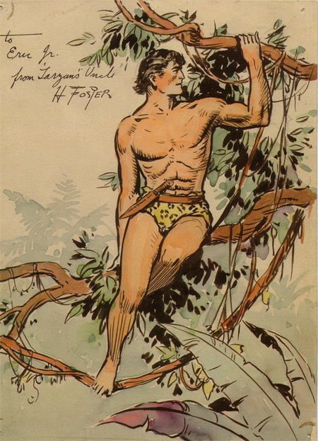
At 29, Hal Foster bicycled from Winnipeg to Chicago. He was in search of a new market, having already achieved the dubious title of most popular illustrator in Winnipeg. Seems like the stuff of a Guy Maddin film, but, nope, it was just Foster, one of our sportier cartoonists (there are apocryphal stories of the artist shooting wildlife out his studio window.) That was in 1921. Ten years later he became the regular artist on the Tarzan comic strip, and six years after that began publishing his masterpiece, Prince Valiant.

I came to Foster and Prince Valiant just recently via Wally Wood. Wood’s trees, the artist long maintained, were Foster’s trees, and Wood’s sense of composition and figures in motion was heavily influenced by Foster’s balanced and graceful panels. Sure I’d read Foster before, but I’d never found a way in. Fortunately, Fantagraphics recently released Prince Valiant Vol. 1: 1937-38, and I was able to absorb the material in a wholly new way. After doing some reading I dug up a copy of The Comics Journal 102 (1985), which features a fascinating interview by Arn Saba (also look for her Caniff and Gottfredson interviews in other issues) with a then-retired Foster. He comes across as a melancholy man but confident man, as humble about his work as he was sure of his abilities. Asked about his inspirations, Foster replies, “I would say inspired by the beauty of my own work, and the loveliness of the stories that I stole from better authors. I always worked alone.” On more cartoony strips: “I don’t know why it is that some fellows can draw a little kid like, what’s his name, Charlie Brown, with just a round head, a round nose, and no particular body, and yet give the thing a personality. I still can’t understand that, and where the little things he says, and the funny little illustrations, are more real than some of the best drawn strips, the adventure strips.” Yes, that’s the master of comic strip realism talking about the virtues of a simpler approach. Or at least the virtues of Schulz. Intangible authenticity and emotional “reality” are not the first things one thinks of when approaching Foster, but as Saba so eloquently explains in her long introduction to the interview, in many ways they are the crux of what his work. In Prince Valiant, “Foster created the quintessentially American interpretations of the King Arthur legends, complete with a nuclear family, the democratic ideal, and the man-child hero whose boyish hi-jinks often lead to high adventure.” Saba tightly defines Americana here, and to that list I might add “idealism tinged with tragedy”, as the strip begins with the boy Prince losing his mother and embarking on a solo quest to find himself. Foster imbues this and all of the other strips I’ve read with a modest humanity. Where Foster’s illustration heroes N.C. Wyeth and J.C. Leyendecker tended towards grandiosity and dynamism Foster emphasizes the human scale of these adventures and keeps things relatively quiet.

I can see where readers might cringe at Foster’s idealism and, well, cleanliness. There is nary a hair out of place, no nod to the dirt, grime, and grotesqueries of the time. Even when Val skins a goose and wears its skin as a mask — a mask later swiped by Jack Kirby for his character The Demon — it’s bloodless. But Foster’s sensibility is so wonderfully innocent and immersed in depicting virtue and honor that to let anything else in would have polluted a clear, defined well of ideas. Prince Valiant is a perfect pre-angst fantasy in which rational justice wins out.

Foster’s artwork completely reinforces the ideal order. The page above is arranged with larger set-up and concluding panels sandwiching a middle section of rapid action, expertly choreographed so that readers can follow Val in and out of a room, and then savor the ultimate conclusion in the last couple panels. A demonic but playful Val, a terrified Ogre, and finally a clearly victorious hero. The figures, while well posed, are never stiff — they have an inner life and animation. Also, Foster, while a stickler for detail, knew when to leave it out: Most of the action plays out against solid colors — yellows and blues expertly rhyming with one another to create a unified page.

This page is remarkable for its wide range of approaches, settings and emotions. In the beginning Val make an emotional proclamation (swiped from a film still, perhaps?) and then Foster races him off to the forest. Look at that bottom left panel. After a couple panels of plain backgrounds, Foster immerses us in the forest (A damn straight Wally Wood forest) with great detail and then, with some flourish, exists Val onto a plateau above the “sinister castle” a skull perched just behind him. Val is on the cusp, and the weight of his adventure is made evident by the panel size and velocity of the action. Meanwhile, the yellow of Val’s shirt picks up his cloak, while the various browns of the woods and cloth are all delicately arranged for maximum readability.

Both of these pages also reveal a key part of Foster’s appeal: He shied away from the chiaroscuro and noir angularity of the Caniff-ian school of adventure comics and instead kept his spaces fairly level, colorful and enticing. These are comics that look accessible but contain a tremendous amount of quiet sophistication. Foster’s sense of place, color, and body language is just stunning. But again, he was never showy. It’s a realism that never calls itself “realistic”.

And the story itself? I thoroughly enjoyed it. Foster himself seemingly didn’t have great ambitions besides to write something that satisfied him and entertained his readers. I found this first book completely engrossing. Prince Valiant opens up a world that I wanted to stay in — a wide-eyed early 20th century approach to fantasy with a now-vanished sincerity and wholesomeness. It’s an all too rare pleasure in comics. I now understand why so many cartoonists after him sought to regain that Foster magic, despite the futility of such an anachronistic exercise: It’s a near-perfect distillation of purity (the high moral pulp sought by mid-century guys like Gil Kane and Alex Toth), skill (inarguable drawing ability), and success. Wally Wood chased it his entire career, and was asked to try out to be Foster’s replacement on the strip, but was not given the gig. But everyone from Russ Manning (who was an heir to Foster on Tarzan) to Charles Vess to Ryan Sook (his Wednesday Comics Kamandi) have tried to claim a little bit of Foster’s legacy. And of course the comic strip itself continues under different hands. But it is not so much the characters I’m attached to, but rather Foster’s masterful spell.

I confess to not having anything terribly profound to say about Foster. I suppose I’ve been surprised by and taken with the sensitivity, grace, and fluidity of his work, as well as what a fine comic strip Valiant really was. Foster understood page design and the interplay of color and form about as well as anyone I can think of in the 1930s, but recently he tends to be relegated to illustration rather than comics history. Certainly I’ve made that mistake. The recent reprint publishing activity has had all sorts of interesting effects, particularly in the way certain artists are re-contextualized. The revival and re-packaging of Valiant is particularly significant, as it no longer seems like an oddball project in the Fantagraphics catalog, but rather a prestige item that takes it place alongside other relevant books like Love and Rockets and, dare I say, Prison Pit (in terms of cartoon clarity and craft, the two have something in common. I also loved Prison Pit). This new project gives Valiant something it was long missing: currency. And I’m looking forward to exploring more of it in the years to come.

Labels: , , , , , , , , , , , , , ,

Rerun


by

Saturday, September 5, 2009


Post Comment


I wanted to post something fun for this weekend. But honestly, I don’t have the time to write about all the awesome old comics my pal Robin McConnell just sent me in the mail. (Can you say, “Blazing Combat f**cking rulez”?) I guess I’ll have to save that for next time.

So, I thought I’d post a link to an old favorite of mine from the CC archive. It’s a post about Jack Kirby’s last issue of Mister Miracle and how Kirby uses a sort of personal symbolism. It was a fun post to write and there are a lot of great comments in the comments section by Dustin Harbin, Charles Hatfield, and Dash Shaw amongst others. So, I encourage you, True Believers, to check it out and add your voice to the exchange.

Please click here to continue reading.

Labels: ,

The bridge is over.


by

Saturday, August 1, 2009


Read Comments (74)

Preface: I wrote this in my notebook after discovering last week that the conclusion to the major re-launch of the 1980s series Nexus had hit the stands. Steve Rude, one of the biggest “indie” comics creators of the last 25 years, made a comeback — to the sound of crickets. No one cared. To me, that meant the Direct Market was really finally and absolutely dead. Everyone said it was dead last summer when Love and Rockets abandoned its pamphlet comic book format and went to an annual trade paperback format. Like Love and Rockets, the fate of Nexus was bound up in the history of the Direct Market. But unlike Love and Rockets, Nexus was suited for the “alternative mainstream” fan. It was a particular kind of adult superhero book that appealed to a seemingly more sophisticated audience than the regular superhero comics. The DM supported titles like Nexus and allowed them to thrive. Not any more. Maybe everyone’s just had their fill of Nexus but the news of this indie’s end got me thinking about the bigger picture. The end of Nexus represents, to me, a window of time that has closed. The new regime is upon us at last, and I wrote this to simply mark the time. Also, the below is really an exploration, for me, into ideas that my friend and mentor Bill Boichel of Copacetic Comics has expressed to me for years—in his store, over the phone, in emails, in class lectures. The “bridge” and “tree” metaphors are pure Boichel. Thanks Bill, for letting borrow your melody line and riff on it here.
——————————————————–

The bridge is over. From 1975 to 2005, the Direct Market was the bridge from the old world “Comics-as-ephemera”, returnable periodicals model to the new world “Comics-as-Literature” bookstore model. The bridge changed comics, saved it from sure death on the newsstand and put comics in a place of permanence. Everyone in Comics has noted the consolidation of the DM and the rise of the chain bookstores & the internet as venues for new work. Now, this year, more than ever, I seem to be repeatedly noting to myself the real split between the mainstream and the alternative sides of comics.

During the heyday of the Direct Market in the late ’80s and early ’90s mainstream and alternative comics were together in one marketplace because there was no other option essentially, no bookstore support, no internet. What that meant was the two traditions were folded together. Gilbert Hernandez and Steve Ditko were on the same rack literally and figuratively. The old mainstream guys influenced the young alt guys, there was a clear traceable legacy. One could see Bernie Krigstein’s influence on Dan Clowes, Jack Kirby’s influence on Chester Brown, Ditko’s influence on Hernandez. It was a singular perspective essentially. One big sandbox. One tradition.

The market can now support multiple perspectives. It is not a monolithic community. There is no official definition of Comics now. It’s too big. Finally “comics” doesn’t just mean American mainstream super-hero action adventure stories. (Well, comics never meant just that genre, but y’know what I’m saying: Marvel and DC have lorded over the form for almost 50 years.) In 2009 you can walk into a comics store like Copacetic Comics in Pittsburgh and see no superhero comics on display at all. There are enough “alternative” or “literary” comics/graphic novels out in the world to fill a whole (small) store. And there are “alternative” publishers who don’t use (or are shut out from) the Direct Market and who use book trade distributors to get the work out to stores.

So we got what you might call a bifurcated market. The two traditions, once folded together in the same market, have split. There are two sandboxes now. What that means is that if you grew up reading comics from, say, 1999 to now you didn’t necessarily have to read superhero comics to get your comics fix or even go to a store that sold both. This is a good thing. It’s a new audience, and a broader one than maybe any of us old school dinosaurs could have anticipated. I’ve spent far too much time ranting about “the kids not knowing their comics history.” Well, I’m over it. I don’t really feel the need to explain who Marshall Rogers is anymore, or convince anyone that late ’70s Kirby is actually really good. Figure it out for yourself.

This new audience, I think, is alienated by superhero comics and associates the genre with corporate America. They don’t like it. And who can blame them? They wonder why folks like me keep extolling the abilities of some guy who drew Spider-Man. They could care less. I had a student tell me, “Yah, it’s beautiful art but it’s Spider-Man.” This too, this palpable attitude, is a good thing. After all, aren’t Batman and Spider-Man just corporate logos these days?

Comics history is like one big tree where McCay and Herriman are the roots, Kirby and Caniff are the trunk, Crumb and Spiegelman are big branches, and the rest of us schlubs are up there somewhere. It’s all connected. Each generation has its precursors. I would assert, however, that for the first time in comics history it’s possible to graft new identities upon the tree without being schooled in the singular tradition, without growing out of the singular tradition. One can choose precursors from other traditions, not just from comics.

I see Persepolis as an example of this grafting. It is at once outside the tradition of comics and within the boundaries of the form. I feel that it was only possible to come into existence because of the split that happened some time in the last 10 years. I’m sure that’s no big revelation for most of you, but it’s something to consider as we move forward into the next decade. It’s now possible to bypass a very particular, esoteric education in “mainstream” comics, and go right to its “alternative” and also to the avant-garde. It opens the door for “vertical invaders,” for artists from different traditions to make work and to find an audience. The marketplace will support a book like Persepolis, I think, precisely because it is divorced from the old world model. Satrapi’s free from the “Tree of Influence” that’s existed in comics; she’s free to draw in a straight-forward generic style that is appealing to a vast audience. (Think of it this way: As “straight-forward” or “realistic” Clowes’ style in Ghost World is to a schooled comics reader, it looks baroque and affected to a non-comics reader.)

One could say comics like L’nR and Optic Nerve may have been the first to appeal to this emerging audience. But I feel that those books didn’t/don’t cross over so much as Acme Novelty Library or Persepolis because the styles of the Hernandez Brothers and also of Tomine are essentially derived from the mainstream comics and illustration tradition. I feel that it was Ware’s choice to reach beyond the mainstream tradition back to the newspaper strip golden age that has allowed him to have such a diverse audience. It seems this new emerging audience still connects particular styles back to mainstream comics. I’m curious to see how Mazzucchelli’s new book does now that he has “unlearned” all his mainstream tricks. ( I also think Seth’s eventual collection of Clyde Fans will “cross over” to an audience beyond comics. He has a style that has little to do with mainstream comics. Interestingly enough, Seth said recently: “I am converting Palookaville into a hardcover format this year. I love the old comic format but Chris Oliveros convinced me that the work would do better if we moved on to this new direction. It’s kind of sad, passing of an era and all that.”)

So, here we are: Summer 2009. Whatever system we have now, it’s working. Pamphlets still get published even if they only serve as advertisements for the collection, GN’s sell better and better, downloads are happening, comics are on Kindle: whatever works. However, in the process it feels like a real division has been formed between the “mainstream” and the “alternative” factions. A division that was always there underneath, forming. But now it’s ruptured and split the marketplace.

Which brings me to Comic-Con. San Diego Comic-Con will always be some sort of Oscars for our community. But whose community is it anymore? Increasingly it’s the motion picture industry’s community. It’s not about “the work” anymore. It’s definitely not about the creators or even the comic book dealers. It may be cool for most mainstream creators or fans but what’s in it for us in the “alternative” community? Not much. So I gotta wonder why “we” still go. I can certainly understand why Fantagraphics and D&Q go (it’s the biggest show of the year, duh) and that Comic-Con is still profitable for them. But for me and my comrades over here on the fringe of the fringe we feel like we’re getting priced out of our own neighborhood. The split seems this year to be more pronounced than ever and it looks like those in the “mainstream” have no choice really but to hold on for dear life as they become co-opted even further into corporate America. They really have no choice. They sold themselves out years ago.

But the alternative comics community does have a choice. So give me TCAF, SPX, MoCCA, SPACE, Stumptown, and the “alternative” circuit and tell Comic-Con and the Direct Market, “Thanks for the memories.” The bridge is over.

Labels: , , , , , , , , , ,

TCAF ramble


by

Sunday, May 17, 2009


Read Comments (13)

FRIDAY

The drive from NYC to Toronto was fun. Dan, Dash, the books, and me. I drove most of the way. It’s a hoof, for sure. Basically ten hours when it’s all said and done. Dan’s a decent navigator, but he likes those Google directions, and I prefer Ye Olde Atlas, so a few times we goofed and missed a turn. For the most part we found our way and got there in one piece. Dan backed into the gas station and crunched the bumper a bit in Buffalo. So, y’know, the usual drive to a con for me and Dan.

Dash is whatchacall a good conversationalist, so he and Dan riffed on all things comics most of the way. The future of print magazines, new subscription models, online comics, animated shorts, oh yah—Dash has these new short animation pieces that he showed me and Dan on his iPod. All hand drawn by him and Jane Sabrowski they look fantastically modern, fresh. Dash sees no distinction really between comics and animation. It felt like reading a solid short comic story. Only two minutes long but just shimmering with a very particular pacing. Remarkable detail and movement.

Dan’s finishing up his second Art Out Of Time book and we talked about John Stanley. Somehow that led to Trevor Von Eeden. Lay-outs. That’s the connection. Comic book page lay-outs. John Stanley horror comics and their page designs. Thriller and how it was DC’s “art” comic. Crazy art by Von Eeden colored by Lynn Varley. And how DC’s other “art” comic at the time, Ronin, was also colored by Varley. Everyone knew she was the secret to Miller’s successful visual breakthrough (don’t laff) on Ronin, but she was also the real reason why early Von Eeden is so good. And then, after Ronin, she mostly only worked with Miller. Things that make you go hmm…..

John Stanley, Lynn Varley. These were the important matters of the day. Then it was Steranko. And Mazzucchelli. Dash did an interview with Mazz for an upcoming Comics Journal. They talked about Steranko.

Dan’s curating a Mazz show for MoCCA. I still haven’t read Asterios Polyp. Dash didn’t know that Richmond Lewis colored Iron Wolf by Mignola and Chaykin. Chaykin! Chaykin was into Steranko. That led us back to Photoshop and animation. Chaykin should do animation. I could do all the backgrounds. Dash would color it. Chaykin would just have to draw the figures over my lay-outs. Cody Starbuck 3000.

Then we were there, we made it, Friday night. This year’s TCAF was in the big Reference Library in Toronto. I was skeptical of the new venue but it turned out to be perfect. We dropped our books off. Checked into the hotel. Went and got burgers. Walked around, got a drink. Dan tried not to smoke cigarettes.

SATURDAY

I spent almost all day Saturday behind the table, pricing my “curated back issues” for the discerning Toronto crowd. In other cities my back issues cause a riot. But in a town that boasts one of the best comics shops in the world—The Beguiling—most of the TCAF attendees were like, “Oh yah, I have all these…” I was shocked. “What? You have Dennis The Menace Goes To Mexico?”

Somebody was rifling through my sets when he pulled out Gilbert Hernandez’s Speak Of The Devil and pointed to the “hype-up” sticker I affixed to the bag. “Is this really the GREATEST MINI-SERIES EVER?”

I was ready to deliver my best fastball sales pitch when the gentleman stopped me and introduced himself. “Hey Frank, it’s Robin McConnell.” Whew. I was getting ready to go off like some used car salesman loudmouth, ha ha. And I thought I had recognized his voice, he of Inkstuds fame, but i didn’t have a moment to register it all. In all the rush to set up the PictureBox table and arrange our wares, I’d almost forgotten about the panel discussion we we doing in the early afternoon that Saturday.

The panel was basically about how old mainstream comics from the last 30 years had a lot of influence on how alt comics were formed. More or less. I think, really, Robin and I wanted to just throw the ball around in front of a crowd. So we got some other folks who are equally comics-crazy to join us: Dash Shaw, Dustin Harbin, and Robert Dayton.

Robin moderated the panel. But I hi-jacked it early on and spent maybe a little too much time trying to guess if the audience had really read all the stuff we were riffing on: Ditko, ’70s Kirby, Steranko. I think my fellow panelists were being polite and just let me TRY and explain why mid-70’s Kirby is important to me as an artist. Once I just spoke “normally” and let someone else talk, the panel occasionally assumed some sense of order. Dustin tried to be a voice of reason. When the audience jumped in was when it really went somewhere. It was fun, anyways.

[UPDATE FROM TIM: You can listen to the panel here.]

(I think at this point I’ll leave the panel description to anybody but me. Please feel free to add your voice in the comments. I’m completely unreliable recalling whatever it was I was ranting on about—and even listening to the mp3 Robin sent me hasn’t helped. Ask Dash. Ask Robert Dayton. But don’t ask Dustin. Or Bill K. (Just kidding, geez…))

Back at the table, business was brisk. I sold a Dennis The Menace to a little girl for 3 bux. She seemed happy. Even Dan was happy. He was only grumpy cuz it was pretty hot in the room we were in once it filled up. It was packed for most of the day. I barely walked the floor to see friends cuz of the traffic at our table. We did okay. I was selling Cold Heat sets at an unexpected clip. People were actually bringing their copies of Storeyille from home to be signed. Saturday just blew by. It was great.

SAT NIGHT

The bar was packed so we had to go upstairs on the enclosed roof. It was loud. Dan hobnobbed with Mr. Oliveros and Mr. Tomine.

Gabrielle Bell, Dash, and I made of list of comics we’d like to “cover”—like we would re-mix a Crumb story or something. But it was just an excuse to ask Gabrielle to collaborate on a Cold Heat Special. She said “maybe” and laughed. I tried to flatter her by telling her that she had nice angles in her artwork. “Maybe.” I tried to compliment her color sense and that we could exploit her mastery by doing a full color offset job for the project. “Maybe.” I tried to buy her a beer. “Maybe.”

Dash has these ideas about re-mixing comics, like “covering” well known comics and just using it like a melody. Just riffing on it. Like sampling, but not. And he also has these interesting ideas about imitating TV formats. Wait, that sounds too literal. It’s more like trying to distill the melodrama out of the narrative. Boil it down. He showed me this Blind Date comic he did where he riffed on the reality dating show and used the format of the show to underpin the arc of the story or episode. Boy meets Girl, Boy loses Girl, you know what I mean. It was a short story, but it really made me think about how one could build comics more informally, how things like TV and YouTube have shaped our sense of narrative. After all, it’s the snippet of story, action, drama, that we like to experience in these other mediums, this instant unfolding. Dash didn’t bother with too much set up at all in the story, it’s all there, programmed into our heads already. So the focus was on the boiled down back and forth between the characters and their movement through space and time. It FELT like a 15-minute episode of a show and not a comic that I read in 3 minutes.

Back at the hotel, Dan asked me if I had seen Seth‘s new book. I hadn’t. Holy shit, Batman. George Sprott is a stunningly beautiful book.

SUNDAY

Got a slow start. Everyone was doing the slightly hungover shuffle. Went and had a coffee with fellow Pittsburgher Erin Griffin. Surprisingly, many coffee shops in Toronto have never heard of soy milk. Maybe I was mumbling.

Dash and I put some of our Cold Heat Special #3’s together. Dan realized I had “borrowed” the stapler from the PictureBox office back at SPX last year. “Hey, that’s where the stapler went!”

Walked the floor a bit. Talked shop with Brett Warnock. Said hello to Nate Powell. Stopped by Alvin Buenaventura‘s table. Said hi to Jessica over at D&Q. Stood in line to get a George Sprott book from Seth. The D&Q table was like a warship at battle. There was a line that stretched out the door for Tatsumi.

Met lots of people read Comics Comics who said they thought I’d be a jerk in person. That’s always nice to hear. I think. Sold some Shaky Kane and Brendan McCarthy comics to Tom K.

Tom K is one of my favorite cartoonists these days. His sense of space is impeccable. No surprise then to learn that he went to architecture school. So we stood around riffing on the Golden Section and how most artists and architects just take all that (knowledge and irrationality and measure and magic) for granted. Tom also has discerning taste in back issues and browsed my back issues for a good twenty minutes. I asked Tom about his MOME comics and if they were going to be collected. He said his recent move to Minneapolis (a year ago now, actually) has impeded his progress slightly on cranking out the comics. And everyone still thinks he lives in New York.

Dan had a panel late in the afternoon. There were still a lot of people milling around. Met plenty of nice people who wanted to talk about old comics. Jim Rugg came by and got a copy of Nemoto‘s Monster Men.

Then the show was over. And then Dan realized we could make it to The Beguiling before it closed. So we packed up quick and raced over there. We couldn’t let another TCAF go by without actually seeing this awesome store that we’ve always heard so much about. And, man, it really is an awesome store. Dash found a whole set of Mai The Psychic Girl for a song. I found a set of Star*Reach. And a set of Trevor Von Eeden’s Black Canary. Dan unearthed some rare Real Deal comics. We were in heaven. And our finds fueled a whole ‘nother round of riffing on old comics at dinner.

That’s what I love about TCAF, that there’s an opportunity to really share ideas and talk at length about comics. I mean, I talk about comics all the time anyways and at other festivals but when everyone gets together like this in a comics-hospitable environment like Toronto, man, there is like none of the guilt that goes along with some comics gatherings, that “What am I doing here?” feeling. So somehow the urge to just keep talking shop and imagining some bright future for alt/art comics sticks around. And the conversations go on for days essentially. Like I started to feel like Dan, Dash, and I were in a Chester Brown comic where he walks around town and goes to bookstores with Seth and Joe Matt and they’re all riffing on comics and art. It was pleasantly surreal. And genuinely enjoyable. We had a great time. TCAF is something special.

[UPDATE FROM TIM: Inkstuds posted the audio from the “Post-Kirby” panel Frank was on here.]

Labels: , , , , , , , , , , ,

Craft in Comics part 1.75


by

Wednesday, July 2, 2008


Read Comments (78)

Hey everyone. I’m going through my notes on the panel (“Craft in Comics” with Jaime Hernandez, Jim Rugg, and myself), and honestly, they don’t capture the feelings I had about the panel, or how I feel about it a week-and-a-half later.

I guess the thing that resonated most with people is my rant about Alex Ross, and I just don’t feel like turning my recollections about this wonderful panel I was on into a bitch-fest about Ross, but … ah fuck it: It’s not just Ross, it’s this culture of photo-referencing in comics that grinds my gears. It’s true, I hate Ross’s work. He’s got great technical ability, but big deal. Why is copying the nuances of a photograph such an achievement? That’s not drawing! He’s the worst example for a young artist to have, the worst role model. No one has done more harm to the form than Ross. It’s not comics he makes. It’s fumetti. There are no real panel-to-panel transitions as there are in “pure cartooning”; he’s just putting photograph next to photograph in a way that some find pleasing. But it’s not comics.

His original sketches for his pages—which I’ve seen in person—are lively drawings that capture the energy and action of the figures. I remember thinking then, “Why doesn’t he just work those up into full drawings?” Instead, he’ll literally dress models up in a costume and take pictures of them dressed as Galactus or Batman. But that’s not Galactus, that’s some guy standing on a washer and dryer in a basement. How do I know? Cuz Ross and guys like P. Craig Russell love to publish those photos for some reason.

There was a Conan book recently that I was flipped through and I could immediately see that it was referenced, because the referencing takes over. Did John Buscema or Barry Smith let their references take over their style? No, they were original enough, wise enough, to incorporate the references, to subsume them into their overall style. P. Craig Russell most often does the same, he’s good enough to really USE the reference, but I always wonder why? Why bother? It distracts me as a reader, it ruptures the balance of his drawings, his lines, because it’s clear that the drawing is from a photo. It sends the other drawings on the page that are not referenced into high relief. Photos flatten the perspective, the shape of the body, the sense of depth. And worst of all it’s not Conan! Or Galactus. My suspension of disbelief is shattered at the moments I realize a photo is being used, and then that break is re-enforced when I see the photo that the artist was using, which they’ll often proudly display like a trophy! Do they think that should be applauded? It’s maddening!! When Kirby drew Galactus it WAS Galactus. Real. Manifest. Not some schlub in his underwear playing dress-up.

Think of Alex Toth. As far as I know he only occasionally lifted a photo straight. Like Neal Adams, he’d draw from it and then integrate it into his style so that it wasn’t so jarring. These days that concern seems archaic. The more photo-realistic the better. And on top of that, look close at the more recent vintage of photo-referenced comics. Generally each photo has the same focal length. You can really imagine the “actors” sitting there on their couches, at their kitchen tables, in the car. It’s so LAZY!! Point and shoot, ah, that panel’s done, next! “Honey, will you stand over there by the window and look off in the distance? I need to nail this Catwoman drawing.”

** More soon—also I’m not responding to comments on this one. On this subject, I have patience only to be dogmatic.

*** Photo-referencing isn’t just a problem in mainstream comics either, by the way. Those guys are just easy targets.

PREVIOUSLY: Part one and Part 1.5

NEXT: Part 2.0

Labels: , , , , , , , , , ,

Personal Symbolism


by

Sunday, April 20, 2008


Read Comments (20)

This is Kirby’s last issue of Mister Miracle (no.18) and effectively the end of his Fourth World saga. Jack would, of course, complete the tale of Orion and Darkseid in a Baxter paper deluxe mini series for DC in 1984 that reprinted the original run of the New Gods series, but this was the end as it happened, amid struggling sales and a changing audience. It’s a funny issue in many ways but it’s also a gem of formal invention, and a classic example of Kirby’s almost Beat-like stream of consciousness symbolic storytelling. I thought it would be a fun example of very simple grid layouts and how the grid provides a counterpoint to the symbolism and dynamism of the drawings.

(Above)It begins with Mister Miracle, Scott Free (Kirby), in a tank of water, in a grave. When the page is turned the grave becomes a trench in war (Below). Scott Free’s allies are silenced by, what I read as, THE HANDS OF FATE. It’s as though Kirby had no script and simply filled in each panel with what frightens him most.


Mortar Fire. Approaching Armies in the distance (Below) and the appearance of an archetypal German soldier. For anyone versed in Kirby’s personal history in World War II, it is apparent that these are powerful symbols for Jack. And it’s not lost on me that he is employing these images in the last issue of this series with full knowledge that the title was being canceled.

Crisis. Romance. The killer framing of Barda slows the pace down, a violence of it’s own that’s played sweetly against the action which will surely erupt again.


Jack holds the tension of the moment at the beginning of the next page and then another Kirby power symbol, The Voice, is used like some passage in the Bible that Jack references with studied aplomb.

Capture. Notice how Kirby holds the framing of his main character (Below)and doesn’t really alter the angle all that much. But by doing so he’s able to show the weight of the figure sinking in a very “realistic” fashion. Also by using the grid to “hold” the framing sequence in place, he allows the reader to piece the stages of the action together very quickly.


Submission. Here, after Scott Free is captured, Kirby created a chapter break and shows himself submitting to the powers that be. A rare sight in a Kirby comic. The hero limp and submitting to “CANT” –okay, well, a character named “Kanto” who Mister Miracle calls the “master assassin” but you get the idea. When in 40 years was Jack ever bound by “cant”? There’s also a Dante reference here but I’ll pass on turning that rock over in favor of encouraging you, dear reader, to go over to your local comic shop or some corner of the inter-web and track down a 5 dollar copy of this comic. The conclusion is great and I don’t wanna ruin it for you.


It’s a fun comic, a wonderful example of “the blueprint” of Jack’s mind that manifests a lot in his work, especially in the 70s. I think that the grid format that he sticks with “opens up” nicely in certain spots (to a double panel or a full page). It’s also a formal structure that allows Kirby to improvise much like the Kerouac does in his spontaneous prose works. Kirby can make quick decisions and change the direction of the narrative in one panel and not upset the rhythm or flow that he has set in motion from page one. Also like many of the Beats, Kirby’s personal mythology provides the reader with clues to possible hidden or double meanings within genre stories. It’s the scrappy, personal pastiche of those genres that feels whole and unique to him and NOT just because he more or less invented these genres within comics. For a comic to utilize war, romance, adventure and occult imagery so effortlessly and simultaneously is just too much. I guess they had to cancel it.

Labels: , ,

Ogden Whitney


by

Sunday, February 24, 2008


Read Comments (6)

From Big Shot number 67, July 1946.

The text reads: Welcome home, Ogden Whitney! HELLO, FANS! Big Shot Comics is happy to announce the return of OGDEN WHITNEY to its fine art staff. After drawing SKYMAN for four years, Ogden enlisted in the U.S. Army. Now, back from the Pacific War Zone with a chestful of campaign ribbons and an honorable discharge, Ogden has settled down to the task of offering our readers the finest quality in comic strip entertainment. We are sure all of you will join us in saying, “WELCOME HOME, OGDEN WHITNEY.”

I bought this issue of Big Shot at one of those Big Apple Cons that are across the street from Madison Square Garden a couple years ago. I think the whole Comics Comics staff was there. That was the show where this one dealer had all these old, ratty, retarded comics –the kind we really love here at Comics Comics. This guy had a small table way in the back and no customers really. He had the greatest stuff. Old Archies, a lot of beat Wally Wood comics, weird Western comics, Romances, etc. Anyways, Tim, Dan and I cleaned him out as best we could. And of course, we never saw him again.

So it was a good thing that I picked up this Big Shot then for four bucks. Anyways, I completely forgot that I had this issue and was leafing through it and found the above splash page for the Skyman story. I’m not big on war heroes, but I am big on Ogden Whitney. He might really be my favorite comics artist. And this splash is just crazy. Whitney, Kirby, and many others made it back from the war. Seeing this just made me think, “What if he’d been killed?” Would I even know his work today? Probably not. Without getting too weepy about the whole thing, I simply found this splash too good to not share with all of the Whitney fans out there. Or at least Bill, Jim, Dan, and Tim, ha.

Labels: ,

ongoing investigation: SHAKY KANE


by

Friday, January 18, 2008


Read Comments (8)


JFK
SILVER SURFER
NELSON MANDELA
WTF

images copyright Shaky Kane

Labels: , , ,

Best of…


by

Thursday, November 15, 2007


Read Comments (5)
Kick-ass Tom Sutton cover. Santoro, take notes.

It appears to be “year’s best” time, when people begin soliciting for one’s “top ten” comics of the year. In honor of that tradition, I give you:

The Outstanding Graphic Stories of 1967, as printed in Graphic Story Magazine #9, Summer 1968.

“Barbering”
Will Eisner
The Spirit 2

“Master Time and Mobius Tripp”
George Metzger
Fantasy Illustrated 7

“Kaleidasmith”
George Metzger
Graphic Story Magazine 8

“HIM”
Lee and Kirby
Fantastic Four 66 and 67

“The Aliens”
Russ Manning
Magnus, Robot Fighter 17-20

“Luck of the North”
Carl Barks [Heidi must be relieved–ed.]
The Best of Donald Duck and Uncle Scrooge 2

“The Gifted Cockroach”
Will Eisner
The Spirit 2

“Showdown on Hydra Island”
Jim Steranko
Strange Tales 156-158

“Project: Blackout”
Jim Steranko
Strange Tales 160-161

Prehysterical Pogo
Walt Kelly

“Who Has Been Lying in My Grave?”
Arnold Drake and Carmine Infantino
Strange Tales 205

“Mr. A”
Steve Ditko
Witzend 3

Gee, times haven’t changed that much. Funny how most of this stuff is still considered classic– I gotta check out that Arnold Drake story. And, whatever else anyone says, that Steranko period is full of fantastic, retardo Kirby and Op-Art pastiches….man, I knew I shouldn’t keep my “collection” in the office. Ok, back to work. Honest.

Labels: , , , , , , , , , , , , , , ,

Speak of the Devil


by

Saturday, November 10, 2007


Read Comments (4)

Speak of the Devil #1-2
Gilbert Hernandez
Dark Horse, 2007

Maybe the real heir to Jack Kirby is Gilbert Hernandez. It can’t be Steve Rude; I was wrong. Kirby drew everything from romances to crime stories to classical Greek epics — and I’d say only Gilbert Hernandez shows comparable depth. He might not have the same chops as Kirby or even of his own brother Jaime — but Beto can keep up with ANYONE. And he delivers on time. Sorry, Steve.

I heard Beto himself say “I can’t draw” at the San Diego Comic-Con this year. “I can’t draw streetlights, door jambs, houses — you can see that in twenty-five years those parts of my drawing have basically stayed the same.” What has improved is his range. Beto’s able to craft a perfect comic book story. Shit, he could do that in 1981, but other than 1996’s Girl Crazy and 2002’s Grip, he hasn’t had much of a chance to stretch out, narratively speaking, in a non-Love & Rockets comic book series. (New Love from ’96 was short strips, natch.) His newest effort, Speak of the Devil, may just be his finest offering in this vein.

Freed of the Love & Rockets/Palomar continuity, he first unleashed (twenty-five years worth of) his pent up “weltschmerz” (world-pain) with Sloth and Chance in Hell — two genre-defying graphic novels that disintegrated this reader’s mind with the force of a cosmic black hole. Next up, Speak of the Devil, a six-issue comic-book mini-series. Bound now by twenty-page episodic chapters and a PG-13 style for the “mainstream” comics market, Speak of the Devil reins in Beto’s multi-faceted approach and broad abilities. The chaotic white hot rage of Chance in Hell is now a focused low simmer. Like Sloth, one can feel the pressure under the surface, veiled. And also like Sloth, the suburban tract house setting creates a fitting counterpoint to the tension. Where it differs from Sloth is in its pace; here Beto swiftly builds a deliberate narrative of nearly silent action without voice-over or introduction. The “hook” of the action sets the stage for intrigue that begins immediately and there are honestly passages that made my heart pound in expectation. Like a Steve Ditko Amazing Adult Fantasy story, the comic is imbued with a mystical air that is difficult to describe because so much of it relies on his masterful and subtle stage direction. Beto’s compositional and storytelling skills are so strong now — he’s at the height of his abilities, like Kirby was in the early ’70s. In fact, because of the pace with which it unfolds, Speak of the Devil reads like an issue of Kamandi or Mister Miracle. Beto has his own set of signs now — he crafts solid pages and imbues his drawings with joy — and like Kirby did, he uses those signs to unleash fantasies that are just so much fucking fun to read. It’s incredible. And again because he’s freed from his Love & Rockets continuity, he’s able to accentuate moments and details that I would think are more difficult to focus on in, say, a Palomar story with its large cast of characters and divergent storylines.

The plot of Speak of the Devil is similar to that of a black-and-white B-movie that one might come across on TV late at night. Val is a hot, athletic teenager with a hot bosomy stepmom. There’s a peeping tom in the neighborhood, and Val’s stepmom sort of gets off on the fact that the peeping tom is around. If it sounds simple, or clichéd, then good: Beto has you right where he wants you. Against such suburban ennui, the story is allowed to flutter and move like the curtains of the bedroom window behind which Val’s mom lies half-naked, waiting. It’s as though Beto has corralled all his obsessions and created a vehicle that permits him the freedom to put it all into one story. The beauty of it is that it doesn’t feel forced; it’s right on target. The tone, the mood, the drawing, the narrative flow — it all falls like dominoes.

And it’s a whole helluva lotta fun to read. Comics, for me, aren’t often much fun any more, because so many titles are either striving to be considered serious literature, or to be adult versions of adolescent king-of-the-hill games. Both of these approaches neglect the form’s raw power. Think Ditko sci-fi or Kirby monster stories — where is that sort of precision these days? Better yet, where are the creators that can do quality short genre pieces AND long-form continuity? And interestingly enough, Beto figures prominently into WHY comics are now being viewed by some as serious literature in the first place. What’s remarkable is that an artist with the ability to do something on the scale of Palomar is also capable of switching gears and doing something so direct and clear, and that still channels the form’s raw visual power.

It’s not a surprise, of course — Beto’s been doing short pieces for twenty-five years — but it’s still remarkable. Like a distillation of all of his influences, Speak of the Devil showcases the talents of a master well versed in comics language, all deployed in the service of a crazy Twilight Zone-esque genre story. That’s Kirby, that’s Ditko; that’s Ogden Whitney and Harry Lucey. And that’s Beto, one of the only contemporary cartoonists out there who can do it all. High, Low, and everything in between.

Labels: , , , , , ,