Posts Tagged ‘Harry Lucey’

The Spidey/Archie connection


by

Wednesday, January 26, 2011


Read Comments (5)

The venerable Bill Boichel has done it again. He has possibly unearthed the real secret origin of Spider-Man. Over on his Copacetic Comics site, he has posted a Harry Lucey story from Archie #126 published in March of 1962. He posits that Harry Lucey… err, wait, let me just cut and paste what Bill sez. Or just go to his site – which you gotta do anyways to read the Harry Lucey comic he’s riffing on. Please enjoy.

“Here for your consideration is the six page story, ‘Follow the Bouncing Ball’ from Archie Comics #126, with a publication date of March 1962. Produced by the peerless penciller, Harry Lucey, this story appeared on the stands five or six months before Amazing Fantasy #15 (AF15 had a cover date of August, but states September 1962 in the indicia).

“This story involves the accidental introduction of radioactivity into a high schooler’s life, with supernatural results. Not only that, but the throwaway gag panel that concludes the story introduces the concept of the so-gained supernatural power interfering with the teen’s normal romantic life, which is a central theme to Spider-Man, and critical to the long lasting success of the character. And then there’s the use of the word ‘tingling’ which came to be associated with Spider-Man’s ‘spidey-sense.’ It kinda of makes you wonder…

“Zeitgeist? Coincidence? Or, perhaps, this story was read by Stan and/or Steve during a lunchbreak, leading to the conscious or unconscious sparking of an idea. The timing is just right. We’ll never know, of course, but it’s something to ponder. Now’s your chance to read it for yourself, and see what you think.”

Labels: , , ,

Archie news


by

Monday, October 11, 2010


Read Comments (5)

BREAKING NEWS DEPARTMENT

According to Bill Boichel of Copacetic Comics, this new comic – Archie 1 The Dawn of Time – is the first time he has ever seen Harry Lucey credited by Archie Comics. I think he may be correct. Even the 60’s collection published recently did not credit Lucey (See Bill’s listing of the collection at his store’s site for details). Could Archie Comics be waking up to the fact that there has been some sort of outcry about this?

Things that make you go “hmmm”.

Labels: , ,

Frank’s soapbox #1 (he’s lost it this time)


by

Friday, August 14, 2009


Read Comments (26)

The new Archie sucks. And the people who publish Archie have got to be mentally challenged. I mean, c’mon, Archie married Veronica? Archie would never marry Veronica! He’d, of course, marry Betty. And, of course, Veronica would marry Reggie. (Archie’s own creator, John L. Goldwater, said as much, and if I can find the quote, I’ll add it here later.) And now, Archie and Veronica are having twins? What?

And I haven’t even mentioned the “dynamic new look” drawing style it’s all drawn in. Archie Comics has one of the most recognizable house styles in existence and they choose to go “realistic?” That’s just retarded. I’m sure they sold a few extra thousand copies and they are a happy little corporation because of it, but to fans of the franchise this is just the last straw.

With all the reprints being issued in recent years, one would think the geniuses over at Archie would publish The Collected Archie Comics of Harry Lucey or collect all of Dan DeCarlo’s Archie comics, but no, the closest thing we get is Best of the Sixties, which has at least some classics. (And yet they still do not credit the artists, can you believe it?!) The publishers are sitting on a goldmine and they don’t even know it. There are literally hundreds of Archie issues with awesome art by the likes of Lucey and DeCarlo, but unless you’re willing to track down the original issues, or dig through the reprints, you are shit out of luck.

UPDATE 8/15: I must’ve been on a particular wavelength because a story about Archie appeared over the AP wire this morning. It makes me think that the whole story arc about the marriage will turn out to be a dream sequence. The article notes that after the six issue arc “the gang returns to high school.” Oy vey.

Labels: , ,

Craft in Comics part 1


by

Friday, June 27, 2008


Read Comments (8)

Heroes Con. Charlotte, North Carolina. Late June 2008. Sunday. Craft in Comics panel with Jaime Hernandez, Jim Rugg, and myself, Frank Santoro. It wasn’t recorded. Bummer. Yet somehow, that was for the best. We didn’t use microphones. There were only about 20-25 people there. Shame on all the folks at the con who missed it. Why would anyone ever miss the chance to see Jaime talk about comics? Oh, you had to watch your table, right. Yeah, on Sunday I heard there were tons of sales. Ahem.

I was moderator. I mean, I lead the discussion. The initial idea was to talk about craft in comics. Craft can mean more than technical skill — to me it means VISION, a way of seeing. Craft is the magic that makes one accept a movie as real, the suspension of disbelief. And that exists in comics, particularly, I believe, in the work of Jaime Hernandez. An honest-to-God master of the form, Jaime has an ability to breathe life into lines on paper that is unparalleled. Only his brother Gilbert can keep up. And they’d each tell you that the other was better.

So my idea was to create a panel, a forum where like-minded artists could discuss and “riff” on craft, on how we create our comics. I wanted the panel to be fun so I started off by encouraging the audience to interject if they’d like to ask a question. “But don’t interrupt Jaime. Me and Jim, fine, but not Jaime.”

Did I introduce myself? I can’t remember. I think I did and also Jaime & Jim, and then I just dove right in. I wanted to set Jaime up with a slow hanging curveball that I knew he’d hit out of the park. I talked about learning basic drawing skills as a teenager and how I had a teacher that really “reached” me at a formative time, an important time. And I knew that Jaime had had a rich education in junior college (I’d heard him tell the story last year at San Diego) and that he could get warmed up by riffing on a familiar story. What was really enjoyable was that although I knew the story Jaime was telling, it was like listening to a favorite song live, in person, and hearing new flourishes, new verses. (If any of you out there are not familiar with the origin of Love and Rockets I highly recommend this interview.)

Jaime told of his old bow-tied teachers who helped provide him with a solid understanding of how to move figures through space, to make them come alive. Between school and comics he fashioned his own education and did so with super-human determination. “There were no classes for what I wanted to do, which was comic books. I wasn’t going to go to the Kubert school in New Jersey. I was in Oxnard and getting $300 a month to go to junior college. I thought that was a good deal.” (Laughter) And then here’s the flourish I was hoping for from Jaime: “I was cocky. I was going to show them that I could do whatever I wanted. There was no one coming out of Punk. There was no one coming out of Low Rider culture. That’s what I wanted to do. And I did it. With Love and Rockets we pushed each other, me and Gilbert. When Gilbert came out with Palomar I really had to make each issue better… Anyways, back to craft.”

I wanted to continue the thread of there never being a sympathetic teacher who “got” comics when I was in school. How I’d bring in a Moebius graphic novel or a Barry Smith print and my teacher would sort of “pooh-pooh” me and tell me “oh, that’s interesting, now could you finish your self-portrait?”

Jim agreed and spoke about how his parents weren’t so comfortable with him trying to break into comics straight out of high school, so he went to a small state school for graphic design instead. “I wanted to do comics, but there was no way to break in. I read the submission guidelines, but it was impossible to even get a response.” I interrupted Jim and told the audience how my friend Rick Mays had gotten hired to draw Nomad for Marvel right out of high school — and how I told my parents that story as proof that if art school was a bust I could always draw comics and support myself. (Insert Nelson Muntz laff here.) Jim also said that he had a teacher who hated all the comics he used to bring into class. “But one day I brought Tyrant by Steve Bissette in and she loved that, she thought that was real art.”

Next, I asked Jaime about Moebius (because I had heard from Tom Spurgeon that Jaime had talked about liking Moebius when he was younger). Was he aware of Moebius in the late ’70s? Jaime remembered when Heavy Metal magazine came out in ’77 and that Moebius’ work did stand out and that he liked it a lot. “All the little lines in Mechanics in issue one were from Moebius a little bit.”

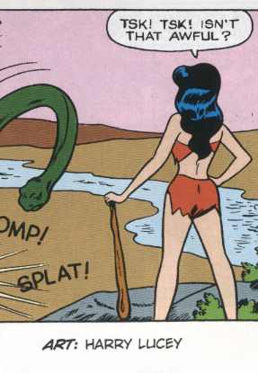
He also spoke about how when he would re-visit the comics he loved as a kid, like Archie, he would notice how expressive the characters were when talking to each other. “My friends would be like, ‘Aww, man, you read Archie? Aww, those are awful, it’s always the same thing, Archie getting chased by Betty and Veronica.’ But if you look at the way Veronica is looking at Archie out of the corner of her eye, and crossing her arms and sort of sneering at him — especially when they’re drawn by Harry Lucey — they’re so real. And so I just put that idea in my comics. I let the characters push the story around with their words and actions.”

All the while, Jaime is leaning forward and back in his chair pantomiming the actions he’s describing. It was another one of those moments where he’s able to really transmit the essence of what he believes as Gospel in comics. That the characters should move through the page, the story, free of plot, free of the constraints of formulaic narrative. One may see formula in Archie’s antics, but Jaime saw a wide field, a frontier. Jaime’s characters are more real to me than any character from a novel, movie, TV show, or ancient myth. I know Maggie and Hopey like I know my best friends. That’s insane. What other art form enables that? What other artist can sustain such a mythology all by himself? No Photoshop. No assistants. (Okay, besides Kirby.)

END PART ONE

(Part two 1.75 includes Alex Ross take-down. Boo-Ya!!)

**I thought I’d put up these thoughts while they are still fresh, and the con still on my memory’s radar. I’ve got pages and pages of notes from after the panel. Since it wasn’t recorded, I frantically tried to get it all down, at least how I remembered it. Jim wrote down a bunch of stuff too that I’ll be incorporating soon enough. I feel the quotes are fairly accurate. But please regard the posts about the panel as my version, like I was telling you a story.

***Thanks to Sammy and Tom for help in framing questions to Jaime.

NEXT: Part 1.5, Part 1.75, and Part 2.0.

Labels: , , , , ,

notebook reviews #1


by

Tuesday, February 5, 2008


Read Comments (19)

I wrote these notes while traveling this weekend. They’re sort of reviews, but really just riffing on color and composition. I’m obsessed with HOW color comics used to be made and want to write about it here for fun.
——————
“The Inheritors”, by Bruce Jones and Scott Hampton
Alien Worlds no. 3
Pacific Comics, 1983
full color

Looks like Kaluta, Wrightson. Reads like an old Unknown Worlds ACG comic but is beautifully painted. Each panel like a small Frazetta fantasy world. And that’s sort of the problem. I like the story, but it’s so serious and heavy and important. No Twilight Zone economy, no pacing, just a slow, laborious plodding. “We were aliens; creatures from another world come to the salvation, not of humankind, but of the planet itself.” A story of immigration, essentially, hacked out by Jones. Tolerable stuff, not great. The art saves it but really it’s just a fairly authentic blend of Frazetta, Wrightson, Kaluta, Vess. Nothing special really but beautiful.

I love the way these old Pacific Comics look. The colors on all the stories are great. All the Pacific Comics back then were done with that crazy process that was called “Greyline”. Steve Oliff actually colored a story in the back, but the Hampton story in the front is colored by Hampton I believe. Anyways, it looks fantastic like some comic straight out of “The Studio.” Plus, I bought it for a quarter. Whatever.

Oh, yes, back to the story. Well, I never finished reading it. I do love this passage (above, bottom panel) however, where a landscape panel has no black-line “overlay.” The landscape is not delineated by black marks, lines that are colored, filled in with paint. The landscape is just pastel colors that recede and allow the inserted black ink’d shadowed image — and the panel itself — to “float” above the color plane. That’s why I bought this one.
———————
Special Forces no.2, by Kyle Baker
DC, 2007
full color

I don’t really want to review this comic, I just want to write about the color and how fresh it looks. Plus, I’m such a Baker fan it’s hard for me to review anything of his fairly. I mean, I could give a shit about a war comic but Baker’s approach, his humor and his vantage point (read: not white) on the subject makes it, um, enjoyable. Remember this is the comic whose opening volley was a (black) guy getting his head blown off.

Baker has been creating his comics on computer for over ten years now. They “worked” for me back in the ’90s; I always thought he struck a balance between the generic Photoshop look of all computer “constructed” comics (meaning: no inked panel borders, floating computer fonts and text all arranged in Photoshop). It’s an interesting mix of approaches that Baker has developed. He seems to be using all the same filters and settings that everyone else is in Photoshop, but since he can draw better than just about anyone (uses no photo references for the figures as far as I can tell, has mastered a sort of Aragones-inspired comical realism, plus he has a real eye for movement, no staged “realistic” photo ref’d scenes that jar the narrative flow to a halt, no spending days playing photo-shoot director, dressing up as the characters for “believability.” Nah … none of these games for Baker, who’s got the time? He’s got kids, man. Plus he can draw. Did I mention that?), and since his use of color is so inventive and comic-booky and fresh — it all simply overrides the sensors in my brain that normally dismiss such “computerized” comics. In fact I actually like the economy of the easy-to-read simplistic layouts. I think they allow his drawings & sequences to breathe. There’s a real organic feel to his customized approach that carries the narrative along quite beautifully.

I really just want to write about the color tho’, so here goes: in many sequences, Baker will switch from the “realistic” color of the Iraqi landscape and replace it with “knockout” color in the action sequences. Meaning Baker will reduce entire backgrounds to a single color like blue while figures in said background are, say, red. This was very common in the four-color era of comics, but it’s rather uncommon these days to switch from “realism” to “symbolism” on the same page.

Baker’s “realistic” color is, I think, a perfect example of using the contemporary approach to color (Hyper-realism: everything molded and highlighted, shiny and video game-like), but using it with restraint so that the drawings are not overpowered by the colors. His “realism” is also served by alternating back to knockouts and the use of pure flat color. This approach develops a rhythm that allows Baker to use the symbolic and “the real” within the same sequence to great effect.
——————-
Archie no.170, by Harry Lucey
1967
four-color

This is an all Harry Lucey issue. You don’t know who Harry Lucey is? He was the best Archie artist. That’s all you need to know. The whole issue is an amazing display of composition, pure drawing, and gag humor cartooning. It’s a fucking clinic, actually. I’ve been doing these warm-up exercises everyday where I just draw from Lucey. I just look and learn.

Anyway, check out the color in this splash page. Stare at it and break it down. Remember this is four-color process, so its simplicity may fool you. For me, it’s the super simple use of the black and green of the girl’s dress in the foreground, which is a darker green and blue, playing off the wall behind her which is a lighter, 50% green and blue behind her. Big deal, you say? Well, look how the shapes unite and allow the central figures to remain on the left of the composition. The lines of the the wall AND the united color shapes create a plane and piece the wall and the foreground girl together in a really pleasing way. It’s a minor thing, really, but these masterful touches throughout each of the 4 stories in this comic all add up to one remarkable reading experience. (For 3 bux.)

Labels: , , , , , , , , ,

Speak of the Devil


by

Saturday, November 10, 2007


Read Comments (4)

Speak of the Devil #1-2
Gilbert Hernandez
Dark Horse, 2007

Maybe the real heir to Jack Kirby is Gilbert Hernandez. It can’t be Steve Rude; I was wrong. Kirby drew everything from romances to crime stories to classical Greek epics — and I’d say only Gilbert Hernandez shows comparable depth. He might not have the same chops as Kirby or even of his own brother Jaime — but Beto can keep up with ANYONE. And he delivers on time. Sorry, Steve.

I heard Beto himself say “I can’t draw” at the San Diego Comic-Con this year. “I can’t draw streetlights, door jambs, houses — you can see that in twenty-five years those parts of my drawing have basically stayed the same.” What has improved is his range. Beto’s able to craft a perfect comic book story. Shit, he could do that in 1981, but other than 1996’s Girl Crazy and 2002’s Grip, he hasn’t had much of a chance to stretch out, narratively speaking, in a non-Love & Rockets comic book series. (New Love from ’96 was short strips, natch.) His newest effort, Speak of the Devil, may just be his finest offering in this vein.

Freed of the Love & Rockets/Palomar continuity, he first unleashed (twenty-five years worth of) his pent up “weltschmerz” (world-pain) with Sloth and Chance in Hell — two genre-defying graphic novels that disintegrated this reader’s mind with the force of a cosmic black hole. Next up, Speak of the Devil, a six-issue comic-book mini-series. Bound now by twenty-page episodic chapters and a PG-13 style for the “mainstream” comics market, Speak of the Devil reins in Beto’s multi-faceted approach and broad abilities. The chaotic white hot rage of Chance in Hell is now a focused low simmer. Like Sloth, one can feel the pressure under the surface, veiled. And also like Sloth, the suburban tract house setting creates a fitting counterpoint to the tension. Where it differs from Sloth is in its pace; here Beto swiftly builds a deliberate narrative of nearly silent action without voice-over or introduction. The “hook” of the action sets the stage for intrigue that begins immediately and there are honestly passages that made my heart pound in expectation. Like a Steve Ditko Amazing Adult Fantasy story, the comic is imbued with a mystical air that is difficult to describe because so much of it relies on his masterful and subtle stage direction. Beto’s compositional and storytelling skills are so strong now — he’s at the height of his abilities, like Kirby was in the early ’70s. In fact, because of the pace with which it unfolds, Speak of the Devil reads like an issue of Kamandi or Mister Miracle. Beto has his own set of signs now — he crafts solid pages and imbues his drawings with joy — and like Kirby did, he uses those signs to unleash fantasies that are just so much fucking fun to read. It’s incredible. And again because he’s freed from his Love & Rockets continuity, he’s able to accentuate moments and details that I would think are more difficult to focus on in, say, a Palomar story with its large cast of characters and divergent storylines.

The plot of Speak of the Devil is similar to that of a black-and-white B-movie that one might come across on TV late at night. Val is a hot, athletic teenager with a hot bosomy stepmom. There’s a peeping tom in the neighborhood, and Val’s stepmom sort of gets off on the fact that the peeping tom is around. If it sounds simple, or clichéd, then good: Beto has you right where he wants you. Against such suburban ennui, the story is allowed to flutter and move like the curtains of the bedroom window behind which Val’s mom lies half-naked, waiting. It’s as though Beto has corralled all his obsessions and created a vehicle that permits him the freedom to put it all into one story. The beauty of it is that it doesn’t feel forced; it’s right on target. The tone, the mood, the drawing, the narrative flow — it all falls like dominoes.

And it’s a whole helluva lotta fun to read. Comics, for me, aren’t often much fun any more, because so many titles are either striving to be considered serious literature, or to be adult versions of adolescent king-of-the-hill games. Both of these approaches neglect the form’s raw power. Think Ditko sci-fi or Kirby monster stories — where is that sort of precision these days? Better yet, where are the creators that can do quality short genre pieces AND long-form continuity? And interestingly enough, Beto figures prominently into WHY comics are now being viewed by some as serious literature in the first place. What’s remarkable is that an artist with the ability to do something on the scale of Palomar is also capable of switching gears and doing something so direct and clear, and that still channels the form’s raw visual power.

It’s not a surprise, of course — Beto’s been doing short pieces for twenty-five years — but it’s still remarkable. Like a distillation of all of his influences, Speak of the Devil showcases the talents of a master well versed in comics language, all deployed in the service of a crazy Twilight Zone-esque genre story. That’s Kirby, that’s Ditko; that’s Ogden Whitney and Harry Lucey. And that’s Beto, one of the only contemporary cartoonists out there who can do it all. High, Low, and everything in between.

Labels: , , , , , ,

What Harry Lucey Knew


by

Monday, June 5, 2006


Read Comments (2)

Not to go on too much about my book, Art Out of Time, but while getting this blog up and running it seems a good source of material. Anyhow, a few major artists were left out of my book because their work was mostly anonymous and for licensed characters. They just didn’t fit. Perhaps my biggest regret is cutting Harry Lucey (1930-1980?), who, like so many of the other men who entertained generations of children, remains as anonymous in death as he did in life. His career in comics began in the late 1930s and he bounced around various companies in the 1940s, drawing such features as Madam Satan, Magno, and Crime Does Not Pay. In the early 1950s he helmed Sam Hill, creating some wonderful stories in the Roy Crane/Milt Caniff/Alex Toth tradition of lush brushwork and cinematic compositions.

He spent most of his life, however, drawing for MLJ, which published Archie, among other characters, and later simply became Archie Publications. Lucey became one of the lead Archie artists, drawing the freckle-faced teenager and his pals throughout the ’50s and ’60s. He took some breaks from the business to work for an advertising agency in St. Louis, but otherwise was dedicated to comics.

Like Ogden Whitney, at first glance Lucey’s work on appears to be generic and undistinguished, but a closer look reveals the artist to be a master of body language, or, in more concrete terms, acting. Every aspect of a Lucey figure is drawn to express what that character is feeling at that moment. Posture, position, and facial expression are all geared towards maximizing that moment in the story. Take a look at this Sam Hill page by Lucey, and note the precision of his character’s movements, particularly Sam Hill’s relaxed smoke rings panel. Lucey was certainly influenced by film, but brings a cartoon economy to the proceedings that can only be accomplished in, well, comics. And, take away the words (as Lucey did in a remarkable Archie story, “Actions Speak Louder Than Words”,) from a Lucey story and readers still know precisely how each character feels and what that means for the plot. In that sense, Lucey’s cartoon characters seem alive on the page like few others.

The only real inheritors of this tradition are Jaime and Gilbert Hernandez, whose Love and Rockets stories continue to be among the most eloquent and passionate comics drawn in the world. They, like Lucey, tell their stories through their character’s precise actions on the page, a topic addressed very nicely by Frank Santoro and Bill Boichtel in the debut issue of Comics Comics.

Anyhow, in most years Lucey penciled and inked a page a day, drawing the complete contents of the Archie comic book every month. Towards the’60s, Lucey developed an allergy to graphite, and reportedly wore white gloves while drawing. In the 1970s he was diagnosed with Lou Gehrig’s disease, and, sometime later, cancer. He refused treatment for the latter and died in Arizona in the late 1970s or perhaps 1980.

Labels: , , , , , , , , , ,