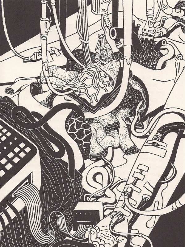
As mentioned a few days ago, redoubtable L’Association co-founder Patrice Killoffer has recently enjoyed a second North American release for Q4 2010, following NBM’s publication of vol. 3 of Dungeon: Monstres, which collected his 2004 contribution to the sprawling franchise created by Joann Sfar and fellow L’Association progenitor Lewis Trondheim. This one’s a newer work, and not a comics job – it’s one of a series of illustrations created for The Man Who Refused to Die, a novella by Belgian writer Nicolas Ancion, published near-simultaneously in French and English (translated by Paul Buck & Catherine Petit) as part of publisher Dis Voir’s line of Illustrated Fairy Tales for Adults. It’s the second entry in the series, after The Adventures of Percival from artist Nicolas de Crécy and writer Pierre Senges (whose work Killoffer has also illustrated, in the 2004 Verticales release Géométrie de la poussière).
I can’t say it’s a very good book — feel free to skip this paragraph if you don’t want the mystery ruined — although Killoffer’s work is often quite nice. The plot concerns your typical doomed noir-ish private detective, investigating the possible sexual abuse of his great-grandmother at her nursing home, only to stumble into a terrible plot to surgically prolong the lifespan of extremely rich men, apparently based upon actual research by one François Taddei, who is credited accordingly. Everyone winds up either dead or immobile, with their minds digitized and left to collect dust with the rest of the world’s prolific and ignored digital detritus, still the closest possible thing to eternal life.
It’d have made a decent enough late-period short serial in Eerie, and maybe a fine Killoffer comic, but mostly we’re left with the artist’s lovely full and double-page spreads of gurgling entrails and swirling amoebae and dense metal piping – lavish spaghetti & meatball renderings of How Things Work, stripping away the skin of a few more straightforward illustrations of people gesturing in rooms. Oddly, it reminded me of another transformation from last week, one less depictive than housed in the comics form, and tangentially concerning another rebellious group of seven comics artists who came to define the 1990s, and comics of the future as well.
Yeah, that’s right: I flip through foreign-language magazines looking for the comics. This is from a bookmark tucked away in a recent issue of Snob, a Russian-language lifestyle glossy which I’m told is common to newsstands in the NYC area, presumably given an especially liberal construction to “area” in that I’m three and a half hours away by train. As you can see, it’s an installment of John Deering’s Strange Brew, initially reading “It really tortured my soul to create this one…” Since I cannot read Russian, I don’t know if the same joke is being communicated presently, or if some advertising or Russian lifestyle-related jest has been covertly substituted, but I think all of us can agree, nonetheless, that making fun of gallery art and artists is as potentially universal a language as has yet been conceived.
For your pleasure, we now present the off-panel first-appearance-by-implication of beloved DC character Grant Morrison. Created by Don McGregor & Gene Colan in 1984, Morrison is notable for having never directly interfered in the action of his originating series, Nathaniel Dusk: Private Investigator, an out-of-continuity detective series (of added historical interest for being among the first division-of-labor comics series colored directly from an artist’s pencils). Morrison’s hands-off presence as a comics player was subsequently and radically reversed as chief among many DC character revisions proffered by the 1988 Animal Man series, in which “the Writer” Grant Morrison displays direct and seemingly unlimited control over storyline action, doubtlessly in support of the evolutionary theme present in the series at large, to say nothing of later related comics works.
While ostensibly killed by writer John Ostrander in a subsequent issue of Suicide Squad, Morrison has nonetheless endured as a pliable (if elusively identifiable) presence in DC or DC-owned comics, ranging from Planetary to Seven Soldiers. He shares a name with author and music video personality Grant Morrison, although it is unknown if McGregor and/or Colan were aware of this other Morrison — potentially through contacts established or submission present in the immediate wake of British writer Alan Moore’s arrival on the North American comics scene in the early ’80s — at the time of his creation.
This has been your Extremely Reliable Comics History for 9/21. Pricing information on upcoming releases follows:
[TIM: After coming to the uncomfortable realization that it has been more than a year since our last Cage Match, Dan, Frank, and I decided it was time to get back in the pen and fight it out over some recently released comic book. Unfortunately for the format, the book we chose as a topic, Al Columbia‘s Pim & Francie, turned out to be a bad subject for a no-holds-barred, drag-out fight, mostly because we all really enjoyed it. But giving up would be too easy.
So here is the first installment of a new, buttoned up, and possibly less exciting feature, the Round Table, wherein we discuss a comic without coming to blows, though with any luck, we will still find a few things to disagree about to at least somewhat interesting effect. No strict rules here, just an online discussion taking place over real time. Readers should please feel free to participate in the comments section. This is a first time thing, and we haven’t really thought it through, so maybe the event will turn out to be a joyless affair, quickly sputtering into sad banalities. But maybe it won’t! If you believe, clap your hands!
In any case, welcome to the Round Table. Dan is starting the conversation, and will take the lectern shortly.]
DAN: I suspect each of us will have a very different interest in Al Columbia’s Pim & Francie: The Golden Bear Days. Rather than attempt a comprehensive statement, I’m going to look at it from a couple of different angles.
A one line explanation of this book is: Pim & Francie is a book of drawings and stories about two cartoon children. What is resembles is a stack of fragments, sequenced to indicate a few suggestive narrative threads. But its surface is deceptive.
If I didn’t know the back story of Columbia’s career (the starts and stops, the destroyed work, etc.) I would assume that the book looks the way it does intentionally. That the artist’s intent is to convey disintegration and ennui through the physicality of the drawings themselves. Images are torn, taped together, burnt, wrinkled, and water damaged. When a character disappears into pencil lines, or is obscured by ink blots; when a scene is interrupted by white drafting tape or a massive tear, the characters seem to come to life. That is, the imperfection of the page, the process of the drawing, drives the characters. So, I don’t read these pages as “sketches” but rather as full blown drawings akin to something like Robert Rauschenberg’s “Erased De Kooning” in which absence animates the page.
The distress is so thorough and consistent that simple coincidence seems impossible. But, then, maybe it’s just unbelievably good editing. And then I got to thinking, what if Columbia is so aware of his mythology and such a good cartoonist—such a master of surface effects to indicate sub-basement meanings—that he wants us to believe the P&F is “just” a collection of scraps so that it quietly engulfs us? What if this doubt, this underestimation, is part of his intent? Then I happened on Sam Anderson’s review of Nabokov’s The Original of Laura in which he suggests much the same thing about that just published fragment. It’s wishful thinking, of course—but it speaks to the power of the author to even make us long for some over-arching master plan.
I am also reminded of a much younger cartoonist’s new book: Josh Cotter’s Driven by Lemons. Lemons is a very different animal, though it also is a brilliant, virtuosic work, and one that needs repeated reads. It as well allows a look at the marks and tones that comprise a cartoon drawing—wiping away the cleanliness of cartoon reality to foreground the process. It’s also a young man’s book by a cartoonist who still has faith in the kinetics of cartooning—in motion, enthusiasm, and outlandish physics. Cotter may be investing in process, but he’s also building his cartoon language, adding new tools and new ideas as he goes.
Columbia, however, has been through it all. This is a book only an older artist could create. His process is up front and part of it is destructive. Reading Pim & Francie is an apocalyptic experience—as if Columbia is demolishing both his own work and the idea of “cartooning” in general. I found it exhilarating and terrifying.
A word about the subject matter: A lot of cartoonists have trod the “inverted comics” general territory. Most brilliantly, Chris Ware used Quimby to convey despair, anxiety, and grief by employing the lyricism of 1920s cartoons. Other, more recent cartoonists have had a lot less success. It’s rather easy to use the form or characters and then blow their brains out. It’s much harder to create something that is empathetic. Columbia isn’t aping an old style—he’s taken the building blocks of 1920s cartoons and rearranged them entirely (in some places I am reminded of the frightening clown of Monkey Shines of Marseleen.) His static figures, sepia backgrounds and faux-happy waltzes are thoroughly redesigned and made his own. There are also no easy pratfalls here. Nothing is predictable. As I watched knives glint and faces warp into horrific grins the furthest thing from my mind was nostalgia. Instead, as with Ware, I was deeply moved by the experience.
And that’s where I’ll stop for now. Next?
=====
TIM: Well if I knew this was going to be that kind of party…
Huh. That’s a nice idea, Dan, that Pim & Francie only looks like a collection of unfinished stories and pieces, but I don’t know if I quite buy it. (I definitely don’t buy the New York magazine Nabokov theory you linked.) But I also don’t know that it matters, because Columbia makes the “unfinishedness” work for the story, just as you and previous critics have indicated, and the resulting book has its own otherwise perhaps unattainable power. It’s difficult to know whether or not these stories would have worked better if Columbia had completed them more traditionally, just as it is to conclude whether or not David Lynch’s Mulholland Drive would have worked better as the television series he had originally intended. In the end, you have to read the book you hold in your hands.
It’s definitely interesting, and telling, that the text of the book itself draws almost no attention to its own raw state, other than in the spine’s parenthetical “Artifacts and Bone Fragments.” As you said, Dan, knowing Columbia’s career history inevitably shapes the reader’s response, and it’s fun and fruitful to (attempt to) read the book as if you aren’t aware of it.
In either case, the fact that so many of these grotesque stories and vignettes don’t really resolve contributes to the reader’s growing sense of unease. It’s almost like a 12-bar blues song (or an intensifying series of songs) that never returns to the tonic chord: your nerves get a real work out.
Of course, in another way, the fact that so many of these funny-animal-like characters are horribly mutilated only to be resurrected, seemingly unharmed, a few pages later only points back to traditional cartoon tropes of endlessly recurring death, dismemberment, and escape. As if Wile E. Coyote’s tortured existence wasn’t played for laughs. (Grant Morrison’s celebrated attempt to capture something similar looks lame and obvious compared to Columbia’s infinitely more subtle work.)
I’ve said it before in another context, but I’m really beginning to believe it: “In a way, every comic depicts a phantasmagoric dreamscape: Squint just right, and everyone from Spider-Man to Dilbert is revealed as a nightmarish figure.” When I was a child, for reasons I can’t even now articulate, I remember feeling a irrational fear looking at Minnie Mouse’s oversize high heels engulfing her strangely shaped feet. Francie wears the same shoes in this book, and now I find them scary as an adult. That’s a big part of what I get out of Al Columbia’s comics in general: they really bring out the surreal terror already buried within cartoon imagery.
That’s it for me for now. You got anything, Frank? And Dan, I guess there’s nothing stopping you (or anyone) from jumping in again at any time, either.
TIM: Also, is it my imagination, or does Cinnamon Jack remind anyone else of Alfred E. Neuman?
=====
DAN: You’re wrong, Tim! Cinnamon Jack looks NOTHING like Alfred E. Neuman. Phew. Had to get that one bit of Cage Match energy out of my system. Sadly, yes, Hodler, you’re right, they do look alike. Which means I’ll never look at either the same way. Tim’s blues analogy is a good one: I’m reminded of John Fahey or something like that—ultra tense, repeating patterns that don’t allow for a satisfying payoff. But, I have to say, the life & death cycle of cartoon characters, as well as their lurking grotesques don’t interest me that much on their own. I almost take it for granted. It’s more like what Columbia does with subtly “off-model” versions, like his repeating Goofy/Lena the Hyena figure. It’s more than bringing out the horror in an extant design, it’s taking components of that design and refashioning them all together. The highly individual result is the scary thing. It’s not like I’m arguing, dear Tim, just expanding.
Also, one thing I forgot to mention before: P&F is also a wonderful demonstration of the cartooning and animation process: The insane amount of drawings produced that have just subtle differences or mistakes. The maddening repetition. Ironically, I have to sign off until late this evening as I have to go teach comics at SVA! I should just have a group reading of P&F, I suppose. Below: A version of the Phantom Blot?
=====
TIM: Well, I take Robert Rauschenberg erasing de Kooning for granted, so we’re even! (It’s probably unwise of me to admit that.)
And I knew that image reminded me of something, and you’re right: The Phantom Blot! So many memories just opened up. Time Regained.
=====
FRANK: I read straight through like a narrative. Like a detective, I put the clues together and read the images attentively as they sped by. I could feel the collage of all these fragments, clues assemble and tell a very clear story to me. I’ve read this story before, have felt the same emotions. Pim and Francie’s adventure struck a chord in me that’s been dormant for a long time. A haunting wonder, perhaps? A curiosity of the unknown that, when found, rattles one to the core?
Does that all sound too heavy? Insincere? Not to me. Like Dan, I felt really moved by the book. I don’t feel the need to explain the “unfinished-ness” of the book at all because I see it as “finished.” Notes, fragments, whatever. I read it slowly, turning each page like I was watching a film that had me riveted. Does that make sense? And then I would go back to certain section I wanted to re-read and watch that unfold again and again.
I also wanted to find a way to gauge the “timing” of the author’s delivery. Columbia’s progression of two-page spreads and how the spreads folded into the next in sequence is truly beautiful. I read each spread as a pairing of the left and right pages. And as I would turn the pages I could feel the changes in tone and how it affected the “loose” narrative. I wanted to be able to feel the changes and mark them so I could return to these transitions and re-read them like chapters.
The way I did this was to determine the first spread in the book, which is this:
Spread #1
The page on the left is, technically, not the first image in the book. That would be this image which is very important:
First Image
The above image of the sun and the torn curtain is, to me, the beginning of the “play” as it were. It feels like it’s part of a proscenium stage.
I numbered the remaining spreads as “Spread #2, #3,” etc. I then would put a post-it every ten spreads to mark the “time” for me. I could see the rhythm of the images, watch how they played off each other. And most importantly it let me appreciate it as a whole even though I was inserting breaks. But these breaks were just so I could get my bearings, a sort of time code for this world outside of time.
Spread #10
Spread #20
There are 118 spreads by my count. To me, the fragments are expertly pieced together and a sort of “hyper-text” is created. I read it up, down, and sideways, using the symbols of the characters as links to other spots within the story fragments.
I would like the reader to enjoy the first twenty spreads without my description. It’s a marvelous fable, a poetic onslaught of images that will deposit you, the reader, into the rabbit hole. And you will find yourself with Pim and Francie, lost in the haunted forest.
And then Grandma appears. She finds you, and all is well. And then, at Grandma’s house, we know real fear. A succession of images terrorize our heroes, and like a nightmare, they find themselves on a dream street in a bad part of town. A cartooned detective appears chasing a killer. On the opposing page, a smiling, long-snouted, gap-toothed visage of fear with piercing eyes is depicted. Turn the page and there are severed limbs on the left hand side of the spread. And on the right hand side is an old man smoking a cigar. The words in the balloon are difficult to make out because there is tape and corrections. The one phrase that is readable is, “They enjoy killing! It makes them happy!”
When we turn to the next spread, we see Pim speaking to this older gentleman. Pim refers to him as Grandpa. This is the first time we understand within the order of the images that this character is Grandpa. The representation of Grandpa, like Pim and Francie, is reduced to a symbol, so when we encounter this symbol, we, the reader, bring so much to the table already. Just the word Grandpa and any cartooned image of a pleasant-looking gentleman, fused together, evoke a very particular feeling in me as a reader.
Spread #25
Spread #26
So when Grandpa reveals to Pim what the murderer does, it also sets up the reader to feel for Pim as he goes down the rabbit hole. On the opposing page, the grotesque, exaggerated visage of a few pages ago is replaced with it’s “flipped image” double. Only now it is hacked to pieces, dead or dying and still smiling. A haunting mad image that bears the text, “Sonny Blackfire had returned.”
When we turn the page again to spread #28 we meet “the Bloody Bloody Killer.” His face, the angle of how it is drawn, all match the “grotesque visage” of the previous spread which of course, rhymes with the original spread. It is this phrasing that interests me a great deal. Spread to spread, Columbia directs my eye to see, in succession, more than the images reveal singularly. It reminds me of how a musical chord progression is built out of single notes, played together in time.
Break.
=====
TIM: Good one, Frank. I feel like we’ve barely begun to get anywhere, but I have to bow out for the rest of the evening, and do some stupid parenting. Maybe you and Dan will come up with more tonight—either way I’ll rejoin the conversation tomorrow morning.
=====
DAN: Top of the morning to ya! A few responses: To the anonymous comment below: The reference to Wolverton’s MAD cover is mentioned above: Columbia merges Lena Hyena with Goofy. And, I’m not pulling art from the book, necessarily. Comics Comics HQ doesn’t have little helpers scanning books so I just grabbed stuff from the vast internet. So, you can stop searching for these images in the book (except for Frank’s spreads. Those ARE in the book). Finally, I wanted to add to Tim’s thoughts on the object-ness of, say, Minnie’s shoes. If, as in a previous post, one could make a list of invented comic strips within fictional narratives, one could also perhaps make a list of invented comics museums within stories. There is a brilliant and haunting spread of a ballroom filled with cracked cartoon visages frozen in song. P&F enter the space wearing their Mickey hats—fresh blood in a toon graveyard. It’s the only literal depiction of these old icons (Snow White, Mickey, the Ducks, et al) and it’s a great disruptive moment. Two other cartoon museums come to mind immediately (and there must be a ton more): Francis Masse’s brilliant “The Museum of Natural History” in Raw Vol. 2 #3 and Spiegelman’s own satirical museum drawn as a poster to benefit Danny Hellman.
=====
FRANK: I think Columbia’s approach points the way to a more intimate reading of the text. The fragments, the feel of the paper, grant us access to the material in a way that is more tactile than we get from most who employ this “style;” there is an almost uncomfortable intimacy. Partly because of the violent imagery but also because of the torn and shredded pieces of paper themselves. The humor and the horror and the presentation do not feel contrived at all, but authentic, sincere—REAL in every sense. The approach, the style of drawing interests me but I don’t feel repelled by the treatment. Meaning that it could be read as “cold” somehow. There’s a seduction to the drawing, the style, the pencil, the stages of development. The “behind the scenes” look can be startling.
I must sound like a broken record to those who know me but here goes: This book makes me think of Be-Bop. Notes, chords but skirting the melody. Playing up and down the scale. There’s a beat (page spreads, rhythm of turning pages, the architecture of the spread—two fixed pages—and the architecture of the page; how it’s presented as illustration, as symbol, as comic strip, as movement, as march), and there are notes, chords, but the melody line comes in and out like Charlie Parker playing a standard from The Great American Songbook.
I listen to Charlie Parker everyday on WKCR in NYC. While writing the above paragraph I heard a live recording of Parker where he riffed on the theme from Popeye. I forget the song but the band is chugging along and Parker is playing up and down and around the melody and slips in “Popeye the Sailor Man” without loss of tempo or control or anything—incredible. And to me, that’s akin to what Columbia is able to do in the way he sequences the notes and fragments together in Pim & Francie. (The above Parker video isn’t the song with the Popeye riff, FYI. Just an example of playing with intention and focus and still finding room to “play”)
Columbia’s style of drawing doesn’t evoke a nostalgia in me; I don’t feel he is drawing in an “affected” way. Hokey it ain’t. It’s very REAL. And his take on this American symbolism is strikingly elegant in its delivery. It’s through this elegant delivery that we connect to the fable, the song which somewhere we have all heard before.
=====
TIM: Frank, your musical comparison seems pretty apt to me.
Dan, have you read Michael DeForge‘s Lose yet? Because there’s a bar in hell there that you really need to see. (I should review that issue—it’s really a great debut. Go order a copy, people.) It’s not exactly the same kind of thing you’re talking about, but it’s close enough for blogonet work.
Also, it’s funny that you began this Round Table by saying that you thought we’d all have “very different interests” in the book, but in fact, our responses seem to have been very similar. Maybe that’s indicative of the power of Columbia’s art, that a book so ostensibly “obscure” and “difficult” can provoke such strong, unified responses. (Or maybe its says more about our own limitations as critics, but that’s too depressing to contemplate.) The relationships and situations seem to shift from “story” to “story” and page to page (are Pim and Francie siblings or spouses? children or adults? dead or alive? etc.), yet always make strong emotional sense (for lack of a better phrase), even as they avoid more traditional, “logical” closures.
One other small effect I don’t think has yet been mentioned: I really enjoy the sense you get (through book covers, logos, film stills, etc.) of an alternate universe full of Pim & Francie books, cartoons, and merchandise. That so many of the characters and images mirror those from real (and often long-forgotten) commercial culture only increases the effect.
I don’t know how much more there is to say about this book, without going into the kind of close analysis that Frank began to attempt yesterday, but maybe you guys will prove me wrong. Or actually do some of that close analysis! Like, I mean, what does it mean when they poke their eyes out? Whose “revelation” is it near the end, and what causes it? And what about that final scene in the meadow? What does it mean, man? Actually, those kind of analytical questions appear to me to be largely pointless. But am I wrong? Is that just lazy thinking?
=====
DAN: I have only flipped through Lose but am looking forward to getting my hands on it. Looks amazing. His Cold Heat special is genius. As for the rest, well, man, I think we’ve run out of steam. Those major questions of yours will have to wait until we next meet for beers. Or at least, me and Frank won’t be answering them. Perhaps some kind souls in the comments will help you through this ontological quandary. If not, you can call me up until midnight tonight. Just kidding.
I think that about does it, folks! Thanks for reading. Now back to your regularly scheduled Comics Comics programming.
Grant Morrison doesn’t really need the attention of Comics Comics, but I’m due for a post and his two most recent books are rolling around in my head. To start with, I ought to note that until his recent All-Star Superman, which I loved, I hadn’t found a lot of his work too interesting. I liked Animal Man but found The Invisibles, The Filth, etc. etc. more or less incomprehensible. But I have always been impressed with the sheer verve of the guy, and his uniquely British ability to become a “personality” as much as a writer. It’s that Michael Moorcock thing. Gotta love it.
He seems at his best when taking everything he knows and distilling it down into a seemingly straightforward story. He is also saddled with the unfortunate disadvantage of often pretty lousy artwork, placing undo emphasis on his dialogue and ideas. With Frank Quitely he actually has an equal collaborator. Quitely’s nuanced, beautifully composed drawings actually convey meaning. This allows Morrison to shut up and let the pictures tell some of the story. Y’know, cause they’re comics and all. Their recent Batman collaboration is a perfect example of brilliant superhero comics.
Anyhow… really what I’ve meant to write about is Batman R.I.P. and Batman: The Black Casebook. I read R.I.P. and could basically understand the idea of it: Morrison’s Batman has experienced the last 60 years of comic book adventures in just 15 years of “his” time. And this becomes impossible for his brain to process. A villain tips him over the edge into insanity and he develops a second personality to cope. Then there are fights and he disappears. It’s a tough slog. The main problem is that the artwork by Tony Daniel adds nothing to the story: no character development, no set pieces — just gritted teeth and stiff action. It’s so funny — after all this time people kinda forget that comics are best when word and image complement each other. Morrison has spun this elaborate tale, but Daniel can’t bring it to life. Batman’s anguish is never manifested in a visually compelling manner. Nor is his madness. It’s all drawn in the same high-energy, hyper-scratchy, distorted manner. The colors never change, etc etc. Basically, nothing the comics does well is harnessed to tell the story. So, while I get the feeling Morrison must intend more for his stories –I mean, the clarity and depth of his work with Quitely in Superman and Batman is just stunning and in such sharp contrast to his other work.
The most interesting part of R.I.P. is its oddball spin-off: The Black Casebook. It’s a modest 144 page trade paperback — flat colors printed on off-white newsprint — filled with reprints of the stories Morrison used as research for Batman’s history in R.I.P. He focused on the most outlandish of the 1950s comics, replete with atomic fear, aliens, personality switches, and anxiety. It’s a wonderful book in a lot of ways (OK, the cover design is bad, but I’ll live) and I love the idea that Morrison treats the “off-model” history of a character/property as canonical. He simultaneously re-jiggered the history of the property by bringing those stories back into print and also treats the “mythology” seriously, under the kind of charming assumption that everything written is admissible.
And then, as a project it’s the first time I’ve seen an “artist’s choice” project with a popular super hero since the Spiegelman/Kidd Plastic Man/Cole book. It’s great to see just a slice of Batman viewed through the eyes of clever writer — I’d love to have see another writer or artist take a crack at this kind of historical project. Bringing that level of subjectivity to the topic and treating as part of an ongoing creative process is pretty fun. Plus, of course the work inside the book is fantastic. Many of the stories are written by Bill Finger, who really can’t be lionized enough as a comic book writer, and drawn by Dick Sprang and Sheldon Moldoff. Sprang’s angularity and grotequeries make him a little stronger than Moldoff, but just by a hair. They’re both fantastic artists and crisp, clear storytellers. So go check it out — Like D&Q’s recent Melvin Monster, The Black Casebook is a lesson in the complex art of deceptively simple comic book storytelling.
Is this a pretty lightweight post? Yep, I think it must be summer.
Sorry about the delay in posting — but for whatever it’s worth in return, the next issue of Comics Comics is shaping up very nicely.
Anyway, here are some of the things I’ve been reading recently:
Sloth, by Gilbert Hernandez I liked this quite a bit, and it’s definitely one of his better efforts for a mainstream publisher. Not exactly Hernandez Lite, this is both far less weird than his Love & Rockets work and far more weird than anything else I’ve read from Vertigo. The story, which involves characters changing places, and revolving protagonists, is somewhat reminiscent of recent David Lynch films, like Lost Highway and Mulholland Drive. It’s definitely worthwhile, but seems like minor Hernandez to me; it also cries out for a second reading before I can really make sense of it and say for sure. Which I don’t quite feel up to right away, so make of that what you will.
Forbidden Worlds #132 This is the first non-HerbieACG comic I’ve read, and it’s a lot of fun. If you like mindless fantasy comics, this is definitely worth checking out. This issue comes late in the game for ACG, after the company gave up its long resistance to the superhero craze and introduced Magicman. It’s pretty apparent that Richard E. Hughes (who apparently wrote all or most of the company’s stories using weird pseudonyms like Zev Zimmer, Greg Olivetti, and Ace Aquila, among many others) didn’t care to put too much thought into his hero, and basically allows Magicman to be capable of anything. In this issue, Magicman has to stop a gigantic, telepathic beast called Ancient Ape, and in the process he uses his “magic” to fly, throw rocks, start tornadoes, appear to transform into a giant snake, and at one point, he even summons the Frankenstein monster and Dracula to fight on his behalf! Pretty hilarious stuff. The other two stories in the issue are basically drawn-out one-punchline gags, that are so stupid and unfunny they come out the other side and become funny again. The effect is somewhat similar to what Rick Altergott achieves in some of his Doofus strips, though the art is not in any way comparable. Anyway, I’m definitely going to be on the lookout for more of these.
Animal Man I’m not exactly a Grant Morrison detractor, but I do find the near-constant and universal praise for him a little hard to take. All-Star Superman is admittedly fun, but it’s also pretty slight and I think its successes owe more than a little to the work of artist Frank Quitely. Seven Soldiers has some interesting ideas and concepts, but basically that seems to be almost all it has. It sometimes seems to me that Morrison just throws a bunch of concepts together and doesn’t bother trying to make any kind of coherent whole out of them, or think through all of the ramifications. That leaves a lot of work for his supporters, but they don’t seem to mind making the effort, so I guess it’s all okay in the end. But it would all go down a lot smoother without all of the near-messianic proclamations made by and for him, and I think his current hero status says more about the general state of “mainstream” comics than it does about the actual strength of his work. (Not that he’s bad, mind you, but that almost everything else is.)
Or anyway, that’s how I’ve felt so far, but I’ve never read most of the early comics he made his name with (Animal Man, Doom Patrol, and the like), and I thought I should give it a chance. This first collection of Animal Man is fairly enjoyable, and I’ll keep reading to see what he makes out of it. This collection includes “The Coyote Gospel”, which apparently is the most well-regarded early story in this series. But while the conceit of having a Wile E. Coyote clone represent a Christ-like martyr suffering for the sins of the world is kind of appealing, it doesn’t really make sense when you think about it for very long. The original Wile E. Coyote wasn’t very Christ-like in his motives or feelings, and if anything, like most comic figures, he represents base humanity itself, not the son of God. Not that this couldn’t be made to work anyway, but it doesn’t seem as if Morrison bothered to go through all the trouble of connecting all the dots, and just thought, hey, wouldn’t it be cool to have Wile E. Coyote in a crucifixion pose? (The recent Superman movie displayed similar problems.)
But whatever — this is still early in the series, maybe it’ll all make sense in the end, and I’ll try the next volume with an open mind.
Short Order Comix #2 I must have heard of this before (I’ve certainly read some of the stories here), but I blanked on it when I saw this in a store recently. (Apparently Last Gasp is distributing it; maybe they found some old copies in a warehouse?) This is the second and final issue of a pre-Arcade anthology edited by Bill Griffith and Art Spiegelman, featuring cartoonists like Joe Schenkman, Diane Noomin, Jay Kinney, and Rory Hayes. Some of this stuff is kind of dated, but Willy Murphy‘s parodies of newspaper strips hold up nicely, Hayes’s strip is reliably bizarre, and Griffith comes up with a good platform-shoe-with-goldfish-in-the-heel joke a good fourteen years before I’m Gonna Git You Sucka.
The real standout story here, though, is Spiegelman’s “Ace Hole, Midget Detective”. It’s occasionally a little pretentious, but moments here are brilliant, like a panel juxtaposing a quote from the old Comics Code (“6) In every instance good shall triumph over evil… 7) Scenes of excessive violence shall be prohibited…”) with a reproduction of Picasso’s Guernica. It also shows a real joy in the act of creation and innovation that has sometimes seemed lacking in Spiegelman’s more recent work. In any case, this story alone makes the issue worth seeking out.


