


The Streets of San Francisco
by Frank Santoro
Tuesday, January 15, 2008
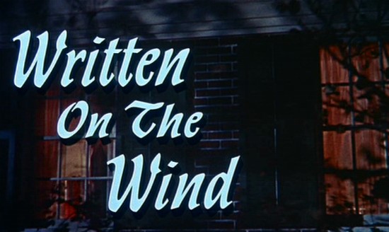
 Tastes change. Styles change. Everyone knows the story about Hitchcock’s Psycho, right? After filming lots of big-budget color movies in the mid to late ’50s, Hitch decided to take a different approach with Psycho. Convinced that he could do it better with his smaller TV crew (from Alfred Hitchcock Presents), he shot Psycho in black-and-white and structured it very much like the short-form pieces he was doing for TV. I think Hitch also understood that tastes were changing and that people liked the small-screen, simple and clear, episodic format that hearkened back to radio (and to Hitch’s own films from the ’30s). Also, many of the people who worked in TV in the ’50s and ’60s were former filmmakers from the pre-Technicolor, pre-Cinemascope era.
Contemporary filmmakers can attempt to evoke older films (Todd Haynes’ Sirk-themed Far From Heaven, for example) as much as they like — but in my opinion they will never be able to truly match or copy exactly what the old timers did BECAUSE THEY WERE NOT FORMED IN THE SAME CAULDRON. (Of course Haynes didn’t want to copy Sirk exactly. Haynes was investigating Sirk’s LANGUAGE.) The dominant style of staged movement, proscenium stage “blocking”, nuts-and-bolts “shot/reaction shot” that one can easily see running through all films of the ’40s and ’50s began to give way eventually. Interestingly enough, it was the French New Wave that had a lot to do with this because they themselves were looking back, like Hitchcock, to the older, formative films of Hollywood, to noir, and to westerns. This back to basics approach was picked up on by the ’60s and ’70s auteurs, but by then they could inject new flavors in to the form (more skin and sex) and the whole paradigm shifted.
 Comics have a similar trajectory. All the talk that comics artists today can draw BETTER than their forebears is meaningless. The point is that this common language I’m describing IS NO LONGER IN USAGE. It’s all but dead because the people who were formed by it, who passed it on, are gone. Toth was an innovator; he was more forward-thinking than Caniff, yet he was still a “Caniffer.” Darwyn Cooke can attempt to evoke Toth in some of his Batman stories, but he will never be Toth because he was not formed in the same 1950s cauldron. So subtly, step by step, each generation puts its own spin on the dominant style. Any attempt to resurrect these “house styles” is seen as retro and somewhat conservative. The bland illustration style that ruled ’50s and early ’60s comics was part Caniff, part advertising, part hackwork. The practitioners of this style, though, knew how to construct a page that read clearly, much like directors of the ’50s films knew how to stage action.
Steve Rude is a great example of an artist who, like Toth, builds on the existing nuts-and-bolts style of comic storytelling without resorting to drawing in a more stylized approach like Frank Cho or Dave Stevens. One hundred issues of Nexus continuity prove Rude’s determination to remain a “classicist” and document his development. He’s committed to telling a story and frames the movement across the page in order to extract the maximum dramatic impact. Rude’s choices work for me as a reader because the clarity of it all, the simplicity of the drawing, allow the narrative to retain its momentum. Cho’s flourishes of technical wizardry, I think, actually prevent the narrative from assuming center stage. His transitions from panel to panel are generally awkward and ham-fisted. Compare the clarity of the Rude page (below left) to the clumsiness of Cho’s page (below right) in sequences that have a similar “action.”


Does Miami Vice look like Dragnet? Does a Dave Stevens page read like a Caniff page? Would I rather watch The Streets of San Francisco or Law & Order? Would I rather read Don Heck or Frank Cho? For me, the last is a litmus test. If you think Cho is a better draftsman, fine. But if you think Cho is a better comics artist than Don Heck, then I’m sorry, but I do not agree. In fact, I think it’s pointless to compare the two. For the reasons I’ve explained above, I think Cho is an ILLUSTRATOR first and a comics artist second. Don Heck, long reviled as one of the worst hacks in the Marvel Bullpen, was a solid storyteller. He had a great sense of comics “naturalism” and is a perfect example of the kind of “nuts-and-bolts” non-photo-referenced approach that prevailed before 1970 or so. In my opinion, artists like Cho and Stevens have contributed very little to the development of the form. Except maybe to impress upon a generation of young comics artists that technical virtuosity is more important than basic storytelling.
Labels: Alex Toth, Alfred Hitchcock, Darwyn Cooke, Dave Stevens, Don Heck, Douglas Sirk, Drawing Styles, Frank Cho, Milt Caniff, Nexus, Steve Rude


I just spent like half the time reading that thinking you had inspired a Todd Haynes film. He used to be next door neighbors with an ex-gf of mine, she wouldn’t let me bang on his door to demand he show us superstar.
I wonder how you feel about contemporary cartoonists who invoke the “ol’ Timey” strip thing- Are they similarly unable to [i]really[/i] build on the language developed by those early practitioners?
Or do we comics fans have an insane urge to parse and organize every idea into neat long boxes?
I think it’s possible to build on the language. Thats what I meant about Toth and Rude. I simply don’t think it’s possible to truly “inhabit” that language because the factors that define an era include things like access to technology or cultural mores. Really. Toth never had that Cap’n Easy / early Terry and the Pirates ‘bigfoot’ vibe in his work. He was formed later in the mid 40s and it gave him this different outlook.
And yeah, I think almost all art forms are obsessed with categories. It makes artists crazy but I think it does provide context somehow. There’s a lots of talk these days into curating museum exhibitions less by chronology or schools, movements –in order to shake off this tendency to categorize.
I thought the Frank Cho page was four views of the same action, after the face off and before the head slamming into the brick column. i had to look really closely at the water tower to realize something else was actually going on.
I always find it diheartening to hear Don Heck refered to as a “reviled hack”. Heck was fine artist who, sadly, is best remembered for his less than stirling work done on books like Wonderwoman which fell late in his career. While he was no Kirby or Ditko his Marvel comics work in the sixties on The Avengers and Iron Man were solid, quality work. He was also an extremely clean and efficient storyteller, a point which seems over looked by many.
very true. there’s a great interview with Bob McLeod that more or less expresses the same sentiment:
http://goodcomics.comicbookresources.com/2007/01/30/drew-geraci-with-bob-mcleod-laying-it-on-the-lines/
I find this to be a very interesting discussion. I wonder if part of what’s being talked about has to do with an artist’s interest in drawing things other than the figure? From what I’ve seen of his work, Frank Cho is a very able illustrator of the human figure and of cartoon animals as well – but the settings he placed them in are less interesting, more likely to be expressed with a form of shorthand. Steve Rude, by contrast, has always populated his pages with interesting buildings, machines, etc. Marshall Rogers was of course known for his interest in architecture.
A lot of the older comics artists you’ve been praising injected such details into their work in part because it was simply the style at the time, but also, I suspect, because they aspired to other forms of employment than comics, and if you wanted to make it in, say, advertising, you’d better know how to draw clothes, furniture, buildings, and so on. Perhaps this is some of what you mean by not coming up in the same “cauldron.” It reminds me of an observation I’ve occasionally made about the Beatles: Even in early songs, Lennon & McCartney often drew on non-rock’n’roll influences (like Latin rhythms). I’ve sometimes wondered if this was partially because they saw playing in a band as a temporary thing and so had already prepared themselves to be professional musicians and songwriters who’d be called upon to work in a variety of styles.
I don’t mean to suggest, by the way, that being able to draw things other than the figure is sufficient for being a good comics artist. In National Lampoon’s Big Book of Comical Funnies, there’s a hilarious comic strip about a food inspector, drawn by Russ Heath, which has ample detail but in which all the “shots” and panel transitions are completely (and intentionally) wrong for the story.
I don’t think it’s really been said here, so here I go. The fact that the environments that comic stories take place in are often just under-realized “backgrounds” usually makes me feel like I’ve been cheated in a big way, and it always takes away from my enjoyment of the story. Those standard superhero rooftop battles loose a lot without the rooftop.
Much of the real work on the execution of many comics lately has fallen to the special effects of the colorist anyway. I’m surprised that there hasn’t already been a shift towards setting, say the Marvel Universe Manhattan stories, into a mapped out 3D world. Computers can do that stuff. It’s pretty much what you get in the Spider-Man video game. This is mass corporate entertainment and should be treated more like the production of a film. Any illusions of the integrity of the individual (team, actually) artistic vision should have long ago been swept away. Despite all the incentives and royalties your work is still all for the profit of the corporation, and they will screw you any chance they can.* But yeah, I need to work to put food on the table too, let’s put more of the illusions on the page.
*Reference what little the WGA is asking for in the strike if I lost anyone on that last bit.
this interview and comments thread bothered me. like one big justification of cutting corners
http://goodcomics.comicbookresources.com/2007/04/03/stuart-immonen-on-computers-and-art/