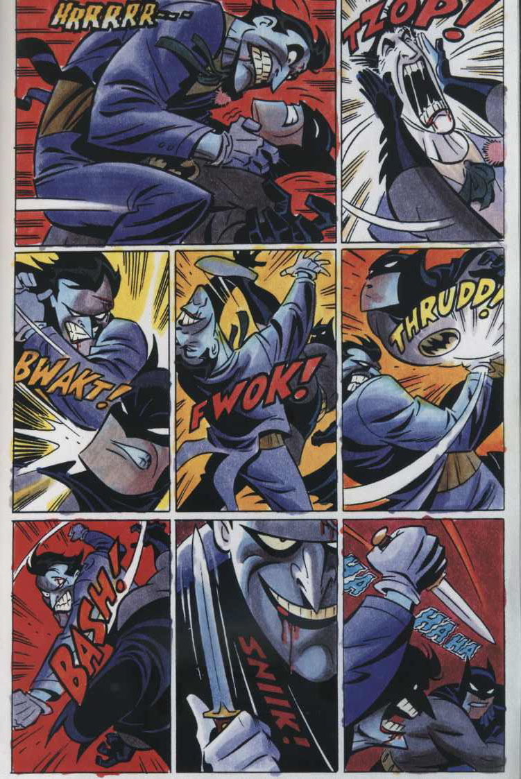
I recently picked up Darwyn Cooke‘s Spirit and Batman/The Spirit. Cooke specializes in nostalgia-inflected revivals of superheroes. His mini series New Frontier was an epic re-imagining of the DC Comics heroes. It was good fun–a light, affectionate version of Watchmen. I’m not sure it adds up to much more than beautifully drawn fan-fiction, which, minus the “beautifully drawn” is more or less what a lot of superhero comic books are these days. In Cooke’s case, the drawings really make the work. His style is the best version of the contemporary strain of comic book drawing that began with Bruce Timm‘s Batman animated series. Influenced by the design atmospherics of Alex Toth and, in a later generation, the smooth renderings of Steve Rude, it’s a cartoon language that embraces the dynamism inherent in superheroes while glossing over the violence and darkness that has been so prevalent in comics in the last 20 years or so. I like it for its elegance and it’s always-1920s look (even if that clean nostalgia feels extremely easy), but am slightly put off by how sexless and toothless it is. Toth had bite, especially in his pre-1970s work, with grit piled on top of his impeccable formalist sense, while Cooke smooths out all the rough edges, replacing all tension with a soft-focus nostalgia for an imagined past. But really, I buy most of Cooke releases, just to peek at the elegance of the drawing. With these two comics, though, I realized that problem is that appeal is, in fact, just the drawings.
The two Spirit comic books, both with Batman and without, are fun exercises, but feel soulless, like a storyboard more than a story. The Batman/Spirit emphasizes the humor in both characters, but does little with either, and The Spirit comic just demonstrates that the fun of that character was not super heroics, but rather the incidental, O’Henry-esque stories creator Will Eisner used the Spirit as an excuse to tell. But more interestingly, while the drawings are, as usual, slick and fun to look at, it turns out that Cooke isn’t a great comic book storyteller. Comic book storytelling requires pictures that flow into one another, and a sense of the page as a whole. Cooke, however, thinks more like the animator he once was, creating single isolated moments in sequence, as opposed to groups of pictures that work together. His panels are often crowded with information, weighing them down in a way that works against his smooth surfaces and slick drawing. It’s a curious problem–a good cartoonist who can’t quite frame a story. The similarly talented Steve Rude suffers from it too. I wonder if that level of polish simply works against the flow of comics. It’s over-determined, in a sense, preventing the motion of the story and keeping readers at a remove. Toth worked in a cartoon shorthand, always emphasizing both elegance and minimalism and allowing readers to enter the story with him. Cooke, in his eagerness to describe every bit of his nostalgic world, over-renders, weighing it down and leaving the rest of us to watch with disinterested curiosity.