Author Archive

Edward Tufte’s Presenting Data and Information Seminar


by

Sunday, March 21, 2010


Read Comments (11)

I went to the March 18 Edward Tufte seminar on “Presenting Data and Information” in New York. He tours around doing these one-day courses occasionally.  This latest tour continues into Pittsburgh (April 9) and Arlington, VA (April 12,13, and 14.)

Edward Tufte wrote and self-published four ridiculously beautiful books on information design: The Visual Display of Quantitative Information (the first and probably most famous one), Visual Explanations, Envisioning Information, and Beautiful Evidence. He’s also a sculptor and does a million other things. He was recently appointed by Obama to the American Recovery and Reinvestment Act’s Recovery Independent Advisory Panel and he spoke at the seminar about working on the design for the forthcoming website where you can see how the Recovery Act is using its funds.

What does this have to do with cartooning? Well, his books are primarily about presenting visual evidence as truthfully and clearly as possible. He told me that his two latest books, Envisioning Information and Beautiful Evidence, are the most relevant to cartoonists. Besides that, if you’re just into incredible books or self-publishing they’re definitely worth looking into.  He writes in the introduction to Beautiful Evidence:

My books are self-exemplifying: the objects themselves embody the ideas written about. This has come about, in part, because my work is blessedly free of clients, patronage, or employers.

At the seminar they give you a box with all four of his books and a pamphlet about his sculpture works. I don’t know who the majority of the people there were, but I suspect they were mostly business people who have to give a lot of presentations. There was a lot of talk (and jokes) about PowerPoint, which Tufte hates and said should be used only as a projector. But I got a lot out of it.

Here were some of the repeating themes:

(more…)

Labels: ,

Cleopatra (Sorta) Translated


by

Wednesday, March 17, 2010


Read Comments (4)

Tezuka’s Mushi Production produced a trilogy of adult animated features in the early seventies known as the “Animerama trilogy.” They’ve been floating around online for years untranslated until recently Cleopatra has been fansubbed and posted on YouTube. As the intro explains, it was based on a machine-made translation of the Chinese version and it didn’t make any sense and so they tried to subtitle it in a way that made sense even though they don’t know any Japanese. “Every attempt has been made to convey the original story as we assume it was intended. Though some artistic liberties have been taken to ensure the story makes some sort of fucking sense.” Pretty funny. It starts here.

Labels: , , , ,

Thirteen (Going on Eighteen) Notes


by

Wednesday, March 3, 2010


Read Comments (50)

This isn’t a review. These are just a few different notes/ideas after reading Drawn and Quarterly’s recent collection of John Stanley‘s Thirteen (Going on Eighteen).

1. These comics are like a ping-pong match. Val runs right, runs left, right, left, back and forth. The dialogue is like this too, like Seth’s repeated image of Val and Judy in silhouette facing-off. If Val’s excited, she grabs Judy by her arms, and then Judy will pull back the opposite way.

If there are six panels on a page, the average page could be seen as battle between the right column and the left: running, bouncing back and forth, with each panel having two characters screaming, grabbing, pulling each other back and forth. It’s all motion. It’s all high conflict, high energy. It reminds me of how kids always run towards something. They never walk. They scream, “Nuh-uh!” If they don’t like something they run in the opposite direction. It’s super entertaining.

A scene where Val’s stuck in a doorway during a rainstorm, waiting for anyone to come by with an umbrella (anyone but Charles!) would be a static scene in any other comic, but here the rain substitutes for the running zig-zag ping-pong motion. Stanley took a quiet scene and made it an energetic back-and-forth riot. I love how Val balls together her fists and leans back when she yells. “Oh, I can’t bear it! I can’t bear it!”

(more…)

Labels: , ,

Angoulême 2010 Highlights


by

Tuesday, February 2, 2010


Read Comments (9)


I apologize for the bullet/tweet-like nature of this post. It’s the only way I could get myself to write it. Frank will do a better Angoulême post later.


I was at Angoulême last year, but this was my first trip to the comics museum there. It had an exhibition of older comic originals with newer cartoonists covering the older page, plus the permanent exhibit: a timeline with a bunch of originals and books in glass cases and occasional videos. The original for this page of Johnny Craig’s “Split Personality” was especially moving. That second panel! Wobbly inky lips and cross-hatching! It’s like a pulpy Persona still.

Of course I loved seeing the Ware originals. They had a red pencil Quimby the Mouse page in the permanent collection. Ware’s exhibit at the Whitney Biennial was a life-changing experience for me. The under drawing, measuring… It’s shocking how raw the drawing is. His drawings look so clean when they’re shrunk and colored in print. In the originals they look so labored over, sometimes even crude. You can see the struggle, his thinking on the page. The Quimby original at Angoulême was such an object; the cut zipatone, the scale, the juxtaposition between the interior panels and the more illustrative background landscape. It was engaging by itself, beyond just being preparatory work for a print book.


The Cornelius Red Colored Elegy book is gorgeous. It has red spot color. All of the Cornelius books are unified—they’re clearly a line with a consistent sensibility across books—but you get the personality of the individual artist on the covers. It’s artist first, publisher second. Hayashi told me that they’ve recently released his short animations on DVD in Japan. You’d have to order them from amazon.co.jp and have a region-free dvd player to play them. He was sweet and humored my dumb questions. At festivals like this you find yourself jet-lagged in a taxi with Jose Munoz and you’re thinking, “Holy shit, what do I ask Jose Munoz? What do I ask Jose Munoz?!” and you end up just bugging him about random things. Try to milk those ten minutes for as much as you can.

The Manga Building had a One Piece exhibit, complete with cosplayers and prop sand dunes and palm trees. It was shoulder-to-shoulder packed. The whole thing had a fun energy. One Piece originals look exactly like what you’d think they would look like.

As you’ve probably heard, “dedications” (signings) are important in France, but Ruppert and Mulot have raised the bar. Ruppert did a drawing of me on the first page of the book, then turned to the last page and pulled out a pre-made stencil that marked different points. After placing dots on the last page using the stencil, he used a stamp to make a small frame at the center square dots. Then he pulled out an X-Acto knife and cut out the center of the frame and the outside areas. He glued the center of the frame to the inside back cover and then cut out the original drawing on the first page. He placed the first page portrait inside what he cut out, flipped it around and put the cut-out together, to hand me a small portrait in a paper standing frame as his “dedication.” Damn. In the States you get a drawing of the main character’s head with a word balloon saying, “Hi (your name here.)”


While I’ve acquired a lot of pulpy 60s and 70s Franco-Belgian comics, I know very little about them. 90% have cool covers and then you open it to see Caniff hackwork. But there’s some gold in that other 10%. I got some good Luc Orients last year, but the best thing I found at this Angoulême was this Michel Vaillant BD and some kind of Little Nemo homage book.


I wanted to get this Lucie Durbriano book last year and I didn’t. It annoyed me for a whole year until I went back and got it.


This woman in Germany, Ulli Lust, did a really dense, long comic about two girls on a road trip, drawn in pencil with a green spot color. It came out in German recently. Wish I could read it.


10 Euros for the complete Airtight Garage! I nabbed it before Frank!

Labels: , , , ,

Genie Junkie


by

Friday, January 22, 2010


Read Comment (1)

Friend of CC Robin McConnell has posted scans of an article about Gary Panter‘s design work for Genie Junkie, a Liquid Television short. I e-mailed Gary about it and he said “it was one more commercial job I did to survive.” He didn’t come up with the idea, or write the script or animate it. Still, it’s fun to check out. Here’s the short:

Labels: , ,

Government Comic PDF collection


by

Monday, December 28, 2009


Read Comments (2)


A collection of U.S. Government commissioned educational comics is now online here.
This news comes via Meathaus via Cartoon Brew.

Labels:

A Little on Makoto Aida


by

Friday, December 18, 2009


Read Comments (5)

I imagine Makoto Aida being a kid who wanted to draw manga like Suehiro Maruo, and then the kid grew up to become a gallery artist. I don’t think he’s that well known in American comics circles, maybe because his work is so explicitly about Japan or because comics is a very small part of what he does. Like a lot of contemporary artists, he works across mediums: sculptures, paintings, performances, videos, plans for housing projects, whatever. He painted a quick Fuji watercolor image over his BFA diploma and sold it for the price of the university entrance fee. (After selling it he said: “Though I am not supposed to say, art is so strange.”) And he doesn’t make dividing the works easy; his (beautiful) monograph Monument for Nothing catalogs his works by color, as opposed to chronologically or by medium or theme. All of the mostly blue works are grouped together, the mostly white works, etc. He’ll break up a series of works if the colors of the individual parts are different.


His main comics effort, Mutant Hanako, is actually a continuation of his “War Picture Returns” series of paintings. Here’s how Aida describes the story, from Monument for Nothing: “With the setting of the Pacific War, it is a mixture of elements of extreme nationalism, brutal erotic depiction, and airheaded adventurous action, which as a whole is closer to simply ridiculous absurdity than a crazy constructed air castle.” There’s a good plot summary of the book here: http://everything2.com/title/Mutant+Hanako


In his more cartoony work, he alternates between very immediate drawings (Mutant Hanako is an example of that, and his “Minna to Issho” series) sort of like Takashi Nemoto and heta-uma (he’s described heta-uma as “a style of illustration and graphic design which was hot [in the eighties]”), and more illustrative, detailed images that resemble Suehiro Maruo. I like how it’s common among mangaka to draw in such a similar way to other mangaka. It’s like the drawings are just about functioning to create a story. The story/storytelling is where the individual is. But, in Aida’s case, he’s somewhere between being a regular fan mangaka and a pop artist. He’s using something that he likes, as Takashi Murakami does. But Aida’s much warmer than Murakami. Aida’s more like underground comics. It’s all very hand-done.

A side note:
I have the Japanese printing of Mutant Hanako and there’s an English translation of the work in the back of it. That’s rare among manga and more common among art books, so I don’t know if it’s because they thought of it as an art book more, or it could possibly be in reference to the crazy American/Japanese relationships in the Mutant Hanako story. Anyway, I’d like to see more of these limited-audience manga be translated on separate pamphlets (by an English publisher/distributor) that would then be inserted into the original printing of the book, and then distributed online through the English publisher. Obviously it isn’t as ideal as a fully translated new book, but beggars can’t be choosers when it comes to manga translations with such a small potential audience.

Labels: , , ,

Shoujo Gateway Book: X-Day


by

Thursday, November 26, 2009


Read Comments (7)


Whenever someone asks me a good shoujo book to start with, I always recommend X-Day by Setona Mizushiro. Here’s why:

1. The layouts are relatively comprehensible/normal for people new to the shoujo collage-y reading. It’s always clear where you’re supposed to read next. It’s always clear where you are in a scene; but it doesn’t sacrifice any of the enjoyable, airy reading of most shojo comics. Everything flows horizontally—across the pages like a scroll—as opposed to the top to bottom, top to bottom feeling of most comics. This is how a lot of shoujo are, but if you’re new to it and start reading Clamp’s X/1999 it looks pretty fucking confusing. “What’s going on? Why are there birds flying around indoors? Ha ha.” X-Day is clearer. X-Day also doesn’t have all of the flower pattern stuff that seems to turn people off. Personally, I like all the “flower patterns = love” stuff; it’s high school; it’s pop. Blankets is secretly a shoujo comic, I’m just not sure it knows it. If you aren’t into melodrama and “flower patterns = love,” you probably aren’t going to want to read most shoujo anyway. Your loss.


2. It’s short. It can be intimidating if you want to start reading shoujo and it’s a twenty-volume, thousands-of-pages investment; even when it takes ten minutes to read a volume and public libraries are ridiculously well-stocked in shoujo (kids read them; libraries want kids to read.) Anyway, X-Day is only two volumes long. It’s a low-level commitment. Both volumes are probably sitting in a “five-dollar box” at the comic shop.


3. It’s good. Rika, a senior former track star, stumbles upon an online chat room where she meets two other students and a teacher who are all frustrated with the school and their lives. Rika’s ex-boyfriend is now dating her best friend. An injury made it so she can’t play track anymore. They all plot to blow the school up—that’s the titular “X-day.” I think it’s an accurate depiction of high school life. All of the characters are plagued by feelings of isolation: “I’m smiling and … acting like everything is normal.” None of the characters understand why the other characters would also feel the way they feel about the school. Conversations move quickly for a page and a half and then a moment is frozen and broken down. After talking to her ex-boyfriend, the panels are divided into quiet moments where Rika just lowers her head. Rika walks down the school hallways in large panels, repeating, “it doesn’t matter… it doesn’t matter.” After one character says, “At least I … like you,” it’s repeated over and over. It’s all an internal landscape. “What kind of girl … am I?” It can be intensely moving or a laugh riot depending on what you bring to the book. Either way, it’s entertaining. Give it a chance.

Labels: , ,

Black Line Vs. Color: Odilon Redon Weighs In


by

Saturday, November 14, 2009


Read Comments (10)

Odilon Redon:

“Black is the most essential of all colors. Above all, if I may say so, it draws its excitement and vitality from deep and secret sources of health… One must admire black. Nothing can debauch it. It does not please the eyes and awakens no sensuality. It is an agent of the spirit far more than the fine color of the palette or the prism. Thus a good lithograph is more likely to be appreciated in a serious country, where inclement nature compels man to remain confined to his home, cultivating his own thoughts, that is the say in the countries of the north rather than those of the south, where the sun draws us outside ourselves and delights us. Lithography enjoys little esteem in France, except when it has been cheapened by the addition of color, which produces a different result, destroying its specific qualities so that it comes to resemble a cheap colored print.

From The Graphic Works of Odilon Redon (Dover Publications, 1969) but I got it from Artists’ Books in the Modern Era 1870-2000 (Fine Arts Museums of San Francisco, 2002)

Labels: , ,

Teach House Styles


by

Thursday, November 5, 2009


Read Comments (61)


I studied cartooning at SVA and recently visited CCS, and so how to teach comics has been fluttering around in my mind for a while. What follows is a suggestion of how to run a Cartooning BFA or MFA course, just a potential direction that I think would be worth considering…

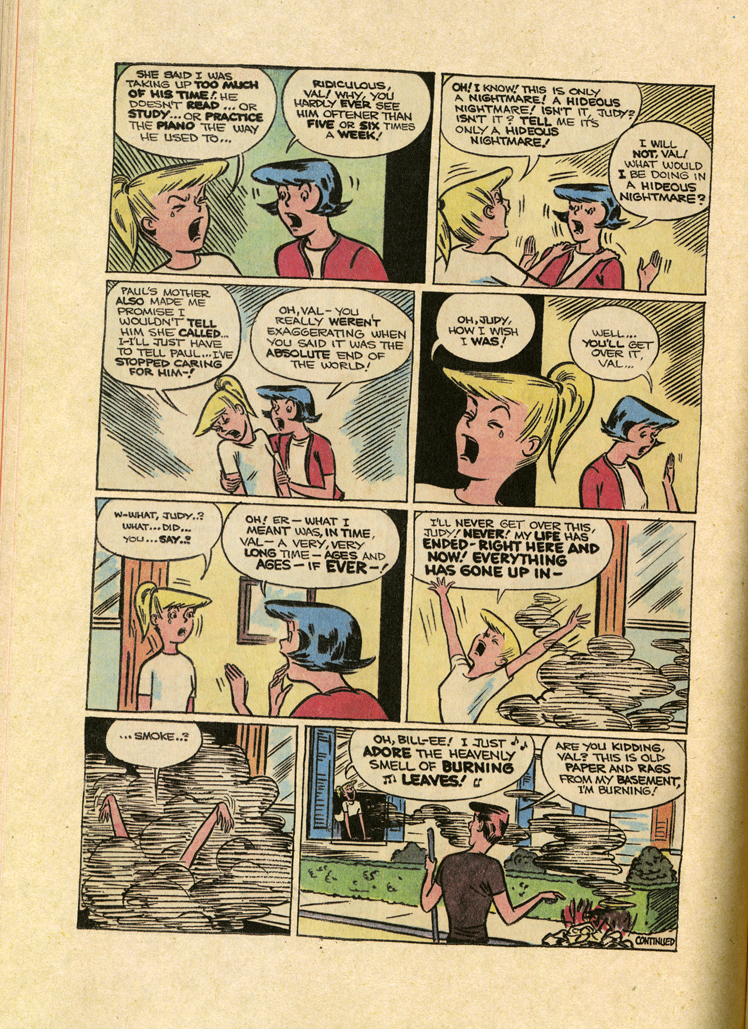
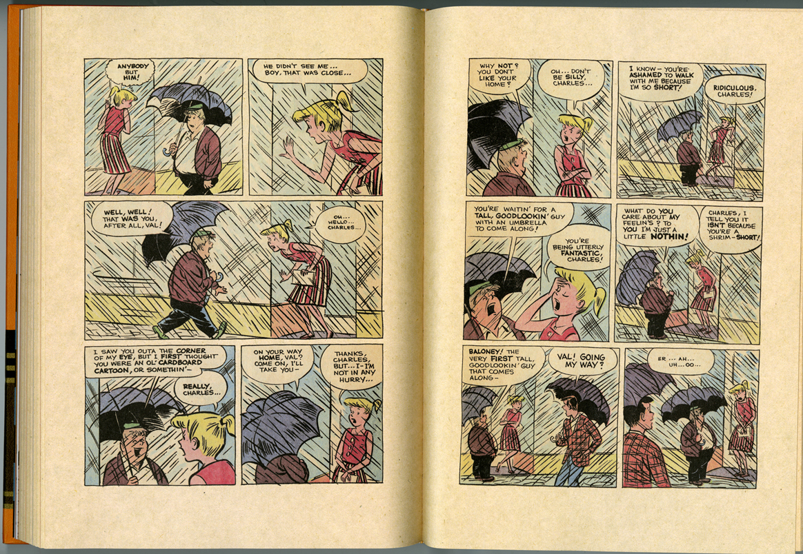
Instead of hiring teachers based on their achievements (and many of the current teachers are geniuses, no doubt about it), hire people who previously worked for many years in a now-defunct house style. Someone who drew Archie for years and is now selling their originals at Comic Con? Hire them. Did they draw Hanna-Barbera comics for years? Hire them. Did they ghost draw a daily comic? Hire them. Look for people who knew exactly how to execute a project on a regular basis and know, completely, the ins and outs of that particular assignment. They know everything about how that unique (now outdated) comic job should be done. They lived it.


The courses would be titled their house style—Archie, Hanna-Barbera—or I also think it’d be possible to get someone who has an expert knowledge of something like Little Lulu or Nancy or Astro Boy comics. There would be no courses devoted to “tools,” no penciling or inking classes. People can learn that elsewhere, like in their foundation year drawing classes. When that separation of responsibilities is brought into the cartooning class it’s usually based on an American production model that leads to people struggling with a tool for a whole year when they’re naturally suited to something else. The house style comic courses would require all of the students to draw everything with the same tools: whatever students write with naturally in non-art classes, probably just a ballpoint pen and paper. Everything tool-wise is nuts-and-bolts, no weird “try a Conté crayon” moments or “how to use a rapidograph” lessons. That’s for other classes.

The entire year-long class taught by these teachers would be based solely on teaching their house style. This would do a number of things:

The critiques would actually make sense. The teacher knows exactly how these stories are drawn, paced, structured, etc. Most of the cartooning class critiques I’ve been in are totally scattered, surreal happenings where the teachers are alternating between talking about character design, inking, storytelling, whatever. All of the students have different goals, and they’re often showing four pages of a long project out of context. Believe me: Usually nobody knows what the hell is going on. Everyone having the same goal (example: to tell an Archie story) would level the playing field. The teacher would know what they need to do to make it fit the assignment, how the characters behave, and the students would, over the school year, slowly hone in on the target, critique after critique.

Personal style and originality would be put on hold. In our current cult of originality, the pressure is to have a personal style as soon as possible, and the classroom environments often have this mentality as well. Everyone is freaking out: “What’s my style? What’s my thing?” It’s too much too fast. This race for originality has, over the years, spread from that future-goal timeline to just after college to (now) inside college itself. A safety zone no longer exists. For the most part, hardly anyone is hiring newbies fresh out of college to draw in a house style and then expect them to grow out of it. If these classes are explicitly devoted to learning a specific form, the anxiety for uniqueness would disappear and everyone would breathe out and look at their comics. The college would be the safety zone and after they graduate they’d start doing their own thing.

The more outdated and inapplicable the house style is, the better. They only have the understanding; they’re not being bred for a specific job that currently exists.

These would be year-long courses, so students would devote a substantial amount of time figuring out these comics. Most cartooning courses are extremely rushed-through. That’s understandable, since if you’re trying to teach a general Cartooning course, there’s probably a lot to cover! But these wouldn’t be general Cartooning courses- they’re very specific. And focusing on a specific world of comics for a whole year, I think, would offer more than week-long (one class) samplings of different worlds.

Finally, and maybe this goes without saying, I think there’s a lot to learn from digesting these house styles I’ve suggested. Regardless of what kind of comics you’d want to do later on, it’s probably going to involve some of the same elements that comprise these house styles.

This is all based on the assumption that the students are there (and pay to be there) to learn something, and the teachers exist (and are paid) to try to teach the students things. If they don’t believe that cartooning can be taught, then they aren’t involved in this exchange.

Students will probably hate this plan because they’ll want to work on their own comics. They’ll be pissed off for Sophomore Year, start to do their own thing through/inside a house style Junior Year, and then maybe Senior Year would be open. I donno. I’m still plotting this thing out…

Labels: