


Thirteen (Going on Eighteen) Notes
by Dash Shaw
Wednesday, March 3, 2010
 This isn’t a review. These are just a few different notes/ideas after reading Drawn and Quarterly’s recent collection of John Stanley‘s Thirteen (Going on Eighteen).
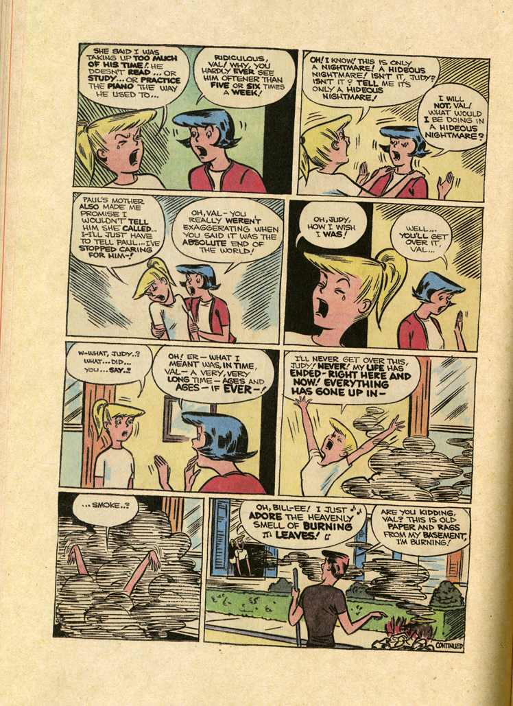
1. These comics are like a ping-pong match. Val runs right, runs left, right, left, back and forth. The dialogue is like this too, like Seth’s repeated image of Val and Judy in silhouette facing-off. If Val’s excited, she grabs Judy by her arms, and then Judy will pull back the opposite way.
If there are six panels on a page, the average page could be seen as battle between the right column and the left: running, bouncing back and forth, with each panel having two characters screaming, grabbing, pulling each other back and forth. It’s all motion. It’s all high conflict, high energy. It reminds me of how kids always run towards something. They never walk. They scream, “Nuh-uh!” If they don’t like something they run in the opposite direction. It’s super entertaining.
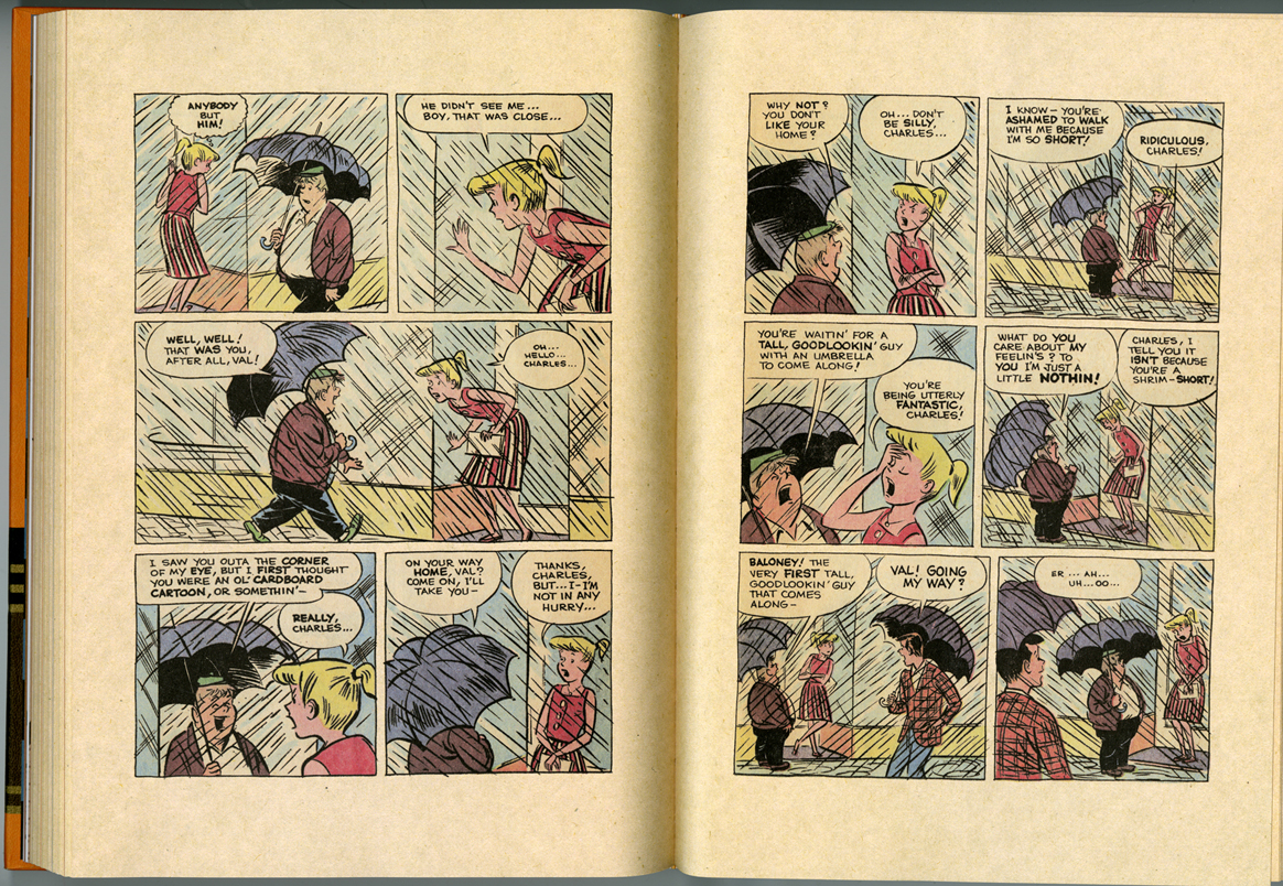
A scene where Val’s stuck in a doorway during a rainstorm, waiting for anyone to come by with an umbrella (anyone but Charles!) would be a static scene in any other comic, but here the rain substitutes for the running zig-zag ping-pong motion. Stanley took a quiet scene and made it an energetic back-and-forth riot. I love how Val balls together her fists and leans back when she yells. “Oh, I can’t bear it! I can’t bear it!”

2. This same back-and-forth conflict carries over to my feelings about Seth’s design. It goes like this:
Seth’s an amazing designer. Like his Peanuts reprints design, this is undeniably a gorgeous book.
That’s true. But his Peanuts, in my mind, is exactly that: Seth’s Peanuts. It’s Seth’s take—his graphic interpretation of the material. That’s great. Peanuts has existed in so many different forms over so many years. It’s refreshing to see Seth’s Peanuts, or Chip Kidd’s Peanuts. These different designers are providing their interpretation of the series. They’re continuing a conversation that existed before them and will go on after them. Everybody knew Peanuts before they saw Seth and Kidd’s books. But this Thirteen (Going on Eighteen) project is different. Seth is introducing it to people in the context/design that he’s created.
And isn’t that great? I mean, Seth’s championed this book and probably pushed this project through Drawn and Quarterly and now lots of kids and adults will read it! He’s taking everyone down to the Seth archives, pulling out the long boxes, and saying, “C’mere kids, isn’t this fun?”
But are kids reading this? I can’t imagine a thirteen year old picking up or holding this book. It looks like it’s strictly for older collector types. It’s a three-hundred-plus page long heavy hardcover book that costs forty bucks, with a text-only six-page introduction.
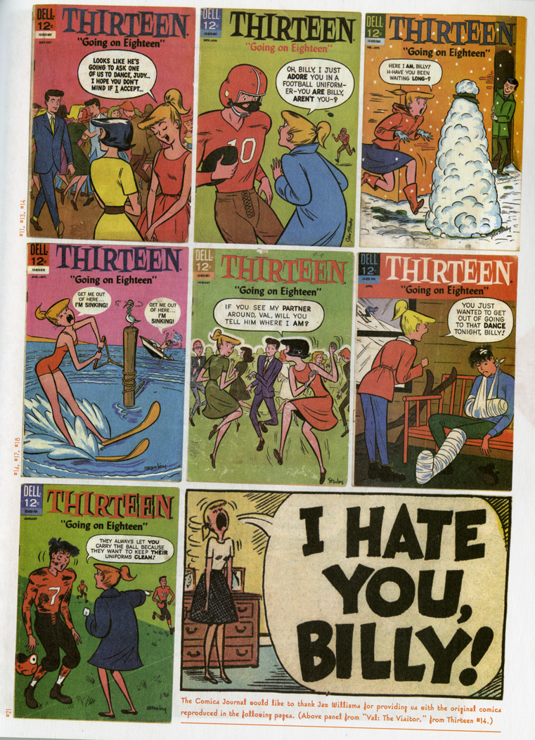
Also, a reader must make the commitment to this huge collection, knowing that they’re in for the whole ride if they want to observe the slow development across issues. It’s not a “best of” collection and the series takes a while to get in its groove. Seth wrote an intro to some Thirteen reprints in the Comics Journal (#272) in which he selected stories that he felt were a good introduction to the series and none of those stories are in this collection because they’re all from later in the series! That Comics Journal issue also had a fun page of reprinted covers. Basically, if someone asked me where to start with this series, I’d recommend they get TCJ #272 before buying the big hardcover collection of the first nine issues. But since this Drawn and Quarterly book is gorgeous and widely available, shouldn’t it be the best place to start?
Does it matter that kids read it? Would they read it in any package? What’s wrong with it just being a book for collector types? They want the complete thing from start to finish.
I donno. Nothing, I guess. Maybe only other cartoonists and collectors are interested… Maybe D&Q has a marketing plan that I don’t understand… but they’re so funny, so lively, I feel like lots of people, of all ages, would like this… It just seems, to me, that this sober packaging is not in the spirit of the energetic comics. But, then again, I’m sure Seth’s thought about this a lot more than I have. Maybe this is the best way to do it. Also, it’s possible I’m completely out of touch with the desire to have the complete series of something. I mean, do we need all of Dennis the Menace reprinted? Maybe this is totally my problem. But, also, in this case, I like it that all of Thirteen is being reprinted! I’m going to buy all of them! So, what am I doing complaining about something that I like?
 Hey wait! What do you know about what thirteen-year-old kids like?! They all love Seth! They want a classy book for their bookshelf!
Oh, I didn’t realize. I have no idea what I’m talking about. I have no contact with children. I thought they like books that look like shiny cereal boxes.
Where did this lowly opinion of children stem from? What would make you think this?
Well, it all started when… [etc.]
3. In screenwriting there’s a lot of talk about “the first scene with a character” and how important that is. “Be a fascist about the first scene with a character!” This book made me realize how rare it is in comics for a character to be completely realized on page one. Even for non-serialized comic books, usually the characters develop over the pages, slowly coming into focus, for the reader and the cartoonist (way slower for the cartoonist!). That’s why someone working on a long comic often has to go back to page one and redraw the characters; the character designs changed. Stanley will try a character out, see how they react to Judy and Val, and then ditch ‘em! The characters grew into their being over the pages, the work and time. Thirteen (Going on Eighteen) is like this: characters voices take their shape, and characters (Judy) literally take their shape by losing weight, shifting. Seth provides a theory for Judy’s weight loss in the introduction. Anyway, the point is that each story is self-contained but the larger narrative and characters are growing and taking form across the variations-on-a-theme short stories (which themselves vary among half-page strips, cover gags, two-part short stories, etc.) It’s psychotic: a variety of different variations of the same thing pushing a larger story across while it comes into focus. Aren’t comics weird?
Labels: John Stanley, reprints, Seth


The other thing that really bugs me about these recent reprints with the Seth design is that he for some reason puts his OWN art on the cover, not Stanley’s. It’s kind of an odd message to send.
Nicely put Dash — you voiced some of my own concerns regarding D&Q’s packaging of this material. Like you I’m immensely happy this stuff is coming out but wonder if it’s not being marketed to stringently to the collectors contingent.
I’ve been handing my daughter these books cause she’s such a bit Little Lulu fan (she really likes Melvin Monster) but would she have sought these out or grabbed them at the local comic shop if she had the chance? I dunno.
I think it’s such a small market that the only people you can really depend on are the older, serious comic/cartooning fans, so they get marketed to by default. But that’s who all those people who work at D&Q are too, so it’s hard to guess if it’s a strategy…Isn’t D&Q funded by Canadians’ taxes on maple syrup, or Bryan Adams Cd’s, or something anyway?
I think they get a certain percentage of Celine Dion’s t-shirt sales.
I doubt DQ gets any money for the Stanley stuff, since it isn’t a Canadian product. Canadian funding would only go towards Canadian books.
What Seth has said about the design is that he wants to mimic the slightly fancy Golden Books line, which has the same general design aesthetic for each book. That’s part of the whole “John Stanley Library” thing, creating this line of nice-looking books that will be on someone’s shelf. I like Seth’s design sense so it doesn’t bother me, but I can see how it would annoy some.
I actually think these books are designed to market pretty effectively to the PARENTS of kids who are into comics. They’re like sturdily packaged treasuries that stand a good chance of making it through to the kid’s adulthood intact. I think parents of the upper class/New Yorker ilk will see value in giving their kids books that look like these do as opposed to a cheaper Marvel digest or Little Lulu collection. And considering kids don’t even have the money for those kinds of comics, I think D&Q just figures they might as well market only to collectors because plenty of collectors are also parents.
(This might also be why Seth uses his own art on the covers — Stanley’s art is kind of itchy and idiosyncratic, but Seth’s art looks like the IDEA of old comics, especially as visualized by parents who are unfamiliar with the medium and just want something for their kid.)
If the idea with these peculiar Seth-designed covers is to market to collectors/parents who might presumably then pass the book on to their kids, it’s a pretty bizarre idea, I think. The kids/YA market is huge–nearly a 100 million in USD in sales in 2006, for example. Trying to sell books like this to the same people who buy the newest Dan Clowes book instead seems like maybe not the best route.
My daughter really dug the FCBD “Melvin Monster” freebie and I’m going to let her have at the Melvin hardcover, but I think most collector types aren’t really going to let their kids go at a “bookshelf book” like these D&Q volumes. As a cartoonist I can appreciate a lot of the craft elements of Stanley’s work, but ultimately these are kids’ comics–GOOD kids comics, but comics nonetheless and, I feel, should be packaged as such in order to best reach their true audience.
Unlike the Chip Kidd book on Schulz as an art book (which is what it calls itself), as opposed to a scrapbook, I have no real problem with the D&Q book collections of Stanley’s work.
The front cover of a book is an appropriate place for a designer to employ his trade, and frankly I couldn’t care less about a cover in most instances. It’s what’s inside that I’m interested in. The cover is a billboard.
My daughter (age 10) is perhaps the worlds biggest Stanley fan. The book arrived today, and I laid it on her pillow. She arrived home from school, and spent the entire evening reading the book front to back, she wouldn’t put it down, and had no interest in any of her usual activities.
She had no comment on the cover, I doubt she even saw it once she opened the book.
Why can’t Seth design an affordable softcover for once?
Have you priced cigarettes and vintage suits lately?
My main gripe with Seth’s design (and there are many, unfortunately) is that it doesn’t reflect the material within one whit. Indeed, the type and illustrations evoke, as Matt Seneca states, the idea of what old comics look like, but it’s an evocation at least 20 years out of date. Seth’s aesthetic is rooted in a time between the wars, having nothing to do with Stanley’s work whatsoever. I’m all for consistency in design for related projects– I just wish the designer would take the source material into account. At least in the Peanuts books, the supplementary illustrations (endpapers and spot illos) are derived from Schulz’ drawings.
I love Stanley and wish I could buy these works, but I don’t want them in my house. I’ll settle for keeping the originals.
I believe Matt is right on the mark when he suggests that, with the John Stanley Library books, D&Q have decided to market directly to the adult collector’s market and, as a ripple effect, the children of those collectors. They probably reach more children, indepentantly of their parents, through the floppy sampler of the Stanley comics on FCBD.
That’s not to say they aren’t great kids comics. They are, and I’d happily give them to any child mature enough to understand them. They’re lovely and charming and creatively punchy, but except for NANCY, they don’t have the pedigree and history of LITTLE LULU. But the line is the John Stanley Library, not D&Q’s line of comics for kids. How many 8 -10 year-olds do you know who follow the creator of a comic?
I think the same could be said for the MOOMIN collection in the North American market. The books are gorgeous, but probably off-putting to an average child. They are large hardcovers printed on beige paper, in black and white. I consulted on library catalogues for 5 years as head of The Beguiling’s library department, and I can tell you for certain that the majority of young readers HATE large hardcovers (and black and white comics that aren’t manga), at least in North America, simply because they can’t read the shit out of it and toss it in their bag when they’re done. D&Q’s MOOMIN books are, essentially, there for the adult reader who cherished the series as a child and wants to pass that love along their own children.
Anyway, just some thoughts.
While I have no inside knowledge of D&Q’s financial situation, it’s entirely possible that they receive Canadian government funding. There’s no absolute requirement that art be Canadian in origin in order to be funded, though the Canada Council for the Arts certainly has a mandate to support Canadian artists first and foremost.
On the subject of Seth’s books design, I have to count myself as a detractor. His Peanuts designs, in particular, are among the worst thought-out book designs I’ve ever seen. He’s putting his own, very distinct stamp on the book, and in the process, reflecting only one very specific side of Peanuts, while ignoring all the others. His John Stanley covers come a bit closer to capturing the diverse feelings you get from reading Stanley’s work, but at the same time, he’s left out any of Stanley’s own art – at least the Peanuts designs have Schultz’s art on the cover.
The bottom line, though, is that we should all be thankful that D&Q is putting out these books, because if they weren’t, it’s likely that we wouldn’t have seen much Stanley in print any time soon. They’re doing great work.
As someone who wants these books for me, I’m fine with the fancy packaging. I can agree with the argument that these aren’t aimed at younger readers, and I can even agree that’s a fault, but it doesn’t affect my enjoyment of them. I love this series and I want it for my bookshelf. If my daughters like it, fine, they can read it too, but the book is mine. Mine, I tell you!
But I do wish they’d print the covers of the comics they’re reprinting. Gallery in the back, chapter breaks, whatever. A lot of those covers are good stuff, with fun gags.
If it’s reprinting the whole series, shouldn’t it have the covers, too?
kdb
I gotta say, I wish people would focus on what I think is a very insightful formal analysis by Dash, rather than ye ol’ publishing second guessing game. I trust that D&Q is doing the best for the material and they know more about the marketing of the children’s book market & the graphic novel market than anyone who has commented thus far. If someone has hard and fast numbers and wanted to do some reporting, then great. Until then it’s kinda message boardy, which is, well… I guess I should tune it out. Publishers are not infallible (hardly!), and everyone loves to toss around ideas, but… I suppose all this guesswork seems so arbitrary. A 300 page color softcover would not cost much less than a 300 page color hardcover. And, as we know, it’s not up to Seth to make cheap softcovers. That’s not his job. I happen to really enjoy the design as a design. It doesn’t need to be historically accurate or feature Stanley’s art. It just needs to be a compelling and respectful series design, which, for me, it is.
I agree with Kurt that the covers need to be included somewhere in these collections. because they do have great gags. My understanding is that they wanted the experience of one long series of stories rather than a collection of a series of comic books, but reprinting the covers in the back would still let the reader have that experience.
As someone who doesn’t have any of the Stanley originals, I am very happy to have these books in my house.
I don’t mind Seth’s design on Peanuts at all; in fact, I find it a useful corrective to many years worth of saccharine “happiness is a warm beagle” cover design and advertising.
Publishing a book devoted to an artist and not putting their drawing, their linework, their markmaking on an image based cover and instead mimicking them using a contemporary artist is, to use a Palin’ism, retarded.
and exceptionally arrogant.
Johnny Ryan should be designing all these strip reprints.
It’s not arrogant, Brian, get over it.
Marvel does the same thing with Kirby reprints. They have an Alex Ross cover or something.
For the life of me I can’t remember where, but in an interview published last year, Seth talked about his cover designs, and (if I recall correctly) basically admitted that he understood detractors’ problems with his work, but that it was impossible for him to design the covers in any other way but personally. In other words, to present the Seth version of Peanuts, or the Seth version of John Stanley, et cetera. And that publishers sought him out to create exactly that. I thought he was kind of admirably upfront about the issue.
I personally like both the Peanuts and Stanley cover designs, though I can understand why some don’t. Their arguments make sense, I just don’t feel nearly as strongly about the issues as the detractors do.
Anyway, most of all, I want to state my agreement with Dan: arguing about comic-book marketing strategies is a boring waste of time and energy, unless the people arguing actually know what they are talking about. I personally know next to nothing about marketing, and if you ever find me pontificating about a publisher’s strategies for attracting readers from any particular demographic, please give me a quick, hard kick to the kneecap.
Also, Melvin Monster rules.
Yeah Frank, If Marvel does it its totally ok.
Cause gosh, Alex Ross is so much better than Kirby.
I’ve never read a John Stanley comic in my life, or a Seth.
Oh and the next Storyville reprint gets a Todd Mcfarlane cover!
as for Dan and Tim, you guys post what, forty posts a week and than bitch when your readers choose what to argue about? We’re all just trying to slow you down cause your just So. Much. Smarter!
Jeez, sorry, Brynocki! I thought I was calling myself dumb… I don’t even remember you arguing about marketing, but maybe I missed it. I just don’t have a mind for business (and I believe the same is probably true about the vast majority of adults spending a lot of time thinking about comic books!), and was explaining why I wasn’t personally interested in, and wouldn’t be joining, that particular discussion. But no offense intended. Argue about whatever you want!
I’m not going anywhere near your argument with Frank…
On another topic: I forgot to say that I agree with everyone who wishes the covers were included in the John Stanley books. I think Tom Devlin might have explained the reasons for this somewhere, but I don’t remember where or what the explanation was. (Alex H., can you get on that, please?)
Nadel commanded me to come on here and write his scripted brash responses in my name when threads get boring. I’m not personally arguing about anything. i hear his voices in my robot head all day long!
I count the Dan pre scripted responses on my toes, all forty of them!!!
And why on earth did a man named Gregory Gallant make up a pen name like Seth?? To be the Everyman?
I apologize to Dash for blathering all over and below his fine post.
everyone, i’m sorry. I retire. so sorry.
oh i’m back! arguing about a cover IS arguing about marketing.
Well I think you can argue about a cover in more than one way. You can say, “I don’t like the way this cover looks,” or you can say, “I don’t think this cover will sell to kids.” The first statement is about aesthetics, and the second is about marketing.
Oh, and I wish I posted 40 times a week! I doubt either Dan or I did that much in the last six months!
I feel weird arguing with a robot cowboy.
I’d also prefer that the original covers be included in the book, and that the cover had art by Stanley. But one aspect in which Seth’s and D&Q’s presentation is superior to the original comics is that anyone who sees these books will know who the true author of these comics was: John Stanley. Something hardly obvious to those who only have access to the original comics. (I’ve known readers who believe that “Marge” wrote and drew all those wonderful Little Lulu stories). I’d take this into account before accusing Seth and the publisher for other perceived faults.
Dash, I enjoyed your comments about the back-and-forth in Stanley’s pages (and the zig-zagging rain observation was great). I was underwhelmed by the recent NANCY collection, but this book (which I expect to receive shortly) seems to be much better.
The interview Tim is talking about is from Comics Reporter last year.
Here’s (I believe) the excerpt Tim refers to:
SETH: That last part of the question — “What does Stanley bring out of you that maybe your other design assignments don’t?” That brings us to a real problem with me as a designer. The truth is, when I design something it really is too much about me. I’m responding to Stanley with the love of another artist. I’m trying to create a package for him that is a tribute to him. It’s not really how designers classically work. I think the best graphic designers try to remove themselves from the picture and create a package that is suited to the work being packaged. I don’t really think that way — I can’t keep myself out of the process. My designs end up having a bit too much of me still in the picture. It’s that way with Schulz, it’s that way with Stanley and it is certainly that way with Wright. I’m probably not a very good graphic designer for that reason.
http://www.comicsreporter.com/index.php/cr_sunday_interview_seth/
Thank you, Alex! That is it.
Does D&Q have an in-house designer(s) like FBI does? I’m not the biggest fan of Covey or Grano, but at least they vary their styles project-to-project (even if the results don’t always necessarily suit each book) and they both seem smart enough to use art from the actual books instead of their own drawings. Would it be easier and/or cheaper to have an in-house designer than to farm the work out to Seth or Tomine or wheoever (I ask because I honestly wouldn’t know)? Clearly all the D&Q reprints are designed by artists who admire the original work.
I think’s Frank’s Marvel example is poor because, gosh, those DC Kirby slabs appear to have Kirby art on the cover (though obviously recolored)… but then DC’s reprints look better all around than marvel’s do.
Tim,
I think Tom’s response was here, but it has been removed per his request (but paraphrased in the body of the post).
http://stanleystories.blogspot.com/2009/06/jeet-heer-responds-re-d-qs-melvin.html
You can still see my unvarnished opinion in the comments there.
Alex, you are the king of the internet detectives.
C’mon, there’s nothing inherently wrong with discussing/arguing over marketing, even if many opinions are ill-informed or inexpert. Many comics critics, for example, feel free to second-guess an artist’s decisions, and yet have no firsthand experience actually drawing a damn book themselves!
That said, there’s also nothing wrong with steering your commenters back on topic. Just do it with respect, men!
clearly D&Q must have been up all night pacing the floors debating the merits of Seth’s design that they forgot to give a second glance at the price on the back before sending it to the printers. check it out. it’s supposed to be 39.99 but they printed 24.99,most shops i’ve been to have had to sticker it themselves. guess somebody goofed. or did they? perhaps it’s just a form of subversive marketing? maybe they want you to go to boarders or B&N or some corporate book zone staffed by people who don’t care or pay attention to comics. maybe Seth wants you to peel back that sticker before you bring it to the counter so that you can get a 15 dollar discount on the book. whose it marketed for now?
Dan, do you think there’s a moral component in a designer using their own art over the featured artist’s art?
PS — I like the book’s design. I like the Peanuts design, too. I don’t like all designs, so I imagine there people that don’t care for these designs. When I was 10 I liked Charles Addams and Edward Gorey and Peter Arno books more than I liked the Fonz and Walter Payton and Kelly Fischer combined (barely), so I imagine kids could cherish these books, too. Despite how much I like these books and their designs, I would buy facsimile copies of the original comics before I would any hardcover, the same way I buy albums in their original formatting/sequences over box sets and cascades of single downloads, so if someone would please devote the next 30 years of their life to building a non-profit comics publisher that published such things so that I could have them I’d greatly appreciate it. I will not hold applying for grants against you, and will in fact hold not applying for grants against you.
Looking at the Canadian cultural landscape in general, I think hosers (and yankee doodles alike) should be happy D & Q receives government funding as a shot in the arm to help produce product that is actually looked at and generally enjoyed (quibbles about this and that aside). Personally I do sometimes find Canada Council frustrating in some things they get behind ( a private joke of mine is that they should fire all the orchestral tuba players) but I wouldn’t wish that funding away. No way. D & Q is a good example of a funded organization putting money into something that actually has an audience.
Design issues aside, I just recently read Seth’s article on Stanley’s work in TCJ (Oct 2001). And he focuses so much on the stories he never really talks about what’s so interesting about Stanley’s art/breakdowns/layouts/etc. In just this brief post, Dash said more about it (love the idea of the left and right pulling on the pages) than Seth. Makes me more interested in reading the stories.
I’m going to make another stab at introducing a related thread of inquiry that I previously introduced into another discussion, hoping to get some takers…
I think the design issue taken up here, has valid points on each side, and as Jeet has indicated elsewhere– maybe there should be a draw, an agreement to disagree. Design issues aside, for me the real issue is one of cost, of the affordability of comics as they are affected by lavish design decisions. For isn’t that the ultimate factor in considering your audience– how much you make them pay for something? What ever happened to the economic alternative that comics once provided to an audience? At one time the form that comics took– the very means of production that brought them into existence, was based on economic feasibility, born of necessity rather than luxury. Earlier, I had provided the following example, as a response to a discussion concerning “Hotwire”:
“As I loved Kramers Ergot Number Seven, and thought it was beautifully curated and impeccably designed, I thought that it took the raw energy of the medium, and encased it in a high-priced container that felt a bit too fetishistic. I have long been a fan of Kramers along with Harkham’s great eye and enthusiasm, but Kramers Seven just felt like the wrong form of presentation to me, for work that was once available to all at a lower price, and something that you could either fold up, roll up, or just carry with you wherever you go. It isn’t just an issue of pricing and portability, but the fact that high-end editions betray the democratic origins of the comic book. I frankly yearn for the days of newsprint and staples and cheap printing, not from an aesthetic standpoint (for I am quite happy with the advancement of printing and biding quality), but from the view that the form was one of necessity rather than luxury. For unlike many other art or “quality-lit” markets, comics have traditionally been a form of alternative transgression/entertainment available to those without big bucks and specialized libraries. It should never be about the collectibility (something Marvel and DC has milked ad nauseum since the late 80’s early 90’s) but rather about the quality of the content itself to carry the day. Good content needn’t be over-produced or over-priced– I think we have enough of that to go around today. I believe that an anthology priced between $20 and $25 is a hell of a lot cheaper than most overpriced fetish collectibles out there. Could it be cheaper? Sure it could, but then again kids on bikes are not driving down to the newsstand to purchase the latest Hotwire and a bag of jerky. Instead it’s “grown-up” folk like us who (should) have employment. So in closing– I don’t think we can return to the 25 cent spinner rack variety (newsprint and all), but we certainly should not be heading toward the slipcased, foilstamped, sewn-in bookmark, heavy-duty stock variety. There must be a middle-ground in there somewhere, in which the packaging does not overtake the product.”
At what point does design trump the basic needs of the audience? Is the designer designing the packaging for him or herself, or for the audience? Is the transformation of a once economically-accessible medium such as comics, into a guilded high-priced package that caters to a “collector’s only” crowd or to the designers themselves, really an act of sharing? If the re-printing of comics in the form of well-produced collections is about being a love-letter from cartoonists to the source material, to be shared with others, does the love have to come like an expensive piece of jewelry? With consideration given to today’s economic climate, is it possible to collect and republish these works in a manner that takes into account the economic needs of the audience?
I am very curious to have designers, artists or publishers respond to this notion of how design affects cost which therefore affects accessibility for an audience. I cannot possibly be the only one who has questioned the rising cost of comics as it relates to more ambitious design schemes. Whereas there can be subjective arguments until everybody is blue in the face concerning what constitutes good design versus bad design/appropriate versus inappropriate, certainly the issue of comics economics must affect everyone concerned…?
@Tom Spurgeon: I hesitate to make sweeping statements, but I know you’ll call me a weeny if I don’t chime in here. So, no, I don’t think there’s a moral component in this case, or as it relates to any cover that clearly states who the artist is, no matter what the image is. To my mind, what Seth, Ware and Kidd have done is honest and right. These are artists who have pushed their teachers into the artistic and historical foreground. Some of that has to do with the package design of these books, which, whatever else you want to say, is all highly personal (that’s a good thing for me), utterly contemporary (yes, Seth’s combination of historical design tropes is indeed contemporary). I respect that, and I don’t think the art or the artist is being harmed in the slightest. None of the books under discussion obscure or harm or lie or even distort the subject. Quite the contrary: the last 10 years or so has been marked by artists taking the lead in illuminating new ideas and ways of seeing comics history. Certainly my own Art Out of Time would never have existed if I hadn’t been lead to that material by a number of artists.
No, morals enter into the picture, to my mind, when, oh, I don’t know, a certain “historian” distorts the truth about an artist, or includes an introduction by the artist’s former employer, knowing full well the damage done by that employer. Or it’s one estate executor trying to block a worthy historical project simply out of spite. Or it’s the continually shabby printing of some of our best artists, despite obviously available alternatives. It’s the pathetic “tributes” that only enforce idiot views. That is the stuff of discussions of morality. With the precise EXCEPTIONS of people like Seth, Ware, Tomine, Kidd, et al, the writing and publishing of comics history is often as shabby a business, and, ultimately as sad a business as the making of the comics themselves.
I just wondered, Dan, I wasn’t trying to push you on anything. I love all the blind items in paragraph #2.
The cost thing doesn’t seem like an issue to me. Some art costs a lot to experience. Try being a theater devotee and having to budget trips to New York or London or Prague to see certain works. It’s way more than an issue of KE7, let me assure you. My shuttle to the airport costs more than KE7. The extent of the current shift towards higher-end entry points on comics is in part a understandable, competitive reaction to nefarious actions on the part of other traditional market players, is partly a conscious choice made by artists, is partly in pursuit of a growing trend in favorable outcomes, the outcome is more than mitigated by how it’s facilitated the widespread availability of this material in libraries, and the trend itself is mitigated by making other material available for free on-line.
The idea of comparing the purchase of a comics anthology to taking a trip to Prague or New York seems a bit off to me. There is a relativity of economics when the experience is concerned. My point is that comics have always been available to those who cannot afford more expensive experiences. That is, until things began to change in the 1990’s when the issue of collectibility started to hit its stride. Along with collectibility, followed a design sensibility that played to that collectibility, and that led to price increases. I don’t necessarily subscribe to the notion that more expensive is better. Especially when it comes to an audience that cannot afford high-end “experiences.” Afterall, not everybody can book theatre trips to Prague and New York. I teach in Detroit, and I can tell you, economics is everything when it comes to the experience of art, music, literature, even going to a ballgame and yes– comics. If you don’t have the money, then you don’t get to experience what the people who have the money can. Period. So I’m sorry, but this is an issue. If not for you, than certainly for many others. At one time comics operated on the economic fringe and kids and adults without money could purchase the experience. This is changing.
Comparing the costs of KE7 to a trip to London so you can see Les Liaisons Dangereuses with Alan Rickman as Valmont is there only to point out that you sometimes don’t get to see all of the art. The retailer with the copy of KE7 doesn’t sound like my kind of retailer, but they wouldn’t let me look at the copies of Police Comics they were selling at Comic Carnival in 1985, either.
There are understandable reasons why some comics cost more; Dan gets into some of them. But not all comics cost more and in general it’s cheaper than ever to get your eye on comics I couldn’t have sniffed with $300 in my pocket 20 years ago. I like cheap comics, too, and I advocate for multiple jumping-on points, and I advocate against artificial price gouging through “speculation” that keeps comics out of kids hands, but I don’t think on balance it’s a big worry in the context of comics then and now or in comics vis-a-vis other art forms.
Maybe mine is just a tale of bitterness, rooted in youth– when I had to settle for the Marvel Tales reprints of Ditko’s Amazing Spider-Man, and my fancy-pants friends were able to purchase the first run of Marvel Masterworks– those golden-framed covers, the gold gilding, marble-patterned endpapers and re-coloring! Oh the flames of despair burn eternal.
@Ryan: As a publisher, I can tell you that with very rare exceptions good, thorough design does not cost more than no design at all. Hardcovers are sturdier than softcovers and cost not much more to produce. Good paper is expensive but necessary. Color is expensive and necessary. I know that to the layman it all seems rather extravagent, but as I’m sure anyone at D&Q or Fanta can tell you, no one wants to make these things any more expensive than they need to be. Base costs are fixed — there’s not much fat to cut, as far as I know. No one wants to lay out more capital than they need to in order to serve the material, the market, and the artist. Kramer’s is kind of the red herring in this argument, and that remains, to my mind, a perfectly legit aesthetic and financial decision. That size simply costs a ton — end of story. There are plenty of comics anthologies, like Hotwire, Mome, etc etc that are not that size, and thus more affordable.
Hell, look at the recent McSweeney’s Panorama — as with a couple previous issues long ago, McS lays out the costs for everyone to see. It makes for fascinating reading and would go far towards explaining what goes into the expensive business of print publishing.
Fair enough. I agree that McSweeney’s does a consistently great job– #13 to my mind was remarkable considering the cost. The Panorama is great. I guess my concern about Kramers (which I agree is a beautiful thing to behold) is placed alongside the origins of that publication as an alternative presentation of new material that was lowcost and accessible. It slowly transformed itself from an old VW Beetle into a Rolls Royce. Recently, when visiting a comic shop in Dearborn, Michigan, I overheard a young customer ask the store clerk about Kramers 7– the clerk said it was an anthology– $125. The kid (around 18) wanted to see it, the clerk said “no,” that it had to stay wrapped and out of reach. That kind of preciousness killed me, especially when I recall the early issues of Kramers and how divorced from preciousness they were. But you are right, in that this is a specific instance. I bring it up because I fear a trend in which high-priced editions trump availability. I might add, that I love the occasional newsprint edition that PictureBox puts out, and yes– I think Mome and Hotwire are very affordable considering the quality packed into those pages. But the numbers are going up for most publications. Probably unavoidable as the cost of everything else goes up. It is good to hear this from a publisher’s perspective, though. I find myself wondering about price as it relates to design.
Ohhhh, Spurgeon, I live in fear of you calling me a weeny. I should talk to my shrink about that. Blind items were merely my sad little tribute to the late, lamented “Spot On”, now perhaps operating solely in the Reynolds/Patton kitchen. I would like to run a CC gossip column with blind items related solely to comics publishing circa 1958 to 1970. Any takers?
Make sure to mention you wrote the word “shrink” five words away from the word “weeny.”