Posts Tagged ‘layouts’

Xaime’s Tiers – more grid talk


by

Sunday, November 7, 2010


Read Comments (9)

I just sat down and re-read thru the new Love and Rockets issue. Shame on you, True Believer, if you haven’t already dog-eared this one. Please, please order this one today and thank me for urging you to do so. As Mr. Heer has already pointed out on this site – Jaime Hernandez has outdone himself. I mean, I’m a cynical super fan at times who often believes he’s “seen it all” and then something like L ‘n R New Stories #3 comes out and just slays me. And like I said, if you haven’t read this one yet – shame on you. I’m talking to you in your pajamas in the front row. Go click around the internet or put some clothes on and hoof it down to ye olde comics shoppe and buy this one. Do it now!

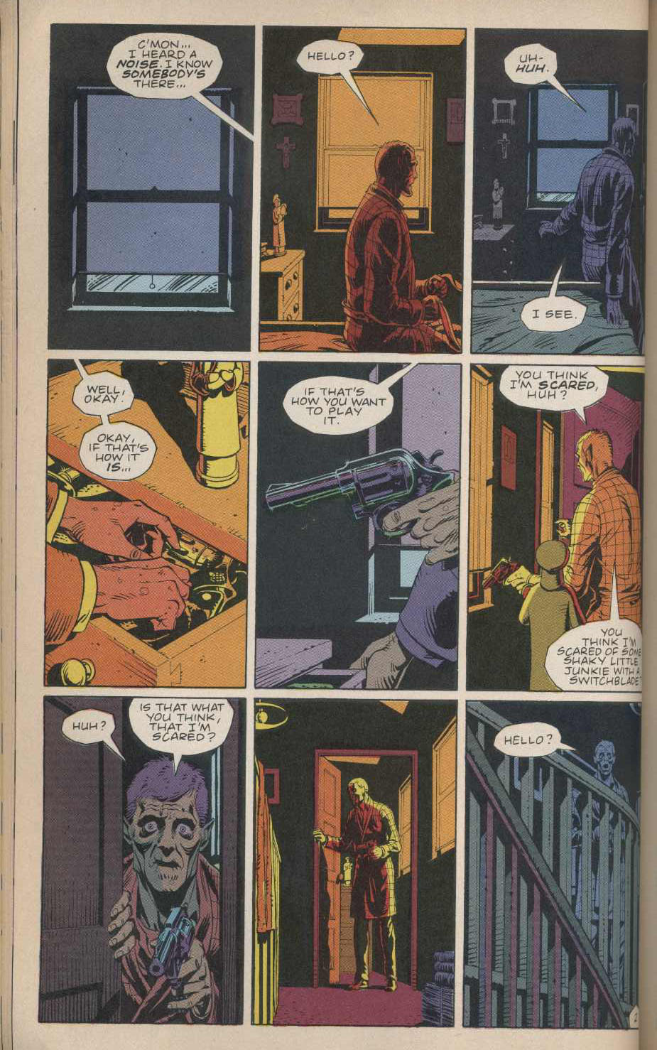
I’m struck by how Jaime lets the story dictate the layout and the pace. I’m gonna try and walk you through, so follow along with me… if you haven’t read the new issue, stop here. I may possibly ruin some plot points for you. Fair warning. (more…)

Labels: ,

THIS WEEK IN COMICS! (10/27/10 – Very Interesting)


by

Tuesday, October 26, 2010


Read Comments (6)

A few more 9-panel grids for you, coming out of Carol Swain’s 1996 long-form debut Invasion of the Mind Sappers. Swain tends to work mainly in short stories — many of them collected into last year’s fine Dark Horse hardcover Crossing the Empty Quarter and Other Stories — which means she sort of fades in and out of view in English-language comics. Still, assembling her various works, which would also include the 2004 solo book, Foodboy, and her 2009 collaboration with Bruce Paley, Giraffes in My Hair: A Rock ‘N’ Roll Life (and not her role as colorist on the notorious 1992 Peter Milligan/Brendan McCarthy project Skin), reveals an affinity for this simple, versatile layout.

(more…)

Labels: , ,

9-Panel Grids


by

Saturday, October 23, 2010


Read Comments (45)

IF 6 WAS 9

Gibbons

Let’s look at 9-panel grids in North American comics. When I think of the 9-panel grid I invariably see Steve Ditko’s Spider-Man page layouts in my mind. Then I see Watchmen. Both stuck to 9-panel grids for the most part. And I think the center panel – the panel that doesn’t exist in a 6-panel grid – is where some of the power comes from in these works.

If I flip randomly to a page of Watchmen and let my eyes scan the page, usually I look straight at the center – and often that center panel is representative of the whole page. It’s like an anchor. Also, the artist (Dave Gibbons) never gives up the center of the page when he uses a different layout. Never! He never has a center tier that has a vertical gutter in the direct center of the page. I really think this is part of Watchmen‘s visual power. When I flip through the book, my eyes just go from center of page to center of page and I feel more enveloped by the story and by the world created. (more…)

Labels: , , , , , ,

Class with Frank part 2


by

Saturday, October 16, 2010


Read Comments (10)

Yummy Fur #19


DOIN’ THE CHESTER
Howzitgoin’ CC faithful!? Good? Good. This week we are studying the evolution of Chester Brown’s grid layouts in Yummy Fur issues 19, 20, and 21. Seriously. What? You don’t have these comic books in your collection? What? How old are you? It’s okay. I know it’s hard to collect comics. But you gotta try. For me. You can have a better sense of the maker’s intent if you dig up the original issues. Track these comics down. They are essential reading. Yummy Fur #19 contains “Helder” and issue #20 contains “Showing Helder” both of which are collected in The Little Man from Drawn and Quarterly. We will also be looking at Yummy Fur #21 which contains the first chapter of The Playboy (originally called Disgust). FYI comparing Chet’s original comics with the eventual collection is a sport in and of itself. Things change and rearrange. (more…)

Labels: , ,

Comics Class with Frank


by

Saturday, October 9, 2010


Read Comments (21)

Welcome to CC’s weekend edition with yours truly, Frankie the Wop. This week I’m gonna walk you through my pickled brain. Below is something I wrote in my notebook. I’m obsessed with comic book layouts.

GIVING UP THE CENTER
I’m a big fan of the grid in comics. Meaning, I like to read comics that employ a fixed grid of some sort to sequence the panels. Grids in North American comics usually look like this:


(more…)

Labels:

From the Breaking News Department


by

Thursday, October 7, 2010


Read Comments (21)

From Sean Howe’s research files, an historical curiosity. First, a semi-famous page from X-Men.

From X-Men #57 (June 1969)

Specifying this very image, Les Daniels has written that “Neal Adams shattered comic book layout conventions with pages like this one.”

Now look at this Comet page drawn by Jack Cole for Pep, nearly three decades earlier: (more…)

Labels: , , ,