


Comics Class with Frank
by Frank Santoro
Saturday, October 9, 2010
Welcome to CC’s weekend edition with yours truly, Frankie the Wop. This week I’m gonna walk you through my pickled brain. Below is something I wrote in my notebook. I’m obsessed with comic book layouts.
GIVING UP THE CENTER
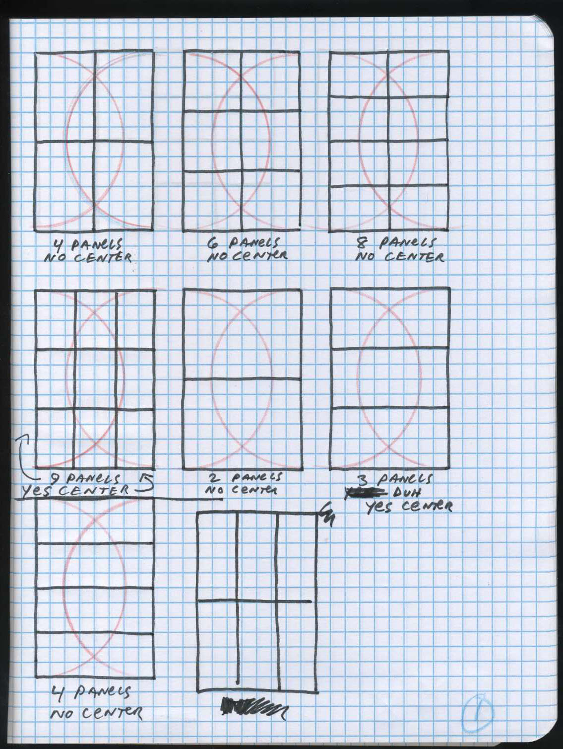
I’m a big fan of the grid in comics. Meaning, I like to read comics that employ a fixed grid of some sort to sequence the panels. Grids in North American comics usually look like this:
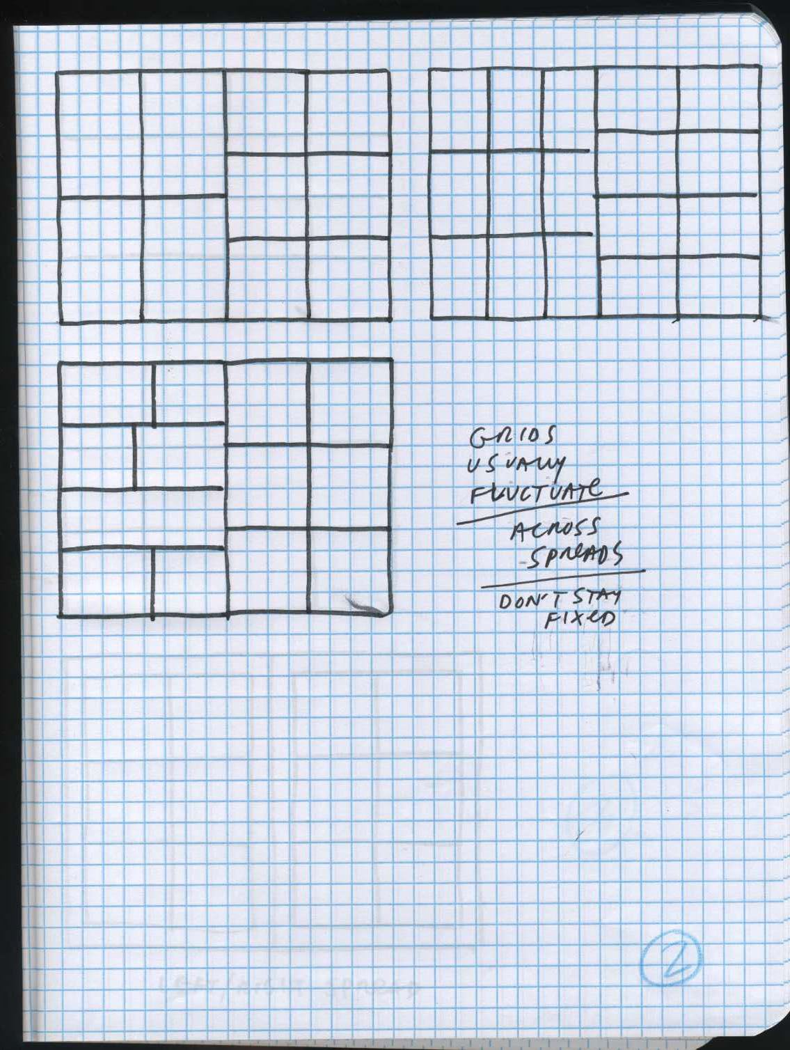
Also, most grids in comics fluctuate – the panel size may be uniform for a page, but often not for a spread. Or one side will have uniform sized panels and the other page of the spread will be different. Alot of times an artist will go in and out of using it when it feels appropriate:
The most common fixed grid is the six panel per page grid. This grid is really suitable for North American-size comic books. NA comics are taller and thinner than Japanese manga, and European BD (Bande Dessine) which are more like a magazine proportion. In manga and BD – you see more horizontal grids without a center vertical line. In manga, I think this is due in some part to the vertical Japanese writing and providing space on the left and right of the image – so the movie screen size panels work better to accommodate the text. The balloons do not stay necessarily on the top of the panel like alot of English language comics. (I know I’m generalizing, just go with it).
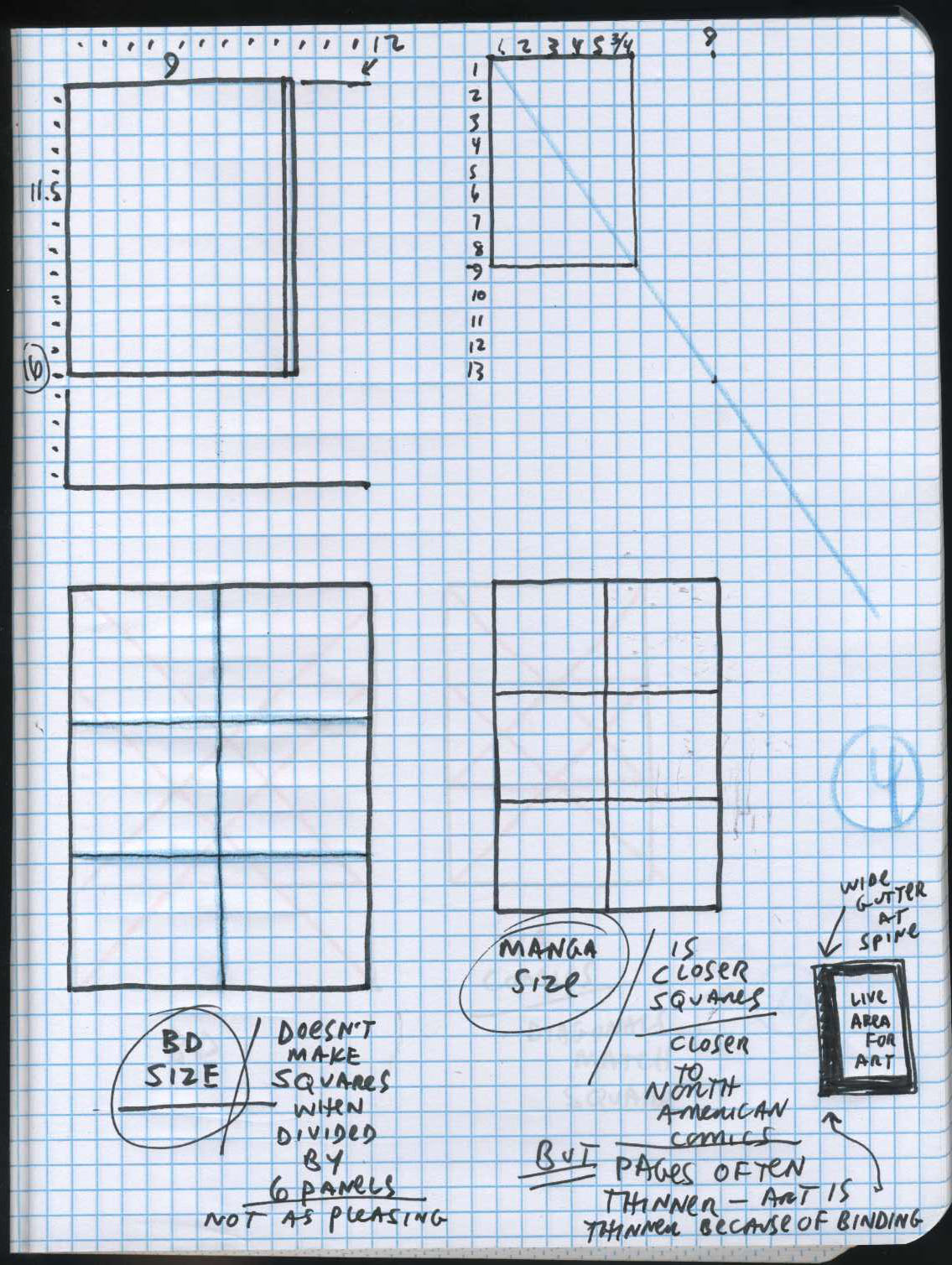
In B.D. you see alot of symmetrical tiers but not panels. Think Tintin. Also, I think the mag format doesn’t lend itself so much to grids. It’s too wide. Eight panels per page looks better but often that’s too many panels. It’s overwhelming.
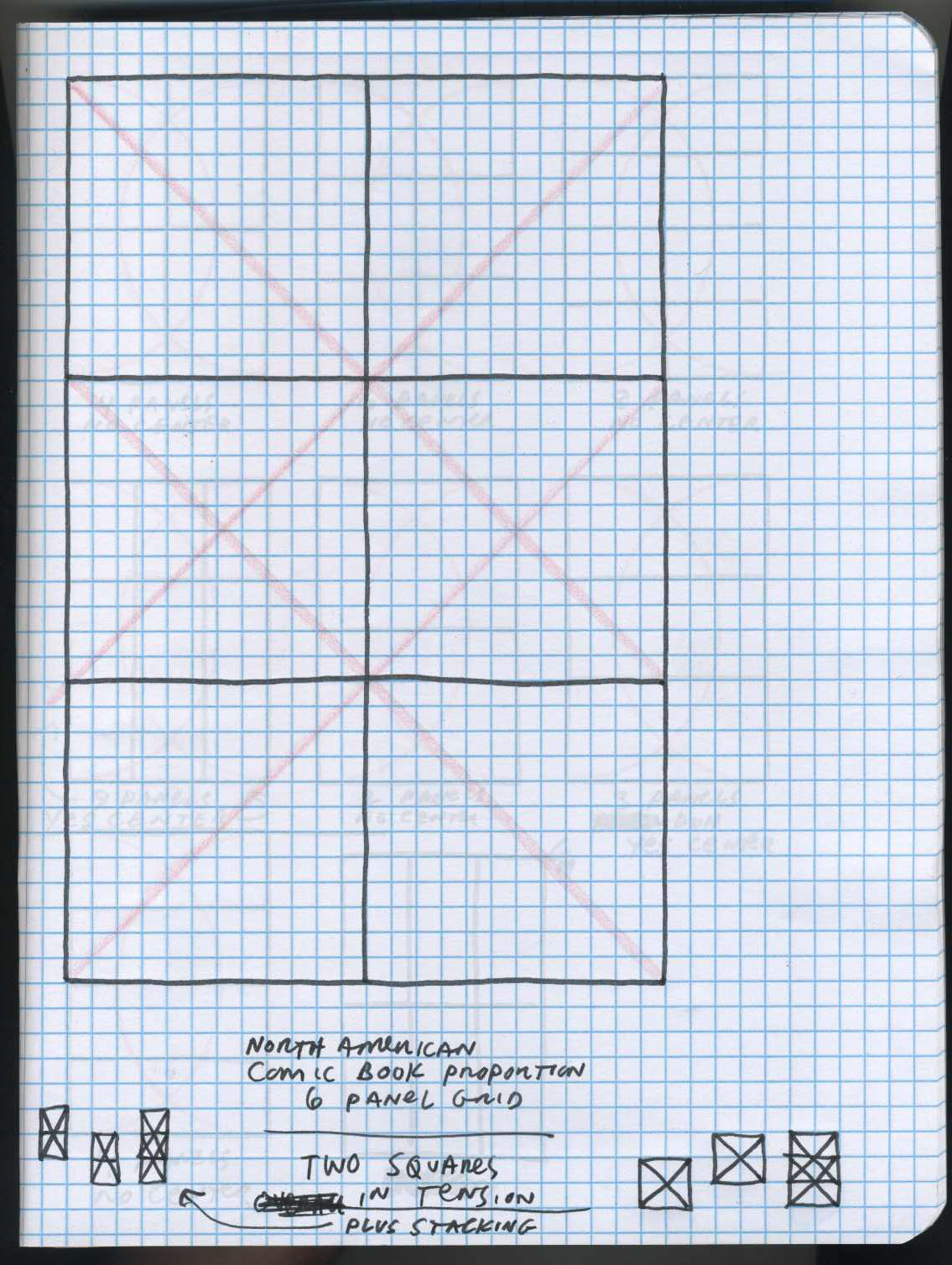
Essentially, the thinner North American format with a 6 panel grid is 2 squares in tension with each other. The top tier and the middle tier create a square of four panels. The bottom tier and the center tier create a square of four panels. The diagonal axis of the top and bottom squares are perfectly aligned with the horizontal and vertical axis of each square.
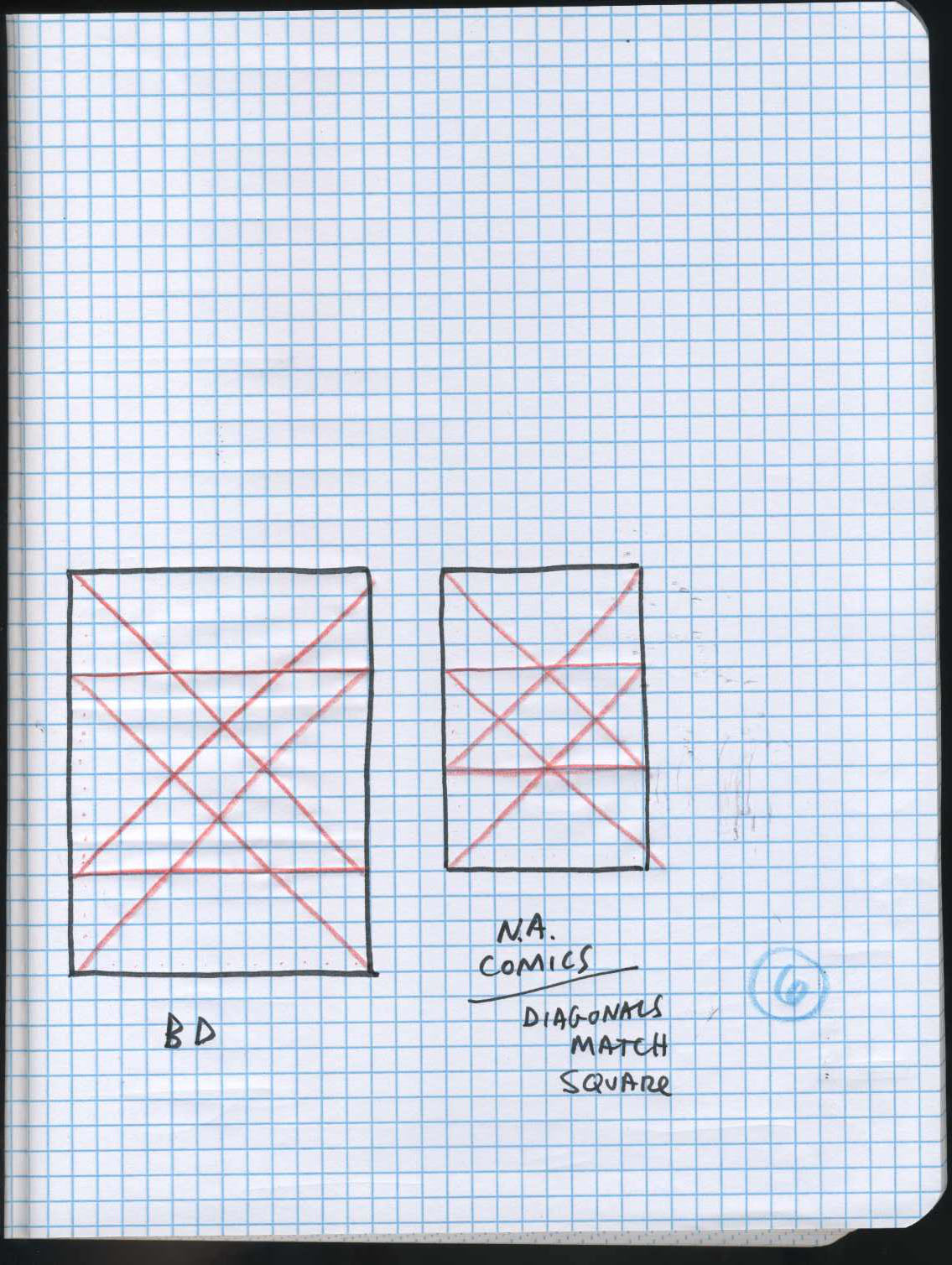
With the mag format (BD) the squares or panels are not even, so the stacking of 3 tiers with a center line creates tall rectangles and not squares. The effect is not as pleasing.
There are lot’s of variations – I’m generalizing for sure – but this is what I see – not so many fixed grids in BD and manga as in North American comics, and consequently most BD and manga do not give up the center as much as NA comics. The influence of manga in the last 20 years in NA comics is definitely changing the situation.
I employ the fixed grid often in my own work. but recently, I’ve been frustrated that using the fixed 6 panel grid takes away the center of the 6.75 x 10 inch NA comic book. I like the rhythm of the sequencing – but often, I dislike the fracturing of the page and the spread. I get around this by moving the readers eye about the page and spread by isolating certain panels and grouping others. It’s like a chess game. Pathways. The movement of a knight – the “L” shaped paths, two squares either forward, backward, left, or right and then left or right one square – is something I think about alot. Thinking ahead. Seeing the whole board at once. Simultaneity.
I’ve been painting single images for a month or so, and now, returning to the comics page, I find it kind of annoying. The center of a 6 panel grid is just a “II” of lines – a gutter – and I think “why should I give up that prime real estate”? In a single image the center is, of course, incredibly important. In the graphic design of any book, any newspaper – the center is of the utmost importance – it needs to be addressed somehow, some way.
And then I started noticing in a lot of comics that employ a grid, the center tier’s vertical line would be offset slightly.
I think a lot of cartoonists are consciously or unconsciously aware of “giving up the center” of the page and that’s where I often see a disruption of the fixed grid – this way of making it organic enough to accommodate a center focus. Often the center of the gridded page becomes a focus – an emblem of the page’s narrative – if the grid is adjusted because the cross-hairs of the grid lead the eye to the center.
NEXT WEEK: Chester Brown and Jack Kirby grids and how the center is just a (“II”) gutter of lines – and how the sequencing, the fracturing is key- it reads very differently than a page with a center focus. It’s like the flickering of a movie screen. No image takes precedence because there is no center focus of the page itself. The center is a gutter line, a boundary, not a resting place for the eye. If time can be measured by the shape of the panels then a fixed grid creates a sort of even film reel. The reader takes in the page all at once, I think, in a way that is more fluid than with “organic” layouts. There is a different rhythm. And it is tuned to the tension of the squares – the architecture of the page and format.
Also, next week (in theory) I’ll riff on 9 panel grids and Steve Ditko.
Labels: layouts


Not many things more fixed than a movie screen, and that works for most people.
I’m with you all the way.
All those grids and compass arcs got me thinking about Holy Numbers, and Sacred Geometry.
Even if you’re a pagan like me, there’s something at the core.
does the content ever dictate the number of panels or is it always made to fit into a handful of layouts? what i mean is, when i’m drawing page after page, I like there to be a rhythm to the page turn, like an event of sorts at the bottom right. not a cliff hanger of course, that’d be the fucking Da Vinci Code, but a comma, a full stop, some sort of beat, using either words or pictures. that dictates panel numbers for me. the importance of each panel will decide on it’s size and then i have the layout.
this is probably the ‘wrong’ way of doing it but it feels right for me. when it works.
Ollie, Hergé paid a lot of attention to the page turn as a punctuating device in the Tintin books. Often the page turn is a character entering a door, or leaving a scene, or it’s a beat of suspense before some action.
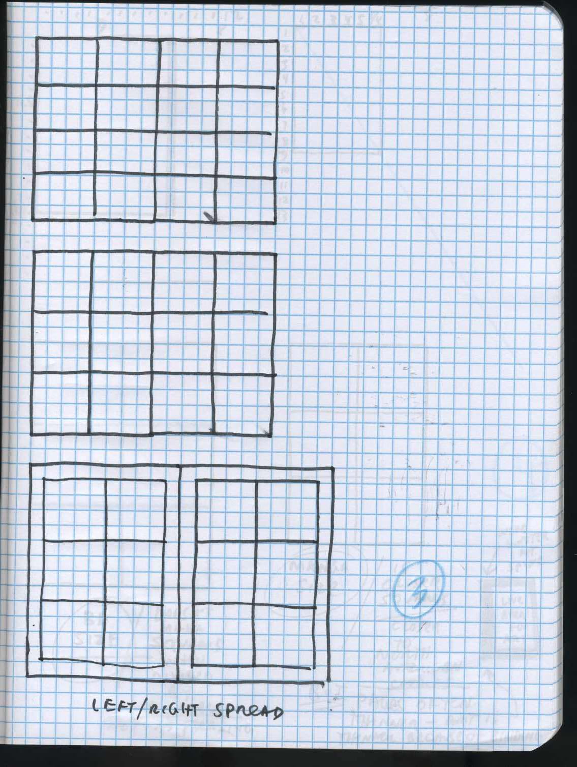
I always always always thumbnail left and right pages together ( to the extent that I number them the same) and I don’t think I ever break L/R symmetry with panels. I tend to work from the center outwards. I’m pretty obsessed with having a complete thought ( or at least a complete module) visible everytime the page is turned.
Anyone interested in grid methods in graphic design / layout might want to check out the following:
Khoi Vinh’s presentation Grids are Good:
http://www.subtraction.com/pics/0703/grids_are_good.pdf
Emil Ruder’s book Typographie:
http://www.designer-daily.com/book-review-typography-by-emil-ruder-1037
Josef Müller-Brockmann’s book Grid Systems in Graphic Design:
http://www.goodreads.com/book/show/350962.Grid_Systems_in_Graphic_Design
“The Grid” by Allen Hurlburt is helpful also.
Oh nice. Thanks, Frank! I’ll check that out.
Wow I can’t wait to dig into those links. Frank I have been thinking so much about graphic design lately, sometimes I get mad at you because you’ll bring up a topic that I’ve been thinking about a lot and then I’ll read one of your posts and it’s like my mind is wripped out of my head. This is one time I am extremely grateful though. I don’t think there is enough focus on grid systems and how typography effects the art on the page, Type and grids being two things graphic design is obsessed with. I always thought Manga used four panels because they are trying to tell the story as fast as they can. That is why it is possible for a business man to read a 400 page book in 20 minutes. Kirby is one of the few artists who can make a four panel grid interesting; by switching the readers focus to a different direction in each panel. Starts with the momentum going east, then north, then west then extreme foreshortening bring the action straight at us. Manga artists also realized how boring splitting the page into four equal parts could be, which is why they completely skewed each panel in a gonzo manner. I noticed a lot of american fans of Manga try to do the dynamic panel shapes as well load the page with content, and the two just drag the storytelling to a halt. Your interview on Inkstuds with the Image artists brought up how talented artists are using all the different influences to their benefit. This post is one of the reasons why I selected you as one of my current favorite writers on Tom Spurgeon’s Five For Friday’s best comic writers poll.
Wim Crouwel.
he got grid-mania. in the 50s.
proper modernist.
designed avant-garde theoretical typefaces.
legend.
http://go2.wordpress.com/?id=725X1342&site=tonypritchard.wordpress.com&url=http%3A%2F%2Ftonypritchard.wordpress.com%2Ftag%2Fwim-crouwel%2F&sref=http%3A%2F%2Fwebcache.googleusercontent.com%2Fsearch%3Fq%3Dcache%3A5iS-SdTszlMJ%3Atonypritchard.wordpress.com%2Ftag%2Fwim-crouwel%2F%2Bwim%2Bcrouwel%2Bgrid%26cd%3D7%26hl%3Den%26ct%3Dclnk%26gl%3Duk
http://www.thegridsystem.org/
Really valuable stuff, Frank, I’m looking forward to more.
on a (sort of) related note – has anyone got a recommended literature regarding 3-panel comic strip vs. 4-panel comic strip?
[…] Heat cartoonist Frank Santoro (he of those bitchin’ Strange Tales II Silver Surfer pages) is talkin’ grids — specifically, the grid panel layouts most frequently used in North American comics. […]
The main problem I have with American comics is that, very often, I’ll look at the layout of a single page, and can’t “read” anything from the pictures alone. Compared to Manga & BD, where the art supports the text, it’s the other way around. It’s not a matter of jumping to the middle part of the page that mostly concerns the average comic reader – it’s forming the images throughout the various panels in a manner that makes narrative sense.
I’ve found it far easier to read American comics on the computer when I only have to concentrate on one enlarged panel at a time, and not be distracted by an image or text on the panels below or besides them. This is a problem that still plagues the American comics industry. Not to mention that oftentimes in mature series such as Fables, in order to make sure every page has a particular “beat”, everything relevant to a certain amount of characters is limited and cut off at the last panel, and then cuts away to another group of characters.
I’ve found that BDs that split their comics with 4 rows (actually two plates taped together) is easier to read than the modern comics page with 3 rows, which oftentimes tries to cram too much information together. The difference is, even at reduced size, I can still tell what’s going on in an untranslated BD. Until American comics can master the underappreciated form of pantomime, they’ll be solely lagging behind other countries that don’t rely on long speeches or narrative prose to tell their stories.
One of the best masters of silent storytelling is Quino, who’ve I’ve talked about here:
http://sundaycomicsdebt.blogspot.com/2010/08/quino.html
People often say that the reason comics took of in Japan was because they had Osamu Tezuka, and other countries didn’t. I stipulate that the reason silent comics were respected was because other countries were exposed to Quino, and the US wasn’t.
“Until American comics can master the underappreciated form of pantomime, they’ll be solely lagging behind other countries that don’t rely on long speeches or narrative prose to tell their stories.”
I don’t see long speeches or narrative prose as necessarily a problem. I would if I considered movies a thorough and exhaustive analogy to comics, but I don’t. Some comic are cinematic; some aren’t. Some pantomime comics are terrific; some wordy comics are terrific.
“I’ve found it far easier to read American comics on the computer when I only have to concentrate on one enlarged panel at a time, and not be distracted by an image or text on the panels below or besides them. This is a problem that still plagues the American comics industry.”
For those of us who happen to like those distractions, and regard them as constitutive of the comics reading experience, this problem is a pleasure. 🙂
Some comments by Don Martin culled from an interview in Cartoonist Profiles.
” I sketch each picture on a separate sheet of bond paper, so when you turn over a page each picture is like a surprise. That is a good way to see if the sequence works.
I can decide if I need to add panels, or eliminate some. Usually when I sketch out a six panel gag I draw up three times that amount, because I’m trying out different things. If I drew all the panels on one page as they appear in a magazine, I would have to cross things out. The way I work allows me to keep on changing different things. Sometimes you have a very fast sequence using quick gestures. Then the next panel could take place five minutes later. The panel after that could be an hour later, and the next one could be the very next move the character makes. You have to work your timing so that it can be read. That is you should be able to read the cartoon visually.
I get good timing between panels by showing only the necessary actions, and eliminating things which are not important.”
I see where you’re coming from, but you may be overlooking how comics are experienced by the reader especially after the story begins and the eyes are used to the layout and visual narrative approach the artist is using.
While pages should be designed as whole images, they’re read as single panels in order. The panel gutters become a form of visual punctuation and are noticed about as much.
Any argument for controlling the visual impact of the center of the whole page is tangential to the real matter of telling the story to the best of your ability within the visual context of the page.
I don’t know that it’s fair using Big John as an example either, since he’s really following the tier tradition established in the newspaper strips and people aren’t laying pages out like that anymore. A better example might be Sean Phillips work of the last few years on Criminal and Incognito.
Interested in seeing where you go with this.
“how comics are experienced by the reader especially after the story begins and the eyes are used to the layout and visual narrative approach the artist is using.”
Yes, fer sure. Will try and address this stuff in future posts. Of course this is all how I personally see things and is colored by my own tastes. It’s tough to be all inclusive in these posts. My point is just that format determines alot. Page proportion, the harmonics of design. Why the grid is used in America is more interesting to me than the splitting hairs of “how one reads” which is different for everyone.
I thought I posted this already but maybe I didn’t- Jaime switched his page layout style to prefer six or eight panel grids when he moved from magazine-format Love And Rockets Volume 1 to standard-american-comics Penny Century and L+R volume 2.
thanks for the post
[…] Frank Santoro takes us to layout school. The “lose the center” concept hit me like a ton of […]