


Charlton Comics Fanzines
by Frank Santoro
Thursday, November 6, 2008
Charlton fanzines! Man, what a guy can find here in Pittsburgh, PA.
OK, lemme see if I can trace this riff back to the source. So, I went to that small convention last weekend and was bragging to my friends about all the cool shit I cherry picked from 50-cent bins, when I mentioned that I passed up those off-sized color comics from Charlton.
My buddy Spahr was like, “Oh, yah, those were great, I love the paper they used for those things. I don’t have any of those around but I do have these, remember these Charlton fanzines?”
The most interesting one, to me, is the first one pictured below (top left). That’s Contemporary Pictorial Literature #12 from 1975 with a Paul Gulacy cover.
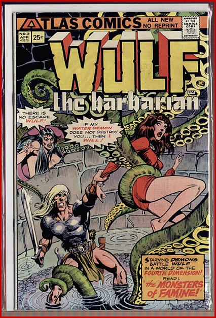
Check out some choice bits from the editorial by Roger Stern about the debut of Atlas Comics (at that time a new publishing effort led by former Marvel Comics owner Martin Goodman), as well as the price increases and content changes to the zine:
“Think for a moment of the really ugly things that go on in comics publishing—the deliberate rack-crowding, the unearned braggadocio, the high-handed treatment of creative personnel—and you’ll realize that Atlas has in a sense become a microcosm of the industry. We have seen a handful of shockingly beautiful books and a carload of tripe. […] It is clear that a free, creative hand can devise a damn good comic. And no better examples can be found than Larry Hama’s Wulf and Howard Chaykin’s Scorpion. […] So here we are for $.75 … four times a year … with ever-lovin’ color covers … and type so clear you can read every word. […] Old timers amongst you will notice that there is no Steve Gerber with us this issue. What with him becoming a Crazy editor, and a number of new titles starting up … well, you’ve heard of deadline doom. Dogs willing, he’ll be back with us next issue.”
It was a cool little zine (mostly put together by Bob Layton, future Iron Man artist) and also inside are spot illos and comics by future pros John Byrne (we used to say “John Brine”) and Dennis Fujitake (remember Dalgoda?), as well as “fan” drawings by established pros like Syd Shores and Herb Trimpe(!).
But the best thing in the issue has to be this line from the indicia: “Contributors! Please refrain from sending in samples unless you can put any of our regular CPL artists to shame.”
Hold on, I’ll be back, I gotta see if I can scare up any Fantastic Fanzines.


Labels: Atlas, Bob Layton, Charlton, Dennis Fujitake, fanzines, Howard Chaykin, John Byrne, Pittsburgh, Steve Gerber


hey Frank, this is a little late, but I feel worth mentioning, I just got the Bat Manga book a couple of days ago and I am really turned off by the production. If you take a look at the page layout, the for-edge of the book is reprinted in the fold. The big black bar with the trivia translations that is dead center in every spread was printed on the fore-edge of the original copies. This is killing me!! I love the comics, but I find them really hard to read because of this discontinuity. The spreads are all printed back to back. The pacing of the stories are completely messed up. I just don’t understand why they did this?!? In the production notes Chip Kidd says he is a comics purist so they kept the comics in an un-flipped state, which i totally agree with, but i think that ruining the integrity of every spread in the comics is much worse! I love the images in this book, but reading and enjoying the comics the way that they were meant to be is impossible.
I totally agree, Noel, but, uh, this is a post about old comics fanzines, haha.
Meet you in the Bat-Manga post from a few days ago? Why don’t you re-post your comments there?
Noel and I are continuing our convo here:
http://comicscomicsmag.blogspot.com/2008/10/frank-gets-bat-manga-mania.html?showComment=1226186100000#c2605053854132702358
That Bullseye # 5 is supposed to be the bomb. Toth doing the Question, can it get any better.
There’s been a guy selling those Bullseye #5’s on Ebay for months for around $15. I picked one up and that Question story is a good one. It also has an early John Byrne story as well, but he was still very rough around the edges at that point. I think earlier issues of Bullseye have some Ditko Question stories, too.
John Byrne was so influenced by Joe Staton. I’m sure none of you know who Joe Staton is but…
Don’t know who Joe Staton is? C’mon! E-MAN rules! And most definitely an influence on Byrne. That “early Byrne” story in issue 5 (also in 4) is the continuation of the Doomsday + 1 story that was a fan fave in the day. And Staton’s influence is all over that stuff. What was amazing was Byrne’s diversity. Somewhere I’ve got a Byrne FF submission from the same era, and it is dead-on Kirby/Sinnot. This was a few years before his initial run on the strip (209 – 221).
Just got back from another local store… and scored weird old Eclipse edition (the first?) of “Sabre” by Don McGregor and Paul Gulacy. There’s an essay in the back about trying to do adult material in the ’70s and getting turned away by Marvel and DC. Pretty interesting, even just as history, seeing how people got their work out there back then.
I loooved Charlton because (a) they didn’t have the (ultimately oppressive) Lee/Barnum pseudo-hipster hard-sell of Marvel or (b) you never felt like you were reading surreal republican adman pamphlets like with DC.
The ‘house style’ was pretty invisible, so a lot of their comics literally felt like they came out of nowhere when I was a kid (which added to the aura of their mystery/horror/sci-fi stuff). They could accomodate Ditko at his craziest, and hone the talent of some awesome (yet underrated) 60s/70s artists. Their heroes never seemed ‘sold’ to you as hip big brothers (Marvel) or bachelor uncles (DC).
We should also note that – for better or worse – Alan Moore and his ‘British invasion’ cohort still owe an awful lot to Charlton…