


Peanut Gallery
by Frank Santoro
Friday, June 4, 2010
Exhibit A: Here’s a panel where a kid is getting smacked in the face. Look at that movement! Isn’t incredible how it really feels like the action is occurring? So realistic!

Exhibit B: Just look at the FORCE at which the hand with the gun swoops through the second panel and clocks the guy’s head! Wow!
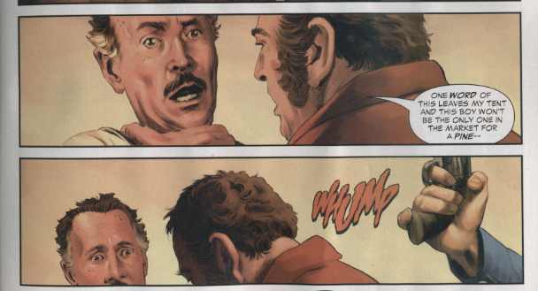
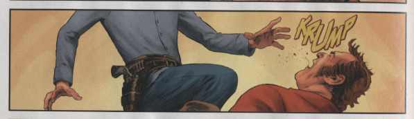
Exhibit C: Another amazing action sequence! See the knee to the face and the recoil of the victim! The feeling of motion just sweeps me off the page.
Anyone who’s read this blog long enough knows how I feel about heavy duty photo-referencing. Is it legal that so many mainstream comic books have shed cartooning in favor of such stiff stage acting? I know, I know, it’s a movie tie-in and they want it to look “real”, but man, this stiffness is so pervasive these days that it makes me just go… limp.
Labels: photo-referencing


Limp? And yet you’re such a hard ass! C’mon, Frank. It takes a sort of perverted loyalty to photo ref every single facial muscle and clothes wrinkle and strand of hair and…
At least tell me you like the coloring.
Look, Fiffe, I gots an image to maintain. I checked my calendar and I saw that I hadn’t ranted about photo-referencing in almost a year.
The coloring actually isn’t that bad.
Completely agree, Frank! My litmus test of if photo-ref works or not for a story is to read the art without attention to SFX or dialogue. The pages above fail terribly.
if it fits, I don’t mind it. it’s just that, mostly, it don’t fit. it worked in the first couple of volumes of The Ultimates, but it stank when Hitch tried it on The Fantastic Four. Ex Machina’s a lovely-looking comic, but Tony Harris’ Spider-Man was awful. Alex Ross leaves me cold. Salvador Larocca, Mike Deodato jr, Alex Maleev, so on, it just gets tedious, and sucks all the fun out of the thing. by and large, I’d like to see a whole lot less of it.
[…] so many mainstream comic books have shed cartooning in favor of such stiff stage acting?”: At Comics Comics, Frank Santoro picks up DC’s $1 reprint of Jonah Hex #1, scans some images, and makes fun of how […]
[…] Comics | Frank Santoro points to the $1 reprint of Jonah Hex #1 as an example of "how photo-referencing has taken all the fun, gesture and action out of comics." [Comics Comics] […]
With the Ultimates, it seemed like a pitch for movie options. Famous actors ‘cast’ in the comic are now in the movies. Ross’ stuff just seemed like a pitch for mainstream illustration exposure (he’s everywhere!)
Mainstream comics are now so sucked in to games and movies ‘synergy’ that they’re losing all internal dynamism. Gary Panter or CF are much better capturing the raw energy of what made us love the damn things in the first place.
Personally, I hate that plodding ‘widescreen’ pace even more than photo referencing. Hardly any mainstream comics MOVE anymore. It’s like watching bad ten-minute TV cop shows.
[…] critique: Frank Santoro shows some panels from Jonah Hex to demonstrate how photo-referencing is killing comics […]
Photo-ref is part of the problem, but the addiction to close-ups is also a factor.
I’m going to second what Scott McCloud said. But also note, there’s a difference between referencing a photo and copying / tracing a photo directly. Also, a poorly composed photograph will make for poorly composed panel every time, as seems to be the case above.
Frank is 100% correct, and I will take on all detractors. It amazes me how much more skill and polish is shown in older comics, and how much easier the eye flowed across the page. The stilted choreography of action sequences, the “porno” poses of most female characters and some male. It just ain’t comics, the Hernandez Brothers can tell more in a panel, than these guys can over the course of a six issue storyline. Some of these guys should be doing nothing more than covers, and Salvador Larocca has the fewest excuses since when he took over Flash from Wieringo way back when, he had a far more animated style that *shock* helped the storytelling.
Yeah, I gotta give this one to you – those look pretty stiff.
I was surprised, actually when I enjoyed Ex Machina so much because I knew it was photo referenced…
The above is pretty disappointing.
[…] This post explains why cartooning is sometimes at its best when the artist doesn’t rely on photoreference. […]
Also, why are all of those panels wide horizontal rectangles?
Leigh – I’ve noticed an increasing preponderance of (page-wide) horizontal panels in mainstream comics. It’s as if page grids are slowly falling to collective amnesia. Take a look at DC’s First Wave: Rags Morales is, in my opinion, an excellent artist (though I miss the lighter, more humorous quality of his earlier work like Black Condor and Hourman) – but for some reason he’s using horizontal panels almost entirely. It’s tempting to blame it somehow on Brian Azzarello’s scripting, but a look at, say, Eduardo Risso’s amazing work on 100 Bullets suggests that there’s nothing about Azzarello that compels such layout.
The only explanation I can imagine for all the horizontal panels is that everyone’s hoping to get a movie deal out of their comics, and those panels are suggestive of the big screen.
A flat image can’t hope to capture the power of reality.
There is photorealism and emotional realism.
Jack Kirby explained the difference to Will Eisner.
Kirby: “I suddenly found myself intellectualizing.
I found myself competing with the movie camera. I tore my characters out of the panels. I made them jump all over the page. In the service of trying to get a real fight. I wanted to transmit the power of men in the ring. I couldn’t do that in a static way. I had to do it in an extreme manner. I drew the hardest positions a character could get into. I had no time to put fingernails on fingers. I had no time to tie shoe laces.
I made an impression of things. I would draw as dramatically as I could. I felt I was a human camera trying to get events as they actually were. I was very sincere about that.
I was trying to get at the guy, who was trying to get at me.
I began to remember people from my own background, and I began to subtly realize they were important, and that I wasn’t ashamed of them. I was no longer afraid of myself, and I began to see them as I should have seen them from the beginning
This was a long way from Long Island. I was still trying to get to Brooklyn. I heard they had a tree there, and the tree was different.”
As bad as the art is here, it’s a shame that this particular title has to be the poster child for stiff photo-referenced art, given that the book has long since turned into an artist’s showcase with Bernet, Cooke, Williams, Heath, DeZuniga, Garres and others making appearances. People turned off by this issue are missing out on some great-looking work later in the run.
Too bad the color on the Bernet issues is like staring into the sun. His work should be colored flat.
Very true. Thanks for saying that – really dig alot of the art in the old Hex series.
I’ve only got one issue of Hex, but it’s drawn by Gray Morrow who knew how to make photos work.
I was about to say the same thing as cole. Jonah Hex has become one of the best drawn books on the stands – almost an anti-photo referencing book. I often don’t mind the referencing if it looks good to me (sometimes it does, sometimes it doesn’t – I really like Epting’s work on Cap America – it is Epting, right?) but i remember this first issue of Hex turning me off the series at first.
“I know, it’s a movie tie-in and they want it to look “real”, but man, this stiffness is so pervasive these days that it makes me just go… limp.”
I hope I didnt miss omeone else’s comment on this, but this issue is a few years old, si it wasn’t created for the movie, but long before – or am I reading too much into the comment?
Last weak I read Volume 1 of Ex-Machina, I loved the story but wasn’t into the overly photo-referenced art. (The “Cast” (models) are given credits in the back) It occurred that the problem was that the panels shouldn’t be trying to capture a static moment in time but something more fleeting and visceral. Thanks for putting a finger on exactly what was bugging me about this growing trend in comic book art.
Oops I meant “week” not “weak”! Maybe I should spell check before I go around critiquing other peoples work.
Some of this depends on the subject matter. I actually enjoy Salvador Larroca’s photo-ref art for Invincible Iron Man–perhaps because I don’t read many other books that so obviously use the technique, and that particular comic–all shiny surfaces and post-Robert Downey mugging by Tony Stark–lends itself to it. The style is like a tacit admission that Iron Man comics have always been terrible, so they’re far better off shamelessly aping the movie. They’re right.
@scott
I wasn’t aware that this issue was not made for the movie. I assumed nevertheless that because of the movie the idea was to put out a ‘realistic’ comic to coincide with the movie release. A growing trend if you consider the Surfer “Requiem” series from Marvel when the FF Surfer movie came out.
That comic is a reprint , the OG was published about about 4 years ago. Movie is coming out now. Frank Quitely does great widescreen panels. Gary Panter draws from photos. I’m pretty sure that is Luke Ross who has been working on Captain America lately. Possibly inking sucked the life out of his pencils, his Cap work is a bit more lively. Yes these 5 panels are quite stiff. Or you could say “still”, or almost “sculpted”. I got into an intense conversation with Frank over Sean Phillips about photo reference at some point, i think Phillips rules and i could care less how he goes about it.
yah, I don’t talk to Brynocki C about photo-reffing anymore. We were gonna rumble a couple years ago over it, haha… Wisely, I changed the conversation to Larry Hama…
Photoref is necessary when drawing places one has never been, for instance I had to draw Pakistan for what I am working on and had no access to the place itself. But all photos can do is give you a general idea of the location, and the work will be devoid of the type of living detail that brings the background to life. Not much use for photos in character/figure work because the stuff ends up looking lifeless IMO. Might as well be doing fumetti. If one really can’t draw figures from their head, then there’s always a mirror or one can use models like Caniff used to….drawn from observation that is, not photographed and traced.
Isn’t this the kind of thing that the “Marvel Age” did away with? Not the photo referencing per se, but non-dynamic composition. Long live Gene Colan.
I think a contemporary example of misused photo referencing is the art in the new Solar series. What I’ve seen looks stiff and awkward.
the color’s not that good either, i mean, how brown can one page get?
Hey brynocki, nice fucking art show last night! Do you use photo reference in your work? Would like to learn more about your methods, but maybe this isn’t the right place to ask.
Whatever action is gained by not doing photo-referencing is lost and then some by the maddening horizontal panels. All body action and follow through is completely lost. And the cropping is horrible. Look how every single head is cropped to the point that complete expressions aren’t even shown. This is story-telling at its worst.
It’s both mysterious and tragic that this has become such a trend lately with many comics doing it for page after tedious page. I’ve seen some outstanding artists reduce their work to being indeciferable and unenjoyable by following this fad.
I agree that it seems to be to create some kind of “widescreen” effect to copy movies. But if that is the case this is very foolish indeed. Widescreen was invented as a film format to fill the field of vision. Since I don’t read comics with my nose pressed to the page it does not work on paper.
Hats off to whoever did the lettering, though, for making these panels at least comprehensible. Can you imagine if those sound effects weren’t there? Oh boy, it would be so much worse, it would look like weird, posed pieces of abstract art where people are just “making motions”.
And yep, it is unfortunate that Jonah Hex has to take the bullet for photoreferenced comics when it is so often the DC book that comes closest to featuring cartooning. (Though this instance certainly deserves plenty of scorn.)
Know who else drew good “widescreen” panels? Carmine Infantino.
Is it a reprint of the first issue of the current Hex run? That was so awful, it went beyond photo referencing it was a fumetti. Some of the characters were actually cut and pate (then 1/2 the face was tweaked) from the Outlaw Josey Whales. DC can’t be reprinting that embarrassment.
Another thing is how dialogue seems so ‘dead’ with the widescreen photoref schtick. Some of these guys just don’t have any rhythm!
At the risk of having Frank bring the hammer down on ME, I wanted to chime in here. Frank, I think what you’re reacting against is dull line quality, overripe coloring, and a tendency towards blatantly storyboard driven comics. Photo referencing in comics is practically as old as the medium itself. Kirby did it, Eisner did it — they all did it; right down to our beloved Steranko and Gulacy. Of course Kirby, et al, were vital cartoonists — they could make exciting drawings on the page. Steranko and Gulacy, when they stiffened up, veered closest to what you’re alarmed by (think Outland, which we both love) but made (and sometimes still make) such exciting drawings and compositions that you can forgive the occasional obvious tracing, etc. Anyhow, I don’t think you should toss out a tool for drawing when it’s actually the poor application of that tool that really bugs you.
You know that and I know that but the knuckleheadz making these modern ref’d comics don’t know that.
CC faithful reader Patrick Ford sent me this interview excerpt from photo-realist master Stan Drake. Check out how Drake describes the difference between illustration and cartooning:
Stan Drake Interview
Hurd: How difficult was it, Stan, for you to shift from the beautiful illustrative style you displayed in ‘Juliet Jones’ for so many years, to the ‘Blondie’ style we’re going to talk about today?
Drake: Strangely enough, I really am a cartoonist – I had to work hard at drawing straight, illustrative type stuff. I started out with Johnstone & Cushing (the advertising cartoon firm) right after the war and my bent was really towards the semi-funny stuff. So I had to learn how to do ‘Juliet Jones’ because they wanted an illustrative strip. I had to work hard at becoming an illustrator. Being funny with my pencil actually is the real me!
When I got into advertising, an art director told me, “If you want to make out in this business, you must learn how to draw pretty girls and handsome men.” So I recall that I bought copies of ‘Vogue’, ‘Harpers Bazaar’ and ‘Mademoiselle’, and when I got home, I’d place some vellum over the heads of the pretty girls in the magazines, and I must have traced seven or eight hundred heads in this way. Every night I’d practice drawing pretty girls and handsome guys and finally I got to the point where I knew what made a face pretty and what the proportions were. Soon I was drawing them without having to trace them.
This was an advertising style that I developed. You couldn’t sell brushwork to advertising agencies as you could to the comic books. The old comic books were all brushwork and this style made your work look dated and it had a comic book look. The advertising agencies wanted a modern style. So I practiced with a pen and came up with a sort of avant-garde, trendy look in my work. So when I took ‘Juliet’ up to King Features, the strip was done in the style I’d been using in advertising.
Hurd: And now let’s get into our topic for today–about all of what was involved when you got the job of drawing ‘Blondie’.
Drake: First of all, I had to copy, I had to make my drawings look like the ones done by Jim Raymond who, in my opinion, was a genius. In a situation like this, you’re forging another man’s handwriting. Jim would do folds a certain way, he would have characters walk in a specific way, and his little expressions are all gems. It was really tough to follow this exacting prescription–it took me a year to become comfortable with the strip. In the beginning, of course, I had to get the strip out using a combination of a light box, enlarger and a copy machine.
It’s been fortunate that I’ve been able to adapt and now go back to the action and the little fun stuff that I love and forget all the folds and all the shading I had to learn in the illustrative game over the years. What l’m doing in ‘Blondie’ is what I always wanted to do.
[…] different in composition and details. Compare that to the obviously photo-referenced panels that Frank Santoro was complaining about the other day—it's a whole different […]
I was just talking to a friend about Norman Rockwell who has often been called a ‘fake’ for relying almost exclusively on photo-referencing. Was that the start of it, do you think?
Personally, I’m happy enough with photo-referenced stuff if it’s not all I’m reading and if the artist still makes it theier own. It was interesting and fresh-looking at first, but now comes across as the easy go-to movie cross-over look (as Wayne said).
cw