 Comics Comics reader Brian Nicholson made a comment about my SPX post which got me thinking. Brian took note that the same words I used to describe the “new” mini-comics at SPX — “long on craft and short on narrative” — could also be used to describe some of my own comics like Chimera and Incanto. He also wrote that “not being at SPX this year, I just associated the type of new comics you’re talking about with some Souther Salazar comics, like Please Don’t Give Up“, and added that “maybe people were selling some pretty fucking out there comics that are nothing like the work I’m using as a reference point.”
Souther’s work is, I think, a little tame next to some of the pulsating color zines I saw at SPX. And I always found Souther’s work pretty narrative-based, even at its most dense and notebook-like. Chimera and Incanto are also, to me, totally narrative. And they too are pretty tame next to a lot of this “new” work I’m loosely describing.
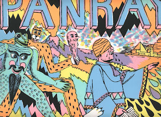
One of the amazingly beautiful “out there” comics I bought at SPX was PANRAY by Raymond Sohn and Panayiotis Terzis. It is a remarkable, mountain-climbing achievement in terms of drawing, color, printing, and presentation. Like some spectral black-and-white silent movie that is interrupted by searing color patterns and abstractions, the book goes in and out of focus, organically and structurally. It’s beautiful. How do I even begin to describe it? And that’s what I want to get at or at least try to approach: a new way in which to discuss the purely visual elements of comics. There’s often too much emphasis on reading a comic like a novel when really it should be discussed like a painting or a sculpture. Far from dismissing these “out there” comics in my original post, I found myself simply hoping to discuss them and appreciate them better, and to do that I think a broader approach has to be encouraged, towards a less conservative definition of comics.
What I was looking for, or at least curious to find at this SPX, was something of both. I lament the fact that narrative comics, of all types, but specifically strong character-driven stories that are also beautifully drawn like, oh, Gilbert Hernandez’s Speak of the Devil unfortunately don’t seem to exist, or at least not in the embryonic form of new, well-executed mini-comics. That particular example might be a lot to ask — but where is the experimentation and growth in straight-ahead narrative alt mini-comics? Most straight-ahead narrative small press comics (read black-and-white autobio/cutesy big-head) don’t have a quarter of the energy and enthusiasm that the “nonobjective”, “abstract” mini comics have.
I was looking for a little of both and that combo was in short supply. There were, for the most part, silk-screened color out-there “art comics” and black-and-white variations on the same type of alternative mini-comic you’ve seen many times before. The “art” stuff looked and felt fresh. Yet they are, generally, not wholly engaging in comics language or structure. (However loose and arty Chimera and Incanto may be, they are rigorously structured to unfold as a comic narrative.) The “arty” minis from SPX are more interested, it seems, in image-making. And that’s awesome. But as a comics fan who reads a lot of older “mainstream” stuff, I would like to see “literary,” straight-ahead alternative comics-makers take a page from the “art” comics play book and try to adopt different approaches towards storytelling and narrative. And vice versa. I think the “new” crafty mini-comics took a lot of Fort Thunder to heart visually but don’t truck in the same “narrative strategies” as BC, CF, BJ, BR, LG and MB — who all tell stories, however visually challenging or stunning they may be.
And let me say this — I’ve always felt that all comics are inherently narrative because of the form that the book takes. For that matter a single image, an abstract painting, for example, is often narrative. Jackson Pollock‘s paintings are narrative — you can follow him, the story of him working by the lassos of color — and the same is true even with the color field abstractionists like Frankenthaler. It’s just a broader range, a greater bandwidth for inventing narrative.
Using this definition, PANRAY is narrative, too. It has characters that appear to repeat, settings where they interact, and even occasional panel structures. It is a miraculously hewn jewel of a comic. Do I lament that there are no obvious narrator type characters to guide me through the book like a Maggie or Hopey? Not at all.
I simply see this end of the comics spectrum flowering at a lightning-fast rate, absorbing SO much and spitting it back, drawing their asses off year after year. But, and I’m really overgeneralizing here, on the other side of mini-comics world is the umpteenth generation of the Ware/Clowes school, who seem to stay firmly planted in straightforward narrative, “literary” comics. With a few exceptions, nothing’s really changed here in 15 years, kinda like superhero comics. There are very few inventive, straight-ahead narrative “alternative” comics for my taste. I think Kevin Huizenga and Dan Zettwoch are the heirs to this evolving school. They both made (and continue to make) beautiful mini-comics that grew easily into their “professional” work.
But I don’t see work of that par so often these days. Most new minis in this school over the last few years are standard fare. The drawing and production values are weak, and the stories are usually slice o’ life snoozers. If I were to name names I probably couldn’t, because nothing from this camp stood out to me at this SPX. Generally, they make black-and-white minis with maybe a color card stock cover. I’ve talked to a lot of kids who do “alternative” comics, who read mostly “alternative” comics, and who know next to nothing about the history of comics before 1999 (or the history of art). They have this weird attitude towards “art” comics. I see them come up to the PictureBox table and literally sneer at the work displayed. They would be doing themselves a huge favor if they could get over their ingrained distrust for the more “arty” aspect of comics.


 Hey everybody, Frank Santoro here with a “Friday distraction” of sorts. I taught some classes over the summer about classical painting structures and composition as they apply to comics. During the class I often referred to a book entitled Picasso’s Guernica – Images within Images by Melvin E. Becraft. It’s a fascinating read. It’s a “map” to look at Picasso’s most famous painting in a new way.