


Compare and Contrast
by Jeet Heer
Wednesday, February 16, 2011
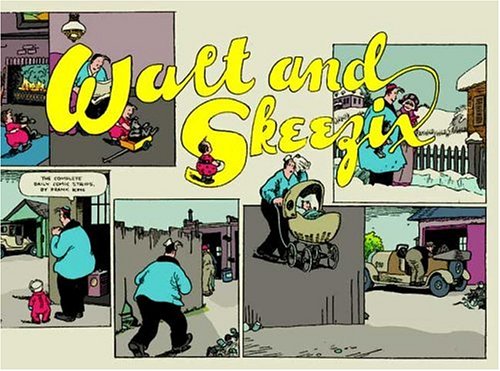
Cover, Walt and Skeezix Volume 1, Chris Ware (after Frank King).

Top portion of Stumptown poser, by Brandon Graham (After Chris Ware after Frank King).
(Just so there is no misunderstanding, I want to make it clear that this post is not meant to be a criticism of Brandon Graham. His poster is lovely and I’m gratified that the Walt and Skeexiz books are informing the sensibility of younger cartoonists. The full Stumptown poster can be seen here. Thanks to Tom Spurgeon for calling attention to this poster. Everyone should buy the Walt and Skeezix books!)
Labels: Brandon Graham, Chris Ware, Frank King, shameless promotion


What are the odds D&Q could be convinced to start a concurrent Gasoline Alley reprint series collecting the later run my Dick Moores?
I’m not going to live long enough (assuming a chronological reprinting at the current pace) to get there on my own.
Moores isn’t the equal of Frank King, but he’s one hell of a cartoonist, better than most.
The (sizable) influence of Frank King aside, I’m not sure I see it in Brandon’s poster….I think it’s more an evolution of the Vaughn Bodé-esque lettering he’s been doing for years than anything else.
@Patrick Ford. I agree that Moores was a wonderfully entertaining cartoonist but I’m not sure, given the current glut in the comics reprint market, if there will be a reprinting of his stuff in the near future. All of Moores’ Gasoline Alley work was been reprinted already actual, in Rick Norwood’s Comics Revue magazine. So if anyone who wants to simply read the strips can go there.
Spearking personally, over the last few years I’ve written introductions to more than 25 books reprinting old comics, so I feel like I’m taxing the patience of the public and publishers. But the day Chris Oliveros wins the lottery, I’ll contact him about reprinting Dick Moores’ Gasoline Alley, among other wish list projects.
Jeet, The problem (for me) with Comics Revue is it was collected a lot of different material, about 50% of which I was not particularly interested in, or already had as tear sheets (I’ve got a ton) or in other reprint collections.
It just didn’t strike me as a good value, and there is a storage issue when you have a thick stack of paper only a small percentage of which you need.
I nice book to look for if a person enjoys Dick Moores is the Jim Hardy 1936-1937 collection published by Hyperion.
I suppose there is something of a glut. As of the moment there are things I’m passing on which I might otherwise buy if there wasn’t much being reprinted.
An example would be Secret Agent Corrigan. I like Williamson just fine, I’ve read some of the strip in the past, and it’s kind of entertaining, but I feel no urgency to own any more of it.
On the other hand if there was almost nothing in the way of strip reprints being published I’d probably jump on it.
Anyhow what Gary and Kim, or Chris really need to publish is the complete Garrett Price.
That is now at the top of my list with Barnaby now close to reality.
I’m with Andrew on this one. I’m seeing more of “an evolution of the Vaughn Bodé-esque lettering he’s been doing for years than anything else” as well.
Hmmm…. maybe the comparison is a bit clearer from the font used on this cover: http://www.amazon.com/Walt-Skeezix-Book-Four-1927-1928/dp/1897299397