


THIS WEEK IN COMICS! (12/15/10 – An honest to god Moebius release via Diamond.)
by Joe McCulloch
Tuesday, December 14, 2010

In the interests of maintaining some semblance of momentum for these BCGF posts, I will now present as the obligatory opening ramble to the weekly upcoming comics column a gallery of recent alternative-flavored manga art culled from the December 2010 issue of Morning 2, purchased over my NYC weekend.
Don’t let the cover art by Hiroyuki Ohashi fool you – this is a high-profile spin-off of a major anthology from a Big Three manga publisher (Kodansha), and the alternative comics ‘flavoring’ typically goes to surface visual style, with content remaining somewhat straightforward compared to what you’d find in Ax or Comic Cue. But then, seinen manga tends to be more expansive in terms of subject matter than any mainstream North American comics, so it sort of levels out.
Anyway, feel free to scroll down for this week’s blind picks. Moebius!
***
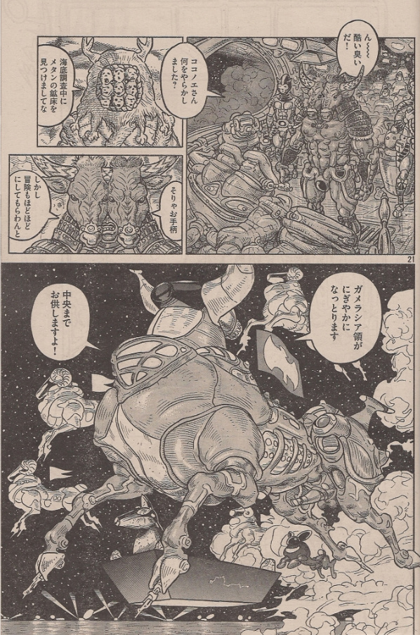
The Planet of Sutakola by Shinkichi Kato (of National Quiz)
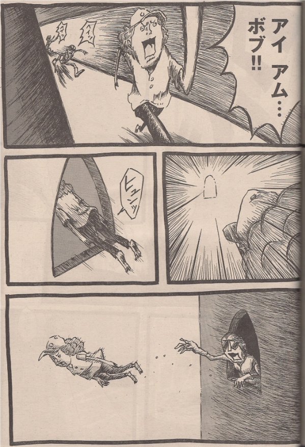
Bob & George by ??? (28th Manga Open Silver Prize Winner)
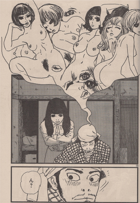
Beatitude by Naito Yamada
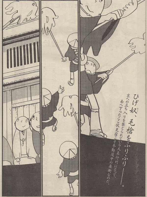
Tsuratsura Waraji by Natsume Ono (of House of Five Leaves)

Abnormal Physiology Seminar by TAGRO (of the manga adaptation of Panty & Stocking with Garterbelt)
Ninpopo 123 by Shiho Suzuki
August Fish by ?????
I Care Because You Do by Daisuke Nishijima
***
And now:
Madwoman of the Sacred Heart: OH SHIT, MOEBIUS IS ON THE SCENE. You know, I figured so many instances of internet discussion would result in another official English-language release – it’s like physics! Anyway, this is from the revived North American wing of Humanoids, an all-in-one hardcover collection of a 1992-98 series written by Alejandro Jodorowsky, concerning a professorial doppelgänger of his that becomes caught up in the birth of a contemporary messiah. Expect much Buñuelian irreverence and mystic revelation. Parts were previously serialized in Cheval Noir, and Dark Horse released a b&w compilation of the first two (of three) albums in 1996, but this is the first time the entire series is in English, in its original color (and, in keeping with Gir’s prior NA releases, it should be sold out and going for twice its cover online by the close of business Friday). Preview; $29.95.
Big Questions #15 (of 15): Wrapping up Anders Nilsen’s long-gestating minicomic-turned-almost-last-of-the-wild-alternative-comic-book-serials. Publisher Drawn and Quarterly is already planning a simultaneous April 2011 release for hardcover and paperback collections weighing in at 658 pages each. Preview; $7.95.
Motel Art Improvement Service: This is the next in Jason Little’s series of Bee comics (now from Dark Horse), essentially Franco-Belgian type glossy color genre stories with a whiff of adult content (and in landscape format instead of an oversized album). Intrepid girl snoop Bee is caught up in trouble while working as a housekeeper. Some of it’s online; $19.99.
A Disease of Language: Information is sparse, but this appears to be a new softcover edition of the 2006 Top Shelf/Knockabout collection of Eddie Campbell’s comics adaptations of two of Alan Moore’s performance pieces — The Birth Caul (1999) and Snakes & Ladders (2001) — albeit possibly only published by Knockabout this time. I think? Anyway, these are very fine comics; Moore’s performances (as anyone whose snagged the recent Unearthing from iTunes will know, although that one’s based on a preexisting work) tend to be dense and allusive, and Campbell does well in adapting it all to intuitive visual ends; $18.99.
Unexplored Worlds: The Steve Ditko Archives Vol. 2: Deluxe reprint! More from editor Blake Bell and Fantagraphics, compiling early stuff in hardcover, 1954-55, 240 pages. Samples; $39.99.
Showcase Presents: Our Army At War Vol. 1: Bulk reprint! A 512-page gob of vintage Robert Kanigher-edited war stories, 1952-54, in b&w, presumably featuring art by Irwin Hasen, Gil Kane, Bernard Krigstein, Carmine Infantino, Mort Drucker, Irv Novick, Ross Andru, Gene Colan, Jerry Grandenetti and others; $19.99.
Not Love But Delicious Foods Make Me So Happy!: Being the week’s deluxe manga release, a 2005 suite of linked short stories by Fumi Yoshinaga, apparently of a type with her All My Darling Daughters from earlier this year, if greater in number and shorter in length, and apparently more comedic (I’m referring to a Katherine Dacey pre-release review). I was fascinated by the previous number, in that Yoshinaga takes on the type of interrelationship subject matter that was typically the exclusive province of ‘literary’ comics in North America for a long time, but pursues them with an off-handed, super-straightforward drawing style you’d likely deem a house style if it were limited to any one publisher, with an emphasis on dramatic, revelatory interactions that arguably invoke Japanese/Korean/name-your-country television drama as much as any rarefied notion of literature. Basically, what we have are colliding comics traditions (even expectations), which are generally neat to witness. This one’s from Yen Press, and sees a manga artist visiting restaurants with her friends while we learn things about them; $10.99.
Yotsuba&! Vol. 9: Meanwhile, Yen also brings a fresh batch of comical lil’ kid stuff from Kiyohiko Azuma, an unlikely all-ages favorite (speaking of expectations bumping into each other) as serializing magazine Dengeki Daioh tends to service a certain subset of the anime otaku audience that appreciates the protective emotions roused by cute girl characters. Do I mention this every time? It’s a nice comic about a little kid having funny adventures. Up to vol. 10 in Japan; $10.99.
Detroit Metal City Vol. 7: In contrast, the intent and effect of Kiminori Wakasugi’s death metal extravaganza — concerning a meek lad’s prodigious talent for musical aggression, and the chaos it wreaks on his daily life — is easily and totally discernible from any culture which music has touched. From Viz, also up to vol. 10 domestically; $12.99.
Kerry and the Scary Things: Apparently, Michael Golden drew a 48-page YA-type comic about a kid thrust into a world of monsters. I’d not known until this very moment. Art by Golden & Kieth Wilson, story by Renee Witterstaetter & Wilson. This is a signed hardcover edition, which appears to be all that’s available for now. From Eva Ink; $39.99.
Doc Macabre #1 (of 3): Also in American genre comics superstars who came to fame in the 1970s, Bernie Wrightson has another project out from IDW with writer Steve Niles, presumably in the same gory, sorta-humorous style; $3.99.
The Spirit #9: And hey, here’s Mike Ploog – all in the week Moebius shows up. It’s a Paul Dini-written backup story for the artist of The Life and Adventures of Santa Claus, as the primary creative team remains David Hine & Moritat; $3.99.
DeadpoolMAX #3: Exploring the latest twitching module in the eternal flux of Kyle Baker. This issue – Deadpool destroys racism! Written by David Lapham. Wordless preview; $3.99.
The Secret History #13: Tom Spurgeon has been all over this Archaia translation of a French immortals-through-human-history serial of late — up to t.19 right now, not counting spin-offs — and it’s indeed good fun, although I haven’t gotten up to date with new issues (a big hardcover collecting #1-7 is out, with a second due next month). If nothing else, primary artist Igor Kordey is always worth a look; $5.95.
Strange Tales II #3 (of 3): Finally, here’s the end-for-now of Marvel’s latest experiment in crossing outside artistic talents with corporate superhero characters. Featuring Ivan Brunetti (on the cover), Benjamin Marra, Alex Robinson, Harvey Pekar & Ty Templeton, Terry Moore, Toby Cypress, Edu Medeiros and Tim Hamilton. Samples; $4.99.
Labels: Moebius, This Week in Comics


Joe if you’re pulling my leg about Moebius, it will be WAR!!
There’s much more than just a whiff of adult content in Motel Art Improvement Service. The two major plotlines are sex and drugs.
Yotsuba&! is way more than nice. It’s awesome. SO there.
If anyone cares: The Ditko book suffers from some production problems, at least my copy is a bit of a mess. The binding is wonky and the pages don’t lay flat when the book is closed, they either “split” in the middle or buckle in one of two other distorted shapes. The silver foil on the cover suffered dozens of scratches before the book even reached my shop. Looks like the UPC code on the back cover was botched so a sticker was applied, yes, it’s anal, but I sat there and picked at the sticker for what seemed like an hour to remove it. I can’ts stands to have ugly stickers on the books, so sue me. While I’m griping, the dark purple ink used for the table of contents/indicia was near-impossible to read, maybe I’m going blind (actually, my eyes are slipping, but still, a weird choice). And the book itself gives off one of the strongest odors of recent note. Why do so many newly released books seem to reek so strongly these days? Woof. I feel like I have to air out more and more books before I can stand to have them near my nose. Opening the (incredible) Polly and Her Pals seemed to release a gas attack in the house.
Anyway, buyers might want to look through copies of the Ditko book to see if one is better than the rest regarding scratches and binding. I’m not crazy about the design on the Ditko Archives by and large (or FBI’s recent horror collection which has a similar semi-overblown treatment) but the new release seems to actually have physical problems with it.
Did I mention Yotsuba&! is awesome? It is.
I work in tha packaging industry, and while it can be fun sometimes (free crazy stickers, whoohoo!), it can also be depressing (the idea of millions upon millions three pound tubs of chocolate raisins is still unfathomable to me, but its true). It can get even more depressing when the customer wants a cheaper bag, so we outsource it to china. When we get the product back, we have to air it out through the big press because it REEKS. This is a very common problem with stuff made there and other asian countries due to their pollution and less stringent production regulation. Like a lot of publishers, fanta prints in singapore, so I’m not too surprised when a book falls apart, looks washed, and smells like butt
wait, how does one buy the moebius? is there any way to preorder online?
Humanoids doesn’t appear to do online direct ordering, but it should presumably be available through the usual channels, i.e. asking your local comics shop to special order a copy or visiting some online retailer… I notice Amazon has tucked the new edition away under the Other Formats link (check “Hardcover”) and has a 2 to 4 week wait on copies… not all of the big box retailers seem to have it, though… can’t find it at Borders or Barnes & Noble, but maybe I’m checking wrong…
Instocktrades.com has the Moebius available for order because the site is attached to a Direct Market brick-and-mortar store.
Amazon, Barnes, and Borders may not get it for a while, if ever.
Amazon has it, but as Jog said, its hidden in a sub-category…
http://www.amazon.com/Madwoman-Sacred-Heart-Alexandro-Jodorowsky/dp/1594650985/ref=sr_1_1?ie=UTF8&s=books&qid=1292425715&sr=8-1
I searched under “Moebius, Heart” and found it but the new edition won’t come up under it’s full title.
They also have the first book of the french edition of “Final Incal” which is drawn by Ladronn.
The US editor for Humanoids has said they plan on releasing Travis Charest’s Metabarons in February. They also plan on putting out The Final Incal in an all-in-one hardcover whenever Ladronn finishes it.
considering that most of Humanoids US publishing plans only last about two years before tanking I hope he draws fast.
Did Charest do more than that one little maybe 10 page story that was a i think a “handing over of power fight scene”, released in a prestige format book some years back? Do people still call square bound slightly thicker than average comic books “prestige format”?
And yes, please Ladronn, draw quickly……I can’t wait. Or fuck it, take your time….
Yeah, Charest did part of a different Metabarons album from that story… it was intended to be a whole series along the same lines, with different stories focusing on the various Metabarons weapons, but Charest took a really long time drawing the first album, and eventually it was given to Zoran Janjetov (of the Incal prequel and the Technopriests) to finish… it was called the Dreamshifters for a while, but now it’s WEAPONS OF THE METABARONS, just a one-off.
There’s a proper Metabarons prequel out, CASTAKA, drawn by Das Pastoras, who did Humanoids’ DEICIDE series and a few Wolverine comics for Marvel… only one volume came out, in 2007…
UNEXPLORED WORLDS: Yeah, we fucked up on the ISBN and had to sticker it, and the table of contents printed much darker than we expected. You should see the proofs: They looked great! News to me that the binding is wonky, though, I need to check that out. That silver foil is fragile, yeah, but we think it looks pretty cool, so live with the scratches!
Is the book varnished or laminated? If not, why not? You should think about doing so. That would generally fix the scratching and flaking, and it shouldn’t impede the desired effect at all. Why isn’t longevity taken into consideration when designing a book?
Also, if the received product doesn’t match the signed proof, why do you sell it anyway? Shouldn’t the printer be taking the cost for sending out a product the customer didn’t ask for?
I find Kim’s honesty hilarious and a little terrifying. But mostly hilarious.
I like picturing him saying that at a nye party in a paper crown and holding a plastic champange flute.
I don’t see the point of releasing Moebius in shrunken down format (or Secret History, for that matter). Fantagraphics has the balls to release the much less visually appealing Adele Blanc-Sec in its original size. BTW, the Ditko Archives would greatly benefit from an oversized format too.
And speaking of the incredible lameness of some American publishers:
Find the difference between the original cover of Madwoman:
http://www.bulledair.com/catalogue/catalogue1/coeur_couronne1.jpg
and the Dark Horse cover:
http://www.darkhorse.com/Comics/95-253/Moebius-Madwoman-of-the-Sacred-Heart
My understanding is the MADWOMAN book is about the same size as Humanoids’ books for I AM LEGION and all their other hardcover releases… 7.75″ x 10.5″, which isn’t quite as large as the most recent (2007) French Intégrale edition on which I presume this release is based (20.5 x 28.5 cm), but not a HUGE difference. Also, the NA edition is in color, while the French version looks like it was b&w:
http://www.humano.com/album/35169
Of course, Les Humanoïdes also masterminded that crummy INCAL recoloring a few years back, so their French publishing decisions shouldn’t be viewed as watertight…
In fairness to Humanoides, the new collected edition of INCAL restores the original coloring and is the best edition of the material I’ve seen by far. It’s coming out in English soon as well, I think.
I recently discovered that in the 2000 edition of Metabarons put out by Humanoids they drew clothing over many of the nude woman, where in the 2004 DC/Humanoids production they reversed course and took the clothing away. Though they also put a crappier cover on the books. One step forward, one back.
I’ve understood that the Incal edition is the “original” coloring, which means it’s good. Does that also mean it’s the same as the Epic reprints? And contains the same material as the Epic books? Or is there more? All such questions…
Dan, if you mean the big hardcover collection of INCAL, it just has the comic and the original album covers…no extra material or anything. I have a few of the original French albums as well, though, and from what I can tell this new edition includes everything from those and looks just as good if not better.
Oh shit, Metabarons by Janjetov and Das Pastoras. wow. I love both, Deicide was great, as was a Wolverine tale i read with him on it. U turn? No, Switchback! The one about the weird sheriff, small town. This a reply to a comment up there that won’t let me reply….
Pastoras is great. He did another Wolverine one shot with a big vampire S’ym type thing, both are collected here: http://www.amazon.com/Wolverine-Flies-Spider-Greg-Hurwitz/dp/0785135693
I actually considered making ADELE smaller because in those first volumes, the art doesn’t really demand the album size, but as it happens I read ahead and later ADELE volumes become more and more dense and feature smaller and smaller lettering, so if I’d started the series with a 10″ or 9″ tall ADELE that looked perfectly fine, by the time I got to Volume 3 and 4 it would look small and cramped and hard to read. It’s strategery, boys.
Tardi has a tendency to change his format like this, sometimes within the same book. I kept on having to up the point size of the lettering in YOU ARE THERE as the chapters progressed because the lettering kept getting bigger in the original; maybe he was drawing the pages on smaller originals.
I think Americans are getting past their resistance to the European album format, and we no longer have to shrink the European books to make them palatable. In which case matching the size of the original is usually the good plan, in my opinion. I do like NBM’s reduced SMURFS books, they’re cute, but the small DUNGEON books bug me, especially some of the fancier-looking ones.
Yeah the recent Killoffer book was an Eye Crime. Such beautiful detail lost to tiny printing.
speaking of comics that have received very little response.
when i read that Killoffer story I thought “Dang, this comic is gonna make some noise, good and bad, at the very least make some people take notice of dungeon”
yet since it came out, I’ve heard nary a peep.
I can’t figure why Killoffer doesn’t get more attention, period. 676 Apparitions was one of the best books of the year when it came out, the MOME thing was top notch, and the art on the Dungeon story was stand-out in a series sick with stand-out art. Is anyone out there planning to publish more?
I agree, 676 apparitions was as unique as it was amazing. I am personally hungry for more of his work. I hypothize he has the same problem that most europeans have with breaking the N.american audience. for some reason enough of the north american audience feels that this guy is not speaking directly to us, while it might be astonishingly good work to many it feels more like we are listening in on what they are saying to another culture. thus the reaction just isn’t as strong. and it’s just not that widely distributed. but that’s just a theory.
I actually do want to know if Moebius or any other european cartoonists have ever commented about this kind of thing. for what seems like since the 90’s Moebius has not had his work available in north america. that’s a long ass time. if I were him I’d be annoyed and upset, i would think you’d like to have your work available globally. but i could be wrong, it might be he just doesn’t particularly care all that much and is perfectly content doing what he’s been doing. clearly they come from an industry dedicated to spreading the art of comics around, if it’s not legal issues is it just the printing mathematics Kim described?
what about Hugo Pratt? to me it seems like Hugo Pratt is what most north american comics readers basically wish Toth had been. but when was the last time any of his work was even available here? across the pond do they ever talk about print on demand or putting this stuff on line in english?
I suspect 676 Apparitions didn’t get a wide release… the publisher was British and seemed to stop publishing right after that book (which is now out of print, it seems).
It was a fascinating and disturbing book. I wrote about it back in 06: http://madinkbeard.com/archives/six-hundred-seventy-six-apparitions-of-killoffer-review
I have a bunch of BW french Tardi books that are way to small and a crime on his work.
This whole thread begs the question.
Moebius is one of the more substantial figures in the history of comics.
Much comic book work has been archived, including European comics translated into English.
So why the spotty, and inconsistent reprinting of Moebius?
Kim? Anyone?
Dan N knows why…..
It’s just business. There’s not an esoteric reason.
http://www.humanoids.com/blog/editor-s-blog/id/26
Any chance you will publish this Metal Hurlant Moebius collection in the future?: http://www.humano.com/album/35645
5 Bob The Editor Friday, November 19, 2010
tyky:
No Metal Hurlant Moebius plans. The rights are a bit tricky for an English language release. If there’s a way to make it happen, we will… but it’ll be a ways away.
sounds like business to me!
Sorry, I thought you meant “business” as just “sales” or “commercial viability”, so I pointed out that there’s more to it than just that.
Yes, the Moebius rights for the U.S. are a bit of a tangle. (I get the impression they’re a bit tangled in France as well; for instance, there is no current edition of the original ARZACH.) I can assure Moebius fans that if the rights were available there are several U.S. publishers who would jump at the chance.
I never responded to the lamination/printing question on the Ditko book, honestly or otherwise. The quick answer is that lamination tends to kill the shininess of a nice metallic like the silver, so it’s a trade-off, it looks good but can be fragile. As for the hard to read TOC, in theory you can send back a book to the printer and say it has to be reprinted from scratch, yes, but in practice there are levels and degrees of problems and you can’t force a printer to take a five-figure bath because two pages are a little hard to read. (Frankly, it was our poor judgment to begin with to run copy that dark on a black background, proofs or no proofs.) And I should add, the copy is perfectly readable under a good reading light.
I understand everything but the fragility. As a fan of h
….hardcover collections, the appeal of them is their durability, and in turn, their longevity. It doesn’t make much sense to design something so fragile just because it looks cool, particularly since you do seem to market books with this in mind.
Point taken. Let’s just say that we didn’t intend for it to be that fragile, for whatever reasons there are variations between printers and this one seemed to come in at the fragile/scuffable end, so we’ll definitely think twice before giving this printer a job with that kind of metallic again.
Is the tangle a result of Moebius often working with different writers?
Did the publishers retain more than first publication rights?
Do the copyright holders (Moebius? and others?) feek the material is worth more than publishers are willing to pay?
Are some of the books based on licensed properties, which complicate the rights?
Okay…I’ll answer that.
All of the above.
Shit…I was afraid of that.
Kim Thompson! Cool!
I’m under the impression that in France it’s more of an issue of Humanoids’ own money issues than a question of rights. Many other Humanoids books (even current ones) have went out of print, probably because the publisher hasn’t got the money to keep reprinting them like, say, Dargaud does. I bet they took a huge gamble with the Moebius Oeuvres book, although it seems to have paid off, since the book is reportedly going out of print just a few weeks after release (a 99 € book with a 3k print run!). I bought two myself, one for me and another for a pal, thanks to the magnificent discounts at Amazon.it.
That is certainly the reason why most newer Humanoids’ Jodorowsky series have such a spotty release schedule. The artists aren’t being paid and just went for greener pastures. I have heard it from some of them (Zanjetov, das Pastoras) on local comics events, so it must be true.
All the newest Jodo series have been published by Delcourt and other publishers, which means Jodo must have given up on Humanoids too…
I think this is probably spot on. If you’re a publisher who doesn’t have great cash flow (i.e. most of us!) and you have an out of print book, the cruel math is this: In order to get a decent per-copy printing price, you have to print X amount. It will take you a period of Y months or years to sell enough copies to make back that investment. So even if it’s a stone cold guarantee that eventually you WILL make this money back, any reprint will tie up thousands of dollars (or Euros) for months or even years. This is why you’ll see what are clearly successful books with solid ongoing sales go out of print and stay out of print for a while.
(If we ever get affordable print-on-demand of equal quality to traditional printing, that will change the entire situation.)
And if you’re a publisher with a huge back catalog, the problem can turn pretty mind-boggling.
Muddying the waters further are books that go out of print because of contractual wrangling or lawsuits (for example Raymond Macherot’s CHAMINOU ET LE KHROMPIRE, which I just happen to know because I tried to buy the rights). And in some cases the author just decides he doesn’t want the book in print any more, for any variety of reasons.
Chaminou is tied up in legal issues? That’s a crying shame! I’ve heard wonders about that book, but it’s been out of print for so long that it’s very difficult to find, even in France!
Still, there must be some specific problem about Moebius English-language rights, because Humanoides can reprint those 420 pages of “Metal Hurlant” era comics in France whereas its American subsidiary can not.
I’m convinced that this issue was touched somewhere on the internet years ago, but all I can find is some tangential references in ancient comicon threads, when even Kim Thompson used to post there at lenght. Take the following example, about Kevin Eastman’s failed attempt to release a “HEAVY METAL CD-Rom Archive”:
http://www.comicon.com/ubb/ubbthreads.php?ubb=showflat&Number=283370
Stephen Bissette:
“you should all understand that, to our knowledge, Jean-Marc and Starwatcher was the ONLY faction to legally engage with Kevin Eastman and HEAVY METAL over the matter. With the prior Tasini ruling clouding the issue considerably, it was Starwatcher’s affiliation with the Moebius material, which is protected by EUROPEAN copyright laws which permit no such assignation of rights to be assumed, that swayed the brief legal tussle over Kevin and the HM offices appropriating 20 years’ worth of material without so much as a fare-thee-well.”
http://en.wikipedia.org/wiki/Jean-Marc_Lofficier
the Lofficiers were hired by French artist Moebius then living in Santa Monica to translate and arrange for the publication of his works in English under the aegis of his company, Starwatcher Graphics
After Moebius returned to France and Starwatcher Graphics was disbanded in 2000.
I had heard something about Moebius having a big feud with Randy and Jean Marc Lociffer and that they are holding onto the rights of their translation, making it harder to reprint all the work that they have translated.
If only Moebius had never worked with a writer.
Wouldn’t it be easier to just reprint the stuff Moebius wrote himself. There is a lot of it, and it includes (based on what I’ve read) all the very best work. The Alejandro Jodorowsky. stuff doesn’t do much for me.
Patrick, the book whose rights are mentioned as being tied up is precisely the one that includes just the solo Moebius stories (except for the widely reprinted, Dan O’Bannon-written The Long Tomorrow). They even went to the point of reprinting in B&W the stories he hadn’t colored himself!
The stories he hasn’t written, like Incal and Madwoman, ARE being reprinted by Humanoids, those don’t seem to be tied up themselves…
And his Blueberry work (mostly written by Charlier) is definitely not tied up – and more than deserves a new US edition!
so, all of the Moebius work published by Epic/Marvel (except v.4 The Long Tomorrow) and all published by Dark Horse (except Madwoman of the Sacred Heart) are tied up for US publication?
What about the most recent material? Is it also entangled in 20 year old feuds?
There’s the 3 volumes (so far) of INSIDE MOEBIUS, which aren’t even traditional BD albums, but thick digest-sized books. It’s the kind of stuff that’s right up Fantagraphics or even Drawn & Quarterly’s alley.
http://www.actuabd.com/Jean-Giraud-Moebius-1-3-Mes-carnets-sont-l-improvisation-d-une-somme-d-archetypes
“It’s an impressionnistic, subjective and humorous view of my passing moods in between the art and the story: there’s no script, no plot, I just make the characters advance through the art, against the backdrop of my state of mind”
As far as I know, the new stuff (including the recent, Angoulême-nominated Arzak book) is free game.
Kim –
Tell the truth — FBI intended for the silver foil to be scratched and buffed until its reduced to gray on every copy in order to drive Ditko Mr. A-bonkers and get back at him over that coloring gripe he had about whatever comic it was you folks published a bunch’a years ago. The one he went bonkers over.
Anyway, very clever.
….hardcover collections, the appeal of them is their durability, and in turn, their longevity. It doesn’t make much sense to design something so fragile just because it looks cool, particularly since you do seem to market books with this in mind.