


Comics: BCGF ’10 (Pt. 1)
by Joe McCulloch
Monday, December 13, 2010

"Matt Groening? Eh."
On Saturday, December 4, 2010, the 2nd Brooklyn Comics and Graphics Festival was held in Our Lady of Mt. Carmel Church in Williamsburg. The organizers were the retailer Desert Island, the publisher PictureBox, and the writer Bill Kartalopoulos. In that the proprietor of PictureBox, Dan Nadel, is also an editor of this site, I’ll refrain from a minute-by-minute show report, although rest assured everything was absolutely perfect and most of the sick and lame were healed, save for myself – I am still extremely lame. However, I also found a bunch of comics at and around the show. Here’s a few of them.
***
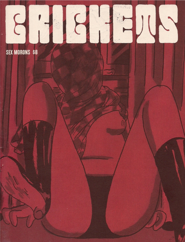
Crickets #3 (Sammy Harkham; self-published, $8.00)
“These are my drawings.”
Such was said to me at last year’s virgin BCGF by Pakito Bolino, co-founder of the notorious French comics/prints/visual noise attack collective Le Dernier Cri, active since damn near the dawn of the American Image Comics Revolution in 1993. At the time, Bolino’s presence seemed indicative of the show’s identity — harsh, colorful, handmade visual sensation — while acknowledging the history of that aesthetic impulse in comics, a world history. Going into the second BCGF, I was interested in observing how the show’s gait might have changed; it remains a curated thing, and a common response to complaints re: the selection of included artists — adequately summarized here, I think — is to assert that the show’s makeup reflects the interests of the show organizers.
(I know this doesn’t address potential irregularities in the selection process itself, but bear with me.)
So what are these interests? In all candor, this year’s lineup of exhibitors didn’t seem to have as particular an identity, instead spreading out a bit more into the wider alternative funnybook sphere. Witness Crickets #3, the latest solo issue by Sammy Harkham, mastermind of the ’00s-defining art comics anthology series Kramers Ergot, which is typically remembered for bringing the stylings of Fort Thunder and affiliated/like-minded artists to the wider scene in an enormous, colorful, designed-to-the-hilt, impossible-to-ignore format. But the keenest trick of Kramers was that it didn’t rely entirely on mad mark-making; it placed these works, in their already diverse forms, into a broader context of contemporary ’00s comics, which I think made them more efficiently digestible to a wider audience. Harkham’s own Poor Sailor, first presented in the landmark Kramers Ergot 4, is an eminently straightforward piece of airy, fast-paced gridding, comparable to Chester Brown’s contemporaneous Louis Riel, but forthright in emotional impact.
(page detail)
This new Crickets sees Harkham breaking off even further into ‘literary’ comics territory, especially compared to earlier issues. Signs of breakage abound; former publisher Drawn and Quarterly’s contact information is included in the legal indicia with a single black line drawn through it — in that no other publisher is listed, we can potentially deem it “Not Drawn and Quarterly” — and the self-contained package’s kickoff work is titled The New Yorker Story, which both identifies the creative item at the heart of the tale and perhaps jokes a little at Harkham’s transition from the fantasy-horror material of the first two issues to stories of desirous men navigating the compromises of their lives. Working with between 22 and 25 panels per oversized page (viewable online through Vice) it’s an impressive piece of compression, cramming down an entire saga of creative frustration/inspiration, gnawing sexual angst and internal conflicts made physical into just four pages, but its positioning marks it as just an overture.
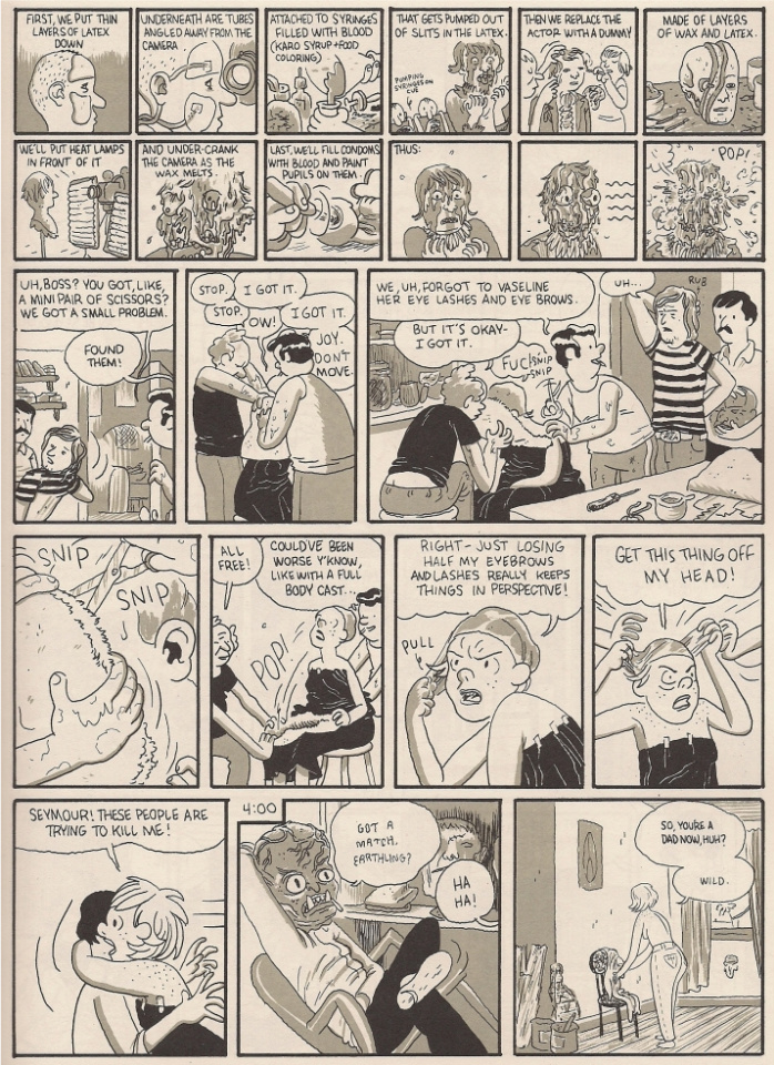
The meat of the issues comes from Blood of the Virgin, a similarly dense but expansive, 41-page look into the life of a lowdown exploitation movie studio functionary in the 1970s, the kind of guy stuck piecing together trailers while (unsuccessfully) working his boss for a shot at directing his own genre picture. It too is a story of seething desire and disappointment — the comic is subtitled Sex Morons, in statement of the characters’ majority concern — yet it also sees Harkham folding his passion for horror material into a ‘realistic’ milieu, complete with small, matching rows of panels clustering at the tops and bottoms of certain pages to provide instructional moments on topics such as cooking or movie makeup (as seen above). Harkham remains fine at pacing a story, despite the potentially crowded nature of his pages, and this little detours into even tighter panels effectively represent moments of focus, in which characters get work done. Everything else sees them emotionally out at sea.
There’s a lot of fun in store for readers who share the artist’s interests; in the issue’s Thank You section, among various comic book names, Harkham mentions filmmaker Joe Dante, who worked for Roger Corman in essentially the same capacity as the Blood of the Virgin protagonist, at roughly the same time. One story seems especially apropos (and in the spirit of drive-in ballyhoo, I will recite its most colorful iteration): Monte Hellman’s 1974 Georgia-set Cockfighter is a horrible flop. Corman calls Dante and urges him to prepare a re-release trailer under a more exploitable title, Born to Kill, spiced up with car chases and sexy footage from other sources. “But Roger,” Dante says, “we can’t just put scenes from other movies in the trailer!” “You’re right,” Corman replies, “put ’em in the movie too.” And so, in Born to Kill, Warren Oates closes his eyes at the end of one scene and dreams of naked breasts and smashing vehicles from elsewhere in the Roger Corman catalog.
Likewise, Blood of the Virgin is an ill-fitting title for a proper literary comic, the kind where a dissatisfied Sex Moron does or does not experience a tiny epiphany while skirting some major change in his life — just as he does or does not witness a woman’s murder as prelude to the story’s critical, full-page super-tight ‘instructional’ sequence, depicting his good lady wife’s homemaking routine at that very moment — but then, the nature of a fake horror movie title is transposition of something exciting for some presumed mundanity. As such, Harkham’s Dante-like protagonist unsuccessfully navigates the hellish circles of filmmaking, attempting to substitute a more exploitable life for his daily routine, but instead only sees his opportunities cut away and taped into others’ projects. “Stop expecting so much from everything,” Our Man’s mogul boss tells him, and for his failure to follow direction, Harkham gives him a plain life’s horror show, appropriate coming from a straight-shooting icon of art comics sizzle.
***
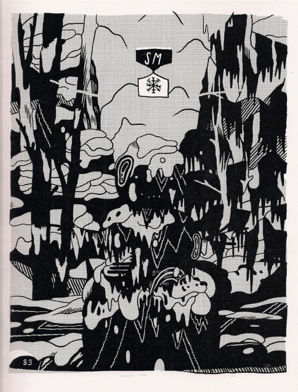
SM (Michael DeForge; self-published, $3.00)
Elsewhere in one-man shows, there’s the very visible Michael DeForge, who’s been evolving on the page at an exciting rate. He had a number of projects ready for the festival, and while the new Koyama Press color comic Spotting Deer has picked up a lot of attention so far, I was a little more taken with this 8.5″ x 11″ twelve-pager, presented in wintery blue. Both comics were show debuts, and in a way they complement each other. Spotting Deer takes the form of excerpts from reference books on a particularly odd animal species, eventually suggesting that the shared author in question sympathizes with the poor beasts on a personal level, though artistic expression is of little use to the maybe-not-so-anthropomorphized-at-all species of the man’s study. The shifting narratives and anxiety of influence present in DeForge’s Lose #1 are active, in a less autobiographically colored manner.
![]()
SM, in contrast, pares down the biological horror of Lose #2 to dreamlike cause-and-effect, and explores a more wild nature, if still not quite free of people (or humanoids) casting animals (or fleshy SnowMen) in their rough image. There’s not much in the way of plot, but some good, eerie images are presented, while long(ish)time readers can enjoy the increasing build of DeForge’s character art into a manga-like cartoon realism, while his in-panel spaces become increasingly evocative. If Spotted Deer is cerebral, presentational, this is coldly observational, and valuable as an alternate glimpse at a multifaceted talent.
***
Swastikka Massala (Laetitia Brochier; Le Dernier Cri, 25€)
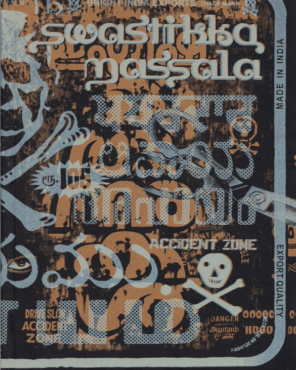
What? I always keep a stack of euros tucked in my back pocket, in case I’m mugged by Walloons. Unfortunately, given my little spiel up top, representatives of Le Dernier Cri were not at at the show this year, so their presence was primarily limited to a display on the Desert Island side of the rear stage, where 25€ translated to $35.
Did I mention there was a stage in the back of the show floor, where the show organizers were set up? It was like a nativity play, with attendees climbing up on the stage like noble beasts to mill amongst Joseph the Carpenter and the Blessed Virgin, played by Desert Island and PictureBox; Mary was whomever was wearing more blue. The babe savior was comics, of course, flowing off the stage beatifically into the mass of humanity assembled, provided they did not run out of money because the nearest working ATM was five or so blocks away. I’m still not entirely sure how Bill Kartalopoulos fits into this allegory, but I assure you I’ve already bought a candle at holy mass before which to pray for answers. WAIT – he’s Santa!! Ha ha, awesome – check canceled!
Swastikka Massala, like much of its publisher’s output, fits more into the Graphics portion of the festival’s title than the Comics, but stories can nonetheless be read. “Mas[s]ala” is simply a mixture, but Hindi speakers could mean it as (commonly) a blend of cooking spices or (commonly to dorks like myself) a blend of genres onscreen intended to accomplish the all-points crowd-pleasing victory coveted by Bollywood filmmakers. The swastika, meanwhile, is a symbol of (pertinently) Hindu import, representing the nourishment of the sun. Artist Laetitia Brochier thereby collides spiritual and sensational satisfaction with a book of collage inspired by a trip to India; the threat of poisoning and overindulgence is present on virtually every page, with consumerized deities sharing space with defaced advert and poster art, a recurring motif of exposed organs pasted down to emphasize the digestion of all this colorful cultural noise.
I’m of two minds about this. It’s often gorgeous work, sometimes massively hot and affecting — of everything I bought at the show, this is the one and only item so far to evoke a “holy shit, this is nuts” reaction from a non-devotee — but fundamentally traffics in an ‘India is torn between spiritual and consumerist matters’ posture that’s banal and faintly condescending, and moreover nonspecific, in that the same can (and in all likelihood has) been said of any rapidly growing industrial state. And then, there’s the more specific iconography: the swastik[k]a can also be taken as symbolic of the punkish, fuck propriety nature of the visual fury practiced by Le Dernier Cri and fellow travelers, perhaps hardening into off-handed self-reference in a less familiar terrain.
***
Exit #2 (Adam Parfrey, ed.; George Petros, $6.00)
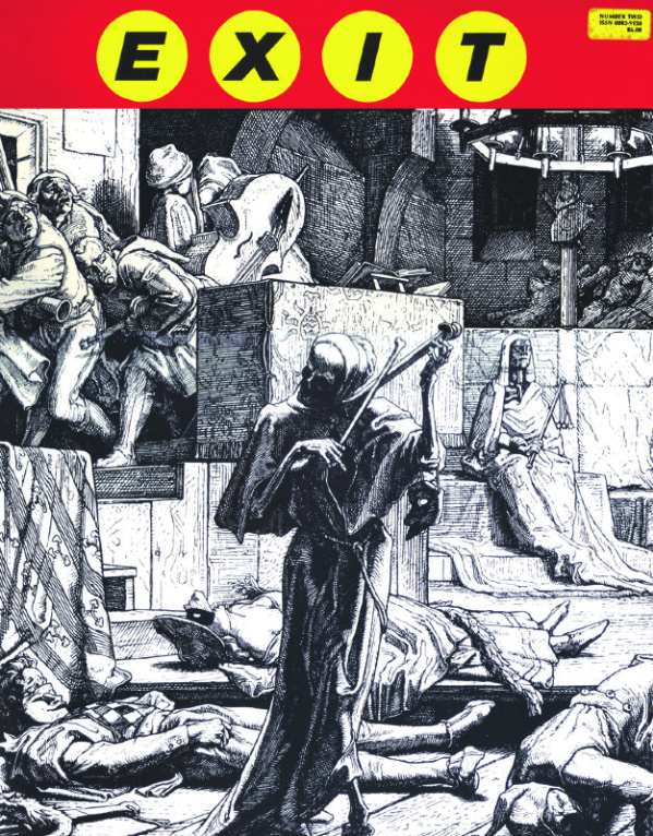
This, on the other hand, is altogether astonishing. It’s a huge production from 1985, slightly bigger than one of the old Treasury-sized comics of the ’70s; I didn’t find it at the BCGF itself — and I totally did not pay the quarter-century old cover price listed above — but I tend to include anything I get from otherwise inaccessible venues (i.e. anything located in New York City and not just outside a cornfield in Pennsylvania) as part of the “show,” so here it is now. It’s actually very much of a piece with the official festival creations, blending images and text and outright by-any-definition cartooning (from Carol Lay, Joe Coleman and others) into a total narrative production.
As a series, Exit lasted only six issues from 1984-94; you’d be best off trying to track down the 1998 Tacit Publications book The EXIT Collection, which compiles all original work created for the project, which publisher George Petros (of Seconds and Juxtapoz among other editorial efforts) characterized in his introduction as “a forum for extreme ideologies and inclinations manifested as political pornography, psychosexual terrorism, scientific threats and infernal texts.” At the same time, there was a definite comics inspiration: “I had hoped we would be perceived as something like a Rock Band — an Art Group in the tradition of Zap or Metal Hurlant or Blast crews.” The editor, as of issue #2, was Adam Parfrey, later founder of the publisher Feral House, of such recent books-on-comics as Siegel and Shuster’s Funnyman and The Weird World of Eerie Publications.
From "The Inferno"; art by Georganne Deen (page detail)
It could be the same malady that causes me to see the Birth of Christ in the layout of a comics convention in a church gymnasium, but Exit #2 strikes me as a narrative work, despite its omnibus approach to political/societal/religious provocation, and its stated analogy to Hardcore music – I’m also reminded of Nick Zedd’s coinage of the Cinema of Transgression the same year, ’85: “We propose that all film schools be blown up and all boring films never be made again. We propose that a sense of humour is an essential element discarded by the doddering academics and further, that any film which doesn’t shock isn’t worth looking at. All values must be challenged. Nothing is sacred.”
Exit #2 is slightly more cautious, in that its first page presents a doctored New York Times front page from 1943, telling of a deadly meteor shower essentially ending WWII by virtue of a natural act. The implication is that world politics of the 20th century are stripped of a heroic narrative, and ensuing pages present a barrage of fascist implications, democratic critiques, images of cyclical warfare, religious and anti-religious fury, and point/counterpoint essays on the contemporary phenomenon of muzak by one Joseph Lanz (the only authentic musical genre for societal sterility) and Genesis P-Orridge (a means of metabolic control nonetheless indicative of frequency/pulsation techniques potentially accessible to the public). Mark Mothersbaugh brews up juxtapositions of glaring luchadores and a pierced clitoris — both less common reference points 25 years ago, I’m guessing — while grotty photocopy collage and early computer art share fuzzy aesthetic space.
From "The Schism"; art by K. Seltzer (page detail)
Comics and graphics, man – absolutely. If you’re looking for a funnybook strain grown apart from traditional lines of development, informed by a separate, more DIY strain of broader Art of the time than RAW, this wouldn’t be a bad source of inquiry. Its assured and alive, and its delight to shock leads it to sometimes silly places, but then it also seems comfortable with the comic aspect of comics, even while it utilizes “montage,” that storied cinematographic term, for its use of sequential images. Don’t mistake it for anxiety, it’s only looking to find some nervy union between, again, comics and graphics, and music and essay and everything else charged up with the shock of living in time and space. A Denouement is labeled, positioned at issue’s end, presenting varied quotes from sources like William Blake and Jim Jones, giving way to a nine panel sequence of lips moving and nine identical quotes from Decline of the West:
“What do we possess today as ‘art’? A faked music, filled with artificial noisiness of massed instruments; a faked painting, full of idiotic, exotic and showcard effects, that every ten years or so concocts out of the form-wealth of millenia some new ‘style’ which is no style at all since everyone does as he pleases; a lying plastic that steals from Assyria, Egypt and Mexico indifferently.”
Repeated in unison, and it starts to sound great. Comics have such appeal.
***
Fiction Illustrated #2: Starfawn (Byron Preiss & Stephen Fabian; Pyramid Publications, $1.00)
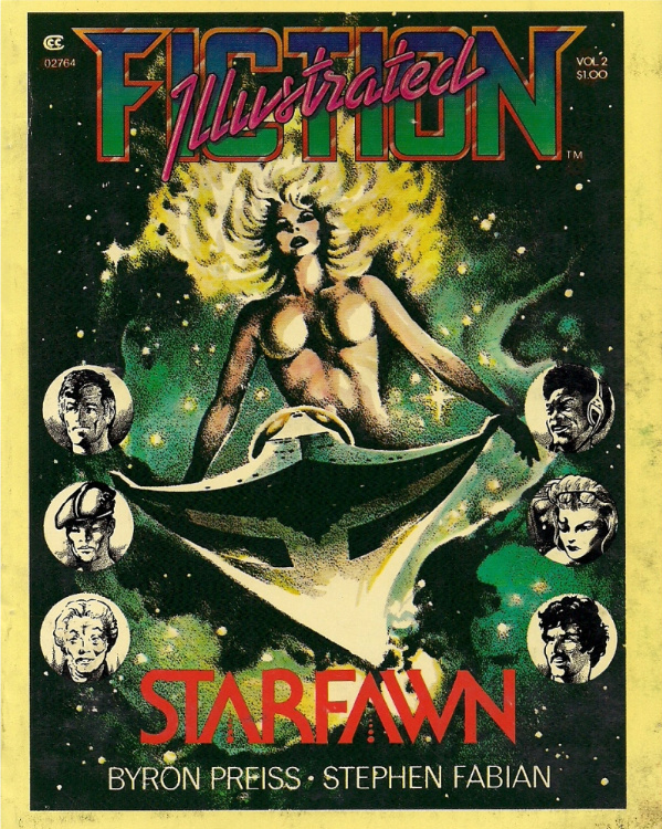
Now this one I did get at the show, and didn’t pay all that much more than 100-cent fee of 1976. Fittingly, it’s a much more comics-centric cut of historical curiosity, hailing from a famously harsh time and concerning a tricky central figure. Byron Preiss’ name tends to come up frequently in reference to the development of bookshelf-ready comics, but he lacks the auteur’s appeal of a Gil Kane or a Will Eisner, and typically hewed close to popular comics-ready genre convention. Still, he was the prime mover behind Fiction Illustrated, an ambitious attempt at selling self-contained, original comics in a digest format to the paperback book market, with uniform branding for the rack and diverse visual styles inside. The effort was unsuccessful, and absolutely all that anybody remembers from the four-book line is Jim Steranko’s Chandler: Red Tide, soon to haunt our souls again from Dark Horse.
Something tells me a Starfawn revival may not be imminent, but it’s fascinating to me as an example of Preiss climbing in and writing a comic-of-the-future directly, as opposed to, say, suggesting the ahead-of-its-time wide-paneled layout structure of the 1978 Samuel R. Delany/Howard Chaykin collaboration Empire. The results aren’t so good from a plotting standpoint; initially juggling a cast of approximately 10,551 characters on a very starry trek into the galactic frontier, Preiss eventually opts to cross-breed a cosmic superheroine’s origin story with a peaceable, idealistic adventure in which humankind and a super-intelligent alien race that uses naps like drugs learn to get along with one another.
But the story has an interesting way of oscillating between clusters of typed-out text sitting outside of panels and hand-lettered dialogue appearing in-panel – it’s a slightly more distended form of the verbose caption narrations already in use in superhero comics of the time, deliberately separated as a page element from the art and given a cooler appearance, so as to emphasize the consideration of narration to the reader. Word and thought balloons are comparatively ‘warm’ in appearance, and positioned as immediate elements of the temporal in-panel action. Such play with the proximity of words and pictures is typical to early ‘graphic novels,’ but Starfawn, hackneyed and generic as its content is, acknowledges the virtue of comic book tradition in the formal sense, while still seeking cooler visual arrangements than the later A Contract With God.
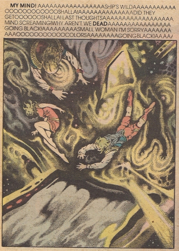
Presiding over the art is Stephen Fabian, who would eventually become a mainstay artist for Dungeons & Dragons; his characters are detailed and stiff, with thick outlines occasionally expanding into clouds of black radiance, filled with glowy cosmic stuff. Likewise heavy are his stippled backgrounds, model-tight; it’s the kind of approach where elements of a given panel can sometimes appear photographic, while weird and seizing characters lurk in cartooning toward the back. Not particularly underground, it’s roughly of a type with the “ground level” bridge works of Star*Reach, which utilized some of the same talents as Preiss, as did the Warren magazines. For all their populism, most are obscure today, but not beyond the none-too-constrained curatorial eye of Comics and Graphics.
***
Header image by Masahito Soda, from MOON?Subaru Solitude Standing; come back later this week for the second part of our landmark saga, featuring exotic foreign “manga,” new comics anthologies and beautiful, cleansing violence.
Labels: Adam Parfrey, BCGF, Byron Preiss, K. Seltzer, Laetitia Brochier, Le Dernier Cri, Michael DeForge, Pakito Bolino, Sammy Harkham, Stephen Fabian


The Crickets issue is a fantastic piece of work.
Where did you score that Exit #2? Did they have any more?
I think I saw that at Time Machine when i was in nyc.
Yep, that’s the one. I didn’t see any others, although you never can tell what’s tucked away in there… I wound up leaving behind a copy of GASM (#2) with some early Ben Katchor…
I picked up the massive first issue of harold head, some more undergrounds and a big stack of Wally Wood reprints.
I think the timeline of that went: I picked it up, showed it to you, got distracted, put it down, wandered off, and saw it here two weeks later. Curses!
[…] Speaking of BCGF, Joe McCulloch has posted “part one” of his BCGF report at Comics Comics. It’s actually more of a review round-up for the books he got there, including Sammy […]
Interestingly, this comments area buttresses Franks comment elsewhere that it seems few want to discuss books after they come out. A hundred comments about some guy’s remote viewing of the not-yet-existing Toth book , but no reams of incoming praise for Harkham’s awesome Crickets? Wha…?!?
To be fair, I’m not sure how available CRICKETS #3 is yet… I don’t think it’s been distributed to comics stores yet, and I believe the BCGF was the first show it appeared at, so I presume people are hesitant to discuss in detail a comic most of them don’t have…
Oh, okay. No spoilers.
No no, you can discuss it here if you want, I’m just saying that some people might not BE commenting right now because they’d just rather not before reading the comic itself, and the comic isn’t so widely available yet…
“Widely available” and “Crickets 3” might never be synonymous, no critique of Sammy’s comic intended. It’s just with that book and a lot of other small publisher books coming out now and recently, if you have seen it, it’s been released.
we haven’t got crickets yet here in minneapolis. isn’t it published “not by drawn and quarterly”
whats the deal there. as for books actually published by drawn and quarterly anyone got any thoughts on the final big questions? I’m gonna miss them donut hoarding birds.
by the way Brynocki, on the subject of the width of availability. I recal a couple years ago being shown that somehow target.com had battlestack glacticrap listed on it’s site. how in the multiverse did that end up happening? I actually tried ordering it just to see what would happen. I got a confirnmation email but no charge to my card.
[…] Jog at Comics Comics […]
[…] month’s issue of Fader has a write up about me. Thanks Fader! – Joe McCulloch begins his BCGF round up here, and writes a bit about my comic […]