


SEVEN MILES A SECOND
by Jason T. Miles
Saturday, September 11, 2010
This comic tore me up by which I mean it wrapped me up and held me. Death grip. Eyes closed, squeezing too hard to nothing. SCARY. This comic is WEIRD. I picked it up from the quarter bin. The art looked good, the colors strange and… um, it was a quarter. And by the tenth page I couldn’t take it no more and had to get up and wash the cover, seriously. Quarter bin comics can be GRIMY. Normally I can take it but in this case the grime was comprehensive. It was plaque. Real lived in terror page by page and despite what I’ve seen it’s hard to reconcile what David Wojnarowicz has seen… I take a paper towel and hold it under luke warm water until its soaked and then I squeeze it until I have a damp wad of paper towel in my hand, then I shake the thing out and wipe down the cover (this is how my Grandma taught me to DUST).
Title: SEVEN MILES A SECOND
Writer: David Wojnarowicz
Artist: James Romberger
Colorist: Marguerite Van Cook
Year: 1996
This comic keeps its distance. Toes on the edge. You can see EVERYTHING. Every God-damned thing. Every sad sad thing. Everything antagonizes in this comic. Everyone is a VICTIM, which could be a criticism but I don’t mind. This comic describes an out of control helplessness, always tragic and leading to one thing: DEATH. And sometimes dying can be beautiful if not ecstatic. FLEETING. We have very little time and what time we do have is out of our control. “The minimum speed required to break through the earth’s gravitational pull is seven miles a second. Since economic conditions prevent us from gaining access to rockets or spaceships we would have to learn to run awfully fast to achieve escape from where we are all heading…”

I’ve seen this cover a million times. I’ve known this cover forever. Where has this comic been? Why haven’t I read it before? What took so long? The cover image is the perfect illustration for what’s about to be read… and sure, we’re all victims of our environment and TIME… but the kid’s leg is turning into roots, which I take to mean we are what’s devouring us… anyway, the roots are breaking up the concrete and digging in and then we see what lies beneath or what doesn’t lie beneath. We see some pipes and some construction shit and some of the kid’s foot roots and then NOTHING. Nothing there. White space… writing about it now, this image is too loaded for a cover, it’s a thesis and I’d prefer it if this were the last image of the comic. Something built. A narrative chord, harmonic dirge.
When I picked this up I knew nothing about David Wojnarowicz (RIP) and I don’t really care to know anything about him or his reputation. This comic hits me where I live. Its repulsive and attractive and its something I know and something I don’t.
There’s a lot of copy in and on this book for what amounts to a 52 page comic. Lots of exposition is provided for us by people not named David Wojnarowicz. We get exposition from Wojnarowciz’s lover. We get exposition from Carlo McCormick and from the usual flap copy and pull quotes… six fucking pull quotes to be exact!?! And all of it is trying to make sure we recognize this comic, this story, David Wojnarowicz’s story is IMPORTANT. And it is important and thankfully the comic itself foregoes exposition because it’d be weak to include all that fucking noise… but that noise, that expository noise is one of the things that adds to that drowning feeling…
Maybe not drowning… maybe submerged… fighting to make your way before…
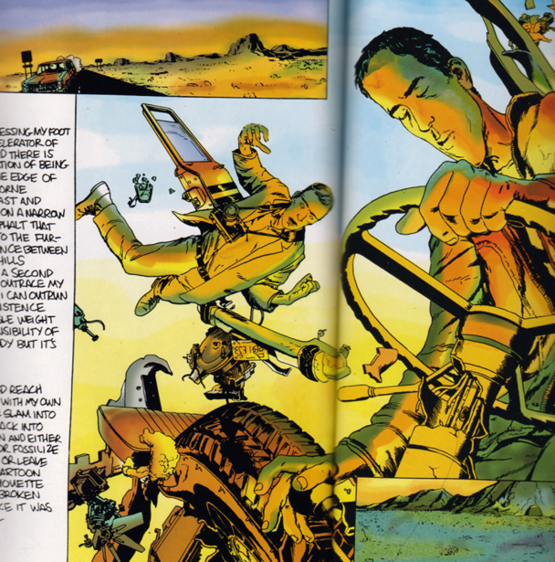
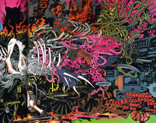
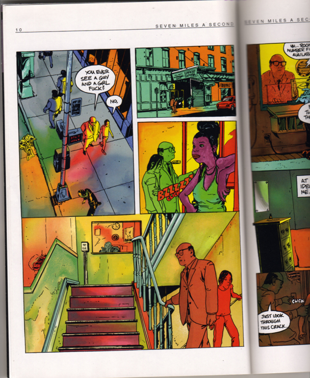
James Romberger is a discovery for me. His work here is awesome and its difficult to look at because it READS. He has an inviting line and he’s got that magic cartoon thing where I feel shoulder to shoulder with his ink. I feel projected into his graphic world. His lettering is lettering! (Dear 2023 Reader, there was a time when comics were only lettered by computers pretending to be humans. I know it sounds stupid but that’s why all that old stuff looks old.) Romberger’s lettering fits somewhere between Alex Toth and Aaron Cometbus. Romberger appears to be coming from the Toth, 80s Mazzucchelli, Tony Salmons side of the yard but in someways he’s more restrained and direct, more functional and attentive to conjuring Wojnarowicz’s script. Flipping through the comic, the layouts look choppy but all those hard breaks evaporate and the eye willingly, thankfully let’s Romberger drive. And its a seasick road because the story is fucked!
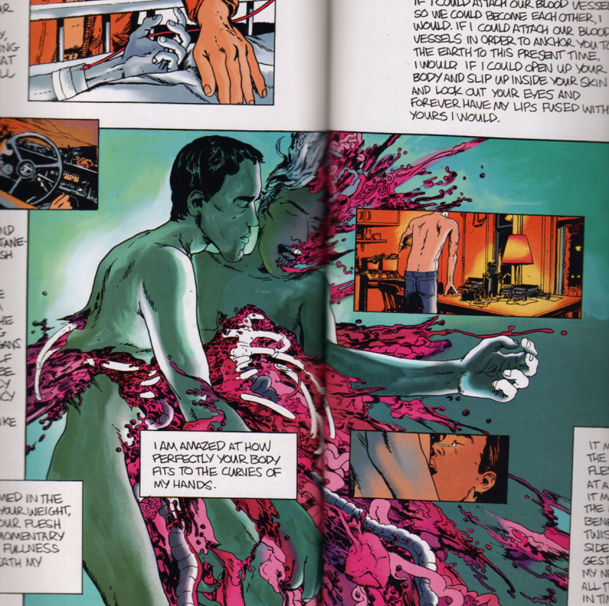
Marguerite Van Cook’s coloring is pitch perfect and tells the story along with Wojnarowicz’s words and Romberger’s ink, which is something not common enough when it comes to color comics. Her colors are a fevered tied died wash of response to what the main character is experiencing. Her colors are psychologically psychedelic. And her color isn’t always full on. There’s a scale to Van Cook’s pallet. Her contribution is deeper than illustrative and is equal parts to that of her collaborators. Her colors push and pull and disorient as Romberger’s layouts turn and Wojnarowicz words dissolve.
Pound for pound, Seven Miles a Second holds its own when held beside the oblique autobiographical comics masterpieces: Binky Brown Meets The Holy Virgin Mary by Justin Green, Invisible Hinge and What the Left Hand Did by Jim Woodring. The presence of Seven Miles a Second in this rarefied pantry is especially significant considering it was a group effort and published by mall-rat goth champs, Vertigo. In a medium known for either assembly line output or fiercely individualistic broadcasts, I hope Wojnarowicz, Romberger and Van Cook’s accomplishment will spurn more worthwhile collaborative illuminations.
Labels: auto-bio, collaboration, David Wojnarowicz, James Romberger, Marguerite Van Cook


Okay, I need to read this.
You should read Delano’s 2020 Visions.
@djm: I was going to say the same thing. I remember reading this when it came out. I think I found it stuffed behind some other books in a comic shop somewhere in London. Now I’ll have to scrounge around and see if I still have it to re-read it.
Delano is a really underrated writer.
I’ve seen that last image somewhere, I’m thinking maybe Brandon Graham’s blogged about this comic, for some reason…
Thanks for one of the best reviews of SMAS ever! Really energized us.
That book was rejected by every publisher in America until it finally found a home at Vertigo.
Note that when and if it is ever rereleased, Marguerite will be credited on the cover as a full third collaborator….there is still a lot of general misunderstanding in the medium regarding the importance of color.
Also, please check my recent post about comics collaboration on the Hooded Utilitarian:
http://www.tcj.com/hoodedutilitarian/2010/08/the-crisis-of-the-collaborative-cartoonist/
Fantastic review! How’d we get a guy who knows stuff, knows the language and is hip too! How’d we find that in comics? Thanks for this Mr. Miles!
James and Margurite are going to feel like a pancake after the Aunt Jemima after this but they deserve it.
I searched out SMAS after reading a short review that I believe was in the Comics Journal news mag some 15 years ago or so? The book knocked me out. I lost mine and’ve never seen it again until I met James in a funny sort of way at one of the Rooseveldt Hotel cons in NY some years ago.
Anyone who’s not seen his other work (mostly in Vertigo) should dig’em up. He’s a natural draw-er, an immersive storyteller and a singular voice. He’s also a thorough student of comics history and classics and able bodied advocate of creator’s rights.
Recognition of James’ and Margurite’s very unique presences on the rack is deserved and over due
May I ever have someday something this unselfconscious, natural, with meat-on-the-bone in my own repertoire.
Now, maybe someone out there with market silohuette will repubish “Seven Miles A Second” with the presentment it deserves.
Bravo, James and Margurite! Your fan, -t.
There aren’t many cartoonists /artists around better suited to painted colour work than James.
http://images.artnet.com/artwork_images_697_355063_james-romberger.jpg
Funny Tony would post here. I just saw an old quote from him while paging magazines last night. No surprises from me. It’s about Kirby.
David Anthony Kraft’s Comics Interview #121:
TS: “I actually liked the stuff Jack inked himself in the 50’s the best. Kirby is a hard guy to take any influence from. Kirby really knew how to draw. And I don’t know where he got that facility from, because it’s really hard to find him swiping anything.”
Dude, shit’s fucked up.
even if one isn’t a fan of david w, this is a wonderful book:
http://www.semiotexte.com/authors/davidWojnarowicz.html
I am honored and humbled that Tony would write in and say such nice things, he is a truly great comic artist.
Pat, thanks for the thought, however, that is not a painting but rather a very large pastel drawing; truth be told, I don’t paint and have little interest in doing or reading painted comics. I’d be happy to be proven wrong but it seems to be too much effort to be passed over quickly in the reading experience of comics… one is stuck looking at the painting and loses touch with the story. Call me old-fashioned but the “holding line” is close to my heart.
jason, we never talked about this one back on rexford?!
I shouldn’t make such a hard and fast distinction and I’ll stop blabbing, but “painted comics” usually signifies means Alex Ross or a line-less look like that to me, I guess. Skilled, yes, and a painterly surface….but I see that as a sort of wall. I mean, there’s a few books like Electra Assassin and Mr. Punch that have some merit as experiments…fine but not in my sphere of interest. Then there’s Anders Nilsen’s excellent strip in that humugous Kramer’s Ergot and Dash Shaw’s Body World, I love those and a few others I’m forgetting, sorry, but, um, they still use cartooning and holding lines. It’s the line and color, along with the words drawn on the illuminated page, that speak to the reader, I think.
James being that you like pastels, maybe this would interest you?
http://www.reuters.com/article/idUSL0783750220080207
There is no reason why colour or rendering would inherently inhibit narrative flow.
It’s all a matter of measure.
Imagine your pastel cityscape as a comic book panel.
It, as it stands, could work perfectly in a story or be a distraction.
If there were a bit of dialogue,
“I remember your grandfather always wore that watch.”
attached by word balloon to one of the cars the “splash panel” might not work at all.
If the “splash panel” was preceded by a page or two of small drab panels; a young woman on a long uneventful, but introspective bus ride to the big city for the first time, dozing, waking up in the dark underground bowels of a city bus terminal, climbing the tight dark steps, and stepping out onto the street:
http://images.artnet.com/artwork_images_697_355063_james-romberger.jpg
The “panel” would work very well.
I’m not for or against colour or B&W. Either way can work. The over-rendered inking of an Alfredo Alcalla was enough to distract even from the basic solid storytelling of John Buscema. The problem with most of the “painted comics” I’ve seen isn’t the colour, it’s the painter doesn’t understand storytelling.
All I can say is, it’s about time this comic got this kind of insightful and appreciative review…and about time people started talking about how awesome James is. Let’s have more of that, comics blogosphere!
Dear Pat,
Again, I appreciate the thought, but still have to say that my pastels are wall objects, not parts of a narrative. If I was faced with drawing a hundred or more pages of a book in pastels, I would probably prefer to slit my wrists.
Comics are aleady labor intensive…plus, pastels are large chucks of compacted pigment, they must be done quite large, to get any degree of detail. I would have to pay massive storage fees for the originals, which would also be ridiculously fragile and would need to be photographed for reproduction, thereby losing much of the detail….so, no. And, I love working with Marguerite and am always surprised by others’ realizations of the drawings in color, plus I enjoy coloring my own drawings…line drawings, which as many people have noted, have a unique relationship with the viewer of comics.
James, My point isn’t that you should do colour comics in pastel, but that fully rendered (tonal) colour can work well as a storytelling tool, and that those instances where it doesn’t are because the artist has made confusing choices.
Does anyone think an artist would be a strong storyteller in B&W line, but a poor one when “painting?”
Jim Woodring is a good example. B&W line, full painted colour, it doesn’t matter the storytelling is a rock.
I just read this in the past year, borrowed from one of my local Kentucky comics swapping buddy-nerds, and find myself really glad to read a review.
I love this book. It really blew my mind when I first read it, and this review makes me realize I need to track down a copy again.
Not surprisingly, I agree with James. But I don’t disagree with Mr. Ford.
This could become very psychological and metaphysical if the subject is parsed enough but essentially it’s this, as I’ve discovered it (because none of us invented it): color and tone are graded volumes, fullness of form, a feminine principle and we are immersed in it. The holding line is an agreed upon convention to represent the edges and limits of all things observed. It is the beginning of our arts in basic drawing classes and I’ll posit here, it is the finish of our ambitions as well, as great Masters show.
The line is not inimical to color and volumes, it is complementary. Line and Form/Volume are opposites that fulfill each other. While color and tone are the fulness of space (abstracted, it means infinite) the line is definite (de-infinite) and is therefore assertive, limiting and masculine.
On a mundane level, no one signs a check or a contract with a smudge of color or tone, they “sign the dotted line” with their “mark.” (In these instances, the graded tones and volumes are in the fine print. Hah!) We all respond to a sunset but psychologically, the brain responds (resounds!) to the full strike of a pen loaded with ink.
Examples: my good friend and fabulous comic book painter Scott Hampton (you must know his stuff) when he was painting the Penthouse Comix Bible Stories, he selected for a black line in the middle of the series (as I remember him telling it to me) to further define his great figure work. He was not only more satisfied with the result but also with the viewer reaction. The change he described is evident in the series.
Most of the great “painters” from classic periods to now utilized the holding line constantly if not always. (Look closely at the individual elements of their compositions.) This includes the Italian masters (Michaelangelo, et al) to the new movements involving Klimt and fine de cicle, to modern illustrators like Dunn, Loomis, Cornwell up to Frazetta: all utilized line to assert the central figures/action/ideas to separate them from a lush color volumetric of the larger image.
These discussions are probably not suited to a column of responses to a brilliant review of brilliant work. It’ll eat up the landscape with gab. But a brief note about Line vs. Form/Volume is pro’lly OK.
Thanks again, Mr. Miles! -t.
Thanks everyone for commenting! Great discussion going on regarding line and color. And thank you for the kind words Mr. Salmons! I’ve been tracking down your work since I found a copy of Dragon’s Teeth (http://www.milehighcomics.com/cgi-bin/backissue.cgi?action=fullsize&issue=27107676190%201) in Jr. High! James, your work and Margurite’s work is fantastic and I’m currently seeking it out. I’m really enjoying the work on your website (http://www.thearteriesgroup.com/JamesRomberger.html), especially “Ground Zero.” Best, JTM.
Thanks Jason. Hey guys, don’t drop the e, its Marguerite. Tony’s amazing work on Lovecraft made that project fly, currently in stores in a collected edition, as is his crucial DC Vigilante miniseries.
I wish David was around to read the good comments. Anyone interested in him should try to find his other books, “Sounds in the Distance”, “Close To The Knives” and the one I think is his best, the relatively rare “Memories That Smell Like Gasoline.” Note they are not comics.