


New Comics riff
by Frank Santoro
Saturday, July 17, 2010
Comics shop reverie. Ah, the new store. Up in the clouds. Heaven. Copacetic rules the roost in Pittsburgh. Best feeling shop in town. I guarantee it! I work Sundays folks, come on down! Take a seat in the easy chair and read the funnies. Have a coffee.
This was a big week for a fanboy/wanna-be-critic like myself. Can you say “paradigm shift?”
Let’s count ’em off: Bulletproof Coffin #2, Orc Stain #4, King City #7 (I know, that came out weeks ago but I missed it and had to re-order it), The Man with the Getaway Face preview, and the new Matt Kindt graphic novel, Revolver. What was I saying about the Direct Market being dead? Sorry, I was high. This has been a great summer already for my new drug: Fusion comics. My term for what Charles Brownstein calls “Boys Comics.” And the Direct Market is delivering my fix, so who’s complaining?
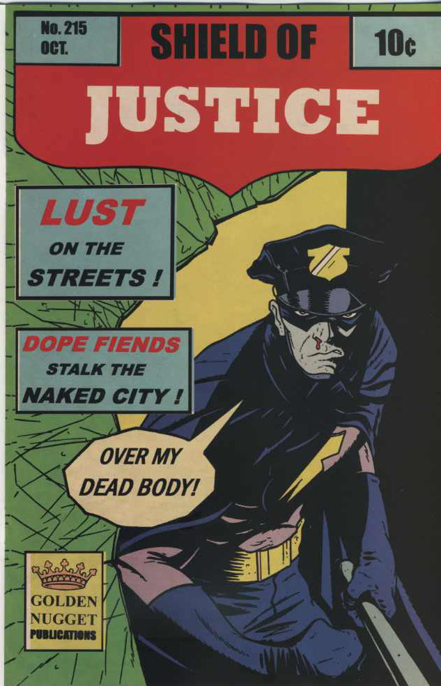 Leading off, The Bulletproof Coffin #2 By David Hine and Shaky Kane. This is my dream comic. I’m in love. This comic is my girlfriend. At this point I wouldn’t care if she fucked my best friend. This comic can do me no wrong. For me, it’s a perfect mashup of styles that POPS with bright colors and dripping blood. The whole book looks really sharp, I think, and the story’s clever unfolding owes a lot to its design. There’s another comic-within-a-comic interplay (Shield of Justice cover to your left) that twists up the story and makes it all swing. If you couldn’t find issue one, I’d say you could still jump on board with #2 and not miss the train. There’s a great synopsis on the inside front cover that made me laugh. Reads like a comic book, like serial entertainment. And for me, really, it’s just the joy reading a Shaky Kane comic. Talk about Fusion – Shaky’s able to somehow subtly, easily shift styles that it really creates a jarring, discordant note in the story. Check it out.
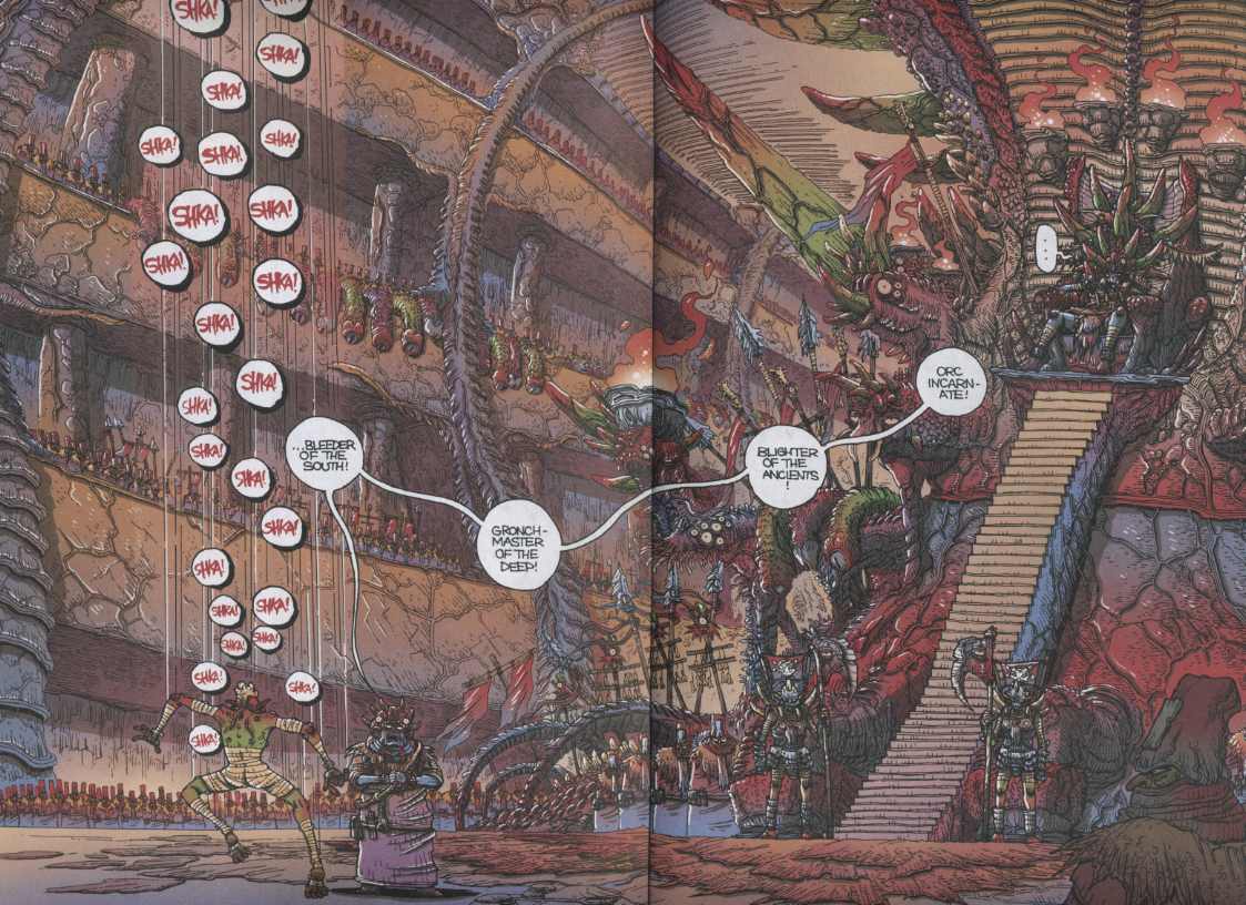
Second up: Orc Stain #4. James Stokoe continues to give me a contact high just from leafing through his spectacular otherworldly narrative. Damn, can that dude draw. (See above spread.) I just try and keep up and decipher it all. I’ve noticed it’s bit hard to take in for the uninitiated, meaning potential new readers. Stokoe’s layouts sort of overwhelm these potential readers. But the sheer drawing skill on display usually sells the book. A favorite of the kids downstairs at the record store.
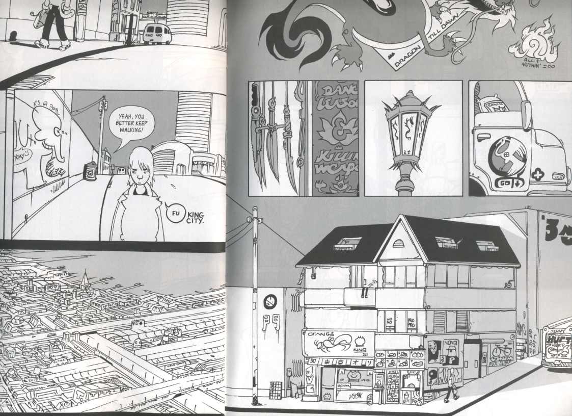
Batting third: King City. I know, I know, King City didn’t come out this week but I still wanted to write about it anyway. I’ve noticed that girls really dig King City. It’s the cat. They love the cat. Cracks them up every time. So much for “Boys Comics.” Fusion, baby, Fusion, I say!
I must be a little girly cuz that cat gets me too. It’s pretty funny. There’s a “cat master” and his cat. The cat is a fully armed ninja with an adorable personality who’s also a supercomputer of sorts. Got it? And it’s drawn in an updated Moebius/Bode style that to my mind just shreds much of the competition these days. I can’t think of a more current and relevant style than Brandon Graham’s right now. What’s so current about it? I think it looks like the streets of NYC or Vancouver somehow. It looks real to me. The backgrounds, the streets, take over. It’s so easy to read. Looking at his art and reading the story just gives me such a good feeling. It’s that feeling I get listening to a new band that I know I’ll love forever. A weird connection that I cannot explain – but will try to on Inkstuds, July 29th live on CiTR Vancouver. Tune us in, True Believer! Brandon Graham, Michael DeForge, Robin McConnell and myself will duke it out for your listening pleasure.
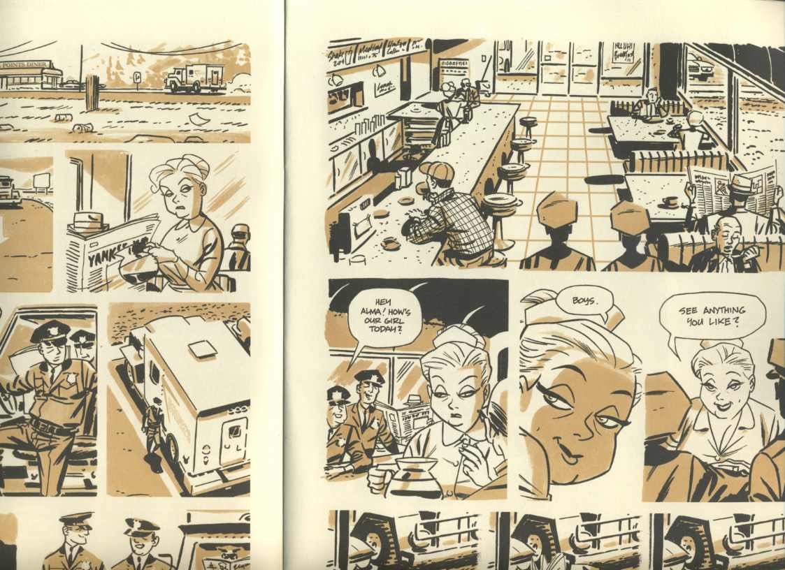
And in the clean-up position: The Man with the Getaway Face. This is the oversize IDW $2 preview edition – It’s a really handsome paperback volume and is, I think, a pitch to get you to drop 25 bucks or so when the complete book comes out in the fall.
I don’t care what Dan says, I’m totally riding the Darwyn Cooke/Parker bandwagon. When I saw it I thought “Cooke is doing a Mazzucchelli-esque Rubber Blanket #1 style in his own way”- which of course was DM’s own take on the throwback framing style that Cooke’s developed for years and is mastering on these Parker books. It’s that spot color and the stage blocking. The figures and brush work too, but less so. It’s a shared language of the era that most readers instantly recognize. Cooke may be, at times, too generic – but good God, if this book was just from the old days and it was something by some unknown generic artist that I found in the back of some dusty bookstore, I’d shit my pants.
Also this week is Matt Kindt’s Revolver from Vertigo. A big hard-cover original graphic novel. I read the first 20 or so pages and was really getting into it, but then a customer wanted to buy it and I had to give up our only store copy. So more on that soon… Looks great! Can’t wait to read it.
How’s that for Team Comics boosterism? What’s a paradigm shift? Shall Earth endure?
Onward!
Frankie the Wop
Labels: "comics elitists", Brandon Graham, Darwyn Cooke, David Hine, James Stokoe, Matt Kindt, Robin McConnell, Shaky Kane


Frank,
I like the term “fusion comics” as a decent catch-all for genre comics that don’t come from a mass-market sensibility. Kindt’s been doing this sort of thing since he emerged from out of nowhere (with Jason Hall) with PISTOLWHIP about a decade ago. SuperSpy is probably his best comic, as he takes all sorts of narrative twists and turns while creating a genuine emotional connection with his characters. His art is a pretty big key to his success…the scratchiness and unusual color choices make his drawings interesting to look at and a little earthy, eschewing any sense of slickness.
In terms of fusion, I like that he fuses old radio plays, history and classic comics adventure strips with modernist storytelling devices. As opposed to Graham, who fuses manga, graffiti art and Heavy Metal-style sci-fi. Or Kaz S, who fuses post-apocalyptic fantasy with a slice-of-life sensibility. Or Trondheim & Sfar with Dungeon….you get the idea. What I like about all of these artists is that this isn’t a calculated pose, but rather it’s just a way for them to figure out how to throw in everything they’re interested in.
Maybe this is re-stating what you already meant — but it’s interesting that all the books you mention are pitched perfectly at the direct market. Just really good, bang-for-yr-buck serialized pamphlet comics that aren’t made for the con circuit or the bookstores but explicitly designed to sit on the racks. Hine and Kane wallow in that comic shops-only sense. The Parker comic is like a primer on how to make a DM pamphlet as essential and worthwhile as a graphic novel. Orc Stain and King City do the periodical’s “little increment” so well. All of them feel like comics that only the existence of a direct market could have produced — Bulletproof is a rifle through the back-issue bins, Stokoe and Graham are rooted in Heavy Metal, and as you pointed out, Cooke is doing a Mazzucchelli thing to compliment his own back-issue glorifications. The direct market customer is the one who gets this stuff presented to him or her — the direct market customer with taste, anyway.
Cassanova and Godland probably fit pretty squarely into the “fusion” category as well.
Image seems like a very logical spiritual locus for that kind of energy.
Fusion, boys comics (love that!), genre/artcomix etc are my favorite, even though all of those titles are vaguely embarrassing. I align myself artistically with this awesome pseudo-juvenilia.
I think 99% of comics are “boys comics” so maybe that term doesn’t resonate with me but it does say something about the adventure aspect of them that ties it together- maybe “Boys Adventure” which is how Spurge always refers to Peter Jackson’s treatment of LOTR. Fusion is a great term since we are seeing the different schools of the past sort of get fused together by “newcomers” who are blending their influences into something different. Seems Scott Pilgrim was maybe the first to really to get that ball rolling but I think you can trace that back even farther since there are always artists incorporating two “old” styles into something fresh.
Stokoe is just a mad man who’s art will make your jaw drop and he looks to be getting better quickly which that is a very scary thing for all other comics artists who aspire to the throne of comics greatness!
I always thought of Brian Ralph as the godfather of fusion comics in the US, and Trondheim/Sfar in the same role in Europe. O’Malley took the fusion in a different direction, with the video game element as his innovation.
it’s funny, one of the first things that attracted me to mat brinkman’s work was how much it reminded me of video games.
a poster like
http://www.designobserver.com/images/meltbanana.jpg
in particular
yes! I’d say Brinkman & Ralph, but also the whole paper radio crew were towing that line, long before Scott Pilgrim (though that is an important touchstone).
RONIN, baby, RONIN
TMNT MUTHAF*****
Know what else I just thought of? Moebius’s Silver Surfer! Obviously a Euro-type book more than anything else, but the Stan Lee scripting gives it that Americomics patios, and Moebius himself talks in the hardcover about trying to ape American composition and page construction type stuff, as well as wishing he could have worked with a separate inker, colorist, and letterer to really subsume his album-making French comics superstardom into the grit of superhero hackery.
I also think there’s definitely a huge Japanese influence in that book, you can absolutely tell he’s seen Otomo, and there’s a lot of Tezuka-style faces and gestures. Just throwin’ it out there….
But also Moebius was deep in american influence as long as he’s used that pen name–with his early American underground looking stuff.
I always say that my favorate artists are guys that are influenced by Moebius.
Like how you can see the moebius heavy in early Otomo– that french man set the comic book earth on fire and people are still getting the hot foot from him.
Tezuka and Moebius hung out.
Yeah man, Moebius… there’s such a weird circle of influence around that guy where like, he took it from Crumb and Corben and them but then he also fed it back into the American tradition, influencing our guys after filtering our influence on him through the Euro sensibility. Plus yeah, his influence on Japan isn’t something I ever really see talked about, but stuff like (to throw out a totally random example) the color section in Gogo Monster just drips of his style.
I guess I see the Silver Surfer book as the pinnacle of “fusion Moebius”, with his natural Euro flair, his American comix influences, his stylisms that so many Japanese artists took after, and explicitly working with the assumption that there’s a language to American hero comics that he can choose whether or not to address. I wrote an article on it, hopefully no one will mind if I post the url… it’s
http://deathtotheuniverse.blogspot.com/2010/07/comix-surgery-fusion-album.html
Taniguchi / Moebius “Icaro” is pretty a inneresting reverse influence
Something to watch over the next 10-20 years is the way in which the current comics publishing renaissance combined with instant internet availability of so many other comics might stoke further kinds of fusion.
Let’s go back to Moebius. He was influenced by mass market American comics, but also by the harder to get underground comics, as well as seeking out comics in Japan. These just weren’t comics that were laying around–he had to seek out these new reading experiences. Nowadays, a kid can walk into a bookstore or library and get their hands on a potential reading experience that’s a hundred times more diverse than it was thirty years ago. And the slightest bit of effort (either reading comics online or finding the online catalogs of boutique publishers) could easily expose them to an even greater diversity. (and if those kids live near the ever-mushrooming small-press comics convention circuit? it’s over!)
The only question I have is HOW these comics will be drawn. Will the old tools continue to be used (with computer tweaks), or will computer tools become sophisticated enough to match the warmth of putting pen/pencil to paper? I predict that just as vinyl has made a comeback because of the warmth of its sound, there will continue to be an emphasis on old-school methods for a large subset of cartoonists.
Word. I’m saving my Fusion rap for Inkstuds radio interview next week…