


Word Balloons in Visual Space
by Jeet Heer
Monday, March 22, 2010

Clowes' "Wilson", from The New Yorker
Joe’s excellent post on thought balloons got me thinking about comics balloons (or text frames) in general: not just thought balloons but also word balloons, narrative boxes, and labels (like the famous arrows in Dick Tracy which diagrammatically call attention to two-way-radio-watches and other items of interest). It would be great to have a history of text frames in comics. There have been stabs here and there by scholars. Thierry Smolderen’s “Of Labels, Loops, and Bubbles” in Comic Art #8 is a good start.
About thought balloons: When did they emerge? I know Harold Gray was very chary of using them: he only used thought balloons a handful of times in his 44 year run on Little Orphan Annie. I think this was deliberate. While his characters where gabby they were also secretive – this is true not just of Warbucks but even Annie, who never says all she knows. Gray wanted to keep his characters mysterious, hence he avoided thought balloons.
Here are a few thoughts on word balloons as physical objects:
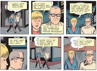
Clowes' Mister Wonderful excerpt.
Many cartoonists use text frames in a strictly utilitarian fashion, to convey dialogue and information. More interesting is the use of these frames as physical objects within the larger visual space of the panel and the page. Dan Clowes is a master of this technique. In his recent “Wilson” story in the New Yorker and the earlier “Mister Wonderful” serial in the New York Times Magazines, he uses text frames not just as boxes or balloons to hold words but as objects in their own right which can sometimes be hidden by other text frames, or placed partially off-panel so they can’t be fully read. Ken Parille, writing in Blog Flume about “Mister Wonderful”, notes, “To show Marshall’s self-involvement, Clowes superimposes Marshall’s narration boxes (perhaps a better term would be ‘interior monologue boxes’) onto Natalie’s word balloons. At first, her words are completely inaccessible to us because we are ‘hearing’ through Marshall; but as he begins to pay more attention to her – and less to himself – her words become more visible-audible with each passing panel. It’s an interesting way to show how we can simultaneously be aware of different things – our thoughts and another’s speech – and how our awareness can change.”

McCay's Little Nemo, Jan. 02, 1910.
Clowes has some important precursors. In a Little Nemo Sunday page from January 02, 1910, King Morpheus has the gout and is great pain. His shouts of anguish aren’t regular balloons but more like little explosive bursts, which dominate the page and cover over the main characters.
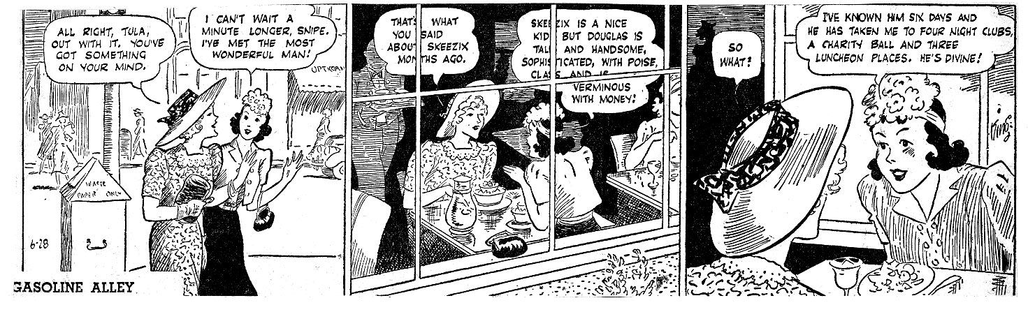
In a Gasoline Alley daily strip from June 28, 1940, Frank King shows two women in a restaurant. He wants to create some distance from these characters, one of whom is an unsympathetic schemer, so in one panel we see them through a window which covers up part of their word balloon.

Hanks' The Superfiend, Sept. 1940.
Evidence of Fletcher Hanks’ artistry can be seen in “The Superfiend” from Fantastic #10 (reprinted in You Shall Die By Your Own Evil Creation! By Fletcher Hanks, edited by Paul Karasik). On the first page, Starburst uses his “long-range television finder” to read the thoughts of the Superfiend, “Civilization must be destroyed!” This noble sentiment doesn’t appear in a thought balloon but rather in a word balloon (presumably because Starburst can “hear” what the Superfiend is saying). Equally intriguing is the way the word balloon isn’t confined within the television screen but bursts out of it, making it seem like an act of aggression rather than a passing thought.

Englehart and Rogers' "Slab", 1981.
In a story called “Slab” from Eclipse Magazine #1 (1981), Steve Englehart and Marshall Rogers experimented with overlapping word balloons. As Gary Groth noted at the time, “Rogers (or Englehart) uses a density of word balloons to suggest confusion at a crowded airport. This may be a wrongheaded attempt to translate filmic language to the comics form. This effect works well in film (I am thinking of Robert Altman’s overlapping soundtracks), but not in comics for the same reason it has never, to my knowledge, worked in prose: the words on the printed page must be sub-vocalized. We cannot let them wash over us in the same way we can in a film. The reader cannot simply subliminally acknowledge dialogue on the printed page as he can acknowledge and subordinate disconnected dialogue in film. Words on a page must be read. The effect in a comic, then, is distraction.” (Comics Journal #65). Groth might have been right about this story in particular but he was wrong in general. As Clowes has demonstrated, overlapping word balloons can be effective technique. As with anything in the arts, techniques don’t exist in isolation of the overall effect. Any technique can be put to good use by an intelligent artist.
Labels: Daniel Clowes, Fletcher Hanks, Frank King, Gary Groth, Gasoline Alley, Harold Gray, Little Nemo, Little Orphan Annie, Marshall Rogers, Steve Englehart, text frames, thought balloons, Winsor McCay, word balloons


Excellent post. I only started looking at word balloons as physical elements on the page after reading Eightball 22 – I think that was the first comic where I noticed the a word balloon being cut off by a panel border.
Like Harold Gray, Alan Moore once said he deliberately avoided thought panels in V.
Jeet:
What happens when the text in the caption merely describes the same image the drawing is showing? What´s the point of the text in those cases?
@PH. Can you give a specific example of “when the text in the caption merely describes the same image the drawing is showing”. That would help the discussion.
Jeet:
Here is a specific example:
http://www.americanelf.com//comics/americanelf.php?view=single&ID=42599
Last panel of this American Elf strip.
James K. writes “And slept on the couch” and the image shows exactly the same thing.
I picked this very fast. I didn´t searched too much. But there are lots of examples.
Thanks.
Howard Cruse used numerous overlapping word balloons in the bar scenes of some of his Gay Comix stories.
The dense word balloons of Marshall Rogers also appear in the Detectives Inc. stories.
@Diana. Thanks for the additional examples.
@ph. That’s an interesting example. I’m not sure what to make of the reduancy except to note that words can never exactly duplicate what’s in the images. The bareness of “And slept on the couch” isn’t the same as the rather sad image. So I’d say that this type of dupclication can be fine depending on the example. But there are lots of abuses. I’m thinking here of many EC comics where the captions add nothing to the image and indeed take away from them.
The only answer I found myself is that, perhaps, in those cases (like the American Elf strip), text is there to make a final beat on the rythm of the strip. But the strip would still convey a similar meaning without the words (though, a different rythm).
I remember hearing Ted Stearn say something like that in an Inkstuds interview.
Thanks for your insight on that Jeet.
I agree with you that a text on captions would be great.
I think is one of the least explored aspects of comics.
I remember thinking Chaykin was doing something very interesting with layered word balloons and sound effects when I first saw American Flagg back in the day. That he had an inventive letterer in Ken Bruzenak didn’t hurt. Sort of a slick, post-modern take the crowded mediascape that was first articulated in the early comic strips. I’m thinking of someone like Segar who had his generic crowds share giant word balloons or else had them all compete with tiny word balloons of a single exclamation each that fought and shoved with one another like gas bubbles in seltzer water. Sometimes Segar could barely get his figures into the panel for all the word balloons. Early comic strip characters like Popeye and Annie didn’t always have time to think in thought bubbles. They were moving faster than thought, maybe. Plus, they were often talking to an audience (the reader) as much as to themselves.
Harold Gray didn’t need to use thought balloons because he often had Annie, and other characters talking to themselves.
Gray did that constantly, and he had Annie talk to Sandy as well.
Gray no doubt picked this up from working with Sidney Smith on The Gumps.
Smith very commonly had Andy, Min, or some other character delivering long monologues to themselves (or the reader).
Two wonderful examples I can think of with regard to the transformation of word balloons into psychological objects, would include some balloons created by Saul Steinberg, in which conversations consist of the balloons forming new relationships independent of those doing the speaking, and those created by the filmmaker Alejandro Jodorowsky in the comics series drawn by himself from 1967-1973– “Fabulas Panicas,” published in “El Heraldo De Mexico.” In a number of these strips,word balloons and thought balloons take on weight and disrupt space in a manner that demonstrates the volume of the spoken word in actual weight. The words of a bickering couple seated at a dinner table become fork and knife-shaped balloons that cut into the child of the couple seated at the table with them. Remarkable. I cannot find a link to these specific images, but I have discovered a blog that has posted some of the other strips: http://fabulaspanicas.blogspot.com/
Actually, here is one of the Jodorowsky images making interesting use of the word balloon as object, one of many such strips of his that accomplishes this:
http://2.bp.blogspot.com/_DVoV_KJmPbk/SZyi5JlzHpI/AAAAAAAAAAo/eCa20fA0fRY/s1600-h/fabula_panica.jpg
STATIC #4 (1993) uses text boxes over word balloons a few times in a way similar to Clowes in “Mister Wonderful.”
Here is one instance in which Virgil is recalling another character’s words instead of hearing what his friend is saying:
http://www.tigershorts.com/projects/images/examples/static_04_14_1993.jpg
[…] ITEM! Continuing this line of thought (sans balloons), Jeet Heer talks about the art of the word balloon. […]