


Awkward Word Balloon Placement in Early Comics
by Jeet Heer
Wednesday, March 2, 2011

Herriman's Major Ozone, Sept. 29, 1906
As an addendum to my McManus notebook, I’ve been collecting examples of reverse-order word ballooning, that’s to say the tendency of early cartoonists to occasionally have word balloons read from right to left rather than the reading protocol that’s easier in English (from left to right).
A few examples of what I’m talking about:
George Herriman, Major Ozone, Sept. 29, 1906:
Major Ozone: “What! And shut out that fine fresh air? Never, Captain, Never!!”
Captain: “Major, you’d better close your door – it may storm tonight.”
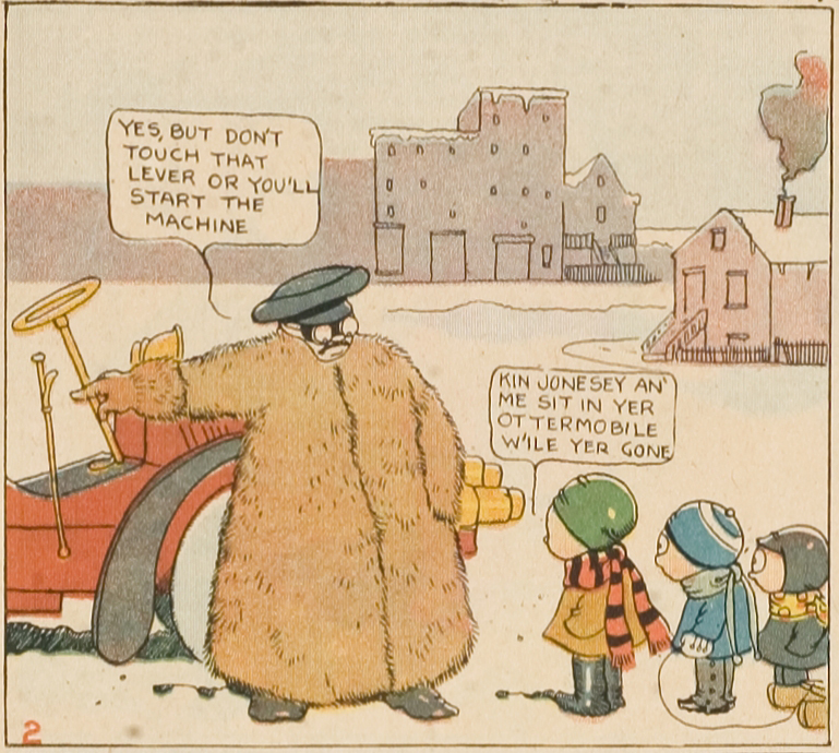
Gene Carr, Bill and the Jones Boys, Jan. 22, 1905:
Motorist: “Yes, but don’t touch that lever or you’ll start the machine.”
Willie: “Kin Jonesey an’ me sit in yer ottermobile w’ile yer gone.”
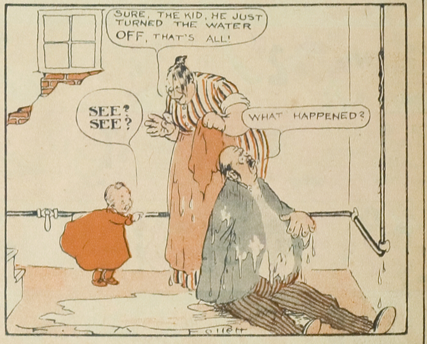
Foster Morse Follett, The Kid, Jan. 15, 1905
Foster Morse Follett, The Kid, Jan. 15, 1905:
Mom: “Sure, the kid, he just turned the water off, that’s all!”
Dad: “What happened?”

Jimmy Swinnerton, Jimmy, July 07, 1907.
Jimmy Swinnerton, Jimmy, July 7, 1907:
Mom: “No Jimmy, dear. I think not.”
Jimmy: “Mamma, can I have another dollar? My eye is all well?”
What exactly is going on here? The simplest explanation is that these strips are all done in the early days of newspaper comics, so these are all primitive works done by artists who have yet to master their craft. Yet the explanation of primitivism or incompetence is belied, I think, by the extreme beauty of the art, and also by the fact that that in these comics word balloons are usually properly placed in most panels. These examples occur from time to time but most word balloons are sequenced to read from left to right (the protocol we’re used to in English).
A few theories:
1. The primacy of images over words. The first generation of newspaper comics were very visually splendid. McCay’s work was the peak achievement but he was merely the headman in a large parade of artists whose main talent was visual. Spectacular display was the main selling point of the early comics. So it seems likely that the images came before the words and had priority over the words. That is to say, the artists drew first and the words were added on as an after-thought, often used to clarify what was going on in the picture.
2. Stagecraft. The early comic strips were heavily influenced by stagecraft; often showing two figures standing in the same relation to each other panel after panel, in the mode of a vaudeville routine. If we see the panels as being modeled after a stage, it could be that the artists thought that the clarity they gained form keeping the characters in a fixed relation to each other outweighed the loss of clarity by having the occasional word balloon reversal. Below I’ve given the first panel of the Swinnerton strip excerpted above. As will be seen, in the first panel, Jimmy is posed halfway between his mom (on the left) and his dad (on the right). This positioning of the characters is repeated in the last panel. Perhaps Swinnerton felt that the visual coherence gained from repeating this positioning of characters was more important than having the word balloons read from left to right in the last panel.
3. A different reading protocol. This is the most difficult concept to explain but after spending time with cartoons from the early 20th century (and also previous centuries) it’s hard to avoid the fact that they have a different type of reading than what we are used to. The early comics aren’t meant to be skimmed or read quickly. They have a density of visual and verbal information that takes time to process. So the occasionally reversed word balloon could be tolerated because the reader was supposed to be spending time on the comics, deciphering them slowly.

First panel of Little Jimmy, July 07, 1907.
Labels: Foster Morse Follett, Gene Carr, George Herriman, Jimmy Swinnerton


This might also be something worth investigating re: the vertical placement of balloons as well. Sometimes even if balloons are positioned correctly left to right, the balloon on the right might be placed significantly higher than the one on the left, drawing the eye to the more prominently placed, right-hand balloon first. This came up as in issue in an H. T. Webster cartoon I use in my teaching. I haven’t been looking at very early comic strips in a focused enough way to know to what extent it’s an issue, but it might be another example of “counter-intuitive” balloon placement that might not have seemed like an issue at the time.
–BK.
At first I was thinking maybe widespread dyslexia common among artists? But I think a large part of it must be the words vs pictures aspect of it, with an element of your stagecraft suggestion playing a part. I mean, just look at that elaborate ship deck scenery in the top Herriman panel. He had more fun drawing the thing than he did lettering it, and maybe got a little rushed around deadline. He didn’t want to obscure the figures with word balloons but still wanted to keep some semblance of traditional placement so plopped them down. Would explain also why the figures aren’t pictured in the order they speak. Interesting aspect of these old strips but contemporary strips are sometimes hard to read too!
If these artists expected a reader to first look at the picture and then read the words, they may have thought the natural way to do this was for the eye to sweep across the panel from left to right while taking in the picture then move back in the opposite direction to read the text, so they’d encounter the word balloons in that order? This would make *slightly* more sense in a single panel strip or in multiple panels stacked vertically than it does in multiple panels placed horizontally.
In the examples above it seems to me that the word balloon order is true to the placement of characters from foreground to background. In other words, the character “closest” to the reader speaks first, then the one who is placed more “downstage”.
since these comics were published in newspapers, it seems to me like editorial judgement (or lack thereof) might have played a role too. if nobody was around to “coach” cartoonists when a panel was hard to read, then it’s possible that the artists were left to their own impression of what worked & what didn’t. & as you say, stagecraft by itself might have lead them to believe the image was clear enough. nonetheless, switching balloon order seems to me like a pretty classic beginner’s mistake, which is easily fixed once you have compelling evidence that it never works.
but basically: is it possible to find some sort of “deadline” after which balloon misplacement becomes rare or inexistant? seems like somewhere around 1910 something must have happened. in krazy kat for instance, balloon switchups are pretty rare.
all in all though, i find your three reasons pretty compelling, particularly the last, which corresponds to my own first reading of little nemo, when i was unschooled about these matters but still able to see when balloons were out of order. but then once you spent time with the drawing, balloon order always became perfectly clear.
i find that this discussion also parallels smolderen’s analysis of hogarth (in the opening chapter of his naissances de la bande dessinée) which goes along the same lines: we find these panels hard to read partly because they are so complex, partly because we no longer have the cultural codes to make immediate sense of them.
Don’t you think there’s also a sense in these early comic strips, an assumption shared by reader and artist, that everything contained within a panel is happening more or less simultaneously?
There certainly was a preference for left-to-right reading of word balloons. But if the panel or arrangement of characters within it dictated out-of-order balloon placement, it seems like the artist trusted the reader to puzzle it out. (This sounds an awful lot like Jeet’s hypothesis, part three.)
@dt. Yes, I think there was a weird sense of simultaneous time in those early strips, with each panel being a unit of time within which events were happening all at once. Often these are very busy panels. In a sense, subsequent cartoonists made time more linear from panel-to-panel by having fewer events in each panel and by being more consistent about left to right progression of words and events.
Good point Jeet, the early strips developed out of the elaborate panel cartoons which many of the early strip cartoonists had been doing only a short time before.
If you look at Herriman’s Los Angeles Examiner cartoons, and the cartoons Opper had been doing for Puck you’ll see the spectacle you’re talking about.
I suppose Thomas Nast was the primary influence, his elaborate cartoons for Harper’s Weekly are loaded with captions, balloons, and banners. The cartoons contain so much information (text and visual) they amount to history lessons, and could almost be seen as one panel cartoon essays.
A tangent to this subject is how early cartoonists often looked as if they drew the balloon shapes first, and then went about trying to fit the lettering inside the balloon. Winsor McCay is well known for this, and it’s obvious McCay was a superb letterer based on everything he lettered with the exception of the words in the balloons.
I’d wonder if McCay saw the balloon shapes and placement as important graphic elements
The contents of the balloons was important, because McCay would squeeze the text he wanted into his balloon shapes.
Hi Jeet,
These theories are nice, but seem to contradict each other and the evidence at hand.
For example, strips that are organized around simplicity of stagecraft and vaudevillian back-and-forth (#2) do not seem to be good candidates for a vision of early comics as having a higher-than-normal “density of verbal and visual information,” requiring slow reading (#3). (You could argue that all comics are equally dense — but that doesn’t seem to be your point in Theory 3.)
Also, strips organized around vaudevillian routines (#2) are almost, by definition, not strips that leave envision words as an afterthought (#1). They are often the main thought — the set-up, straight response, punchline, etc.
Similarly, the idea that older strips are organized around “spectacular display” (#1) does not seem to fit these particular images, which — with the possible exception of Herriman’s background imagery — are all but lacking in spectacle.
Perhaps, though, there isn’t really much a problem to solve. The fact that the art in these strips is extremely “beautiful” doesn’t mean that these comic practitioners aren’t still developing what came to stand as basic rules of their craft. One does not have to choose between “incompetence” and “development.”
Many of these “rules” for balloon placement — like the rules of framing or editing in classical Hollywood cinema — probably developed piecemeal and intuitively, eventually settling into their more rigid and explicit form. These comic artists are pushing the newer pieces of a relatively young art form around, trying to see what works to achieve different effects.
Doesn’t that seem like explanation enough?
In a few of these (and a few of the McManus ones from the last article), the panels in question show either sudden surprising events, or their immediate aftermath. Maybe in ones like the Follett panel it’s not supposed to be a dialogue SEQUENCE so much as a random assortment of reactions? The mother explains what’s going on to the audience, while the father gives an exclamation more than asks an actual question. That reading doesn’t work for all of them, but given the way early newspaper strips tend toward over-exposition anyway, explaining what’s happening in most every panel whether anyone asks for it or not, it seems like it could be responsible for some of the garbled dialogue.
Hi Pat,
Applying your ideas to the work at hand, It clear that Herriman drew the balloon around the words, while Gene Carr seems to have placed the words inside the pre-drawn balloon.
But the Swinnerton panels — words first, balloon second, I think — seem to be the first in this collection to really think of the shape and arrangement of the text as an important part of the “word balloon design.” The lines are even, the “margins” almost justified, creating a little textual rectangle. That’s an important step, I think, in the regularization of word balloons.
BTW, in my comments directly following yours, I did not mean to imply that certain individual cartoons and cartoonists did not value “spectacle” and/or design density above all else. Those characteristics just doesn’t seem to be strongly evident in these examples.
Last point: regarding the “vaudevillian staging” in Swinnerton, it seems interesting to note that this strip does *not* just stage the conversation from the single, theatrical point of view. Between the first and eight panel, the viewpoint rotates around and moves behind the father’s chair — although the relative placement of the character in frame remains constant.
Best, Peter
A good discussion. To clarify: I didn’t mean my theories to be either conclusive or consistent. They were as theories in a literal sense, as conjectures or possiblities. And they don’t necessarily all apply equally to each of the examples. That’s to say, I think the explanation of visual splendour applies to Herriman more than the others. I think the idea of stagecraft applies to McManus more than the others. The Swinnerton is an interesting case. I tried to download the image but it was too large for the blog to accept. But, yes, it’s true that Swinnerton has a lot of fancy camera work in the middle panels. But its also the case that the relations of the characters is the same in the first and last panel, a deliberate choice, I think, to show the family returning to the natural position after the chaos of the intermediary panels.
Models / languages available to early cartoonists:
Apart from stage, there was also painting.
In that case, the eye moves (more or less guided) around the image, in time, so that the mind can assemble an impression of simultaneity.
Or even a quasi-simultaneity.
It’s the “puzzle it out” thing.
The panel as a unit of comprehension that the viewer must actively engage with.
Not ideal, but what is? What we do now?
Even diagrams were less hand-holdy back then.