


THIS WEEK IN COMICS! (2/2/11 – Rarely Fully New)
by Joe McCulloch
Tuesday, February 1, 2011

Here we see Steve Ditko in as close to a conciliatory mood as his solo work tends to get. It’s part of a Heads strip from the 1985 comic Charlton Action: Featuring Static #11, an all-Ditko special facilitated in the twilight of the Charlton press with editor Robin Snyder. As part of its introduction to the Ditko Series, “a view of art, man, and life, a look at values, conflicts, right and wrong, and justice,” the artist’s Heads — at least as prominent to me as his hands, because what is the Avenging World if not wrinkled with the sweat and agony of compromised individual principles? — seems content at the moment to merely suggest possibilities, with the idealistic middle head, though closest to Ditko’s own disposition, given a kind of daffy eyes-to-heaven grin. Nonetheless, the rest of the issue proves an adequate guide to the artist’s preferences.
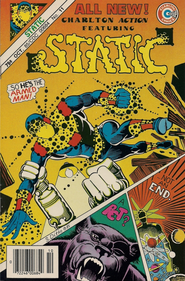
Of course, the main event of the comic is The Armed Man, the first chapter of Ditko’s Static, which was retitled, recolored, relettered and slightly rewritten from its original 1983 debut in Eclipse Monthly, from which Ditko had taken the serial following editorial disagreements. Charlton had long provided a venue for Ditko’s work, and by ’85 working without the Comics Code seal in place and was willing to support creator-owned content, which fit Ditko’s purposes. Personally, I found Static to be the least interesting content of the issue, but it’s undeniably a major work, Ditko’s Watchmen, in that its various characters stand for distinct philosophies prone to addressing the superhero as metaphor, here for Justice.
Granted, unlike in Watchmen, these philosophies are detailed at some length via sometimes multiple speeches per chapter, across modular confrontations with equally metaphorical villain threats; I tend to prefer Ditko as he works now, collapsing a type of editorial cartooning into a short-form superhero style that charges seemingly every mark on the page with meaning, playing across brief stories evocative of Golden Age, pre-WWII genre stuff. Static seems entirely too weighted down by the comparative ‘realism’ of Ditko’s art and the density of his language, although the case could be made for the visuals-as-visuals being more pleasing on their own.
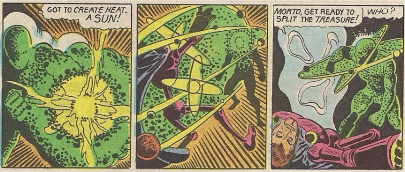
I was drawn more to the issue’s backup materials, like The Beginning, a visually dense 12-16 panels-per-page space opera that sees a heroic captain trapped in a chamber with an experimental living universe. He emerges as a starry superhero not unlike Captain Atom, a Charlton character and the first superhero Ditko originated (in 1960, with writer Joe Gill). By ’85 the Charlton superheroes had already been taken to DC, and had appeared in Crisis on Infinite Earths that year. Naturally, Captain Atom and his confined origin would also form the basis for Dr. Manhattan of Watchmen, and so Ditko’s earlier revision — ironically produced in a fully creator-owned capacity which Watchmen famously lacked — stands as something of a totem for Justice and proper superheroic behavior in the face of a collapsing Charlton and darkening superhero landscape. It can still be a Beginning, you see.
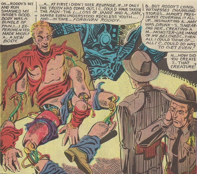
Still, my favorite thing in the issue is Pet Monster, a fusion of Ditko’s pre-Code informed suspense/horror approach with the same idea of Justice as present in the rest of the comic. Above is a memorably grotesque moment, as the mad scientist who unleashed a ravenous creature on the family of the corrupt Mayor who wrecked his life — the politician’s son had killed the scientist’s son and wife in a hit and run incident, and so he ruined the wife’s reputation to place the blame on her — reveals how he tore his own guts out to become a machine. To look at it in an ’80s blood and thunder sense, a post-Watchmen sense, you might think of the scientist as an anti-hero, a flawed man attacking the system in a cruel manner.
This would not be in concert with Ditko’s ideas. He does not care for “the anti-anything ones” suggested up top. A is A, and the scientist is Bad, as is essentially everyone in the story. But by the end, the crucial final speech is given by the sheriff, the potential hero who reflects on his own failings that necessitated this chaos. The anti-hero is only the breakdown of heroism itself. The idea would have traveled anyway, but Static in particular eventually picked up and moved to Renegade Press in b&w the next year, and finished itself off in ’88 as published by Snyder & Ditko themselves, away from the sticky trends of corporate genre mechanics.
***
Also sticking around:
Scenes from an Impending Marriage: This one’s made the rounds at festivals and the like for a little while, but it’s new to comics stores – a small (4.25″ x 5.5″, 56-page) b&w hardcover collecting vignettes on topics leading up to artist Adrian Tomine’s wedding, originally given out privately in minicomic form in 2007. Accordingly, its lightness of tone and style is most directly reminiscent to some of the comedic bits in Tomine’s early minicomics collection 32 Stories, content which I’ve occasionally heard people wishing for. Preview; $9.95.
Lynd Ward: Six Novels in Woodcuts: I was not aware this wasn’t yet available in comics stores through Diamond, but now I guess it is. A 1,526-page stack of wordless full-page images and supplementary materials from the Library of America, covering Gods’ Man (1929), Madman’s Drum (1930), Wild Pilgrimage (1932), Prelude to a Million Years (1933), Song Without Words (1936) and Vertigo (1937). A pair of hardcover volumes in a slipcase, 8.5″ x 5.5″, with nine essays by Ward and introductions by editor Art Spiegelman. Samples; $70.00.
Pandora’s Eyes: Being a new English-language release for Milo Manara, of several look-at-whatever-he-does lists, covering a 2007 album done in collaboration with screenwriter Vincenzo Cerami, of various Roberto Benigni vehicles, which naturally(?) suggests Benigni’s connection to Federico Fellini in his final film, The Voice of the Moon, and thereby Fellini’s collaboration with Manara on Trip to Tulum. However, this seems to be going in more of an orthodox sexy thriller direction, with an obligatory gorgeous, troubled woman kidnapped by sinister forces. An 8.5″ x 10.8″ hardcover from Humanoids, 64 pages in color; $19.95.
Daytripper: Probably the most widely acclaimed Vertigo release of last year — the serialization of which, in the interests of full disclosure, I fell off of about halfway through — in which Fábio Moon & Gabriel Bá examine several dispersed segments from the life of a man, contextualized as alternate moments leading up to his death. Introduction by Craig Thompson; $19.99.
Fall Out Toy Works Vol. 1: Tiffany Blues: One of the odder East-West fusion projects of late, this is a collection of an Image series based on concepts from the band Fall Out Boy, written by Brett Lewis (of the very nice fantastical crime comic The Winter Men) as a man-android romance and drawn by assorted artists (Sami Basri, Hendry Prasetyo and the Singaporean/Indonesian Imaginary Friends Studio) in a glossy cartoon screen capture style that brings to mind Image’s anime-informed comics scene of the late ’90s; $16.99.
Little Lulu Vol. 26: The Feud and Other Stories: Another 200-page color slab of Stanley & Tripp from Dark Horse. Chris Mautner put out a nice overview of Stanley’s work the other day, if you missed it. Preview; $14.99.
Black Jack Vol. 13 (of 17): The 296-page latest in Vertical’s line of episodic super-surgeon fantasies from Osamu Tezuka, always a welcome presence. In case you didn’t hear, the publisher has recently announced a new (if considerably shorter) Tezuka serialization effort for later this year: the influential girl-targeted supernatural cross-dressing fairytale saga Princess Knight, to be presented in two volumes apparently culled from the earliest, three and two-color version of the material presented in the magazine Shōjo Club, 1953-56, which would be a departure from the 2001 Kodansha International edition of the series, which was derived from a later b&w revision; $16.95.
Blade of the Immortal Vol. 23: Scarlet Swords: Continuing Hiroaki Samura’s edged weapon mayhem series, currently up to vol. 27 in Japan, although owing to the Dark Horse edition’s roots in comic book serialization/subsequent collection, I don’t think the English editions quite line up (the cover to this volume is the cover to the Japanese vol. 22, for example). Preview; $19.99.
Vampirella Archives Vol. 2: From Dynamite, but basically the same as the Dark Horse compilations of vintage Warren material (i.e. Creepy and Eerie). Covering issues #8-14, which saw associate editor Archie Goodwin attempt to impose some measure of seriousness and continuity onto the title character, while the various Spanish artists who’d give the magazine its visual identity began to trickle in, particularly defining character artist José Gonzales. With Tom Sutton, Billy Graham (who became editor during this span of issues), Wally Wood, Jeff Jones, Barry [Windsor-]Smith, Neal Adams & Steve Englehart (the latter as the former’s art assistant, although he’d be writing Vampirella soon enough), Dave Cockrum, Frank Brunner, Mike Ploog, Sam Glanzman, Jose Bea and Esteban Maroto. Samples; $49.99.
Witchfinder: Lost and Gone Forever #1 (of 5): Another extended Hellboy universe series, the second in this particular 19th century-set subcategory, now featuring the art of EC/Warren veteran John Severin, which alone is worth a page through. Written by Mignola and John Arcudi. Preview; $2.99.
Hellboy: The Sleeping and the Dead #2 (of 2): Meanwhile, the main series continues to occupy itself with small stories from assorted guest artists, Scott Hampton in this case. Kevin Nowlan is due for something in April, sometime after which the main-main series ought to resume with Duncan Fegredo, and then Mignola himself is going to draw some stuff, I believe. Preview; $3.50.
Captain America: Hail Hydra #2: In which WWII rages, and Tom Scioli draws. Preview; $2.99.
Batman: Odyssey #6 (of 13): The first phase of this Neal Adams thingy concludes with Batman and the sometimes-possessed Joker tumbling into Arkham Asylum, because really – how couldn’t they? Note that issue #7 is still due next month, phase or unfazed; $3.99.
Superman 80-Page Giant 2011: A grab bag of new standalone Superman family shorts, noteworthy for the front-of-Previews writing debut of cartoonist and writer-on-comics Abhay Khosla, who is of course affiliated with a website to which I am a very occasional contributor, so CONFLICT OF INTEREST, etc. It’s a Jimmy Olson short, drawn by Andy MacDonald, and the subject of an interesting process essay; $5.99.
The Strange Case of Edward Gorey: Finally, your book-on-comics for the week – a newly expanded hardcover edition of Alexander Theroux’s 2000 profile of the famed author and illustrator. From Fantagraphics, 168 pages. Excerpt; $19.99.
Labels: Robin Snyder, Steve Ditko, This Week in Comics


Anybody know if copies of the Woodwork exhibition catalogue have been picked up for US distribution?
I’ve heard that copies were supposedly attempting to wriggle into the U.S., but I don’t know how easy they are to find, or if they even materialized; the museum that housed the exhibition doesn’t seem to have a page for its publications up yet:
http://www.casalsolleric.cat/publicacions/actuals/
I believe the full title is WOODWORK: WALLACE WOOD 1927-1981, although my limited searches aren’t bringing any up besides a few blog posts… apparently the print run was 2000, with an additional 100 hardcover editions. You might have to keep an eye on eBay, I dunno…
Yep, there’s one on ebay right now for $125 (ouch!). Over the last couple months I’ve contacted both the museum AND the Belgium-based store that was/is apparently distributing it but haven’t heard anything back. I would love to get a bunch for PBox.com but… it ain’t easy. On the other hand, 2000 copies is kind of a lot, so they’ve gotta be SOMEWHERE. Maybe some of the American lenders know who to contact? Then again, I don’t know who loaned what. Anyone with any solid info, feel free to contact me at: dan (at) pictureboxinc (dot) com.
I love seeing that page for the museum in Catalan! It’s one of the most beautiful languages.
Oh yeah, and the Ditko Static pages look really good in color–much better than in the b&w collected edition I have. I especially like that weird mustard-brown on the cover, it’s such a perfect color equivalent for the bizarreness of Ditko’s art. Who was the colorist?
Wendy Fiore is credited with interior colors, although I think Ditko may have been behind the cover colors himself… the later b&w Renegade issues had similarly striking cover color schemes, I’m partial to this one:
http://www.ditko-fever.com/dwstatic01.html
I’d also agree that STATIC reads better in color, by virtue of being ‘fuller’… color would destroy his more recent work, though… it’s so dependent on penwork forming texture, and texture carrying a sometimes specific narrative meaning (my post is coming soon, I promise!!)… plus, Ditko tends to see a specific use to b&w, in that he articulates his philosophy in ‘black and white’ values, which can be literalized on the page… supposedly a while back Frank Miller was trying to persuade Ditko into collaborating with him on a project that sounded like a reverse SIN CITY, with everything in color save for the Ditkovian hero, who’d be depicted in b&w… Ditko didn’t go for it.
That cover is grand – my own stuck-up-my-own-ass independent interpretation would be “Ditko vs. Kirby – ONLY ONE WILL SURVIVE”, what with Static’s hand, the dots (more carefully patterned, not flowing and willy-nilly like Jack’s), and that weird-tech gun (who would design a gun you could only hold that way? Ditko, that’s who, smart-assed punk!).
Ha ha, I’m hapless enough that I paus whenever I see the term “anti-life” show up in Ditko’s work, I associate it so much with Kirby… Ditko’s dots have multiple literal meanings on the page, but they’re usually symbolic of illumination, i.e. the (white) light of reason casting away the (gray) shadow of compromise or the (black) darkness of force/fraud, with the dots themselves giving meaning to blank space by suggesting fine particles caught in a beam or whatnot… or the ‘static’ of Static, which becomes the presence of/potential for illumination in his philosophy, if not precisely a diegetic light source…
(The General looks like a Kim Deitch character…!!)
(The General looks like a Kim Deitch character…!!)
Yeah – it’s the moment the Kim Deitch character encounters Waldo, but Ditko doesn’t truck with two bits of sweat popping out – this guy gets his own halo of anxiety. Beat that, Comics!
[…] -Jog talking Ditko is great. Ditko’s a guy I love for Amazing Spider-Man more than anything else. I need to branch out into his other work sometime soon. […]
Joe,
A very interesting and well thought out post on Ditko’s work. I’m particularly fond of Static, and found the character design to be one of his best in this period. Although I quite enjoyed the black and white package, there is a vibrancy to the color version, with the simple, yet compelling red, blue and yellow. The backup stories in Charlton Action were also quite interesting. It’s interesting to note that stuff like this could be purchased in a neighborhood candy store back in those days (which is where I purchased the comic).