


THIS WEEK IN COMICS! (1/19/11 – Vintage French Chipboard Dinosaur Omnibus)
by Joe McCulloch
Tuesday, January 18, 2011
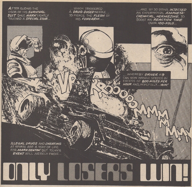
From Creepy #64; art by Howard Chaykin, words by Rich Margopoulos
Yes, comics are always racing to your friendly local merchant, but some arrive faster than others! For example, apparently Midtown Comics in NYC is expecting a whole stack of Fantagraphics releases this week, including the Lorenzo Mattotti-drawn Stigmata and vol. 2 of Pirus/Mezzo’s King of the Flies, but Diamond doesn’t have them listed for this week. As a result, you’ll want to keep your eyes peeled – you never know what might turn up.
I’ve been reading a stack of new Steve Ditko comics lately — you might say I am Paying Attention — but I don’t want to comment until I’m done, so let’s go right into the new releases:
The Smurfs Vol. 4: The Smurfette: Being the latest in NBM/Papercutz’s line of vintage materials by Peyo & Yvan Delporte, this time featuring a 1967 piece which I don’t believe has ever been released in the U.S., although an English translation was produced for the U.K. market in the late ’70s. It’s another farcical sprawl of social commentary — or at least that’s how it sounds to one American who hasn’t yet had the pleasure of reading it — focused on male reactions to feminine beauty. Preview; $5.99 ($10.99 in hardcover).
Denis Kitchen’s Chipboard Sketchbook: This is from Boom! Studio’s ‘literary’ comics imprint Boom! Town, which from its start last year seemed oddly poised with an eye toward reissues and merchandise, and I think has since faded from visibility. This is its newest release – a 128-page collection of back-of-notepad doodles by the Kitchen Sink Press founder, edited by Greg Sadowski (recently of the Fantagraphics anthologies Supermen!: The First Wave of Comic Book Heroes 1936-1941 and Four Color Fear: Forgotten Horror Comics of the 1950s) with comments by the artist; $19.95.
Starman Omnibus Vol. 6 (of 6): Concluding DC’s application of the hardcover omnibus format to a well-remembered recent(ish) longform series from writer James Robinson; I think this effort might be best remembered for juggling all the various tie-ins and spin-offs and crossovers and peripheral materials a successful superhero series tends to spawn into an organized presentational whole, although at this point it’s pretty much a straight shot through issues #61-80, primarily sporting art by Peter Snejbjerg, with contributions by Paul Smith and Russ Heath. Do note, however, that the 2010 one-off revival issue #81 — itself a tie-in to the recent Blackest Night crossover mega Event — is also included, with art by Fernando Dagnino & Bill Sienkiewicz, potentially providing a coda on the transient finality of shared universe superhero properties, even in world fit for bookshelves; $49.99.
B.P.R.D.: Plague of Frogs Hardcover Collection Vol. 1 (of 4): But hey, why leave the fun to the half-century-and-running crowd? The generally very good Mike Mignola-created B.P.R.D. series recently added a new subtitle (Hell on Earth) to its most recent storylines (New World and the currently running Gods), seeking to distinguish the material from the prior status quo, which now seems to be grist for the omnibus mill.
Still, this 408-page maiden volume serves an additional purpose – collecting various and sundry materials, 1998-2004, accounting for the first three B.P.R.D. softcover books, it neatly groups together all of the various small experiments and not-always-satisfying digressions that marked early attempts to expand Hellboy into a series of series. Mignola doesn’t even participate in some of this stuff — including a story by genuine shared universe superstar Geoff Johns — although the best in show sees him teamed with artist Ryan Sook (and two co-writers, Christopher Golden & Tom Sniegoski), for a hollow earth episode that sets in motion the general escalating conflict of the series at large. By the end of the volume, Guy Davis is in place as the series’ primary artist, though Mignola’s plotting remains intent on poking at background mysteries established in Hellboy; it won’t be until the second omnibus and the arrival of co-writer John Arcudi that the series begins to click as its own entity. Even then, B.R.R.D. was a slow cooker, and maybe huge chunks will serve it well in building effect; $34.99.
Age of Reptiles Omnibus Vol. 1: AND THAT’S NOT ALL! Here’s a 400-page softcover collection of wordless dinosaur comics by Ricardo Delgado, created between 1993 and 2010 – kind of an odd, honking, crashing, observational thing that Dark Horse has revisited seemingly whenever a new set of issues is complete. Worth paging through if you come across it. Samples; $24.99.
Myspace Dark Horse Presents Vol. 6: But getting back to the frailty of contemporary comics publication, this softcover anthology volume memorializes the final bow for Dark Horse’s online effort at funnies in the short form, with entries by Jaime Hernandez (very much in the superhero mode of the early Love and Rockets Vol. 3), Graham Annable, Jason Little, Matt Kindt, Larry Marder, Stan Sakai, Evan Dorkin & Hilary Barta, Gabriel Bá, Scott Morse, Andi Watson and others. Note that Dark Horse Presents will return as a print format comic book later this year, Concrete and all; $19.99.
Dorohedoro Vol. 3: An ongoing manga choice – this rough, horror-tinged fantasy extravaganza from Q Hayashida. Online for now, so you can confirm the presence of multiple injuries to the eye; $12.99.
Cyclops #2 (of 8): I couldn’t pinpoint exactly when Archaia Studios Press started really getting noticed for its releases of mainline French comics in English, but I imagine the seeds were planted in mid-2006 when the publisher began serializing The Killer (Le Tueur), a crime/assassin series from writer Alexis “Matz” Nolent and artist Luc Jacamon, subsequently collected into various hardcover volumes (the third, due very soon, should bring American readers up to date with the European material). This is the pair’s other creation for French publisher Casterman, a recently-concluded sci-fi/action thing with the very Heavy Metal premise of a man caught up in a privatized war that’s also a reality television show. Be aware that Jacamon departed the series halfway through; artist Gaël De Meyere should be taking over with issue #5. Preview; $3.95.
The Secret History #14: Meanwhile, a second Archaia-published French series rounds out the material necessary for a second fat compilation of material, due in March. It’s post-WWII shenanigans among very old beings, illustrated by Igor Kordey and written by Jean-Pierre Pécau. Preview; $5.95.
DeadpoolMax #4: At this moment in time, all-American superhero comics don’t look any odder than this David Lapham/Kyle Baker project. This is another issue, guest starring fellow Rob Liefeld memory Cable. Preview; $3.99.
The Invincible Iron Man #500: Big round superhero number, written by Matt Fraction with multiple artists for various segments. Nathan Fox is among the number, for those who enjoyed his Fluorescent Black or various Marvel appearances. Preview; $4.99.
Mickey Mouse and Friends #304: This is the ostensibly ongoing Disney mouse series, currently housed at Boom!, which looks to be starting up a tour of various noteworthy stories throughout franchise history. Chief among the kickoff exhibits are a pair of Floyd Gottfredson pieces from 1932 (a Sunday page, I believe) and 1944 (The Pirate Ghostship, written by Bill Walsh), for those who simply cannot wait for the Fantagraphics Gottfredson reprints to launch later this year. Preview; $3.99.
Creators of the Superheroes: Your book-on-comics of the week (History Dept.), a Hermes Press collection of interviews with and commentary on Jerry Siegel, Joe Shuster, Bob Kane, Bill Finger, Jerry Robinson, Jack Kirby and Will Eisner – there’s probably some significance to the Spider-Man cover I’m missing, but Stan Lee and/or Steve Ditko do not appear to be involved. From Thomas Andrae, recently of the Feral House essay/reprint collection Siegel and Shuster’s Funnyman (and previously of the Bob Kane autobiography Batman & Me); $39.99.
Creating Comics!: 47 Master Artists Reveal the Techniques and Inspiration Behind Their Comic Genius: Your other book-on-comics of the week (Current Affairs Dept.), a 176-page Rockport Publishers compilation of (apparently) craft or process-minded interviews, put together by Judith Salavetz & Spencer Drate. The rather diverse list of subjects includes Paul Gulacy and Michael Cavallaro (who also provide the introduction), with Jeffrey Brown, Michael Golden, Paul Pope, Jim Steranko, Ben Marra, R. Sikoryak, Amanda Conner, Josh Neufeld, Glenn Head, Danny Hellman, Sara Varon, R. Kikuo Johnson, Ward Sutton, Mark Texeira, (Hooded Utilitarian columnist) James Romberger & Marguerite Van Cook, (Comics Comics contributor) Dash Shaw, and quite a few others. Maybe worth a peek; $30.00.
Labels: This Week in Comics


The cover of the Creators of Superheroes book, with Spiderman carrying the crook under his right arm, is from Amazing Fantasy #15 and was drawn by Jack Kirby, who is interviewed in the book. I guess that explains why they used the cover, but it’s still an odd choice.
Ah, of course! I figured I was missing something basic…
Spider-Man on a cover might be a commercial consideration as well.
Kirby said he created a Spiderman character based on Joe Simon’s The Fly, a comic book Kirby had worked on with Simon.
Lee said he created the character and assigned it to Kirby.
Ditko was supposed to ink Kirby’s art; when he saw KIrby’s five page story Ditko said to Lee, “This looks like Joe Simon’s The Fly.”
According to Ditko Kirby’s story was very similar to The Fly, and contained a spider-powered teenage orphan living with his Aunt and Uncle.
Lee said he reassigned the art to Ditko because Kirby’s Spiderman was too heroic looking.
Ditko said Kirby’s Spiderman appeared in only one panel of the five complete pages he’d been shown by Lee. There is no mention by Ditko of Lee being concerned about anything in the five pages until Ditko pointed out the similarity to the origin of The Fly.
In the early 60’s Kirby’s characters were still lanky looking, and he’d already created two pencil neck geeks in the form of Reed Richards and Bruce Banner. It was a couple of years later that Kirby’s characters (including Richards) became increasingly stockier.
Lee’s stated misgivings about the heroic nature of the Kirby Spiderman are contrasted by Lee having Kirby draw the covers for the first two Spider-Man comic books.
I too picked up the late era Ditko work after the article last week. It’s dizzying stuff, even more stripped down than his early 2000 work. I look forward to your commentary.
I have been much enjoying Dorohedoro. it’s like a comic that seems to take place in the world of marilyn manson and nine inch nails music videos from the 90s took place in. but the tone seems rather undark or action packed. the lead characters seem to be rather leisurly tackeling their main quest and instead seem to spend most of their time talking about fried dumplings and going trying to decide what resturant to eat dinner at. it’s pretty funny to me.
It’s a very warm. Hayashida does a good job of making the friendships feel organic and laid back in a way that’s really unique for a punk/ body horror story.
Dorohedoro v2+ Saturn Apartments v2 in the same afternoon was my favorite reading experience of 2010 by miles.
UPDATE: According to Fantagraphics, their comics ARE arriving in stores this week; there was apparently some issue that resulted in Diamond not listing their stuff. More:
http://www.fantagraphics.com/index.php?option=com_myblog&show=New-Comics-Day-catch-up-Blecky-King-of-the-Flies-Mascots-Stigmata-Usagi.html&Itemid=113
Deadpool MAX is the first superhero comic in a really long time I get excited about every month, never lets me down and routinely blows me away. Kyle Baker’s digital approach to comic book craft is fascinating and I’m enjoying Lapham’s riffs on random characters from the Marvel U. I never want it to end.
that sounds pretty good, I miss Lapham, I realize he hasn’t exactly gone anywhere but I have yet to read any of his non strap bullets marvel and dc comics. people keep talking about how apparently Deadpool comics are good, I was a x-force fan at just the right age, so I dig the character. but I’m skeptical, especially when it seems like there are many, or have frequently been several series or miniseries on the stands at once. I do need to be pointed towards exactly what Deadpool comic is the most goodest one.
Young Liars is a Masterpiece
DeadpoolMax #4: At this moment in time, all-American superhero comics don’t look any odder than this David Lapham/Kyle Baker project.
A bold comment to make when Batman: Odyssey is still a going concern.
Very true, but for all its shiny digression I don’t think Adams’ stuff registers as ‘odd’ in quite as hard a manner; if you just flip through it, it does basically look like a Batman comic of a traditional superhero lineage (i.e. Neal Adams)… although I suppose that aspect of familiarity might make reading it even stranger for some…
Actually, since Richard has brought it up, and I just happened to read the new DEADPOOL now – I tend to find that Baker’s visual style overpowers Lapham’s story, more often than not, which helps set it apart from Adams’ work… you need to read that stuff to realize how odd it is.
With Baker, his is the primary signature on the series; that isn’t to say the art doesn’t ‘serve’ the story, but that it’s effect I find to be much more powerful. For example, the new issue has a LOT of backstory in it, five of six pages setting up Lapham’s larger plot, and while it fits in with the tone of the series — both in terms of Lapham’s revising Marvel superhero tropes as the insane imaginings of U.S. black operatives, and the running joke of most issues losing track of the Deadpool-kills-someone A plot — it mostly winds up drawing attention to how the storyline particulars of each issue (and potentially the overarching plot) aren’t very fresh. It’s also not terribly funny aside from the line about future lovemaking skills, and even that’s mostly sold on Baker slapping down a particularly moody exterior view.
What IS funny to me, though, is everything visual, from the awesomely stiff Brad Pitt mask to the easy-but-effective humor of Cable whipping off his dress jacket to reveal the ’90s shoulder pads underneath. I don’t know how much digital modeling Baker is doing in this series, but Deadpool almost always looks like a action figure whenever he’s supposed to be doing something badass, which is awkward-funny while reinforcing the none-all-too-fresh genre critique going on with Lapham’s plot. There’s a real tension in Baker’s work, pitting super-posed, almost digital clip art-like elements against scribbled backgrounds and free-drawn stuff; it practically screams aloud when put next to the prevailing glossy styles Marvel books tend to work in.
This is the core of its oddness – contextual, sure, but I think you can pick it up on even a slight glance. It also assures that I remember Baker’s contribution first and foremost…
It’s spectacular to see what Baker is doing on these pages – your comment on the juxtaposition of the scribbly aspects and the superhero glossiness is dead on.
Originally, I’d assumed he’d approach this with something very akin to his SPECIAL FORCES aesthetic, overly glossy, with pages that would just shout MOVE, MOVE, MOVE at you. There’s something like that at first (weirdly, it sometimes strays into Ariel Olivetti territory), but he finds a surer footing in the second issue, due to, I suppose, having to accomodate Lapham’s script, giving the book something like a more stately pace (as opposed to SF, which never let up in its adrenaline, all the better for the satire to deliver its gut-punch post reading) and amping up the already pretty strong caricature into straigh-up Mort Drucker territory. I said this elsewhere, but it’s reads alot like “A MAD Look At Modern Superheroes”, and all the funnier for appearing in the context of a explicit-content corporate comics monthly.
I tend to think Baker’s art and Lapham’s script serve each other pretty well. To me they both give me the feeling of two of the best talents working in comics today putting in some time at the corporate office building to make some needed dough. I’ll admit I haven’t read what are considered Baker’s best books and it’s been years since I read Stray Bullets (I remember it being totally awesome), but Deadpool MAX, I’ll hazard to guess, lacks the passion of these guys’ most important works. I look at the fat PhotoShop brushes Baker’s using to casually block out shadows, the scribbled tangle of lines that make up a hand and I picture Baker drawing each issue on his Cintiq at his kitchen table while eating breakfast, coffee and the paper. (By the way, Baker’s Deadpool reminds me so much of Necron 99 of Ralph Bakshi’s “Wizards” or some kind of Vaughn Bode character; also, I love that he’s using the Kirby six-panel grid). Lapham’s scenes linger unnecessarily for pages and the plot of each issue is the same. Every line of Deadpool’s dialog are never-ending adolescent jokes but only hit their mark about a quarter of the time. It’s for this style of execution – off-the-cuff, in-their-sleep, with-their-eyes-closed – that I’m obsessed with this series so far. It’s a demonstration of how superhero comics should be done: fast, loose and on time. Most importantly each issue is accessible. Anyone could pick up any issue and be immediately entertained and know what’s going on. Also, the books are created with heavy doses of self-awareness, lacking of preciousness and with heaps of self-satire. It’s awesome to watch these guys do something so far below the heights of their vast talents and capabilities. It’s kind of like listening to classically trained musicians play punk rock. It’s like looking at the visual representation of Bad Brains.