


The Most Secret Graphic Novel of 2010
by Joe McCulloch
Thursday, December 30, 2010

"The Wednesday Crowd"
In the midst of last week’s focus on Joe Vigil’s Dog, commenter Jones inquired as to a stray mention of The Baby of Mâcon, a Peter Greenaway movie from 1993. It got me nostalgic, I confess – when I was 14, The Cook, the Thief, His Wife & Her Lover was one of the four or five notorious VHS tapes constantly traded around the lunchroom, and I was perfectly happy at the time to (ha!) catalog the director in my ‘big tent’ approach to horror, a liberal enough perspective to accommodate both that most populist of Greenaway’s features and various ultraviolence-tinged superguy comics such as The Crow, and surely Faust, had I access to it at the time.
Little did I know that a more immediate connection was present: earlier this month, on December 3rd, the very day I was visiting NYC for a certain Comics and Graphics Festival, the Netherlands-based Greenaway was also in town at the Park Avenue Armory for the opening of Leonardo’s Last Supper: A Vision by Peter Greenaway (running through January 6th), the American debut of his ongoing Ten Classic Paintings Revisited project, a touring installation series dedicated to explication of various masterpieces with the stated aim of promoting visual literacy to a public disinclined toward substantive engagement with certain storied arts. This involves the presentation of a digital “clone” of the painting in question (or, in rare cases, the original work) surrounded by light and music and voices, and blasted with projected images that emphasize or excerpt pertinent details.
I didn’t get to the the New York show — which, title notwithstanding, apparently combines elements from European shows on Da Vinci’s The Last Supper and Veronese’s The Wedding At Cana — but photos reveal a small chamber of clear panels to ensconce the audience in projection data, seated against glowing elements out of some faux-Biblical Tron, in a manner more specifically faux-Biblical than Tron manages on its own. Indeed, this whole effort strikes me as the first Peter Greenaway joint that could realistically prompt the Walt Disney Company to back up the proverbial dump truck of cash for a semi-permanent iteration in one of the edutainment-minded corners of its theme parks. Applicable catalog materials, however, reveal the whole thing as a typically idiosyncratic venture for the artist.
Also, there is a comics connection, and not just because the planned library of ten accounts for every Ninja Turtle save for Donatello. No, in light of recent mentions of illuminated manuscripts and the religious element in comics, I will argue that Peter Greenaway is, in fact, the creator of 2010’s most secret graphic novel.
Greenaway, you see, was a painter before he became a filmmaker. Moreover, his entrance into filmmaking came though editing and directing educational shorts for the UK’s Central Office of Information, which doubtlessly colored his bemused, rather puckish eventual participation in the world of experimental (often structural) cinema; Renoir, Godard and Fellini are often cited in discussion of his dramatic features, but Hollis Frampton pops up early on. Visible almost immediately was an obsession with categorization and arrangement, typically acknowledged as a futile human effort at carving meaning and society out of a chaotic total – and what is cinema if not individual frames arranged into an edifying pattern? Thus, cinema as viewed on a screen is self-evidently a frame of an illusion of reality, and from that it could converse with earlier frames and fantasies, older arts. A crucial mature short, 1978’s A Walk Through H, is little more than a filmed exhibition of 92 seemingly non-representational works by Greenaway, transformed solely via a narrator’s insistence into 92 maps the man followed on a mystic flight to, perhaps, reincarnation. Among the ideas suggested is that maps, utilitarian human tools, only remain tools by virtue of utility, and are subsequently reincarnated as testaments to ephemeral organization of a little-changed landscape. Content dies, while form is eternal.
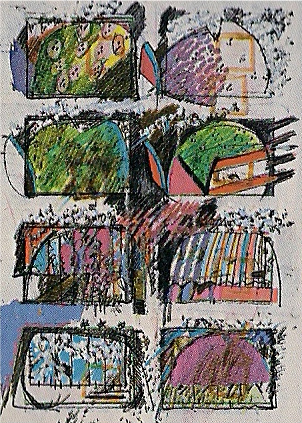 Talk of frames, or rather panels, brings comics to mind. Greenaway was no agnostic in that respect; his appreciation for Tanino Liberatore’s RanXerox is on the record, and Winsor McCay is among the 100 stars counted in 1988’s Drowning by Numbers. To your left is a more direct engagement, a page from The Book of Frames, an assemblage Greenaway put together from 1989 to 1991, but apparently never published, “one hundred and fifty consecutive pages of over one thousand individual frames, eight to a page, suggesting that all human activity can be contained in the ubiquitous rectangle of Western culture where painting, theatre, photography, cinema and television operate. Sometimes these eight-frame sets behave like sequences of film-animation, as here, where they are explosively alive with comic marks mostly derived in admiration from the graphic invention of Krazy Kat.”
The quote and the image are from Greenaway’s 1998 book 100 Allegories to Represent the World, although they might as well come from an anthology of abstract comics, having been excerpted from what sounds like a non-representational graphic novel, circa ’91. This interdisciplinary mindset led Greenaway down some interesting paths; his further use of image frames in cinematographic works like A TV Dante (1989) and Prospero’s Books (1991) were facilitated by the Quantel Paintbox, not an unknown tool to visual artists at the time but used by Greenaway in a manner extremely close to that of its typical utility for composing graphics for television news broadcasts, i.e. layering multiple streams of narratively or thematically linked information, often to some explanatory result. The effect is quite a lot like using the video-streaming internet today — or, frankly, watching prolifically windowed and scrolling cable news broadcasts — although sitting as a helpless witness in the dark and merely observing the internet is strange; interaction seems especially necessary, as Greenaway indicated through increasingly blunt jeremiads on the death of cinema as a relevant and evolving art, and eventually his ’00s movement into movies as only ever a portion of sprawling multimedia engagements, be they his madly self-referential The Tulse Luper Suitcases sequence, or the 2007-08 diptych Nightwatching (a dramatic feature) and Rembrandt’s J’Accuse…! (an essay film), which comprised the movie portion of the first entry in the Ten Classic Paintings Revisited series, concerning The Nightwatch. The New York show covers paintings two and three.
And yet, tricks abound. Rembrandt’s J’Accuse…! details Greenaway’s reading of a murderous conspiracy thriller into the positioning of figures in The Nightwatch (as opposed to Nightwatching, which dramatizes the theory in a manner not disconnected from Greenaway’s name-making 1982 dramatic feature The Draughtsman’s Contract); it was received in a po-faced manner by most film critics I’ve read on the subject, but one can presume that Greenaway — whom at one point, while proffering the advent of painterly chiaroscuro as the birth of cinema, depicts his own windowed talking head as issuing from a horse’s ass — is primarily attempting to demonstrate, by sensational example, tongue, I imagine, firmly in cheek, a means of approaching a Classic Painting that facilitates ‘literacy’ over observation and suggests some skeletal means — form over content, remember — of divining one’s own meaning from a painting. Or, fundamentally, divining narrative, as did a fellow highlighted in one of Greenaway’s digressions as taking a kitchen knife to The Nightwatch in the belief that the painting actually depicted a veiled Satan guiding Christ and, by gesture, the viewer, into Hell.
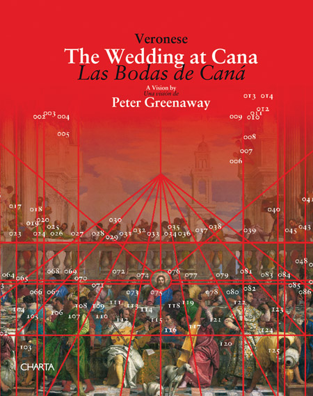
This brings us to the covert funnybook surprise of ’10, right at the end of the year. It’s the 92-page catalog to a European iteration of the Ten Classic Paintings Revisited project, an installation/projection show held in Venice in 2009, focused entirely on The Wedding at Cana. Greenaway provides a short essay in the front to explain the initial interdisciplinary aim of the project (circa The Nightwatch), tracking areas of confluence between painting and cinema:
We might mention some of those areas as being the parallel and contrasting relationships of form to content, the translation of three dimensions into two, the efficiency of compositional construction, illusion versus abstraction, the translation of metaphor into image, the comparison of the particular with the general, the translation of narrative into a single all inclusive image, the depiction and representation of movement, and the uses of manufactured illusion in the service of the suspension of disbelief. Such investigations of the two media interacting on each other in this way, certainly suggested possibilities for much further exploration of the whole issue of the vocabulary of contemporary visual literacy.
The core of the Ten Classic Paintings Revisited project is duly identified as a “dialogue” with the painting in question via some mechanics of cinema, though Greenaway is careful to specify that subjects have been chosen for their amenability to the process. Philosophies, ideologies and compositional materials differ, but all share:
…what might be described as a cinematic presence and a wide screen, deep-focus appeal, where the painted space is often crowded with human figures, or copious detail of image and materials, where there is a great consciousness of the language of framing, many various uses of different forms of perspective, a great comprehension of the use of the flat picture plain – the ‘screen concept’ in fact – and various schemes of colour-coding and colour-perception, contrast, picture resolution and chiaroscuro – and it can be seen here that the language used to describe painting is often the language used to debate cinema, and vice versa.
Oh, I sense heads nodding! Yes, the language used to debate cinema is indeed often too the language to discuss comics, and the catalog to Greenway’s Veronese exhibition, eccentric thing that it is, implicates the language of comics.
Specifically, the book serves as a dialogue guide to the many figures present in The Wedding At Cana, presumably in keeping with spoken or subtitled lines presented in the show itself. It is a panelization of Veronese’s painting, one panel per page, excerpting the posture of various figures along matching gestures or lines of sight, and providing typewritten dialogue in rectangular captions matched to numerically designated characters. Moreover, the pages/panels proceed chronologically, following the action from a high-positioned figure’s suggestion to his dog of what a wedding represents — “Hey Champion – some wedding, some drinking, some prelude to a long life of alternate tedium and misrule. How long will this one last in high happiness and a bouncing bed?” — through the realization of the lacking libations on the premises and the immediate aftermath of Christ’s intercession.
It is, effectively, the re-translation of all-inclusive image narrative into sequential images. Of working, self-identified comics artists, Dave Sim currently makes the most of this technique in his Judenhass and glamourpuss, which function in large part via Sim’s incorporation of traced photographic images, sometimes broken down and arranged into details that draw narrative power from their positioning on the page and next to each other. In the specific context of glamourpuss, this implicates the practice of photo referencing in comics history, though Sim cleverly links photo-tracing to the inking of pencils as similar means of imposing his narrative identity on fashion magazine spreads and The Heart of Juliet Jones alike, positioning himself as both student of comics masters and a participant in a historical tradition.
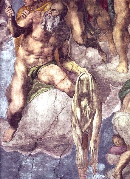 Greenaway also has history on his mind, subtly aligning himself with 16th century poet and satirist Pietro Aretino, most famously depicted in Michelangelo’s The Last Judgment as seen to the right, holding the flayed skin of the artist himself. Veronese also inserted the (then dead) Aretino into The Wedding At Cana, and Greenaway posits that the theatrical schema of the painting was actually inspired by a devotational transcription of the event as imagined by Aretino, purportedly influential on an earlier, similar miracle painting by a different artist. Doubtlessly, Greenaway is also aware of Aretino’s participation in the 1527 release of what is popularly known in English as Aretino’s Postures, a suite of Sonetti Lussuriosi added to a publication of three years prior, I Modi, presenting pornographic engravings of historical and mythical scenes by Marcantonio Raimondi, from images composed for a private commission by Mannerist painter Giulio Romano, who was apparently unaware of the book endeavor until after the initial verse-less edition was printed. By Aretino’s intercession, words and pictures combined to form a most illuminating manuscript, survived only in partial and copied form due to the goodly efforts of the Roman Catholic Church, which probably has near mint copies slabbed and stowed in the Papal longboxes.
Greenaway’s word-picture blend betrays less immediately appreciable content. His dialogue is momentary and conversational, sometimes banal, and stilted in a manner not uncommon to a comics writer struggling to illuminate art that hasn’t manifested in a totally sympathetic way. There also appears to be a production error at work, in which sheets of paper detailing guide lines and vanishing points appear to have been supplied as opaque rather than transparent, limiting their utility as overlays to the full painting, presented three times as double-page spreads. Some minds might accuse Greenaway of padding such limited content, and indeed playing a simplistic game of fancy in the service of overwrought PowerPoint lectures prone to imaginative gallops.
However, to see form over content is to witness the fascinating separation of cinema and comics in Greenaway’s presentation. Comics, in the blunt, linear, potentially inadvertent form seen in this catalog, are cinema honed down, stripped of sound and movement, or the mechanical, inhuman aspect of photography that Bazin identified as critical to its divorce from the plastic arts. Also, centrally, in Greenaway’s catalog, comics replaces the source work, the Great Painting, transforming it into something else as surely as Dave Sim running ink over Alex Raymond. This puts the reader in the eyes of a secondary artist, while the true ‘dialogue’ of the project — the live projection of image and sound onto and around the painting — perches Greenaway over your shoulder, theoretically illuminating a cinematic read of the cloned original. Comics, then, provide a replacement reality to that of the painting, while Greenaway, from his prior works, and the trajectory of his career, might intend instead to spark some participation from the stationary viewer in imposing sequence, comic-ness, onto the Great Painting, so as to live with it, and keep it alive apart from canonization, which is only enjoyed by dead Saints.
You can also say that Greenaway has limited — framed — the swathe of painted art in his selection of such crowded, theatrical work. The next two planned subjects, Pablo Picasso’s Guernica and Jackson Pollock’s One, Number 31, 1950, promise movement away from ‘realistic’ human staging and into a more iconographic or mark-based exploration of “copious detail of image and materials” that joins such painting and cinema.
But then, Greenaway is fond of saying that there is no history, only historians, suggesting the overarching authority of human fallibility over yet another cataloging of existence. Many of his prolonged projects and series — like Sfar’s & Trondheim’s Dungeon — seem designed to remain unfinished, grouped by way of personally charged, meaningful numbers. Ten comes up a lot, being the number of paintings under examination, and especially 92, which is the number of pages in the book, the number of books in the “Greenaway Catalogue” series helpfully identified on the back cover, the number of maps in A Walk Through H, the atomic number of Uranium and therefore totemic of the birth of apocalyptic modernity, and, most importantly, Greenaway’s own inaccurate count of the number of anecdotes in John Cage’s Indeterminacy: New Aspects of Form in Instrumental and Electronic Music – it’s actually just 90. And so, fallibility is built right into the core, not merely a risk but the inevitability of categorization and panelization as practiced by the human observant.
Labels: comics vs. art, comics vs. movies, Peter Greenaway


Oh man… great/timely post.
Wonderful wonderful post, Joe.
I would also point you toward his 2009 book “Fort Asperen Ark,” which recounts the Biblical flood in 92 pages/days, in a stunning narrative sequence of watercolors. So many of his pictorial works, such as the maps comprising “A Walk Through H”, or his project “A Framed Life,” could easily be considered a form of abstract comic-making that could easily find a home in the “Abstract Comics” book. In 1989, Greenaway created a work titled “McCay’s Grid,” of which PG had this to say:
“The grid is a borrowing. Winsor McCay’s Christmas syndicated strip-cartoon of “Little Nemo” for December 13th, 1908, admired for its regularity, its sequence excitement, its reprised shapes and its formal and symmetrical narrative. However, more things were pressing– how to organize the multiplication of points of view in “Prospero’s Books”– a version of “The Tempest,” a consideration of “you are what you read” as opposed to the “you are what you eat” of “The Cook, The Thief, His Wife, and Her Lover.” McCay’s grid lost Nemo and the Christmas moon and is now full of different information– it has become an illustrated weather forecast for Prospero with signs and symbols and isobars and a few windy quotations from Constable.” (“Papiers,” Dis Voir, 1990)
Of another series of small ink drawings, totaling 800, and executed from 1968-1974, Greenaway has written:
“There are a great many pictorial quotations in this collection, from ‘Krazy Kat” to Robert Crumb, Daumier to the “Scientific American,” Jane’s “All the World’s Aircraft,” Persian miniatures and a complete Rudyard Kipling, illustrated by way of Indian shadow puppets.” (“The World of Peter Greenaway,” Journey Editions, 1995) It would be great for an enterprising publisher to print all 800 of those drawings.
Actually, “Fort Asperen Ark” was published in 2007. It is a wonderful book as object, beautifully bound, with a hole punched through all of the pages as well…
Ha, I’d meant to work in FORT ASPEREN ARK, but I didn’t think up a good way… yeah, it’s neat book, and pretty much just the kind of thing you’d see on someone’s table at an art-minded comics show. I’d totally forgotten the Crumb mention in THE WORLD OF PETER GREENAWAY, although I suspect he fits in just as firmly with the ’60s cultural reference points Greenaway sometimes pings off of as anything specific to comics… the Veronese catalog also has a Beatles reference squirreled away.
Don’t have a copy of PAPIERS, but yeah, I’d generally like to see more of Greenaway’s drawing… tangentially, Dis Voir has recently been recruiting French cartoonists to illustrate their line of fairy tales for adults (French and English editions available)… Nicolas de Crécy on THE ADVENTURES OF PERCIVAL (written by Pierre Senges) and Killoffer on THE MAN WHO REFUSED TO DIE (written by Nicolas Ancion). I don’t know what they’re like, but I should be laying hands on the Killoffer one pretty soon…
Oh, huh – apparently Greenaway also wrote the preface to at least one edition of “Little Nemo au pays de Winsor McCay,” a 1990 French-language Editions Milan essay collection(?) edited by Thierry Groensteen…
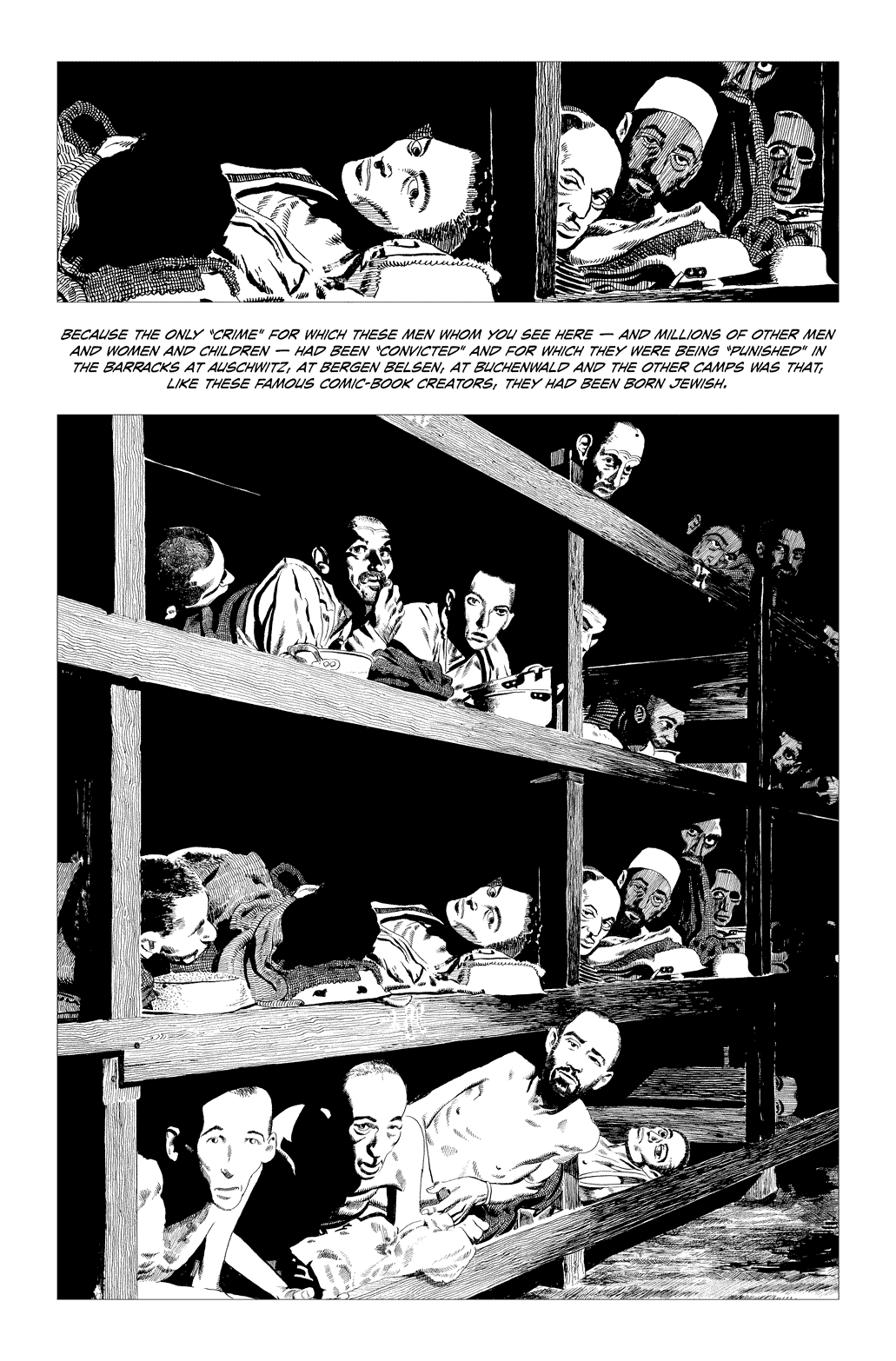
Those Sim images look like they were made with Colorforms, a collection of disparate figures slapped down on a found background. Stiff, awful, lifeless, an artist not seeing an unearthly forest for the unreal trees. I doubt he was using this approach to make a statement on the dehumanization of the camps, but those aren’t human beings, those are mannequins, store props and plastic heads assembled with the eye of a car-assembling robot, clippings of old background characters from the Alex Raymond school (more like pre-school) pasted down to an embarrassing effect. I’ve never been a fan of Sim’s work, but at least Cerebus was an organic, living breathing something. This is depressing to look at, and not just because of the subject matter.
Well sure, I don’t disagree… but he’s doing the best he can with what he has, yeah?
Hell, where’s YOUR Shoah comic, Evan? Don’t YOU want a caped Pulitzer bust for your collectibles humidor?
I can see it now… Maybe in your version could shoe all the Jews in Vans sneakers and drape them in checkerboard PJs and call it (hold on) The Ska-locaust? Or maybe you could, I dunno, have the guards be talking dairy products with cavernous mouths to, like, emphasize the prisoners’ lack of food? Damn, that’s profound; feel free to go with that idea, gratis. Oh snap! Then you could have a “crossover” with Artie’s Maus, cause, you know, mice like cheese! Certainly there’d be a lot more “jumping around” in your interpretation of those terrible events, wouldn’t there — I mean, gotta give the readers something to relate to, right? Hell, EVERYBODY likes to jump around once in a while, you know, have fun while you’re here, you know what I mean?
Jeez, it’s a tricky subject, huh?
And yet another surprise I had reserved for the eventual Abstract Comics vol. 2 goes down the drain!
Of course, I haven’t yet been able to find Greenaway’s direct contact information, but I’m trying. (I even asked a friend who is friends with the head of a major Hollywood studio–one of the artier ones–but the latter never got back to me.) If anyone has any leads, by all means let me know.
This would be great Andrei.
Have you tried any of the galleries or museums/institutions that have hosted or are planning to host Greenaway exhibitions of Greenaways work? Galerie Fortlaan 17 in Gent, is a possible contact, as is the Nicole Klagsbrun Gallery in New York (who hosted some Greenaway exhibitions in the 90’s).
Then of course, there is the Kasander Film Company…
Volumina Artbooks in Italy, has worked extensively with Greenaway lately, in producing beautiful unique artbooks with him. His regular publisher is Dis Voir. I’m sure you could contact any number of publishers he has recently worked with (these two being the most frequent).
Let’s hope this can work.
Best of luck, Andrei.
There’s also the (likewise Italian) Change Performing Arts, which is the production company behind the Ten Classic Paintings Revisited project, as well as various other shows of his…
Lou Copeland, who did the “tech” side of JUDENHASS, forwarded me a printed out copy of this article, which I found interesting enough to violate my acquiesced-to pariah status…
(I think we’re all in agreement that misogynists should not be accepted socially. My own view is that feminism is essentially “wrong headed’ and that it isn’t misogynistic to point out that self-evident fact. This puts me at odds with the otherwise universally accepted view in the comics field that it’s an either/or: either you’re a feminist or you’re a misogynist. Thus my “acquiesced to” acceptance of universally perceived reality. Perhaps these comments could be put in a special “WARNING: these comments have been written by a person universally perceived to be a misogynist. Read at your own risk”?)
…since the genesis of JUDENHASS was structural along the lines of what Mr. McCulloch is discussing in his article, originating late in the CEREBUS storyline with what I would describe as “Excerpt narrative”. The idea being that you have a master drawing of some intricacy and detail from which you excerpt images. If you excerpt the images in (there’s really no language for this yet) “sequential adjacency” from left to right across the master drawing, you effectively are doing a “pan shot”. The extent of the overlap determines the “speed” of the pan shot.
The subject matter — the Shoah — came late in the proceedings. I was looking for a subject which lent itself to this sort of “master drawing”; excerpt narrative”; “sequential adjacency” approach, but the original idea was: how few master drawings would you need to do in order to produce a satisfying “read”? The fewer the master drawings, the more time could be devoted to each one and the greater the level of photographic detail that could be applied to each image.
Close-ups presented an obvious problem because if you just enlarge an image past, say 120% then the density of the lines became incompatible with the adjacent images. This increased the number of master drawings. Any enlargement at 150% or larger need to be traced off and re-inked at the appropriate density. Or enlarged as a photocopy with the then “too thick” lines whites out and replaced with lines of an appropriate density.
I experimented with the structure again with the mini comic LOST KISSES #11, using a half dozen or so master drawings to create 40 or so individual panels.
The biggest drawback is the computer time involved which is why I don’t use it as much on glamourpuss as I originally intended. The process of cutting and pasting the individual panels, fitting them within panel borders, making all the panel gutters the same width… well that was Lou’s part of it, so he can address the subject better than I can. If JUDENHASS was selling thousands of copies a month and I could pay Lou for all his time and work then I could start thinking of projects with similar structure. In a way it’s unfortunate that I picked a subject that just rubs the comic book public the wrong way which has led to a “baby with the bathwater” loss of the structure which I think is a valuable tool and pretty close to what Mr. McCulloch is talking about here — cinema on paper, a kind of strange wedding of film, comics and animation.
I just want to write and draw, not run a sweat shop which is what I think would be involved to optimize the structure: a team of cut-and-paste guys able to do, say, 15 to 20 panels each a day on computer from thumbnail storyboards, with computer lettering and scripts which which indicated successive percentages of enlargement and reduction, pan shot measurements to establish durations and speed, backgrounds and figures dealt with separately and then integrated. I think you could definitely do a plausible Bernie Krigstein or Jim Steranko narrative that would LOOK drawn (because it would be drawn, just mechanically composed into pages) and, depending on how good your team was you could maybe do five or six pages a day, every panel of which would look like the master artist drew them. Because he or she would have.
It’s NOT misogynistic to critique feminism, it IS misogynistic to critique women and use those critiques to make a case and state over and over that they are inferior to men.
pwned!
Surely there are more interesting things in this post to respond to than Dave Sim’s idiosyncratic views about women . . .
I agree. Not to pick sides, but the funny thing is…if you come out and criticize women, people tend to forget how innovative you are (in Sim’s case). But if you don’t say you’re criticizing women, and pump out tons of sexist books like Marvel, DC, Image, etc. (where the women have slim personalities and even less clothing), people embrace it. The whole controversy is more about joining a cause than believing in one.
As for the actual post…that “panning” technique is great. And probably more affective here than in film, because in a comic you’re constantly reliving it by flipping through the pages. In comics every event is always happening at once. Movies aren’t like that–you have to sit there and wait.
@joe that’s not the definition of misogyny by a long shot.
In fact many said Feminists were called misandrist by that very same definition you gave.
“In a way it’s unfortunate that I picked a subject that just rubs the comic book public the wrong way….”
Has anybody told Dave who won the big prize in Angouleme?
Look, Jog’s discussion of Greenaway is very nice, and I think Sim’s ideas about more large scale implementations of the Judenhass technique are fascinating and I’d love to see them implemented . . .
. . . but it strikes me that we’re talk about a technique here with severe limitations from a narrative standpoint. And, yes, I’m totally sold on the Molotiu, et al., idea that the visual language of comics can be implemented in a purely abstract fashion, without “narrative” in the explicit old fashioned sense of a story with characters. But there is an important sense in which the best of the abstract comics exhibit a “narrative”, and that’s in a dynamic motion through some kind of emotional / aesthetic landscape. The problem with the “panning” across large scale still images technique discussed here is that all dynamic aspects of the visual / reading experience are derived from an underlying static image. Yes, our point of view changes, but no particular element of the image changes state. Frankly, this was one of the failings of Judenhass – only so much dynamic can be derived from shifting attention across a still image. Ultimately, the work failed to provide as strong an emotional impact as it might have precisely because it was ultimately so static.
Traditionally, this is a technique more suitable for backgrounds – I wonder if Sim would envision overlaying changing characters on top of the changing perspectives from a large scale static image he envisions extracting through this procedure? Here, the relevant influence would be animation, where this technique has been used frequently, but it might reinterject a dimension of dynamism to the sequence of images which is lost by mere “panning” across them through successive panels.
I’m reminded of Carl Theodor Dreyer’s The Passion of Joan of Arc – some of the most striking shots appear to be inspired by Renaissance paintings. Much as is discussed here, the image pans across a static tableau, arranged with all the care to placement and depth one finds in the best paintings. Of course, this is real panning, rather than panning simulated by carefully chosen progressions of sub-images. Nevertheless, the idea of arranging a static scene, then creating movement through it through a change of perspective (while characters / objects remain stationary) seems essentially the same. With two crucial differences: 1. these static arrangements do not constitute the whole of the narrative of the story, but rather scene setting moments, where a stationary position for all the objects, characters, etc. is motivated by the broader narrative purposes of the film; 2. these “static” arrangements are not in fact completely static – the actors so carefully posed occasionally twitch or scratch or shift their weight. But this ever so slight movement in the subjects of the pan creates a depth and reality that would be completely absent were they as still as mannequins.
I guess what I’m saying is: yes, this is an interesting formal constraint, but when viewed in the context of the broader purpose of communication (whether abstract or more traditionally narrative), it closes off a crucial dimension of information. In a way, the most effective implementation of the technique would defeat it, by drawing each of the successive images not from a single larger one, but a sequence of ever so slight variations.
In a quite different idiom and aspect ratio, there is Shaky Kane’s recent Monster Truck.
http://www.shakykane.co.uk/wishbone/monstertruck.htm (entire work)
The strip has no overlap from panel to contiguous panel, so it can be deployed either as a comic-book, one panel per page, or as a panoramic frieze with the direction of movement suggested by internal pictorial elements, as in a classical painting.
A key source of rhythm is the recurrent appearance of the eponymous vehicle, which is the only specific “character” seen more than once, although there are other examples of motivic repetition.
Time is suggested both by the spatial repositioning of the vehicle and its progressive alteration as caused by the rigours of the journey, as well as being diegetically explicit in the text.
There is actually one single insert panel, subversively enough, which shows the interior of the truck. This happens within the 41st of the continuous panels.
SPOILER:
The implied shape of the (spatial) journey itself seems to be circular, however the hand of time has written and moved on, suggesting that the ideal organisation of the piece for display might be as one cycle of a spiral, with the first panel proper overlapping the last.
[…] Dave Sim and Joe McCulloch have a contretemps over at the Comics Comics blog (comments section). Some interesting background on Sim’s Judenhaus project and the matter of […]