


Frank’s Soapbox #5
by Frank Santoro
Saturday, August 28, 2010

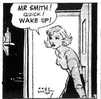
Noel Sickles sketches
I think there are two ways to learn observational drawing. There’s the contour line approach and there’s a tonal approach. Contour line drawing is concerned with defining form by lines without shadow. Tonal drawing is concerned with values of light and dark. Shadows and the modeling of light is the focus. These approaches are of course the building blocks of drawing; of reproducing what is there in front of the maker. Style is unimportant with this approach. A large class of students’ contour line drawings, if they are “accurate” enough, look almost as if they were drawn by the same person. There are no flourishes or mannerisms with this method. It is a documentary style of drawing.
(When I taught contour line life drawing at Parsons, my goal was to place the whole class at the same starting point and strip away their “mannerisms” and force them all to look at the model as though they were all looking through the same camera. After all, the camera is the same for everyone. Draw like you are a camera. Imagine drawing from life before cameras existed. What was it like?)
Now, of course, all drawing from life is an abstraction. There are no lines around things that separate them from the space around everything, right? Still, this can be done in a fairly accurate way which, again, with contour line drawings can be “style-less”. We’re all taught this approach in school first and then we learn tone. Values are learned in black & white first and then in color. Simple. (All those old paintings in the Met are painted in black & white first and then the color is glazed over. Even Alex Ross uses grisaille underpainting)
Comics is interesting because this “abstraction” that happens when one draws from life is repeated through the sequencing of images. So things repeated get simplified, reduced and turn into symbols. Stylized. Still, I think it’s possible to maintain a certain freshness that is part of the observational approach and soften the “reduction” process. The maker has a “style” but it’s quality is judged (I think) by it’s accuracy and feeling. The style is submerged slightly because there is a specific target (life). When I look at Noel Sickles’ comics I see a natural way of drawing transposed to comics. He reduces the figures to simple lines and the backgrounds to tones. His drawings remind me of Edward Hopper’s sketches and etchings. Basic drawing at it’s best.
Sickles influenced Alex Toth a great deal. He took Sickles’ approach, modernized it and defined a whole language. Toth had a way of drawing clearly, accurately, without modeling or hatching and created space in his compositions with masterful spotted blacks. I honestly think his Hanna-Barbera Johnny Quest style is the perfect synthesis of cartooning and “realism”. I call it “cartoony realism” (genius, eh?). And I think that Toth’s Hot Wheels run is a perfect example of how one can approach depicting “real life” in comics without devolving into mannerisms. There’s a punchy cartoony energy to the drawing, but it feels real to me, and I think there is a real tension between drawing accurately and exaggerating the forms stylistically for effect. I think this approach to comics making is about as close as one can get to life without becoming too stiffly “real” (see Foster) or without referencing photos excessively. Because then the cartoony-ness is too hard to pull off in relation to the drawings that look like photos. You lose that whole spectrum of exaggeration and tension. There are “realer” comics but usually they feel photographic and lifeless to me. Toth never feels that way to me. He plays around the with the level of realism graphically in a way that is interesting fascinating to me.
Tangent warning: Style is a really interesting thing in comics if you think about it. I had a friend (who can draw from life very well) tell me that she can’t draw comics because she can’t draw ‘in that comics style”. I said superhero style or funny animal style, what style? She said, “No, just with all those little marks and stuff”. What she meant was all the cross hatching lines and little mannerisms that most cartoonists use in their drawing. We talked about how manga has manga lines and for the most part all looks like manga. How French comics look like French comics. (I said “Everyone’s a Caniffer” but she didn’t get it.) And, yah of course, we also talked about how North American comics look like North American comics.
And here’s where I switch into my soapbox riff. I was surprised to look up and down the comics shop’s alternative section and not find much in the way of “naturalism”. Does anyone over here draw in a straight ahead natural style these days? Eddie Campbell does. Jason Lutes does. I think Gabrielle Bell has a natural, observational style. Adrian Tomine. Blaise Larmee has pretty naturalistic approach. CF. Jaime, of course – the heir to Alex Toth. Who else? Quick! Think! You can’t name many can you? Joe Sacco? Jordan Crane’s Uptight is naturalistic in a pleasant Jaime-esque way. A nice cartoony realism. Sammy Harkham has a similar cartoony realism that’s steeped in observation. Still I think they both feel more cartoony than someone like Gabrielle Bell. Maybe it’s her contour line approach because I read her drawings as more “real”, more documentary than Crane’s or Harkham’s drawings. Maybe slightly less expressive but more specific to the person she’s observing and portraying.
So, what’s my point? What am I tryin’ to say, eh? Not much. Just saying that it is interesting to me to see how alt/art comics for the most part aren’t trucking in naturalism these days. And I don’t think that’s bad or anything. Simply something I’ve noticed. Many of the stories may be about real people but frequently are they portrayed in styles that do not reflect “real life” but an exaggerated , mannerist POV. Again, this isn’t bad, but it is a little weird, no? Why do I find this weird? I guess because since these stories are often about people they would be depicted “naturally” and unaffectedly. The stories are often unaffected – that non-genre genre of autobiography – so why is the drawing so affected? I find it interesting that fewer alt cartoonists are following a more natural drawing style similar to Jaime’s drawing model. Or Eddie Campbell’s model. Or Adrian Tomine’s model. I don’t mean follow the style and copy the mannerisms. But why not follow the approach like Campbell’s page organization or Tomine’s exquisite stage blocking? I guess it’s really because most can’t draw as well as these folks or the natural approach doesn’t interest them. Maybe “real life” subject matter needs a counterpoint in non-naturalistic cartooned drawings. Or why most alt comics that have “natural” subject matter stay a safe distance from “realism”. Is that why naturalistic cartooned exaggeration works so well in Chester Brown’s autobiographical comics? Would it all be “too real” otherwise? Maybe it’s an 80’s 90’s thing. Or maybe it’s just too much work.
Labels: Adrian Tomine, Alex Toth, Drawing Styles, Gabrielle Bell, Jaime Hernandez, Jason Lutes, Joe Sacco, Jordan Crane, Noel Sickles, Sammy Harkham


I like Tim Lane, and that DJ Bryant guy in the new MOME is good.
Lane can do tones like no one else in comics. He’s amazing.
I think the whole notion of alternative cartoonists not leaning towards realism is because their influences and inspirations aren’t like that.
Come to think of it, when I was waiting in line to meet Jamie at ECCC this year, I DO remember Bryant standing in front me, showing him that very story. He told Jamie how much L&R influenced his style. So, the more naturalist ’80s alt. Cartoonists did influence others to head into that direction.
Cool. Just remember if you see Jamie again to call him “Hy-meh”
I wouldn’t be latino if I didn’t.
sorry. wasn’t tryin to be a snot – you typed “jamie” so I mentioned it
Related link from Tom K:
http://www.transatlantis.net/blog/2010/08/28/marvelous-melodrama/
This is something that’s come to my mind recently (I think helped by reading articles about the Uncanny Valley, perhaps?)
Comics seem to present this unique opportunity to really explore the abstract qualities of the two dimensional page, and I’ve been more interested in seeing drawings that are more symbolic and graphic. While not everyone can do it so well as Hernandez or Toth, there’s still a lot of folks who have strayed too far from naturalistic roots.
Obviously, the ones who do it well have beautiful work, and I don’t appreciate it any less. However I’ve noticed that I’m more inclined to buy something that has a more designed feel, for lack of a better term.
Part of it probably has to do with my growing appreciation for real life. I used to be totally absorbed with 2D/flat representations of things (fiction). Now I feel a drawing or photograph or film can’t really compare with how things look in living three dimensions, so I like to see two dimensional drawing playing to its strengths. Kind of (but not really) like a Greenberg formalist outlook.
I may not feel this way forever, but for now at least the more cartoony and graphic (I realize that Toth and Hernandez overlap into this description, and I think Jordan Crane can do it pretty well also)
Related link:
http://en.wikipedia.org/wiki/Uncanny_valley
Frank, I love naturalism in comics. I’m a giant fan of Eddie Campbell, Sickles, etc. I have to say that I think a large part of the ability to to that comes from being classically trained to an extent (I don’t know really what the above artists’ training was). I find as a cartoonist that its actually the most challenging way of cartooning, because it forces you to think much more about what marks to make and what to leave in and what to leave out–you can’t just draw an abstract symbol for a nose, you actually have to think about what the shadows of the nose would look like from that angle and reduce that down to a single accurate mark.
I must say I’ve been a little dissappointed at my school, which has a cartooning program, how little classical drawing training goes on.
You can see this skill a lot, by the way, in the drawings of many classical painters– in addition to Hopper, who you mention, many of the Ashcan painters also were cartoonists, and it goes back to Honore Daumier and others….
Word. I’ve been looking at Daumier. He was Degas’s favorite artist.
It seems like the 90s trend toward less naturalistic, more cartoony approaches is related to a rediscovery (through reprint books of the 80s? through Raw?) of early newspaper comics. Ware was a big part of this trend and his hieroglyphic strips tended to eschew realism in favor of design. McCloud may’ve led a lot of folks down this road, too – his formalism seemed to be hugely influential in the 90s. And a lot of these guys came from the zine subculture (Hart, Rege, etc.) where simplicity and quickness were really helpful and the DIY ethos (untrained = doesn’t matter) was in full effect (since a lot of these guys and gals grew up on punk and were into low-fi indie music).
That was a good one.
I just reread Raeburn’s book on Ware, and there is a quote in there (I’ll type it out later) about Ware and his view of his drawing style, where the simplification of forms/style/rendering is about making the comic easier to read as language rather than see as pictures, and how he thinks more realistic rendering blocks readers from feeling emotion from the pictures.
I hope I’m not totally misrepresenting that, but… it sounds ridiculous to me. Reading a lot of photorealist strips lately, like Drake’s Juliet Jones, I see/feel/read a lot of emotion is his work, which, sure, is heavily photo-referenced, but also loose and a little cartoony (particularly in the Eve character’s rendering and dynamism).
It’s interesting to think of his quote in relation to his sketchbooks which are mostly from life. Interesting balance he maintains.
Here’s the quote:
“Fundamentally you’re better off using ideograms rather than realistic drawings,” Ware says. “There’s a vulgarity to showing something as you really see it and experience it. It sets up an odd wall that blocks the reader’s empathy.” Imagine if for the cover of the fourth issue of his Acme Novelty Library Ware had substituted in place of his symbolically weeping cat head a finely detailed close-up of a yowling tabby with wet fur and quivering whiskers, and you see immediately this wall. Realism is fine for telling tales about jut-jawed good guys in tights who sock dastards, but it is too explicit for anything emotional. It bullies the readers and their emotions turning sentiment into sentimentality. Just as the old saw holds that in writing fiction you should show, not tell, in comics to show too much is to “tell” too much. Ware kept his pictolinguistic strips simple because his goal was not to depict emotion, but to create it.
Raeburn, Daniel. Chris Ware. p.18-19.
Notice the dig in there at genre comics. Perhaps part of the lack of naturalism is a backlash against its domination in superhero comics.
And at the same moment in history – early 90’s – Alex Ross makes the scene.
i’m not crazy about raeburn’s book which to me just seems to be a rehashing of what chris ware already spells out in his notebooks, but anyway, yeah, the prominence of (what i would call) schematic over naturalistic drawing probably stems from a backlash against genre material. that’s one thing fabrice neaud complains about at some point (in l’éprouvette no 3 i think) where he says his (sometimes approaching photo-realistic) drawing style often aroused some suspiction among readers in the french alt-comics scene: i.e. it’s too “realistic”, thus it’s suspect of mainstream envy.
on the other hand, schematic drawing has a long history. it’s the DNA of cartooning, if you will. & it’s been theorized (if you look at “ligne claire” for instance) as the best way to inspire identification in the reader. (whether this is true or not remains to be debated, but it’s not a weak argument.)
what’s interesting with chris ware is that his acting is actually quite naturalistic, almost to a fault. so the schematic drawing sort of offsets that proximity to the material, & increases the distance between the reader & the comic, to give us a somewhat more “comfortable” vantage point to the story.
with naturalistic drawing, i would argue that this distance is created using the reverse method, by making the acting less natualistic, more dependent on stock poses & gestures.
what i’m saying is, naturalism is not just about the drawing, it’s also about the acting.
interesting post, anyway, & a great topic to think & argue about, certainly.
Frank, I’d be interested to know whether you see Al Columbia as fundamentally naturalist or mannerist. There are very strong veins of both in his work, especially Pim & Francie, where a bunch of the individual pictures employ multiple drawing styles.
Yah, that’s an interesting area where his “mannerist” characters are in a “natural” space. Similar to lots of manga. But ultimately, it’s mannerist I’d say.
The Stan Drake quotes I posted here awhile back address some of these points.
http://www.drake.org/Stan/CarPro86/Article.html
Drake described how his inclination was toward cartooning.
At Johnston & Cushing realism was called for, and Drake spent weeks tracing photographs until he could draw photo based “naturalism” without reference.
Later Drake had the opportunity to draw the Blondie newspaper strip, and reversed the process. He spent weeks lightboxing Jim Raymond Blondie strips.
BTW I never thought of Jamie Hernandez as being any more naturalistic than Gilbert.
There is Toth in the mix, but also Hank Ketcham/Wiseman, Kurtzman, DeCarlo, and Kirby.
Re: “Manga mostly looks like manga”
I’d agree, and I’d guess that the younger alt-comics crowd’s relative familiarity with manga is part of why you’re seeing fewer outright naturalist artists.
The only place I see a regular lean toward naturalism in manga is Seinen samurai work, which makes practical sense when you consider how many of them are grim and visceral with a strong human rights subtext, but is kind of funny when you consider how Japanese art of the periods portrayed valued naturalism even less than it does now:
http://www.britishmuseum.org/explore/highlights/article_index/j/japanese_portraits.aspx
Thanks. I’m not familiar with Seinen so much.
“The only place I see a regular lean toward naturalism in manga is…”
Tanaguichi is a mannered naturalist. “The Walking Man”. Popular in France but not so much in Europe.
So true. Works like Lone Wolf and Cub as well as Satsuma Gishiden, have a strong naturalist drawing style. Ditto some of the Garo work like Sampei Shirato.
Jaime Hernandez — if they could, they would.
With regard to the Chris Ware quote that Derik B provides:
Ware really could, but he suffers from a genuine difference in philosophy. Based on that passage, it is clear that Ware truly believes that the more abstract depiction of emotional events draws the reader into the story in a more intellectually honest way. Note what he says about “sentimentality.”
In my personal reading of Ware’s work, the aspect that he seems to overlook is that while a more naturalistic depiction of emotion may lend itself toward one kind of “sentimentality” (I take issue with this), the problem is that Ware’s method goes the other way and creates a mask…or is that “masque?” His work hides true emotion by disguising it as pure artifice.
Ware is, in my personal opinion, a victim of his culture–Western culture which praises stoicism and frowns upon heartfelt genuine emotional response. Real men don’t cry, they make art films in which it rains or something. I find the more naked expressions of painful emotions (and let’s be honest–we’re always talking about pain with Mr. Ware) to be far more brave and far more challenging to the reader.
Ware seems to feel–based again, on my readings of his work and his passage quoted above–that sincerely expressed emotion is somehow unsophisticated. I would contend that he has a point in that genuine emotional response often isn’t “sophisticated,” it’s the layers of self-delusion that years of our cultural baggage create that makes a simple emotion into something bigger than it really is.
Shorter version: Chris Ware writes about emotions but is afraid to genuinely show them.
“Shorter version: Chris Ware writes about emotions but is afraid to genuinely show them.”
In your opinion Mr. Ayo, in your opinion. Reading his sketchbook comics like when he goes to China are expositions of raw emotion (in my opinion).
Lets stay on the topic of reduction to symbols but leave CW out of the discussion. I stay away from writing about Ware cuz of it always devolves into bizarro tangents. Thanks.
Here’s some “naturalism”:
http://www.slate.com/id/2265076/
I wonder how much Understanding Comics had an influence on Ware. McCloud’s book came out right around the time Ware was beginning Acme Novelty Library. And, by the way, I’m not a big fan of Ware, but his sloppy autobio strips from his sketchbook (reprinted in at least one TCJ special and the Acme Novelty Datebook) are really incredible.
Well, remember the strips were published first in papers before the comics. McCloud’s book is 93 and that was the same year the first Fanta issue appeared. So probably not much. Still, similar ideas “in the air”.
Well put and well observed … drawing is the god of visual communication. Without it one is always condemned to stylization and self-reference.
oh, yeah – duh! and Ware’s style was already pretty much formed.
I guess in Europe, two main comics artists working on a kind of naturalist approach are Blutch and Emmanuel Guibert (Alan’s War being very interesting, as it’s someone else’s memoirs, still presenting naturalism). And both have a very strong and personnal style, though.
Bastien Vives has a nice “from life” approach –
I’m also a big Manuele Fior fan. Check those cats out, dear reader, if you haven’t – both have a very different approach than most European cartoonists
Fabrice Neaud, Judith Forest, who both do autobio work (so their images are based on actual people/places).
I think “5.000 kilometers per second” is the best book of the year on this side of the ocean – and maybe on both sides, yes! What a book… You’re right. As for Bastien Vivès, although I really like his work, I would not say he’s a naturalist… His black and strong brush lines seem more expressionist to me… ?
Perhaps a useful tangent:
I think there’s a connection between “reduction to symbolism/iconography” in comics and what David Bordwell calls “intensified continuity” in film. In both cases, there’s an attempt to create a 1:1 relationship between an individual narrative unit (panel or shot) and its meaning. The meaning of each panel/shot is meant to read clearly to the audience, without much room for interpretation. In works like these (Ware’s comics or the movies of the Coen Bros., say), complexity, nuance, and ambiguity comes from the (often elaborate) arrangements of these individual units of meaning. At the other end of the spectrum, you have comics/movies where the individual panels/shots are more densely packed with “meanings” (Kim Deitch’s work, say – although he’s not “naturalistic” – and movies by guys who work in deep space with long takes, like Renoir and Wyler). While I know its a bit of a lightning rod term, I think the iconographic/intensified continuity approach tends to be more literary, simply because the reduction of a panel or shot to a single idea makes the act of reading/watching more like reading prose.
It’s worth noting that Campbell often works as a courtroom artist, a job that requires the ability to quickly render plausible likenesses, mannerisms, etc. This style is definitely of a piece with the observational tone of his Alec stuff.
I like this post even though I find it problematic. I LOVE the way Sickles draws but for me reading his stuff is a fight to get past all the great drawing. Whereas Milton Caniff’s stuff reads much better and I’d put him on the naturalism side of the fence despite being more mannered than Sickles. I’m a BIG Toth fan and his stuff reads great when the drawing doesn’t over power his storytelling. I’ve always figured the Roy Crane influence on Toth saved us from just his pretty drawing. I’m with you 100% regarding Xaime and I think it’s important to note that of your 3 primary examples, his stuff READS and it’s almost impossible to separate the form from the content of his stories.
Frank, do you think observational drawing can be connected to mannered drawing the same way you connect it to naturalism?
“Frank, do you think observational drawing can be connected to mannered drawing the same way you connect it to naturalism?”
Yah, Durer is a good example of that. In comics Marsh has a “mannered” but observational style. There are ways of making marks in a “mannerist” fashion and still have all the proportions correct and make beautiful “life-like” drawings. The 17th century artist Poussin is the king of that I think.
Still, the point is that “observational” drawing can be measured I think. It’s like a tuning fork for all drawing. What one considers “natural’ is fairly subject but natural drawing is rooted in observation so again it’s “measurable” – but feeling is feeling. If you like Caniff more than Sickles, great, but they are basically the same approach. Mannerism is more about decoration.
Cool… I’m going to chew on this some more, especially “It’s like a tuning fork for all drawing.”
I actually prefer the way Sickles draws to the way Caniff draws, even though I think Caniff is the better cartoonist/storyteller.
Panter is a good example of mannered naturalism. So many of his drawings are about him looking carefully at what he’s depicting, not drawing a linguistic form but a visual one. Of course, he’s super mannered, but the drawings are totally based on observation.
I like what you’re saying, John – there’s a way to make comics that doesn’t seem to have been explored so much where’s there’s ambiguity in the imagery that doesn’t correlate directly to an intended meaning. Ian Sundahl is someone who does this.
I vaguely remember an essay in The Comics Journal that was guest edited by Tom Devlin about 10 or so years ago where someone wrote an essay saying something to the effect that there was no need for realistically drawn comics anymore. I tried to find it i but I stupidly misplaced it or threw it out and its not available online. At any rate, It made an impression on me at the time.
Realistic comics fit well with genre writing such as with superheroes and mysteries. I can’t imaging Brubaker’s Criminal series I am currently reading done in the style of, say, Ron Rege Jr. or John Porcellino. ‘Art comics’ material in general tends to be more introspective and personal; less gritty dealing more with emotion than in hard action. The art in these comics then are more like sketches (more personal/ universal) and less of what historically in Western art has been though of as a final, fully rendered drawing.
I believe you are thinking of this piece, which is sort of an essay, from issue 238.
That’s the one.
The email thread is a bit on the smarmy side but the whole thing is still an interesting read especially as it pertains to art/alt comic drawing trends in the 9 years since it was written. It shouldn’t be surprising that these cartoonists are not using a natural drawing style. Aside from other reasons, the publishers haven’t wanted it.
I forgot about that one! Still, I think when Tom says he likes cartoony drawings I personally think of Johnny Quest. I think there are extremes and then there are very fine divisions once you get towards the middle (which is the “truth” of observational drawing). Like Tomine can be cartoony at times and naturalistic at times – he goes up and down the chain. Same with Mazzucchelli. Same with Jaime. I see the extremes of hyper-realism and cartoony scratchyness but the middle is a wide, nuanced playing field alot of people stay away from cuz it’s hard to do, I think. I actually think it’s a big reason why alot of people don’t do it. It’s pretty hard to maintain a “comics” energy and be naturalistic, realistic. Sure, it’s a choice – but those who can do it are a rare breed in comics I think.
BTW, Tomine has a new full-page comic is the Sept. 6 “New Yorker” that is draw in a cartoony vein. Its not available online but he posted a snippet on his blog…
http://3.bp.blogspot.com/_wHFJnUUljWk/TH-VGcNcqAI/AAAAAAAAALs/PFqar5mJ15k/s1600/DiningOut-crop.jpg
I love that essay, it should be printed up and disseminated as a new comics manifesto. Sort of like Rozz Tox but funnier.
In a sort of random order – this is something that has always fascinated me and comes back to the arguement between, say Stanislavsky and Brecht in theatre acting. Chris Ware’s arguement is the same as that made by Brecht and is what culminated in his idea of the ‘verfremsdung effekt’ or ‘to make strange’ and is really the central tenet of modernism. To be able to see the meaning in something, you need to make it appear ‘strange’ so that it will prevent people identify with cahracters and lead them to identify with the issues that are put infront of them.
Stanislavsky believed that you needed to draw upon experience to make an acted event appear a true as possible to create a believable reality. Both creating methods of achieving what they believed ‘art’ should achieve, i.e. immersion (Stanislavsky) or intellectual distance from the characters so that the ‘ideas’ are what comes through.
What i find interesting is that this is still looking at the visual approach and not the use of the language. One of the things that you have confused here is ‘naturalism’ and ‘observational’ which are two very different things. The main problem is that something that is draw to look like is does in life is not neccesarily ‘observed’ because something looking like an object doesnot neccesarily capture the experience of that object for the viewer or the individual experiencing it. I think this is why people opt to stylise – it seems to be easier because there is already a language to portray these emotions. It is also easier to creat a world that is consistant.
This is where i find that photo-referenced stuff falls flatter than even the most mannered drawing approach. If you look at, say Sean Phillips work on Kid Eternity and then his work on Hellblazer, this was the tippping point, for me, where it became obviously ‘referenced’ as opposed to what i would call ‘worked into’ his style and approach. BY that I mean, you’re looking at some of those drawings and you can see the stock poses that he has taken a photo of and then he sort of sticks them together and it doesn’t make for a whole image.
It’s a crummy description – I suppose the best way to describe it is that it’s like watching a blue screened film, you can see where the person is floating around inside a reality rather than being part of it. It’s like driving scenes where the car is obviously in a studio and the background is projected behind them, they’re different unmeshed styles that don’t fit.
Now this may all be ‘natural’ but it’s not ‘observed’. This is what a lot of people on art courses struggle with. I did animation and it was even worse there than in the illustration or fine art courses. Our lecturer used to get bored of saying ‘look at what is infront of you and not what you expect to be there’ and had devised many different methods of combating them.
My favourites were the ‘blind drawing’ tasks where you weren’t allowed to look at the page as you drew, only the object. The other one that worked well was to get people to make 1 minute drawings of people who were moving at the timeto force you to understand the movement.
Anyway – i digressed – if you look at seomthing like The Wordsmith (renegade press) that is a ‘naturalistic’ drawing style that feels ‘observed’ – i suppose this is what people call ‘well acted’. If you look at ‘the photographer’ from Guibert – i just see photo’s that sit on a backdrop and don’t react emotionally and spacially with each other.
I hope that makes some sense…
Very well said. Thank you.
“The main problem is that something that is draw to look like is does in life is not neccesarily ‘observed’ because something looking like an object doesnot neccesarily capture the experience of that object for the viewer or the individual experiencing it. I think this is why people opt to stylise – it seems to be easier because there is already a language to portray these emotions. It is also easier to creat a world that is consistant.”
– I think what you wrote there this is a great point when talking about comics vs single image making and very relevant to what I’m trying to get at. Thanks!
I’m reminded of Peter Blegvad’s “Imagined, Observed, Remembered” strips.
I am reading a book on bullfighting that uses examples from art to illustrate its points. What stood out to me among the rich, wonderfully-detailed oil paintings was a detail of a quick little sketch of a matador. The lush paintings represent an idealized beauty and also privilege with their connotations of academy and aristocracy. The paintings are a hybrid of Blegvad’s “Imagined” and “Observed”. The sketch seemed to me to be a freer, uninhibited expression of the artist and right there is appeal of drawings that are closer to sketches than to paintings. Uninhibited expression that is closer to our collective “Remembered” cultural memory.
ideography (?) in comics is perhaps partly driven by an essentialist impulse.
i.e. trying to distinguish the medium from (and, maybe, avoid comparison with) closely related precursive artforms.
regarding Ware’s relationship to McClouds schema: i wonder when it was that Ware (reputedly) began using the tools and techniques of typography to construct his figures.
contours definitely seem more abstract to me than the more sensually direct tonal approach.
Infantino in the late 1950s was surely influenced by the energy of high-modernist graphic design, hence his work seemed so relevant, although, in many ways, his approach was not a new one.
i feel the same way about the cartoonists who follow in the footsteps of Sterret and Schultz etc. it feels relevant perhaps because it seems to address certain recent concerns/ambitions about the legitimacy (huh) of the medium. (the essentialist urge rears its head, nail-marks streaking its hairless scalp, boxing shadows)
i don’t know if i’m making this up or not but could it also be considered that,
“naturalism” (a problematic term, of course) is to “ideography,”
as,
prose is to some rarified kind of poetry.
hmm, i probably should be thinking more about about sequentiality, and such.
[…] while ago, the ever-inspiring Frank Santoro wrote up a little soapbox on Comics Comics about drawing style. His position seemed to be a yearning for artists who were […]