Posts Tagged ‘Frank Santoro’

The Brooklyn Comics and Graphics Festival


by

Monday, November 30, 2009


Read Comments (12)
[PAID ADVERTISEMENT]


PictureBox & Desert Island Present:

The Brooklyn Comics and Graphics Festival

Saturday December 5th 2009: 11 AM – 7 PM
Our Lady of Consolation Church
184 Metropolitan Ave.
Williamsburg, Brooklyn

Free admission

Download the festival program here for a map and schedule.

UPDATE 12/1/09: I’m pleased to announce that Mat Brinkman will be at the PictureBox booth signing books on Saturday.

The Brooklyn Comics and Graphics Festival consists of 3 components in 3 nearby locations in Williamsburg, Brooklyn:

Over 50 exhibitors selling their zines, comics, books, prints and posters in a bustling market-style environment at Our Lady of Consolation Church, 184 Metropolitan Ave.
Panel discussions and lectures by prominent artists, as well as an exhibition of vintage comic book artwork at Secret Project Robot, 128 River St.
An evening of musical performances at DBA, 49 S. 2nd St.

In the cozy basement of Our Lady of Consolation Church (184 Metropolitan), exhibitors will display and sell their unique wares. Exhibitors include leading graphic book publisher Drawn & Quarterly of Montreal; famed French screenprint publisher Le Dernier Cri; artist’s book publisher Nieves of Zurich, Switzerland; Italian art book publisher Corraini; master printer David Sandlin; and tons of individual artists and publishers from Brooklyn.

Featured guests include the renowned artists Gabrielle Bell, R. O. Blechman, Pakito Bolino, Charles Burns, Anya Davidson, Kim Deitch, C.F., Carlos Gonzales, Ben Katchor, Michael Kupperman, Mark Newgarden, Gary Panter, Ron Rege Jr., Peter Saul, Dash Shaw, R. Sikoryak, Jillian Tamaki, Adrian Tomine, and Lauren Weinstein, among others.

FESTIVAL GUEST SIGNINGS
184 Metropolitan Ave.

1:00: Jillian Tamaki, Michael Kupperman, Lauren Weinstein
2:00: Matthew Thurber, Ron Rege, Jr., C.F.
3:00: Kim Deitch, R.O. Blechman, Dash Shaw
4:00: Ben Katchor and Gary Panter
5:00: Mark Newgarden, David Sandlin, Lisa Hanawalt
6:00: Gabrielle Bell & R. Sikoryak

The commerce portion of the Festival is partnered with an active panel and lecture program nearby at Secret Project Robot, 5 minutes down the street at 128 River St. This mini symposium will run from 1 to 6 pm and is being overseen by noted comics critic Bill Kartalopolous.

PROGRAMMING SCHEDULE:
Secret Project Robot
128 River St. and Metropolitan

1:00 GARY PANTER & PETER SAUL
Two generations of painters, Gary Panter and Peter Saul, will discuss their shared history, image-making, narrative, and the joys and dilemmas of making difficult work. Moderated by Dan Nadel.

2:00 PANELS AND FRAMES: COMICS AND ANIMATION
Comics and animation operate very differently, yet retain deep historical and stylistic connections. R. O. Blechman, Kim Deitch, and Dash Shaw will discuss the relationship between the two forms with moderator Bill Kartalopoulos.

3:00 BEN KATCHOR
Ben Katchor has chronicled the pleasures of urban decay and other metropolitan phenomena in comics including Julius Knipl, Real Estate Photographer and The Jew of New York. Katchor will read performatively from his comics and discuss his work in this rare spotlight presentation.

4:00 FLATLANDS: COMICS ON THE PICTURE PLANE
Do comics need a third dimension? Lisa Hanawalt, Mark Newgarden, Ron Regé, Jr.,
and David Sandlin will consider the tension between comics’ illusionistic worlds and their status as images on a picture plane. Moderated by Bill Kartalopoulos.

5:00 LIVE COMICS DRAWING
In a one-of-a-kind comics drawing session, Frank Santoro will present Gabrielle Bell and R. Sikoryak with a rough page layout based on his principles of composition and design. These two artists will translate Santoro’s layout into two unique pages of comics, live, before your very eyes.

Also: An exhibition of 1950s original comic book art curated by Dan Nadel

PERFORMANCES
Death by Audio
49 S. 2nd Street

Finally, at the end of the day visitors can troop over to Death by Audio at 49 S. 2nd Street, for an evening of musical performances by cartoonists, organized by Paper Route, and including performances by Kites, Ambergris, Sam Gas Can, Boogie Boarder, Nick Gazin, Graffiti Monsters, Dubbknowdubb.

The Brooklyn Comics and Graphics Festival

Exhibitors and Artists:
Our Lady of Consolation Church
184 Metropolitan Ave.
Williamsburg, Brooklyn
11 AM – 7 PM

Panel Discussions, Lectures & Art Exhibition:
Secret Project Robot
128 River @ corner of Metropolitan Ave.
Williamsburg, Brooklyn
1 PM – 6 PM

Musical Performances:
Death by Audio
49 S. 2nd St Between Kent & Wythe
Williamsburg, Brooklyn
9 PM onward

NOTE: See PictureBox site for our own info: new Gary Panter Jimbo mini and other goodies.

See you there!
Labels: , , , , , , , , , , , , , ,

Paid Advertisement #2


by

Tuesday, November 10, 2009


Read Comments (3)

Well, here we go. Mark your calendars to come to Brooklyn and meet tons of artists, including much of the Comics Comics crew (me, Frank, probably Tim, Dash). Now you can tell us that we’re snobs/hipsters/idiots/intellectuals/low-brows in person! Official text below. Watch the web site for panel schedules, updates, and other goodies.

Desert Island and PictureBox present:
The Brooklyn Comics and Graphics Festival
A gathering of the best of contemporary graphic art

Saturday December 5th 2009: 11 AM – 7 PM
Our Lady of Consolation Church
184 Metropolitan Ave.
Williamsburg, Brooklyn

www.comicsandgraphicsfest.com

Free admission

New York has long been the hub of contemporary graphics and comics publishing, and Brooklyn the borough of choice for many of the city’s best cartoonists and graphic artists. Bringing together an international cast of cartoonists, illustrators, designers, and printmakers, The Brooklyn Comics and Graphics Festival , founded by local bookstore Desert Island and local publisher PictureBox, is the first festival to serve this vibrant community.

The Brooklyn Comics and Graphics Festival will consist of 4 components:

– Over 50 exhibitors selling their zines, comics, books, prints and posters in a bustling market-style environment
– Signings, panel discussions and lectures by prominent artists
– Exhibition of vintage comic book artwork
– An evening of musical performances

In the cozy basement of Our Lady of Consolation Church, exhibitors will display and sell their unique wares. Exhibitors include leading graphic book publisher Drawn & Quarterly of Montreal; famed French screenprint publisher Le Dernier Cri; artist’s book publisher Nieves of Zurich, Switzerland; Italian art book publisher Corraini; master printer David Sandlin; and tons of individual artists and publishers from Brooklyn.

Featured guests include the renowned artists Gabrielle Bell, R. O. Blechman, Charles Burns, C.F., Kim Deitch, Ben Katchor, Michael Kupperman, Mark Newgarden, Gary Panter, Ron Rege Jr., Peter Saul, Dash Shaw, R. Sikoryak, Jillian Tamaki, and Lauren Weinstein, among others.

The commerce portion of the Festival is partnered with an active panel and lecture program nearby at Secret Project Robot gallery, down the street at 210 Kent Ave. This mini-symposium will run from 1 to 6 pm and is being overseen by noted comics critic Bill Kartalopolous. Also at Secret Project Robot will be an intimate exhibition of original comic book pages from 1950s romance, western and science fiction comic books, curated by PictureBox’s Dan Nadel.

Finally, at the end of the day visitors can troop over to Death by Audio at 49 S. 2nd Street, for an evening of musical performances by cartoonists, organized by Paper Route, and including performances by Boogie Boarder, Ambergris, Scary Mansion, Nick Gazin, and many others.

The Brooklyn Comics and Graphics Festival

Exhibitors and Artists:

Our Lady of Consolation Church
184 Metropolitan Ave?.
Williamsburg, Brooklyn
11 AM – 7 PM

Panel Discussions, Lectures & Art Exhibition:

Secret Project Robot
128 River @ corner of Metropolitan Ave.
Williamsburg, Brooklyn
1 PM – 6 PM

Musical Performances:

Death by Audio
49 S. 2nd St Between Kent & Wythe
Williamsburg, Brooklyn
9 PM onward

Poster image by Charles Burns
Labels: , , , , , , , , , , , ,

Full Circle


by

Thursday, October 22, 2009


Read Comments (4)


Dan just somehow hacked into my computer and stole my planned post almost word for word, but that won’t stop me. Those of you who aren’t color blind should hie thee to Same Hat, like, now to see some of the incredible work that inspired Frank to “riff” on Steve Oliff. Color nerds united.

Then wish you were at APE so you could have bought some of these yourself. The picture of Frank that was going around kind of scared me, but now I think the trip would have been worth it.

UPDATE: Also, I feel bad for linking to this for some reason I can’t put my finger on, but I can’t help it: Frank Miller has been leaving appreciative comments on toga-crazed warmonger Victor Davis Hanson’s blog, a sampling of which can be found here. [via] I kind of don’t believe the ones at the end where he repeatedly decries anonymous commenters as cowards, but the others seem genuine.

And whether it’s Miller or not, I agree with him: “Use your real names, or I will call you cowards.”

Labels: , , , , ,

Kwik Lisnin


by

Tuesday, September 29, 2009


Read Comments (7)

Appreciating Frank’s point


The indefatigable Sean Collins has posted the audio for two panels from SPX that may be of interest to Comics Comics readers: the “New Action” panel featuring our own Frank Santoro (as well as Benjamin Marra, Kazimir Strzepek, and Shawn Cheng), and the criticism panel, which includes CC contributors Joe “Jog” McCulloch and Bill Kartalopolous, as well as about a million more worthy names than I feel like typing out.

[UPDATE: STC has posted a transcription of the “New Action” panel here.]

Labels: , , , , , , , ,

PictureBox at SPX


by

Monday, September 21, 2009


Read Comments (18)


Well, while PB is waiting to be bought by Disney and/or be given the rights to half of Mole Man we will be exhibiting this weekend, September 26-27, at SPX. Booth D9-11.

We will have our full range of titles and Frank Santoro and Matthew Thurber will be in attendance. Besides our newest books, including Santoro’s Cold Heat 7/8, Thurber’s 1-800 MICE 3, Mat Brinkman’s Multiforce and Gary Panter’s Pee Dog 2, we will have a stack of the phenomenal new Bart Simpson’s Treehouse of Horror (now on sale in our shop!), featuring stories by Ben Jones, Jon Vermilyea, Thurber, Kevin Huizenga and many others. We will also have a selection of new mini-comics, zines, and the legendary comic book series Real Deal.

And, bonus: There will be a Treehouse of Horror signing with various artists on Sunday, 9/25, from noon to 1 pm.

SPX is always a fun time. Come out and see us.

Labels: , , , , , ,

Hustling the PictureBox Merch


by

Tuesday, September 8, 2009


Read Comments (2)
Summer vacation was fun. But now it’s over….

Here is some shameless promotion from your sponsor, PictureBox.

We have some excellent new and recent items in the store right now: We’re pleased to announce that Cold Heat 7/8 by our beloved Frank Santoro and Ben Jones and Matthew Thurber’s 1-800 MICE #3 are now in stock! Two mighty comics series making bold returns. And Anya Davidson has returned with an excellent new comic, Cosmic Collisions.

Cold Heat 7/8!

Also, back in stock we have Yuichi Yokoyama’s Painting and his full line of posters for your gazing pleasure.

And last but certainly not least, we’re carrying vintage original printings of airbrush posters from the 1970s by Kings Peter Palombi and Charlie White III. We have limited quantities of these masterpieces, so get ’em while you can.

Other news:

ITEM: We are now offering some of our titles on the iPhone via Panelfly. So now you can read Powr Mastrs, The Goddess of War, Travel, and Storeyville on your iPhone!

ITEM: The PictureBox Gallery (online only) is bursting at the virtual seams with original art by Ben Jones, Gary Panter, CF, Charlie White III, Peter Lloyd and many others. Go have a look.

ITEM: We owe a giant thanks to all of you who pre-ordered If ‘n Oof and Powr Mastrs 3. You can look for those in March 2010.

Phew, that was a lot. Now, onto the sale!

For one week (Sept. 8-15) we are reducing our prices by up to 35% on many items in the shop, and for the first time we’re offering “Value Packs” for your shopping convenience. That’s right, we’re making it that much easier to enjoy PictureBox goodness. The sets are as follows:

The Overspray Deluxe Set: Pimp-out your bookcase and walls with a copy of Overspray: Riding High With the Kings of California Airbrush Art, as well as two enormous Peter Palombi posters: This is Why You’re Overweight and Exotic Pets.
All for just $35!

Powr Mastrs Set: Need to catch up on Powr Mastrs before the third one drops! Well, get the first two volumes and CF’s miniature masterpiece, Core of Caligula, for an even $20.

80s Grotesque Set: Pee Dog 2: The Captain’s Final Log and Monster Men Bureiko Lullaby. Feeling overwhelmed by the world? Hopeless and ruined? These two graphic romps through sexual confusion, misery and poop jokes will lift your spirits and have you up and around in no time! Cheap therapy for just $20.

Young Painters Set: Here at PictureBox we sure do love a good painting. So much so that we’ve published books with some of the best damn painters around. Get 6 publications by Eddie Martinez, Joe Bradley, Jonas Wood, Michael Williams, Chuck Webster, Katherine Bernhardt and Brian Belott for just $40. That’s a lifetime of gallery-going for one low price.

The Ben Jones Approved Set: Three books beloved by artiste Ben Jones. Mythtym, by Trinie Dalton; Travel by Yuichi Yokoyama; and Jones’ own New Painting and Drawing. See from whence Jones draws inspiration and sample these goodies. $35 is a small price to pay for a glimpse of immortality.

Rock Set: If you’re not to busy playing Rock Band, how ’bout immersing yourself in a multi-generational rock-out with these fab books. For the Love of Vinyl will teach you the meaning of album design; The Wilco Summer Tour Program will leave you in stitches; Real Fun will bring you back to your indie rock roots (or give you new ones); A fantastic Chuck Berry poster by Charlie White III will loom over you; and all of this can happen while listening to Gary and Devin whale away on their psych-country trip. Rock to build a truck on for just $50.

And that’s it. We hope to see you on the road in the next couple months, either at The Small Press Expo in Washington D.C. or The New York Art Book Fair. Thanks!

Labels: , , , , , , , , , ,

Dave Sim/Neal Adams on Color


by

Sunday, July 12, 2009


Read Comments (10)

Hey everybody, Frank Santoro here again this week with an excerpt from Dave Sim’s Following Cerebus No. 9 where he interviews Neal Adams. A great interview all around, but one part of it really caught my eye. It’s a long story that Adams tells about how he managed to re-organize DC Comics production department’s approach to color and how Adams “updated” their color chart. It’s a great, funny story. And I reference it a lot in my rants to friends and I want to reference it in future articles. So, I thought I’d post the original story from the source. But like I said, it’s really long. So, I wrote a letter to Dave Sim and a few weeks later I got the “okay” to reprint the excerpt in full. I think it’s an interesting story that Adams tells, and an important one. It’s these moments in “comics history” that often get swept under the rug, yet they are often moments that ripple through the years and can be seen later as “game changing” events. Please enjoy.

Thanks to Mr. Sim.


DAVE SIM: Rather ungraciously I couldn’t resist interrupting at this point and dragging Neal tangentially off-topic to find out if what he was referring to was a rumor I had heard about, centering on the chocolate-brown color that Neal had pioneered on the cover of Batman No. 245, a color which was formed by using 100% cyan, 100% magenta, and 100% yellow; one on top of the other.

NEAL ADAMS: The science of art and the art of science are wonderful things because they don’t mix together all the time, but they mix together a lot and one of the areas where they mix together is the science of mixing colors. You can make millions of colors just by mixing the different percentages. And the question is, “How many colors do you start with?” You start with three: red, yellow, and blue. You make a guide with percentages of colors, and that guide is made up of dots of color. Dots of red, as an example—if they are spaced far enough apart and are small enough—will make an area of those dots look pink. Smaller red dots spread further apart will look light pink. If you add an area of blue dots, you’ll get a light purple, and so on. And, doing comic books in the 1960s, what you had was 25% of yellow, 50% of yellow, 75% of yellow, and 100% of yellow; 25% blue, 50% blue, 75% blue, 100% blue; 25% red, 50% red, 75% red, and 100% red. With these percentages, mixing them together and using them individually you would get 64 different colors to work with.

DC Comics, at the time I joined the firm [laughs], they had 32 colors. And I didn’t quite understand it until I got their chart, and I noticed that they didn’t have what we call “tone yellow.” They did not have 25% yellow and 50% yellow, and I did not understand why that would be, because I had done a syndicated strip and all kinds of other process-color work using the same basic chart, and I thought, “If you have 25% and 50% of red and blue, why don’t you have 25% and 50% of yellow?” It didn’t make sense. So I asked around a little bit … kind of quietly … and, apparently [laughs] at some point to save money in some weird way at some weird time they decided to do without “tone yellow.” So that if you see a DC comic book from back in “them thar days” you notice that all the Anglo-Saxon flesh is pink. You don’t continue to notice it because after you turn the page you’re reading the story and it isn’t a glaring difference but the flesh is pink. Whereas if you looked at Marvel Comics from the same time period, it’s more of a flesh color—25% red, 25% yellow. Because they only had 100% yellow at DC, if you tried using that for a flesh tone you’d have orange flesh. You couldn’t have all the subtler colors with “tone yellow” values. You lost HALF of the colors. Instead of 64 you had 32.

So, when the full impact of this hit me, I went to see Sol Harrison [DC’s production director at the time] because I was coloring stories with a color palette of 32 colors instead of 64. And I asked him about it … which is one of those stupid things you shouldn’t do, as I would find out … and he said, “No, we don’t have ’em because it costs more money. By not doing these colors, the company is saving money.” Well, if you were talking about a whole range of colors, that might be possible, but if you’re just talking about 25% yellow and 50% yellow, it seemed to me that that couldn’t be the case. How could two tones of yellow cost that much extra money?


So, I thought about that for awhile. And then I went and talked to some people around DC Comics and asked them if they had noticed this. Most of them hadn’t. So I went to Carmine Infantino, [DC’s publisher at the time] and asked Carmine and Carmine went in and asked Sol and Sol explained that it was “too expensive” and as far as he was concerned, that was it, the subject was closed. And I thought, well, that didn’t work very well. I just ended up back at Sol Harrison. So the question was, “How to get around Sol Harrison?” So, I went to Joe Kubert, who was an editor at DC, as well as the great artist he’s always been, and I said, “You know Joe, ‘we here at DC’ [laughs’ we don’t have tone yellow.” He said, [flawless Joe Kubert impression] “Really.” I said, “Yeah, you think we would.” And he said, “Well, Sol’s probably saving money.” And I said, “Well, okay that’s probably true, except that Marvel has got tone yellow.” He says, “Let me see.” So, I pull out a Marvel Comic and show it to him.” “Yeah,” he says. “Darn. I wonder how they can afford it?” I said, [laughs] Yeah, I mean it’s Marvel, Joe. It’s Timely Comics.” [Marvel—which was really just what was left of Timely Comics—was pretty much of an under-financed shoestring operation compared to DC in those days]. [Sim laughs] “Yes, that’s true. Hmm. I’ll go see Carmine about it.” I said, “No, I saw Carmine already.” So, he said, “Okay, I’ll go see Jack.” Jack Liebowitz, the head of the company. So he walks away and disappears into Jack Liebowitz’s office, about time for a 4 or 5 minute conversation. Liebowitz comes storming out of his office in his pinstripe grey suit, his little mustache twitching and he goes down the hall into Sol Harrison’s office in a rage, muttering things like, “That son-of-a-bitch Goodman [then-Marvel publisher, Martin Goodman] wouldn’t pay one G-damned dime more for his G-damned colors than I would. G-damn it.” Things like that. [Sim laughs] And he goes into Sol Harrison’s office, and he says, “Sol, how the hell much more is it going to cost to get tone yellow? Marvel’s got tone yellow, what the hell is going on?” And Sol says, “Well, we’re saving money.” “Martin Goodman is spending more money on his comics than I am? That’s bulls–t!” Sol said, “Well … I’ll call the separators.” So he picks up the phone, and calls the separator up in Connecticut. The separator hired housewives in Connecticut to come in and do the separations. The brushes that they used looked like the back end of brooms. And they weren’t very subtle about what they did, and it occurred to me, having been up there, if it was the same guy [laughs], he didn’t give a damn about tone yellow. So Sol calls the guy, and it turns out that this guy did the color separations for Marvel and DC. So, Sol got on the phone and—trying to “prime the pump” a little bit said, “How much more would it cost us to get tone yellow?” You know: setting the guy up to give him the right answer.

SIM: “Thousands of dollars.”

ADAMS: [voice of doom] “Yes, thousands of dollars, way too expensive for YOU.” But, of course the guy had a close working relationship with Marvel AND DC so there was no way that he could give that answer. So what he said was, “You want tone yellow? You got it.” [Sim and Adams laugh] So Sol said, “Uh, yeah … we’ll … we’ll take it.” And hung up the phone. And Sol turns back to Jack Liebowitz and says, “We’ll, uh, we’ll be getting tone yellow now.” [laughs] The actual conversation took about fourteen seconds. That day DC got twice as many colors as they had they day before.

SIM: I don’t think you’d even want to look back over the years of DC Comics to see how long they had been without tone yellow.

ADAMS: [picturing it] [laughing] Exactly. So, you can see right there that i should have learned my lesson not to ask Sol questions like that. If I asked him a question he would invariably tell me, “No, you can’t do it.” And not only that, he would explain to me in great detail WHY I couldn’t do it. It actually got to the point that if I asked Sol if you could do something and he said, “No, you can’t,” the odds were that you probably could and easily.

The next one … the story that you are referring to … was when I asked Sol, “Why aren’t we using the dark colors? I mean, it’s bad enough that we only have 64 colors to begin with, but we’re losing about a third of the colors because we’re not using colors like 100% yellow, 100% blue and 50% red [all in combination]. And the answer was, “Well, you can’t use any color that adds up to more than 200% because then there’s too much ink on the page, and the paper will slide off the press.” So, I said, “Well, Sol, we’re kind of printing on [laughs] toilet paper.” [Sim laughs]. I think the paper that we’re using absorbs any amount of ink pretty quickly. I could understand if we were doing Newsweek magazine with some slick paper stock like they use that maybe the paper would slide a bit, but this is pretty much the crappiest paper you can buy and I don’t think the ink is apt to slide on it.”

SIM: [laughing] “Sliding? Sliding is not the problem with this paper.”

ADAMS: He said, “Well, that’s what we had to do during the war.” During the war? [Sim laughs] You’re talking about WWII, right? “Yeah, we had to save money.” Well, yeah Sol, you saved money by using lots of different kinds of paper when there were paper shortages during the war, but, Sol, now that paper is readily available again [laughs] we tend to use all the same grade of paper, the worst grade of ultra-absorbent toilet paper that’s available.

Stupid conversation, I don’t know why I was going on with this conversation, I think I just wanted to hear the litany of bulls–t that was attached to his one was. So he says, “Just don’t use any of those heavy colors.” And I said, “Sure, Sol.” [laughing]

SIM: Don’t go over 200% total color.

ADAMS: So I immediately went to my desk and immediately and in as many places as possible used as many colors that totaled more than 200% as I could. Just to find out. I wanted to see a book come in that slid all over the place on the press. [Sim laughs] In fact, I brought a book to Sol, and he said, “See, it’s off-register [color sticking out over the holding line in the drawing] here.” I said, “Sol, virtually every page DC has ever printed has been off-register because our production standards are crap!” I did a sky color on a couple Batman’s where I think I did 25% yellow, 25% red and 100% blue—which still didn’t add up to 200% but which was still considered “out of bounds” at DC at the time. After awhile, people were coming up to me in the production department and saying [awe-stricken voice], “Did you create new colors?”

Oh, God [laughs], “Come and burn me as a witch!” No, it’s not that I’m creating new colors; it’s that you guys aren’t using the colors that you have.

SIM: [They’d] basically amputated a whole section of the color chart saying, “We can’t use anything from here over.”

ADAMS: [laughs] That’s right.

Labels: , , ,

Frank’s Back Issue Sale


by

Tuesday, June 30, 2009


Read Comments (3)

Can’t make it to a convention where I’ve got my “curated” longbox of back issues for sale? Never fear, true believer, I’ve got you covered. Hop on over to the blog where I’m currently selling some great warehouse finds. Check out what I scored the other day: Jim Starlin’s trainwreck masterpiece, The Price. I’ve also got some great Brendan McCarthy, Matt Wagner and Marshall Rogers stuff up right now. Stop on by just to read my hype up stickers! They’ll make you laff, I promise! You think I’m retarded? I say thee nay!

Labels: , ,

Fish Fry


by

Friday, June 26, 2009


Read Comments (13)

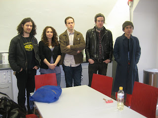
A Conversation with Yuichi Yokoyama.

One fine day in Lucerne, Switzerland I gathered Frank Santoro, Lauren Weinstein and CF around a table to interview Yuichi Yokoyama. Via his translator he responded to all of our various questions. What we didn’t know was that later, after a few beers, his English got a lot better! Alas, we didn’t record his musings on soccer, baseball, fishing, and Donald Judd. Next time. For now, herewith a conversation with some of the best bugged out minds of my generation and one doofus (me).

April 2, 2009

Dan Nadel: Maybe we could talk for a few minutes about adventure and motion, since everyone here does adventure comics, often involving action — approaches to action.

[Everybody stops to think]

Yuichi Yokoyama: Being here at this moment, at this table, with the publisher, Dan Nadel, this is an adventure. I am surrounded by foreigners, this is also an adventure. I cannot speak your language, that is also an adventure. I have never thought about it before, why it’s an adventure… I don’t think I’m going to draw any so-called “actions.” Not anymore. I’d like to draw an impression of something very quiet, philosophical.

CF: Well, it’s hard to think about what action is, because anything that’s moving is in action, or is an adventure. And everything’s some kind of quest of the will, even if it’s a very unimportant thing. And at some point, it becomes adventure or it becomes action, but it’s always that way. So, in some ways I feel like the hardest thing to do in comics is to make nothing happen, because the panels are always moving forward, so you always have that energy of action, and you always have that energy of adventure, and it’s very hard to “still” that. I think I’ve been trying to do that. The way you show pacing, how fast you make a fight move, is a really strange thing. How the time between panels can be so many different things — it could be like a half second or a number of seconds and the only way you can tell is by the drawing itself. So it’s very weird . . . it’s not rational.

YY: What you have said is very interesting. It’s rather human, very human. After forming actions with rapidity, then you have to read from one panel to the other, quickly — that is very exciting, but you like to go back to another side of humanistic . . . you like to think about “quiet”.

CF: I like to think about everything, but the problem is that, I think, some things are harder to get than others, harder to achieve. I think one of the hardest things to achieve is a sense of stillness. Let’s not say that, even, let’s say a sense of non-action. And quietness is action, too, in a lot of ways.

YY: In my case, I do not have any “stories,” as such. There are no stories in my manga–just the impressions in each panel, that is what I want to consider. In a Hemingway story two friends of Nick Adams get out of a train somewhere in a very humble, dirty, small, coal mining town and they go to the bar. It’s a very rough bar, and they are treated very badly, and they plot their revenge. But don’t take revenge; there’s no story. They go back to the train. Such a simple thing, there’s no story, but there is something lurking in the background anyway. That is what I want to take out of the story. I want to express this sort of thing without words, so readers have to “read between the lines,” between the panels.

CF: And why do you want to not draw action anymore? Because of that?

YY: No, I wouldn’t say that I want to stop completely 100%. For instance, I would like to draw a war for 1000-2000 pages. From the beginning, only scenes of fighting, and the end, the last page, after 1000 pages, they’re still fighting. For that, I need a tremendous amount of time. With my present technique, it takes an enormous amount of time. If I find out I can employ a special technique within a very limited amount of time, I might start action manga again. If I use a magic marker, like in Baby Boom [A new book he’s drawing in a different style], maybe it’ll happen. I’d like to make my own technique to draw faster for this special idea of the 1000 page war comic. I’m very ambitious, I always want to compete with time.

DN: Do you want to compete with other artists or just yourself?

YY: I don’t want to compete with others, I want to draw for myself.

Lauren Weinstein: With the war comic, would you re-enact a battle that’s already been fought, or is it your own war?

YY: It would blend what I have seen in the past through movies, on television, the newspaper, and in photos. I don’t want to describe any humanistic feeling, but at the same time I don’t want to describe any death scenes. For instance: Take an empty town, but the person in the manga thinks that there must be a lot of enemies in this dead town. In this case, nobody can be dead, there are no enemies there. I’m trying to think of how I can avoid a scene of dead bodies lying on the floor. So many things I have to solve technically. If I figure out a technique for that kind of scene, then I can start drawing it.

CF: Why are you avoiding the human? Why is the deleting of human concerns in the work important?

YY: I’d like to read such a manga myself, nobody else writes such manga, that’s why I write, so basically the purpose is to draw manga for me, not for others. Self-contemplation.

CF: Are there any artists working today that you feel connected to, in any way, any kind of artist, contemporary artists?

YY: I mostly feel kinship with Japanese artists.

CF: Who?

Y: Tadashi Kawamata, he lives in France. He used to he used to make oil paintings. Now he’ll use a a piece of a tree, a broken board, or other scraps to create a new building. He’s always invited by art festivals all over the world, he’s considered one of the top artists in Japan.

CF: I realize this might be an impossible question to ask, but why is it that the manga that you want to read has those aspects, no story or anything, like that war comic?

YY: It’s very difficult to describe, but in my personal life I don’t respect human feelings. I’m very far from human society, I’d rather appreciate natural phenomena. I’m very interested in understanding how a bird might see things. I want to delete the human feelings because the reader wants to emotionally take sides with one particular person and I’d prefer they remain neutral. That’s why I don’t want to produce a scene where people feel sympathy with a particular person.

CF: I feel like I’m trying to do the same thing: Creating these situations where people would feel drawn to root for, or side with certain elements, but in the end hopefully there’s no one to side with. Hopefully there’s no one to say “this is good,” or “this is bad,” but still have those human elements in there, and draw people out.

YY: Not to be obnoxious, but I’d like to go up even higher than the human consciousness. What we all can do, as humans, is sort of very limited.

CF: That’s true, but I’m young and I think that’s where I have to begin. That’s how I feel right now.

YY: If we have another ten days, maybe we can go into more details, but I have to go back to Japan tomorrow.

DN: You started manga when you were 31, how did you first learn to make it, was there anyone you were looking at to help you learn to tell stories?

YY: 12 years ago, I switched from oil painting to making manga. I went to a second-hand bookshop and I bought this manga techniques book with a little money and started to train myself.

Frank Santoro: Well your style seems to have come fully-formed. It doesn’t bloom, it just… arrived. It’s just so unique that that’s, I think what we’re trying to…

YY: The first panels I drew, they’re not in a book. Of course, you didn’t see the original drawings, from when I was starting 12 years ago. I still have them but they’re so terrible that nobody would want to buy it or make it a manga. So you only saw the first book, that’s why you think it’s the way you described

FS: I think I’m speaking for everyone, but I speak for myself too, but I don’t see any influence from another style. I see you taking things from modern art, but not necessarily from other manga. So the synthesis of modern art and manga is very unique, and that’s what I think it’s fully formed.

YY: I believe you.

FS: Thank you!

DN: The thing about the Hemingway stories is that most people would say that those have a lot of emotional content because it’s all in the subtle interactions between the two men. Do you see those as having emotional content, or do you only see them as plotless sequences of actions?

YY: Yeah, from the beginning, I delete or disguise this emotion. I don’t see it.

CF: He just likes the grilling of the fish.

YY: All of the conversations in the Hemingway stories, I don’t find them to be very humanistic conversations. I don’t see the humanity. I feel they’re very cold and inhuman. There is something sticking behind the conversation which has nothing to with the warmth of human interaction. There are a lot of short stories with scenes of just people talking in a restaurant, and then I can’t detect any meaning behind those conversations; they’re meaningless. There is one scene in a Hemingway story, this one station scene: Tourists arrive in the station and they decide to go into the local bar and they sit and they encounter three or four local people from the city. They start to talk to each other. The tourists, this group of people, have ordered a very very expensive gorgeous champagne that they give to everybody. One of them explains, “I have just divorced, that’s why I’ve taken this journey” and he talks to the local people about married life. Then he leaves because the train comes, but before he leaves the bar, he tells the locals that they have to share the champagne that is left. But instead the locals bring the half-drank champagne bottle back to the counter and ask for money back. It’s a very humanistic story but it’s also very cold, extreme coldness.

CF: This is a fascination in your work that you’re actively pursuing at all times, and maybe this is inappropriate, but in your personal life I know you have a girlfriend or something. How does it relate to personal human relationships with your family, for instance?

YY: My daily life with girlfriend and with my mother and with my friends, it’s an absolutely normal human relationship, I respect my friends, I feel very warm feelings towards my friends, my girlfriends, and my mother, I eat regularly….

CF: I know that!

YY: So you’re suspicious that I’m also a very cold person

CF: No. I just think that when you’re doing something creative, when you’re exploring things that you’re fascinated by, it’s because you have questions about them; questions are inspiration. I have a desire, I think, to merge what I’m doing in my work and my personal life to some extent. If you’re always in your work trying to get to these higher levels that are beyond humans, to me sometimes it’s kind of sad that you can’t achieve them in your normal life.

YY: Have you ever been to Japan? I think the Japanese are very very emotional people. If you ever watch Japanese television, you will encounter every second, such a scene of appreciation, emotional extremes, emotional expressions. Always crying and uh, emotional. That is our national character. This emotionality disturbs me and I think that that I would say that within me there is an unconscious protest against this tendency.

CF: And you’re making art to reflect that.

YY: I think I do that very unconsciously, but I have to admit that it reflects in my work, as you’ve pointed out. Our emotionality is not like yours in America. It’s so shadowy; even if we express ourselves with joy, appreciation, excitement, somehow a shadow is behind it all. This is not like your emotional life, you express joy, sadness, pathos, enjoyment very differently.

CF: What’s the shadow, the shadow is infinity?

YY: It’s very ghostly. Our emotional environment in Japan doesn’t go up and down so much. It’s relatively balanced. Anyway, I think that geographically Japan is also a nice place to live. Very pleasant place. Under these circumstances, in time, humans become lazy, unambitious, very comfortable. Too comfortable. That weakens us. Like you, in America, when you laugh you open their mouth and the laugh comes out from here. Our laughing is not like that, but I find that your style is more healthy. It explodes. That’s much healthier than ours.

CF: But what’s funny is that “healthy” does not get results that are interesting or tell you things that are new. I think that being healthy or maintaining vitality doesn’t necessarily, or in most cases doesn’t give you results that are interesting or answers that you weren’t aware of, new information, I think, comes out of sickness and out of imbalance.

LW: You’re talking about asceticism though.

CF: It’s just an extreme, it could be decadence.

LW: A search for purity doesn’t mean decadence.

CF: I’m just saying limits of human ability just to survive, I just wanted to make the point that healthy is maybe a little bit beside the point, in creative work.

YY: “Mentally and physically,” this is very important to my creativity.

Labels: , , , , ,

COMICS CLASS 2: electric boogaloo


by

Tuesday, June 23, 2009


Post Comment

Saturday July 18th and Sunday July 19th
two different classes – same lesson
both days
noon to six
COMICSCLASS2700
with FRANK SANTORO
“DISCOVER THE HIDDEN TEMPO OF COMICS”

Hey Everybody. I’m offering my Comics Class again. I’m doing TWO workshop classes in New York City at the infamous Westbeth artists’ co-op on Saturday July 18th and Sunday July 19th. Be there or be square. It’s gonna be an intense, small class of six people. Not for beginners. Come ready to draw.

The focus will be on the student’s contour line drawing and composition. This class will explore the process of improvisation within a rigorously structured page design. Meaning students will learn how to find a framework of harmonic points on the comics page. These points act like a “tuning fork” and provide page proportions which allow the drawings to unfold in sequence while firmly remaining “in key.”

Seriously. See, the problem I see with most comics is that often there is a real lack of a consistent narrative pace. Comics can be structured like songs and utilize tempo, rhythm, harmonies, and melodies to change the pace of a story. It’s this invisible structure that will be explored, diagrammed, and discussed.

And as for the drawing end of it, we will be drawing in a contour line style. No shading, just lines. Some color. Students will be making a manuscript, a “print dummy” of sorts for making their own 16 page zine. Each student will be “improvising” upon a pre-existing story structure designed by myself. Straight ahead, no-frills drawing and composition, transitions and sequencing will be the order of the day. I will be working with each student one on one to really explain how structure and improvisation can unlock one’s narrative vision.

Email me: capneasyATgmailDOTcom if you’re interested. It’s 40 bux. Noon to six with a lunch break. Space is limited to six people each day.

UPDATE 6/26: There’s one spot left for Saturday and 1 spot left for Sunday. Thanks.

Labels: ,