Posts Tagged ‘Heer notebook’

Toth’s Phallic-Sensitive Staging & Other Notes


by

Wednesday, March 10, 2010


Read Comments (17)

Excerpt from Toth's Man Of My Heart

Toth’s phallic-sensitive staging. A 1950s romance comic, one that features a stereotypically weepy woman crying over her love life, is normally not where you would expect to see a commentary on erectile dysfunction. Yet take a look at “Man of My Heart,” (New Romance #16, June 1953 and illustrated by Alex Toth, author unknown). The story is about Pris, a young woman torn between two lovers: Jim Foster who is a long time friend her own age and the much older Dan London, a distinguished gent and friend of her deceased father. Like the knights of old, Dan and Jim compete for Pris’s love by trying to best each other in an athletic competition. Take a look at the key climatic tier on the final page where Dan gallantly explains why he’s bowing out of the competition. “”There’s no compensation for real youth … or the complete sharing of the things you two alone can have!” Dan says in the last panel of the tier. Toth has carefully cropped the panel so that we don’t see Dan’s face, only his torso. He’s wearing a bathrobe with the cords dangling down. Off in the bottom right-hand corner of the panel we see the outline of Pris’s face with an eye lash, an eye brow and part of her hair and an earring. But we can’t see her eyes and have no sense of what she is thinking. Dan’s incompletely viewed body is contrasted with Pris’s incompletely viewed face. The discordance between body and face underscores the theme of sexual incompatibility. Is there any doubt that Toth is underscoring the point that as an older man Dan won’t be able to sexually satisfy Pris? Aside from this, the story is overloaded with phallic symbols: a cane, swords, tennis rackets, a long cigarette holder. The story is both post-Freud and pre-Viagra. Derik Badman offers another reading of the story and more excerpts here. The whole story was also reprinted in Alex Toth: Edge of Genius Vol. 2.

(more…)

Labels: , , , , , , , , , ,

Jack Kirby Was the 20th Century & other notes


by

Saturday, March 6, 2010


Read Comments (10)

Foxhole #1 (1954) by Jack Kirby.

More gleanings from my notebook:

Herriman’s Missing Signature. Michael Tisserand has a question: “Does anyone know (or have any ideas why) George Herriman generally no longer signed neither his daily nor his Sunday comics in their final years? How uncommon is this? Are there any reasons having to do with comics production, or is this a purely personal decision? I also noticed that there were periods of time in Herriman’s early stint at the Los Angeles Examiner where he didn’t sign his comics. These are the only comics in those issues that are unsigned.” Any thoughts on this would be appreciated.

Jack Kirby Was the 20th Century. Jack Kirby was the immigrant crowded into the tenements of New York (“Street Code”). He was the tough ghetto kid whose street-fighting days prepared him to be a warrior (the Boy Commandos). He was the patriotic fervour that won the war against Nazism (Captain America). He was the returning veteran who sought peace in the comforts of domestic life (Young Romance). He was the more than slightly demented panic about internal communist subversion (Fighting American). He was the Space Race and the promise of science (Sky Masters, Reed Richards). He was the smart housewife trapped in the feminine mystique, forced to take a subservient gender role (the Invisible Girl). He was the fear of radiation and fallout (the Incredible Hulk). He was the civil rights movement and the liberation of the Third World (the Black Panther). He was the existential loner outcast from society who sought solace by riding the waves (the Silver Surfer). He was the military industrial complex (Nick Fury). He was the hippies who rejected the Cold War consensus, and wanted to create their own counterculture (the Forever People). He was the artist who tried to escape his degrading background (Mister Miracle). He was feminism (Big Barda). He was Nixon and the religious right (Darkseid and Glorious Godfrey). He was the old soldier grown weary from a lifetime of struggle (Captain Victory). There was hardly any significant development in American 20th century history that didn’t somehow get refracted through Kirby’s whacko sensibility. Jack Kirby was the 20th century.
(more…)

Labels: , , , , , , , , , , ,

Notebook jottings


by

Wednesday, February 24, 2010


Read Comments (59)

Glenn Head's Hotwire Comics

Below are some jottings from my notebook. They are not substantial enough to be essays but might spark some thought or debate.

Praise for the competition. Lots of spitballs have been thrown at The Comics Journal‘s new web format, some of them hurled by mutinous writers from the Journal itself. I care more about content than format, so I don’t agree with the general line of criticism. For me the biggest problem with TCJ these days is that there is an overabundance of good stuff. It’s hard to keep up with the magazine since it offers so much to read every day. Put it this way: the magazine features long essays by Donald Phelps, Gary Groth, and R. Fiore. These aren’t just three of the best comics critics around, they are among the best essayists around period. Phelps is a critic of the stature of Manny Farber or Pauline Kael. (In fact, the Library of America’s great volume American Movie Critics has essays by Farber, Kael, and Phelps). Fiore and Groth are a notch below that Olympian level but there essays are as good as anything found in The New Yorker, The New Republic, The Believer or n+1. Aside from these key writers, the magazine offers regular essays from a strong cohort of intelligent, informed critics — Clough, Worcester, Ishii, Kreiner, Suat Tong, Crippen, Garrity, etc. (Anyone who isn’t on the list shouldn’t be offended, I’m writing off the top of my head.)
(more…)

Labels: , , , , , , , ,

Crumb’s Visual Sources: Research Note 2


by

Wednesday, February 10, 2010


Read Comments (6)
Robert Crumb is a great synthesizer, a great adopter of other people’s stylistic conventions which he cunningly redeploys for his own ends. Any in-depth analysis of Crumb has to come to terms with the way his art is not only great in itself but also serves as a veritable museum of 20th century cartooning. Most comics criticism tends to have a literary bias, so this visual aspect of Crumb has gone under-discussed. But I don’t think we can understand Crumb’s art without reference to his many allusions to earlier cartoonists (not to mention painters and illustrators).

Here are a few notes that might help future research:

1. Wolverton. Crumb has often talked about his debt to Basil Wolverton, going back to the sacred cover of Mad comics #11. Interestingly, Wolverton and Crumb both adapted the Bible. I’d like to know how familiar Crumb was with Wolverton’s religious art (now available in the great Fantagraphics book The Wolverton Bible).

Above is a scene from Wolverton’s rendition of the Noah story.

And here is a panel from Crumb’s The Book of Genesis Illustrated. Notice that in both Wolverton and Crumb, the choppy waves have an oddly static look, as if they were sand dunes rather than water.

2. Billy DeBeck. I’ve never heard Crumb talk about Billy DeBeck but Crumb’s big-nosed style, especially in the late 1960s and early 1970s, had a strong touch of DeBeck’s bounciness.

Above are two excerpts from Billy DeBeck’s work, one showing the character Bunky (the very eloquent baby) and the other Lowzie, the bonnet-wearing hillbilly.

And here is Crumb’s Big Baby (from Big Ass #1, 1969).

3. E.C. Segar. The creator of Popeye is much loved by Crumb.

Here is a panel from a Segar Thimble Theatre page (July 19, 1931). Pay close attention to the crowd, a jumble of noses.

And here is Crumb’s cover for Weirdo #14, where he pays homage to Segar’s crowd of fools.

Labels: , , , ,

Comics and Photography: Research Note 1


by

Thursday, February 4, 2010


Read Comments (20)


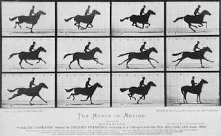
Eadweard Muybridge’s motion study of a galloping horse.

This is the first of a new series of blog posts I’m going to be starting up under the umbrella title “Research Notes.” These posts will be quick notes on ideas that could (and maybe should) be spun off into larger, more polished essays. But in the research note I’ll just jot down the preliminary notion. Since Comics Comics has a very smart and articulate readership, my hope is that the notes will spark suggestions for how the idea can be refined and developed.

So the first research note is for an essay on “Comics and photography”; the idea was sparked by Dan’s earlier comments on the new Rip Kirby book (and by a subsequent conversation Dan and I had). Some quick thoughts:

Comics and photography were both part of the proliferation of images that occurred in the 19th century, the explosion of the visual made possible by mechanical reproduction.

To what extent were late 19th and early 20th century cartoonists like A.B. Frost and Winsor McCay, who did so much to introduce sequential movement into comics, influenced by the motion studies of Eadweard Muybridge?


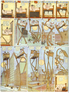
Winsor McCay’s motion study of a galloping bed.

Frank King was a lifelong shutterbug, at the vanguard of the first generation of middle-class Americans who used the camera to record family life. As Chris Ware and I have documented in the Walt and Skeezix series, photographs were a major source for King, who used family photos as a reference tool. Yet King only very rarely directly copied from photos; rather he used photos as a memory tool. And indeed, even King’s own photos seem somehow not to record so much a moment in time as a slightly-fuzzy memory of a moment. King’s photos are nostalgic and backward looking.

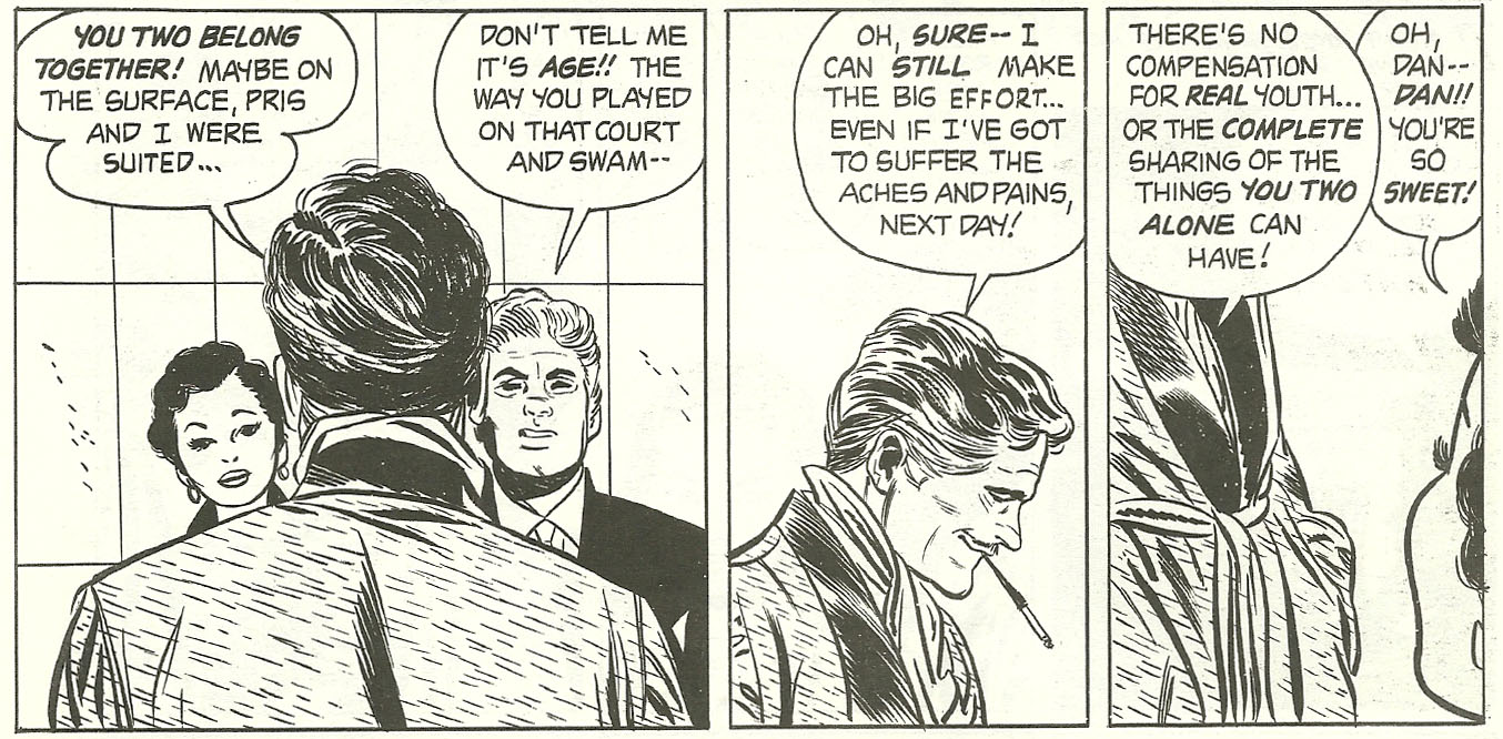
The Sickles/Caniff school is often linked to movies, and it’s true that Sickles and Caniff were great film buffs and absorbed much from the cinema of the 1930s and 1940s, not just classics like Citizen Kane but also B-movies with their slightly darkened sets. Caniff and Orson Welles had a mutually admiring correspondent. A fan letter to Caniff in the early 1940s smartly compared Terry and the Pirates to Casablanca. What hasn’t been investigated is the likely impact of magazine photos: the 1930s were the decade Life magazine took off as America’s leading photo-magazine. The use of photographs to record the news, particularly the darker corners of the Depression and the onset of the war, transformed the world’s visual imagination: Walker Evans, Dorothea Lange (who was friends with George Herriman by the way), George Strock, and many others. Caniff was paying attention.

Socially and politically he was very close to many people in the Time/Life staff, who tended to be smart, internationally minded college boys like himself. The Luce magazines often promoted Caniff’s work, since he did the comic strips that most closely resembled their own aesthetic and political outlook.

If Caniff came out of Life, the post-war Alex Raymond was affiliated with Vogue. Depression austerity and wartime rationing were over and Paris was in ruins, so the post-war years were the period when New York became the world’s fashion capital. The first Rip Kirby story involves a fashion model; and the whole ambience of the strip comes from the fashion world. Raymond’s drawings weren’t just done in a photorealist style; they were distilled fashion shots.

If King used photos to pull him back to the past, Raymond was interested in snapshots that caught the present, the sleek and shiny now rather than the blurry bygone days.

Like Caniff, Raymond often photographed models. But when Raymond reinvented his style with Rip Kirby he was able to take this use of models and photos an extra step because of a new invention: the Kodak instant camera. Photorealist comics depended on this new technology.

Even among naturalistic, literal-minded illustrators, not everyone was a fan of photography. Here is Burne Hogarth’s thought: “[Hal Foster] is one of the great geniuses of the comic strip….Other artists were fixated on photographs; this guy worked it out straight out from his eye outward. He solved problems that very few people ever did. I began to realize that because when I had to draw figures that were flying, I sat down and draw those things, for Christ’s sake. I couldn’t have models pose. Milt Caniff many times had model pose. Stan Drake had models pose. The point I’m making is that those guys used Polaroid cameras all the time.” (The Comics Journal, #166, p. 75).

The decline of photorealism as a comics style might have something to do with the parallel decline of magazine photojournalism. During the years when Life was supplanted by television, photorealism lost favour as a cartooning style.

In sum, it’s not just the case that some major cartoonists were influenced by photography. More complexly, as photography evolved, comics followed along; the two art forms developed in tandem.

Labels: , , , , ,

Cubists and Cartoonists in Chicago, 1913


by

Friday, January 8, 2010


Read Comments (6)

Clare Briggs, March 20 1913.

Modern art famously came to America in a burst at the Armory Show that opened to scandal and praise in New York on February 17, 1913. The story is often told and it’s true enough. But not quite the complete truth. In fact, there had been exhibits of modern art as early as 1911 in W. Scott Thurber’s gallery in Chicago. And on February 25, 1925 the Art Institute of Chicago hosted an “Exhibition of Contemporary Scandinavian Art” which can be seen as strongly paralleling the more famous New York show.

Frank King April 24, 1913.

For our purposes what is important is the number of top notch cartoonists who went to the show, including Frank King, Clare Briggs, and John T. McCutcheon. The show was much mocked in the press but was a popular success, attracting many ordinary Chicago residents (including Frank King’s wife Delia who went to see it by herself).

John T. McCutcheon, April 3, 1913

For months afterward, cartoonists would use cubist and futurist imagery in their work. Intriguingly, many of these comics weren’t done in the typical philistine “you call this art” mode. Rather, these artists seemed to be affectionate to the new art, and tried to assimilate it into more homespun, familiar experiences, notably Briggs’ jest that the quilt maker was the first cubist. Another cartoon showed a bear cub (symbol of the local baseball team) done in a cubist mode: “our own little cub-ist.” In effect these cartoonists were domesticating modernism.

L.W. Newbre (?), March 25, 1913

Frank King of course remained obsessed with modern art for many years, leading to the great Gasoline Alley Sunday pages where Walt and Skeezix enter into the world of abstract painting. In his personal papers, King often alluded to Picasso.

There has already been one academic paper written about the 1913 show and Chicago cartooning. Alas that paper is as yet unpublished. But more work remains to be done. The crucial question I think is this: was their a hidden affinity between comics and cubism? Did the encounter with modern art liberate King and other cartoonists to free themselves from illustration and become more abstract and cartoony? This is a story that has yet to be written.

NOTE: Robert Boyd makes an important point in a comment posted below. The Armory Show travelled to Chicago. This would explain all the cubist cartoons printed above, except the Clare Briggs one which ran before the show moved from New York to Chicago. This renders moot my speculation that the artists might have seen modernist art in earlier gallery shows. Oh well, we can still enjoy the cartoons.

So to clarify: Briggs, who did at least 2 cubist inspired cartoons, might have gone to the Armory Show in New York. King, McCutcheon and L.W. Newbre probably went to the Armory show in Chicago. The show that Delia went to was the Armory show in Chicago, not the earlier exhibit of contemporary Scandinavian art.

Labels: , , , ,

Notes on the Midwestern School of Comics


by

Tuesday, December 29, 2009


Read Comments (15)

The Comics Journal 300 carries a conversation between Kevin Huizenga and Art Spiegelman. During the course of the interview, Kevin brings up the idea of a Midwester school of cartooning, something that I’ve discussed in various essays on Little Orphan Annie and Gasoline Alley. The conversation goes like this:

Huizenga:In one of the recent Annie reprints, Jeet Heer talks in the introduction about this idea of a Midwestern, or Chicago school of cartooning that was more preoccupied with everyday life and the quiet rhythms of everyday life. The style was quieter and more repetitive. I think you can definitely see how Ware fits in that tradition, and also he’s called more attention to that kind of cartooning. Visually, it might look boring, at first, to some people, but it’s a form that’s fitted to content. What they’re doing is comics about mundane things like talking to your wife, or whatever — the “little things.”
Spiegelman:I guess. But I think rather than just Midwest, I would make it Protestant, you know. Like they don’t have those ornate crucifixions.
Huizenga:I have those two strikes against me, I guess, here. [Laughter.]
Spiegelman:It’s definitely suspicious of ornament and exuberance…

A few points can be added to this discussion. I elaborate one what I mean by the Midwestern comics tradition in an interview with Tom Spurgeon in the Comics Reporter, where I talk about this school of art and how it links together Harold Gray and Chester Brown. Here’s a relevant part of that interview:

The geography of rural Illinois left a strong mark on Gray’s imagination, as can be seen if he’s compared to his Wisconsin-born colleague Frank King. In King’s work, the country-side is always rolling and sloping, with cars constantly sputtering up hills or flowing down valleys. In the early Little Orphan Annie strips, by contrast, once our heroine leaves the city, the countryside is as flat as a quilt spread out on a bed, each acre of farmland its own perfect square, with stacks of hay and isolated silos the only protrusions on the land. The flatness of the prairies, the prostrate manner in which the horizon spreads out as far as the eye can see, spoke to something deep in Gray’s imagination: it perhaps explains his sense of the isolation of human existence, the persistent feeling of loneliness his characters complain of, and their commensurate need to reach out to Annie and create strong (although temporary) families, with the orphan as their child.

Brown of course didn’t grow up in the prairies, which are the setting for Louis Riel. His childhood was spent in the very different landscape of Quebec. But I do think that appropriating Gray’s style helped Chester capture the landscape of western Canada, especially the flatness and isolation of the region. I do think there is a tradition of mid-western cartooning, a family tree that is rooted in John T. McCutcheon and extends to Clare Briggs, Harold Gray, Frank King (with a crazy branch that includes the grotesque approach of Chester Gould and Boody Rodgers). The latest branch of this tree is the alternative comics of Chris Ware, Ivan Brunetti, and Kevin Huizenga. Brown is interesting because he’s not from the mid-west at all, in fact is not even an American, but has absorbed the aesthetics of this
approach.

A few other points:

1. Spiegelman is on to something when he says that this is a Protestant tradition. What I’d say is that the tradition of Midwestern comics brings together various strands: partially regional tradition of vernacular, low-key literature (the line of George Ade, Sherwood Anderson, Ring Lardner) with its focus on small town life, partially from the low church Protestant tradition of plainness, partially out of the Chicago Tribune’s populist stance. So I prefer the more expansive term Midwestern cartooning, which seems to bring most of these things together. But perhaps we could also say that this is Midwestern Wasp cartooning?

2. If we were doing a genealogy of ideas, credit for the concept of Midwestern catooning should go to Gilbert Seldes, who talked about the “Chicago school” in his 1924 book The 7 Lively Arts. In the 1980s, Richard Marschall revived the idea of Midwestern cartooning in a few scattered essays in Nemo magazine. I’ve tried to give a third life to the idea by linking up the great Chicago Tribune cartoonists of the 1920s with their modern counterparts like Ware and Huizenga.

Labels: , , , , ,