Hey Everyone,
This is an article on color I did for CC#2. I’m posting it here because my friends keep telling me they haven’t read it. I tell them there is a free pdf of the issue on the CC blog, but still they don’t read it. Maybe they’ll read it now. Thanks.
————————————————————————————-
 Make It Loud: Comics Color, Kevin Nowlan, and Cosmic Depth
by Frank Santoro
Until the early 1990s, most color comics were produced in the same way they’ve been made for nearly one hundred years. The artist drew the comic in black-and-white and then, for the most part, provided the printer with a guide of some sort to color the comic by. These guides would have been anything from simple color sketches to hand-colored photostats or Xeroxes of the black-and-white line art. Engraving plates would be created by the printer for four different colors: red, blue, yellow, and black. In combination, and with the help of screens, these would produce a limited but comprehensive palette. There was no guarantee, however, that the vision of the artist and the reality of what came off the press would match. Photoshop did not yet exist. There was no way to preview the results.
Despite this, I still love the idea of the subtle collaboration between the artist and the folks on the press, and even the old printing press itself. The old assembly line process has all but disappeared from comics, but there’s a warmth to the color comics made in that era that I don’t feel in those made with today’s precise computer-regulated printing techniques. The hand isn’t there in the artwork or on the press. Color separations produced in Photoshop strike me as somehow lacking. Not everyone agrees. Kevin Nowlan, one of the rare mainstream comics artists who colors his own work, has noted that today’s coloring “can be overpowering. Too much airbrush, too many effects, distracting textures,” he says. “But that’s a problem with the colorist, not Photoshop. A little restraint goes a long way.” While this is true, it’s worth mentioning that Nowlan was afforded the hands-on experience of learning how to produce color comics the old-fashioned way. He implicitly understood the limitation of the four-color process and with it was able to produce one of the most striking and vibrant color comics ever made: Outsiders Annual #1, published by DC Comics in 1986.
 I asked the artist recently how the opportunities to color his own artwork came up. “After I’d done as few stories and covers that were colored by other people, I started asking the editors if I could do my own guides,” Nowlan says. “Most of them were agreeable. There was some resistance when I asked to do guides for the Outsiders story. The editor was okay with it but called back rather sheepishly and explained that I’d have to send in some samples before they’d let me do it.” The “guides” were what I was interested in—how exactly did a colorist do his or her job with the four-color process? For a long time, I believed that the colorist actually “cut” the separations for the letterpress, much like rubyliths are cut for a silkscreen press.* Actually, the “cutting” of the individual colors out of film to create the color plates was generally done by a middleman called a “separation house.” The colorist would provide the “separator” with hand-colored Xeroxes of the line art. These color guides would also have codes written across each color on the page that corresponded with a list of all the available colors on the press. The separator would then literally separate the four colors into distinct plates.
There were only four plates, but there were also countless variations possible if techniques such as overprinting (yellow and red make orange) and screens (a dotted, finely screened red looks pink).
If the separator was conscientious with the colorist’s guides and carefully prepared the film, the final printed comic would resemble the hand-colored guides. If they were careless about following the guides, and about interpreting each tiny shape of each color, then the results could be disastrous.
Poorly registered colors, unplanned overprinting, and a sense that coloring jobs were rushed are very common in old comics. Things changed in the 1990s. Photoshop has made separation houses obsolete. The colorist now “cuts” his or her own separations, but not by hand. “There’ve been two big changes for me,” says Nowlan. “First, colorists are now colorist/separators. If I’m doing my own coloring I don’t have to work with a separator. I can get exactly the results I want. Secondly, if I’m working with a colorist, it can be a real collaboration. They send the separations to me and I can make changes before the story sees print. In the old days, you didn’t see the mistakes until it was too late.”
In the old days, the discrepancy between the colors that the colorist indicated on the guides and the way the comic actually looked when it was printed was often quite large. Nowadays, that problem is “very slight and rare”, according to Nowlan. “There are fewer hands spoiling the broth. [But back then] no one saw what the colors would look like until the book was on press. The guides were done with watercolor or marker and the separator was working with film. Running proofs was expensive and time-consuming so you had to just imagine what it would look like when it was printed.” To most of today’s comic artists, who’ve never had to deal with this limitation, the idea must be unthinkable. There was simply no way to really “preview” what the comic would look like in its final form. Although I’ll admit this is an improvement and is ultimately a better process, I feel something has been lost now that the separations are, generally, not done by hand. There is a warmth in hand-cut separations that I don’t feel with those “cut” in Photoshop. “I wouldn’t want to recreate the separations with the old process,” argues Nowlan. “The only thing worse than that would be those Zipatone overlays that we used for hand separations at Fantagraphics. Tedious doesn’t begin to describe that process.”
Was there anything about the old process that he missed in today’s comics? “I liked the softness of it,” Nowlan says. “It didn’t seem to overpower the line work as much as modern coloring can. The limited palette pushed us towards a visual shorthand that works well with comics.” Indeed, very familiar and traditional coloring techniques have been marginalized. Certain looks that almost all comics once shared (such as “knocking out” backgrounds with one solid color or assigning a single color to a character—or even a whole page or sequence) are now rare. Some of the old accepted shorthand techniques walked a tightrope between realism and symbolism: a nighttime landscape would often be depicted with orange and blue, or a tense horror comic moment would be colored in greens and purples. These colors signaled a mood, and while this is still possible today, the inherent limitations of the four-color process helped create a shared language of color. And if the available colors and their compact combinations became a language first, they became a musical score second. Certain “phrasings” and “harmonies” were established like a jazz scat singing style. Although each comic had its own tone, they were all bound by this slang, all derived from the same set of colors. With today’s technology, there is a tendency in comics to color everything “naturally”, like in a movie or animation. All surfaces are modeled with perfect shadows, fades, and effects, leaving little to the imagination. Think of Shrek. Now think of old Hanna-Barbera cartoons. It’s a question of taste, sure, but doesn’t this trend say something about language and communication? We seem to have replaced the symbolic with the hyper-real, and in the process, lost a lot of depth of feeling. “I miss the old flat colors,” Nowlan admitted. “But we can still do that with Photoshop. Editors are resistant to it and sometimes insist on rendering-for-rendering’s-sake, but I like seeing a variety of approaches, from flat coloring to heavily modeled. My own work tends to be somewhere in between.”
Keep in mind that the way colors are created is not the only factor in this change. There have also been lots of changes with the paper stock in the last twenty years. Almost all mainstream comics are now printed on bright white glossy paper. When the new brighter, white Baxter** paper came out it in the mid-1980s, it was a shock, as the old palette suddenly printed brighter than before and made even the most subdued colors look garish. “When they started printing on the good paper, with offset presses instead of letterpress, many of the [old] coloring rules had to be discarded,” Nowlan says. “The colors were no longer subdued by the soft, light tan paper. Everything became too bright and intense. In the old days, subtlety in color choices had been discouraged but now it’s essential if you don’t want to blind the readers.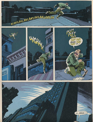 “When Baxter paper was introduced, new possibilities seemed to be opening up. One of the nicest things about the offset printing was that the blacks were finally solid black. As much as I like the letterpress/newsprint look, it was very inconsistent. We all got used to seeing the black ink looking like a dark gray. If any of the four colors were run a little light [on the press], it threw everything off.”
Seen in this light, Nowlan’s Outsiders Annual work is all the more impressive. Printed with the relatively brand new process that utilized an offset press as opposed to a letterpress, and the white Baxter paper instead of newsprint, Nowlan was able to craft a color comic with an inventive palette that was at once forward-looking and conscious of tradition. In my opinion, it’s a big moment in comics history. (Remember, this was a four-color comic made with separations cut by hand, not a full-process book like The Dark Knight Returns, which was painted. The color separations for the painted Dark Knight pages were separated photographically by a camera, not by hand.) Here was one of the first high-profile comics from a major publisher made with the new process, and it didn’t just work, it actually raised the bar. There were, of course, comics printed on Baxter paper before Nowlan’s Outsiders Annual but for the most part they were eye-popping disasters. Nowlan’s contribution was to make use of the “look” of the new colors—beautiful pinks, soft fluorescent greens—that were next to impossible to achieve in the old way. His choices and arrangement of the new palette created a striking degree of depth. Entirely constructed out of flat colors and the occasional screen, Nowlan’s images achieve a balance in the coloring and line art somewhere between the photorealistic and the surreal. He created fades by careful arrangement of the flat tones, especially yellows, greens, and browns. No airbrush effects, just intelligent design, and his work would be imitated often.
Soon enough, though, such careful choices wouldn’t have to be made using flat colors and clunky screens at all. Photoshop was around the corner. I asked Nowlan if there was a combination of new and old processes that he would like to see utilized, and he replied: “I’d like to see some books printed on off-white paper. I think most of us who grew up reading books on newsprint are still put off by the bright, white paper.”
“My yardstick is still the Silver Age DC Comics covers. They used a little airbrush but generally, the effect was created with flat colors. I think they still look great today.”
 While coloring and printing techniques have improved in comics, some intangible qualities have been lost (though the poorly printed color comics section of contemporary Sunday newspapers still retains at least some of the old magic). Although I don’t believe this loss can be attributed to just one factor, the fact that most coloring is no longer a hands-on craft concerns me. Creating depth with flat colors, overprinting, and making a limited arrangement “sing” is quickly becoming a lost art. These were once essential skills involved with being a colorist. Now that “depth” can be created quite simply, by using Photoshop effects and fades, the visual shorthand that’s been in place for nearly a century has been all but abandoned. The shorthand still exists, and can of course be replicated using Photoshop, but that’s not really the point. The demands of the craft have shifted and tastes have changed drastically in the last twenty years. Photoshop isn’t really directly responsible for the sanitized sameness of most color comics, any more than Pixar is responsible for the death of the hand drawn animated cartoon. The technology is simply changing, and along with it so is the product and the demand for the old formulas. An artist like Kevin Nowlan strikes a balance because he learned how to make it work by hand, under the old limitations. But most comics artists working today, however, haven’t had that training, and their coloring looks unnatural to me. There’s no magic, no “how’d they do that?” wonder to the craft anymore. There’s a rift between the handmade drawings and the precision of the computer color separations that I find unsettling, and ugly. I wish colorists today could find the restraint that Nowlan speaks of. There’s a middle ground between the old and the new processes, but we don’t see much of it in comics. “We don’t see it today,” says Nowlan, “because it’s too time consuming and expensive when you compare it to Photoshop.” And the handmade quality of mainstream comics? “It’s all but disappeared.”
——————————————————————————————————
*In silkscreen printmaking, each color is created by literally cutting the shape of each color out of a red transparent film called rubylith. This film is then “burned” on to the silkscreen by a photochemical process, and what’s left is the shape of the color to be printed. The letterpress process is similar in that the person creating the individual color plates also works with film.
**In 1986, DC Comics, in order to compete with independent publishers, introduced a higher quality, uncoated, flat white paper stock called Baxter paper in a handful of its comics titles. This paper was far brighter than the traditional light-tan-colored newsprint paper.
(all images from Outsiders Annual #1)


 Sorry for the lack of posts from me lately—I’ve been in vacation country, reading a lot of books without pictures. Luckily, Frank and Dan have been hitting it out of the park here so often that most of you probably didn’t even realize I was gone.