Posts Tagged ‘color’

Black Line Vs. Color: Odilon Redon Weighs In


by

Saturday, November 14, 2009


Read Comments (10)

Odilon Redon:

“Black is the most essential of all colors. Above all, if I may say so, it draws its excitement and vitality from deep and secret sources of health… One must admire black. Nothing can debauch it. It does not please the eyes and awakens no sensuality. It is an agent of the spirit far more than the fine color of the palette or the prism. Thus a good lithograph is more likely to be appreciated in a serious country, where inclement nature compels man to remain confined to his home, cultivating his own thoughts, that is the say in the countries of the north rather than those of the south, where the sun draws us outside ourselves and delights us. Lithography enjoys little esteem in France, except when it has been cheapened by the addition of color, which produces a different result, destroying its specific qualities so that it comes to resemble a cheap colored print.

From The Graphic Works of Odilon Redon (Dover Publications, 1969) but I got it from Artists’ Books in the Modern Era 1870-2000 (Fine Arts Museums of San Francisco, 2002)

Labels: , ,

Two More Oliff Akira Color Guides


by

Sunday, October 25, 2009


Read Comments (4)


Labels: , , ,

Full Circle


by

Thursday, October 22, 2009


Read Comments (4)


Dan just somehow hacked into my computer and stole my planned post almost word for word, but that won’t stop me. Those of you who aren’t color blind should hie thee to Same Hat, like, now to see some of the incredible work that inspired Frank to “riff” on Steve Oliff. Color nerds united.

Then wish you were at APE so you could have bought some of these yourself. The picture of Frank that was going around kind of scared me, but now I think the trip would have been worth it.

UPDATE: Also, I feel bad for linking to this for some reason I can’t put my finger on, but I can’t help it: Frank Miller has been leaving appreciative comments on toga-crazed warmonger Victor Davis Hanson’s blog, a sampling of which can be found here. [via] I kind of don’t believe the ones at the end where he repeatedly decries anonymous commenters as cowards, but the others seem genuine.

And whether it’s Miller or not, I agree with him: “Use your real names, or I will call you cowards.”

Labels: , , , , ,

The Gender of Coloring


by

Sunday, August 2, 2009


Read Comments (22)

Among the many juicy tidbits in the Trevor Von Eeden interview in The Comics Journal #298, is the story, which was news to me, that the cartoonist was dating Lynn Varley, who served as the colorist on his groundbreaking Batman Annual #8. Varley would go on, of course, to date and marry Frank Miller, and color many of his works as well.

This got me thinking about the relationship between gender and coloring in commercial comics. Although comics have been very much a boy’s club, it is noticeable that there a number of women have carved out a niche for themselves as colorists. Many of these women had personal relationships (as sisters, girlfriends, wives) with writers and artists.

Examples would include: Marie Severin (sister of John Severin), who was also course an accomplished artist; Glynis Wein (first wife of writer Len Wein), Tatjana Wood (first wife of Wally Wood), and Richmond Lewis (who is the wife of David Mazzucchelli, and did an amazing job coloring Batman: Year One). In some of the classic newspaper comics as well, cartoonists used their wives to help do the coloring. Outside of mainstream comics, Lewis Trondheim’s work has occasionally been colored by his wife.

The reasons for these women becoming colorists vary, of course. Lewis, as I understand it, is a special case because coloring was a sideline from her main career as a painter, and occurred mainly because Mazzucchelli wanted to bring Lewis into his world of comics (she also collaborated on editing Rubber Blanket).

I’d like to see someone do a good gender analysis of why women went into coloring. I’m inclined to see this as something more than mere sexism or the creation of a pink-collar ghetto. One factor at work is that for much of the 20th century, women were more likely to be associated with the decorative arts than men; in commercial comics coloring is often seen as a decorative. I’m not a gender essentialist so I don’t think women have an innately better color sense than men. But for historical and cultural reasons, women in our culture are more likely than men to be raised with color sensitivity.

There is also the fact that a cartoonist’s studio often resembles an old fashion artisans shop, with the main master being assisted by apprentices and family members. Again the classic newspaper strip provides examples, with many cartoonists taking on sons (and sometimes daughters) as assistants.

For at least some of the women we’re talking about (I’m thinking here particularly of Severin, Varley, and Richmond), coloring was clearly an expression of their creativity. They all had a major impact on the history of comics. As Mazzucchelli once suggested, the last person who works on a page of comics art, whether it’s the editor or colorist, often has the biggest impact.

Labels: , , , , , , , , , , , ,

Dave Sim/Neal Adams on Color


by

Sunday, July 12, 2009


Read Comments (10)

Hey everybody, Frank Santoro here again this week with an excerpt from Dave Sim’s Following Cerebus No. 9 where he interviews Neal Adams. A great interview all around, but one part of it really caught my eye. It’s a long story that Adams tells about how he managed to re-organize DC Comics production department’s approach to color and how Adams “updated” their color chart. It’s a great, funny story. And I reference it a lot in my rants to friends and I want to reference it in future articles. So, I thought I’d post the original story from the source. But like I said, it’s really long. So, I wrote a letter to Dave Sim and a few weeks later I got the “okay” to reprint the excerpt in full. I think it’s an interesting story that Adams tells, and an important one. It’s these moments in “comics history” that often get swept under the rug, yet they are often moments that ripple through the years and can be seen later as “game changing” events. Please enjoy.

Thanks to Mr. Sim.


DAVE SIM: Rather ungraciously I couldn’t resist interrupting at this point and dragging Neal tangentially off-topic to find out if what he was referring to was a rumor I had heard about, centering on the chocolate-brown color that Neal had pioneered on the cover of Batman No. 245, a color which was formed by using 100% cyan, 100% magenta, and 100% yellow; one on top of the other.

NEAL ADAMS: The science of art and the art of science are wonderful things because they don’t mix together all the time, but they mix together a lot and one of the areas where they mix together is the science of mixing colors. You can make millions of colors just by mixing the different percentages. And the question is, “How many colors do you start with?” You start with three: red, yellow, and blue. You make a guide with percentages of colors, and that guide is made up of dots of color. Dots of red, as an example—if they are spaced far enough apart and are small enough—will make an area of those dots look pink. Smaller red dots spread further apart will look light pink. If you add an area of blue dots, you’ll get a light purple, and so on. And, doing comic books in the 1960s, what you had was 25% of yellow, 50% of yellow, 75% of yellow, and 100% of yellow; 25% blue, 50% blue, 75% blue, 100% blue; 25% red, 50% red, 75% red, and 100% red. With these percentages, mixing them together and using them individually you would get 64 different colors to work with.

DC Comics, at the time I joined the firm [laughs], they had 32 colors. And I didn’t quite understand it until I got their chart, and I noticed that they didn’t have what we call “tone yellow.” They did not have 25% yellow and 50% yellow, and I did not understand why that would be, because I had done a syndicated strip and all kinds of other process-color work using the same basic chart, and I thought, “If you have 25% and 50% of red and blue, why don’t you have 25% and 50% of yellow?” It didn’t make sense. So I asked around a little bit … kind of quietly … and, apparently [laughs] at some point to save money in some weird way at some weird time they decided to do without “tone yellow.” So that if you see a DC comic book from back in “them thar days” you notice that all the Anglo-Saxon flesh is pink. You don’t continue to notice it because after you turn the page you’re reading the story and it isn’t a glaring difference but the flesh is pink. Whereas if you looked at Marvel Comics from the same time period, it’s more of a flesh color—25% red, 25% yellow. Because they only had 100% yellow at DC, if you tried using that for a flesh tone you’d have orange flesh. You couldn’t have all the subtler colors with “tone yellow” values. You lost HALF of the colors. Instead of 64 you had 32.

So, when the full impact of this hit me, I went to see Sol Harrison [DC’s production director at the time] because I was coloring stories with a color palette of 32 colors instead of 64. And I asked him about it … which is one of those stupid things you shouldn’t do, as I would find out … and he said, “No, we don’t have ’em because it costs more money. By not doing these colors, the company is saving money.” Well, if you were talking about a whole range of colors, that might be possible, but if you’re just talking about 25% yellow and 50% yellow, it seemed to me that that couldn’t be the case. How could two tones of yellow cost that much extra money?


So, I thought about that for awhile. And then I went and talked to some people around DC Comics and asked them if they had noticed this. Most of them hadn’t. So I went to Carmine Infantino, [DC’s publisher at the time] and asked Carmine and Carmine went in and asked Sol and Sol explained that it was “too expensive” and as far as he was concerned, that was it, the subject was closed. And I thought, well, that didn’t work very well. I just ended up back at Sol Harrison. So the question was, “How to get around Sol Harrison?” So, I went to Joe Kubert, who was an editor at DC, as well as the great artist he’s always been, and I said, “You know Joe, ‘we here at DC’ [laughs’ we don’t have tone yellow.” He said, [flawless Joe Kubert impression] “Really.” I said, “Yeah, you think we would.” And he said, “Well, Sol’s probably saving money.” And I said, “Well, okay that’s probably true, except that Marvel has got tone yellow.” He says, “Let me see.” So, I pull out a Marvel Comic and show it to him.” “Yeah,” he says. “Darn. I wonder how they can afford it?” I said, [laughs] Yeah, I mean it’s Marvel, Joe. It’s Timely Comics.” [Marvel—which was really just what was left of Timely Comics—was pretty much of an under-financed shoestring operation compared to DC in those days]. [Sim laughs] “Yes, that’s true. Hmm. I’ll go see Carmine about it.” I said, “No, I saw Carmine already.” So, he said, “Okay, I’ll go see Jack.” Jack Liebowitz, the head of the company. So he walks away and disappears into Jack Liebowitz’s office, about time for a 4 or 5 minute conversation. Liebowitz comes storming out of his office in his pinstripe grey suit, his little mustache twitching and he goes down the hall into Sol Harrison’s office in a rage, muttering things like, “That son-of-a-bitch Goodman [then-Marvel publisher, Martin Goodman] wouldn’t pay one G-damned dime more for his G-damned colors than I would. G-damn it.” Things like that. [Sim laughs] And he goes into Sol Harrison’s office, and he says, “Sol, how the hell much more is it going to cost to get tone yellow? Marvel’s got tone yellow, what the hell is going on?” And Sol says, “Well, we’re saving money.” “Martin Goodman is spending more money on his comics than I am? That’s bulls–t!” Sol said, “Well … I’ll call the separators.” So he picks up the phone, and calls the separator up in Connecticut. The separator hired housewives in Connecticut to come in and do the separations. The brushes that they used looked like the back end of brooms. And they weren’t very subtle about what they did, and it occurred to me, having been up there, if it was the same guy [laughs], he didn’t give a damn about tone yellow. So Sol calls the guy, and it turns out that this guy did the color separations for Marvel and DC. So, Sol got on the phone and—trying to “prime the pump” a little bit said, “How much more would it cost us to get tone yellow?” You know: setting the guy up to give him the right answer.

SIM: “Thousands of dollars.”

ADAMS: [voice of doom] “Yes, thousands of dollars, way too expensive for YOU.” But, of course the guy had a close working relationship with Marvel AND DC so there was no way that he could give that answer. So what he said was, “You want tone yellow? You got it.” [Sim and Adams laugh] So Sol said, “Uh, yeah … we’ll … we’ll take it.” And hung up the phone. And Sol turns back to Jack Liebowitz and says, “We’ll, uh, we’ll be getting tone yellow now.” [laughs] The actual conversation took about fourteen seconds. That day DC got twice as many colors as they had they day before.

SIM: I don’t think you’d even want to look back over the years of DC Comics to see how long they had been without tone yellow.

ADAMS: [picturing it] [laughing] Exactly. So, you can see right there that i should have learned my lesson not to ask Sol questions like that. If I asked him a question he would invariably tell me, “No, you can’t do it.” And not only that, he would explain to me in great detail WHY I couldn’t do it. It actually got to the point that if I asked Sol if you could do something and he said, “No, you can’t,” the odds were that you probably could and easily.

The next one … the story that you are referring to … was when I asked Sol, “Why aren’t we using the dark colors? I mean, it’s bad enough that we only have 64 colors to begin with, but we’re losing about a third of the colors because we’re not using colors like 100% yellow, 100% blue and 50% red [all in combination]. And the answer was, “Well, you can’t use any color that adds up to more than 200% because then there’s too much ink on the page, and the paper will slide off the press.” So, I said, “Well, Sol, we’re kind of printing on [laughs] toilet paper.” [Sim laughs]. I think the paper that we’re using absorbs any amount of ink pretty quickly. I could understand if we were doing Newsweek magazine with some slick paper stock like they use that maybe the paper would slide a bit, but this is pretty much the crappiest paper you can buy and I don’t think the ink is apt to slide on it.”

SIM: [laughing] “Sliding? Sliding is not the problem with this paper.”

ADAMS: He said, “Well, that’s what we had to do during the war.” During the war? [Sim laughs] You’re talking about WWII, right? “Yeah, we had to save money.” Well, yeah Sol, you saved money by using lots of different kinds of paper when there were paper shortages during the war, but, Sol, now that paper is readily available again [laughs] we tend to use all the same grade of paper, the worst grade of ultra-absorbent toilet paper that’s available.

Stupid conversation, I don’t know why I was going on with this conversation, I think I just wanted to hear the litany of bulls–t that was attached to his one was. So he says, “Just don’t use any of those heavy colors.” And I said, “Sure, Sol.” [laughing]

SIM: Don’t go over 200% total color.

ADAMS: So I immediately went to my desk and immediately and in as many places as possible used as many colors that totaled more than 200% as I could. Just to find out. I wanted to see a book come in that slid all over the place on the press. [Sim laughs] In fact, I brought a book to Sol, and he said, “See, it’s off-register [color sticking out over the holding line in the drawing] here.” I said, “Sol, virtually every page DC has ever printed has been off-register because our production standards are crap!” I did a sky color on a couple Batman’s where I think I did 25% yellow, 25% red and 100% blue—which still didn’t add up to 200% but which was still considered “out of bounds” at DC at the time. After awhile, people were coming up to me in the production department and saying [awe-stricken voice], “Did you create new colors?”

Oh, God [laughs], “Come and burn me as a witch!” No, it’s not that I’m creating new colors; it’s that you guys aren’t using the colors that you have.

SIM: [They’d] basically amputated a whole section of the color chart saying, “We can’t use anything from here over.”

ADAMS: [laughs] That’s right.

Labels: , , ,

Pacific Comics specifically


by

Sunday, June 28, 2009


Read Comments (13)


Frank Santoro here again. Another “article” on color. Again, it’s just my notes, so forgive the stops and starts. Just trying to get it all down and out into the world.

Pacific Comics. Early 1980s. From what I understand, Pacific “ganged up” four or eight pages at a time on a color offset press. This was called the “grey-line” process. The black line art was photographed at 10 percent and looked grey when printed on a flexible printing plate. That plate is the surface that the colorist works on. It was a weird, slick surface to work on apparently. The usual paints and markers wouldn’t stick to it—they would just streak—so a lot of people making color comics for Pacific relied heavily on airbrush.

The other thing to remember with the Pacific books is that the color art plate to be shot for the camera was the same size as the printed comic. Meaning the color art was made at a one-to-one ratio where the drawings were made at usually one-and-one-half times the final printed size. This was standard practice in most four-color books but because the drum scanner for the grey-line picked up every little nuance of tone, I think about the color being made by hand instead of a screen. The colorist’s “hand” is very noticeable also because of the full color “color xerox” quality of the printing then. They reinforce each other. The printing isn’t bad; it isn’t bright, just subdued. Cheap. The colorist’s streaky markers and weird concoctions are all THERE, almost like a instrument played through an old fuzzy microphone. So the high notes and low bass parts “ring” louder. Buzz more. I dunno. I like it.

The Elric series, by P. Craig Russell and Michael T. Gilbert for Pacific is an spectacular feat of inventiveness. I like to think about the limitations that the printing process imposed upon the creation of the art, specifically the color art. Pacific began the series using a coloring system that I’m not familiar with—it may have been a similar process to grey-line, I don’t know. But the results were pretty bad. The inked lines of the art are muddy and the colors are streaky. By issue 3 though they began using a different process, trying to get crisper blacks, but the color was still wonky. Check out this note from the editor on the inside cover of issue 4:

And the response from a fan in the letters page in issue 5:

“This note is mainly a response to the “Grey Line” technique used in Issue #3. The over-all results are quite good. The color clarity is markedly improved and the inked lines appear much more solid. I never realized how muddy the inked lines in the previous issues are until I compared them just now. I am quite pleased and do appreciate the extra time and expense involved.”

Then a note in the same issue from the artist / colorist:

“Are you as impressed with the printing of issue four as I am? Pacific starting using a new camera with that book—and the colors were remarkably close to what Craig and I drew. Take a copy of Elric 1—and compare the printing to that of number 4, and you’ll be amazed at the difference from the earlier issue.”  

Whether you’re a fan of of the book or not, you’ve got to be won over by the tenacity and will of the artists and production people involved. They took the most rudimentary coloring and printing methods and found their own way to make it look good when most others at the time were satisfied with poor color reproduction in comics. Remember, this is 1983: no Photoshop, no way of “proofing” the colors really. They had to tweak each issue as it was published.

Below is an excerpt from an interview with the artist P. Craig Russell, who was one half of the team that created this particular Elric series for Pacific Comics in 1983. Check out how he describes the process of trial-and-error that led Michael T. Gilbert to literally invent a new way of coloring.


The Comics Journal #147 (Dec. 1991). Interviewed by Craig Paeth

Interviewer: This is where you developed the coloring style you have used for all your projects up until now.

P. Craig Russell: Right; I am eternally grateful to Michael T. Gilbert for that. We were coloring on photostats with the acetate overlays. To try to use watercolor on an acetate just looks terrible. Michael came in one day with a panel he’d done using frisket paper, which is what you’d usually use if you were airbrushing. You’d put this stuff over it and cut out the area you’d want to airbrush and then lift it up when you were done. It’s like a stencil type thing. Michael was airbrushing the entire sheet of frisket and would use it like you’d use zip-a-tone or a pantone sheet by placing it down on the paper and cutting around it. So we started playing around with that, and by gluing your color down you’re not streaking it onto the paper.

It was developed as a way of getting around this horrible coloring process we had, with necessity being the mother of invention. We found that you could color underneath a frisket and that a pencil eraser would erase your watercolor off the paper and you could get sort of pseudo-airbrush effects that way. It could get very complicated and by the sixth issue I really think we had it working. I think Michael did the best color work he’s ever done on those Elric issues because I’m much more meticulous and clean in my approach and I wouldn’t let him get away with sloppy utility knife work, I really kept him on his toes as far as a finished look would go.

(from Elric issue 6)

————————————————————————

BACK TO COMICS COMICS: And now, let’s hear from the other half of the team, specifically guy who handled the lion’s share of the art on this book. I wrote to Michael T. Gilbert and asked him a few questions about the Elric series and some of the old coloring methods like grey-line and the following is his response:

The Early Days of Comic Book Coloring, As I Remember It!
©2009 Michael T. Gilbert

I consider myself primarily a comic book artist and writer (Mr Monster, Elric, Donald Duck and crew, etc.), but over the years I have done my share of coloring. I cut my eyeteeth coloring my cover for New Paltz Comix an ” underground” comic book I self-published 1973.

I was a 21-year old college student when I brought the art to New Paltz Comix to a printer near my home on Long Island, and asked him how to color it for reproduction. He showed me how to cut frisket for a simple two-color cover (black-and-white, with various shades of blue). After placing a slab of Rubylith paper (a clear plastic sheet with a red see-through sticky plastic on top) on top of my cover art, he instructed me to cut away any areas that I wanted to remain black-and-white when they photographed it. The rest would be whatever color I’d indicated when they’d print it in. If it was to be printed blue, let’s say, I’d paint a section black (red, actually, since the red Rubylith photographed as black!). Confusing, eh? If I wanted it to be dark blue it would be 100% black, or if I used a 50% grey shading sheet on top, the final result to be a lighter 50% blue.

I didn’t fully understand what the printer was telling me, but gave it a try anyway; cutting cut away selected areas as instructed. Months later, when my comic was finally in print, I was delighted to see that it worked!

For the second issue we tried doing a fully-painted cover, which would have saved us a ton of time and looked far more professional. But having the printer photograph it turned out to be too expensive for our meager budget, so I took a stat of the uncolored cover and redid the colors with hand-seps, using multiple layers ––one for yellow, another for blue and one for red. By mixing the colors in various shades you could get all the other colors when they were printed on top of one another. The cover looked great when printed, though not as impressive as full-color.

Over the years, I did a few more covers using hand-cut colors, over the black-and-white art. It was hard, tedious work, but a fun challenge.

My most ambitious cover coloring was the one to Star*Reach Publication’s Imagine #6. I did hand-separated color (in black-and-white) on three different layers (plus the black-and-white plate) –– using airbrush! Since I was drawing the red, yellow and blue plates in black, white and grey, I had to guess how it would look when all the colors were combined. And I couldn’t afford to get printed proofs beforehand. In order to get them you’d need to have film negatives made first from each layer, and proofs made from them. Star*Reach’s shoe-string budget couldn’t afford that until the negs were shot for final printing. Luckily, I’d mostly guessed right that time, and the cover looked good overall. I breathed a sigh of relief!

Though I’d never done interior color, around 1981 I decided to give it a try. I was intrigued by the blueline method I’d seen Bil Stout use on some Slow Death covers, and decided to give it a try on one of my stories. With bluelines, the printer makes a negative of the art, somewhat larger than the printed size. Using that, a light blue image of the drawing would be printed on a stiff-but-porous sheet of cardboard. Then an identical black-and-white drawing would be printed on a transparent sheet. Once placed over the blue art, the black would cover the blue and hide it (since it was the same image, and the same size). But when the black-and-white transparency was removed temporarily for coloring, the artist could use the blue as guidelines when coloring.

I did the color for my 8-page story “The Circle Game” using Dr. Martin’s Dyes and airbrush. It was a real trial-and-error situation, and I went through a lot of paper before I was satisfied, but I learned a lot in the process –– and just in time, as it turned out! The following year I was invited to work with Craig Russell drawing and coloring the first Elric comic book series for Pacific Comics.

As Craig mentioned, we had trouble doing the color. This was in the VERY early days of full color comics and nobody at Pacific seemed to know what they were doing (though I had assumed otherwise coming in!). We only had a week or two to color the entire comic on printed size stats, which turned out to be too slick to hold the Dr. Martin’s Dyes, which would pool and turn blotchy. Desperate, I came up with a stopgap measure of making Xeroxes of the stats on porous cardboard. The colors didn’t reproduce as intensely as they would have on stat paper, but at least we were able to finish the job on time.


By the third issue I came up with the idea of spraying colors on clear frisket paper with a sticky back that would hold to the surface of the slick stats. We’d do an undercoat color on the stat, but add the colored frisket on large areas that required more subtle color. When the comics were collected into a graphic novel later, we recolored those first two issues, and the black came out sharper and the colors more intense. I later used the same frisket-on-slick-stats method when I colored some of my Mr. Monster stories a couple of years later for Eclipse.             Speaking of which, did you know that the first comic book story ever done with computer color was printed in Mr. Monster? First Publishing had done a comic called Shatter, which was allegedly the first comic drawn on a computer. It may have been drawn on a computer, but it was colored by hand, the same way as all the other comics were at the time.

My friend Steve Oliff tried to convince Eclipse to let him try coloring a story using computer color, which had never been done. I suggested that Steve could color “My Fears!,” a four-page story drawn by Jeff Bonivert, as a backup in Mr. Monster #5 (February 1986). In my typical cheesy manner, I christened our experiment “Terror-Chroma!” Brrr! The results were dark and murky, but it worked. Good thing too, because we were pretty nervous about this newfangled “computer-color” stuff.

In more recent years I’ve learned to do computer color myself, most recently on my new G5 iMac. Getting the hang of Photoshop was a huge learning curve, but now I’m doing things I could only have dreamed in the old days. The frisket colors I employed on the old Elric comics were clumsy and very time consuming, though the results were often impressive. Today I can do the same thing better in minutes using layers of color –– and change the color instantly with the click of a mouse. Moreover, I can instantly see how the final colors will look on my computer screen, and even make printouts on my laser printer.

Coloring is a whole new world today –– and I like it. I don’t always care for the overuse and over-saturation of modern computer coloring, but that’s the fault of the colorists, not the medium.

When I think back, it’s been a long strange trip, from Rubylith to Photoshop CS3.

But it’s certainly been a very colorful journey!

The End
————————————————————-

‘Nuff said. Well, true believer, please understand that I’m just trying to understand these processes myself. My friend and mentor, Norman Hathaway makes fun of me all the time about this stuff. He tells me I gotta look outside of comics to understand the processes better. That I’ll find more of the information I’m looking for if I begin to wrap my head around the idea that these processes were used in commercial printing as affordable ways of proofing colors before expensive plates were made. In comics this cheap “proofing” method was the actual printing method. Hunh? You still with me, faithful reader? No? All right, well, stay tuned for future “articles” on color and we may just figure this out yet.

Labels: , , ,

Steve Oliff riff


by

Saturday, June 20, 2009


Read Comments (30)

Okay, Frank Santoro here, and this one’s for all the color nerds out there. It’s just my notes, fragments of an interview with a master.

Steve Oliff may be one of the best color artists in comics history. I tracked down the 30-year veteran of comics and asked him a few questions about some old color processes used in the late ’70s and early ’80s. He was kind. And patient. But please know that these notes, this “interview,” is really just to satisfy me and to add fuel to the fire of my own obsessions—so forgive me if this isn’t a super well rounded portrait of an artist. (And thanks to Steve.)

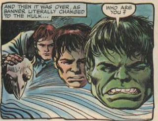
I was just reading, looking at everything Oliff had worked on, collecting the coolest and weirdest crap comics just cuz he’d colored them, and trying to make sense of how the processes changed over the years. He ushered in the computer era when he found a way to color Akira by the most insane process in 1988. And before that he worked on Marvel’s first full color comic magazine in the ’70s, The Hulk!, the first book there to use the “blue-line” process.

Blue-line. Blue-line color process. What is it? From what I understand, generally, it’s when the “black line” (the inked, finished art) is printed on an acetate sheet and then is also printed in non-photo blue on Bristol board at the same size. The acetate is usually hinged at the top of the board and brought down for reference. Anyways, the board gets the full color treatment, watercolor, acrylics, dyes, anything that’ll stick to the board. The colored page and the black-line page are shot by the camera separately. The idea is that the blacks stay black and the color stays balanced. You can paint the fuck out of it and still have these crisp containment black lines that’ll shape it all up.

An example of this process is found here. Read the intro paragraph about original blue-line comic art.


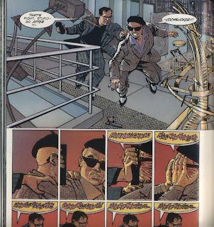
I got really into reading Howard Chaykin‘s Time2 and really into trying to understand how Steve Oliff went about coloring it. Time2 has a fresh, light palette that adjusts to the mood of the story ?very nicely. The light “pastel” palette was so different from the ?traditional four-color books on newsprint and the garish Baxter paper ?books of ’84-’86. ??”Flat” colors for the most part with slight airbrushed gradients that? presages computer color’s ubiquitous “modeled” color of today—a look that ?Oliff was instrumental in creating.

Yet, the effects achieved in? Time2 are remarkable because they do not rely heavily on “modeling” ?and gradients; the colors are restrained and generally “flat.” Oliff ?arranged the mottled, impressionistic flat areas of color to create ?tension and mood and it worked beautifully. White Conté crayon ?highlights and watercolor paper-like textures reveal a hand? with a liveliness rarely seen in color comics. This approach ?pairs very well with Chaykin’s style, which is important to note.? Subtleties of color,? highlights, and patterning that mirror Chaykin’s style unify the color and line ?art, like a second voice providing a stellar harmony.


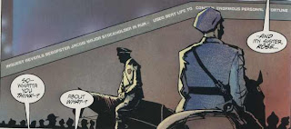
Note the blue flourish on the back of the policeman to the right. And how it rhymes with the sky on the adjacent page.


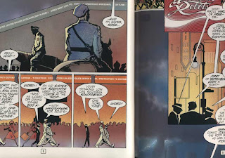
These flourishes and the simple painted sky background were? not possible with the four-color process. All “art” was made on the ?black line with the four-color process. A colorist may have implied a? stormy sky in his color guides, but it would be left to an unknown? “separator” to create the sky—a chance that most artists and? colorists were not, generally, prepared to make. It was very uncommon ?to see elements created by the artist printed on any of the color ?plates. For the most ?part the artist was limited to the black line, and the colorist to flat? color, screens and mechanical gradients notwithstanding.

Santoro: Was this (Time2) your first experience with the blue-line process?

OLIFF: Yes, this was the first time I’d tried the blue-line process. It was the second time I’d worked with Howard Chaykin, though. The first time was in 1978 on The Stars My Destination. On that project we just did full-color art. I was laying in the basics and Howard did the finishes.

On Time2, Howard and I worked very closely. He sent me a pile of color references, from painted TV Guide covers to fashion photos. He had a late-forties to early sixties flavor to all of it. He does extensive reference research for his projects. That naturally carried over to the coloring.

Time2
had a couple of things different about it. First, many of the pages were designed as double-page spreads, and could be linked thematically. I knew there weren’t going to be any annoying ads that could pop up randomly with God only knows what kind of a color scheme to compete with my work.

Then you have the real advantage of blue lines: You can use any paint, pencil, etc., that you want. I could use gouache (opaque watercolor). And in reproduction, that word “opaque” is crucial.

I’m going to digress a bit, but this is important.

Comics had traditionally been colored on the guides using Dr. Martin’s Radiant Transparent Watercolors. These guides were not used for reproduction, just as an indicator for the engravers and separators.

When people started doing full-color, they were looking for bright, saturated colors, which Dr. Martin’s gives on the original color art. However, when you try to reproduce the transparent colors, because of the crystalline structure of the pigment, and the bouncing of the light between the white paper and the pigment, the colors will over-saturate, and react weirdly.

With opaque colors, the light hits the paint and is directly reflected back to the camera or scanner without the trip under the transparent colors. This gives a much more controllable color that can be accurately reproduced.

Up to that point in my career, I had been using transparent dyes, felt pens, and only a very little opaque Cel-Vinyl animation paint. Gouache changed my whole approach to color. And best of all, I could mix the gouache thin enough that I could airbrush with it. (And there is a lot more airbrush work on Time2 than at first meets the eye.)


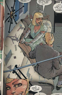
One of the main things that separates Time2 from my earlier coloring jobs was that I mixed up my own special palettes of colors to airbrush, and then I used some of those same colors to paint with. Then on top of that, I was using some of the leftover frisket (a masking film) to create patterns of color. For instance there is a big shot of a girl sitting on a couch. The pattern on the fabric is mostly used frisket pieces. We used spatter and colored pencil extensively to give texture.


I also used Pantone films to cast shadows over the colors once they were rendered.

And finally, Howard came back in and gave a lot of the faces hard edged color. He felt some of my color edging was too soft, so he cut in some highlights.

I was out of the loop on the proofs, so I don’t know what was going on in that department. Howard and the editors were more on top of that. Time2 has been one of the most popular works of mine among colorists. I can remember Brian Haberlin mentioning it as one of his favorite color jobs before he became a pro. I think it still holds up. I’m proud of it.


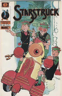
The blue-line process changed the way colorists essentially ?”created” color. To get an insight on how different the process was, ?I asked Steve to compare Time2 to another book he worked on only the ?year before: Mike Kaluta‘s Starstruck series.


When I worked on the Epic titles: Timespirits, Coyote, The Bozz Chronicles, and Starstruck, they were all flat color books. (Timespirits eventually switched to full-color stats for the last few issues.) It was an adjustment for me. It was like working on Captain Victory and Starslayer for Pacific, which I’d done in the early ’80s.

How were your guides interpreted for Starstruck?

I’m guessing ?paper seps that were then shot with screens to get percentages. This is more or less the same process that had been in place for fifty years ?in comic books.

Starstruck was separated by one of the old hand separation companies, probably Chemical Color up in Connecticut. They did a decent job considering I hate to write numbers all over my guides, so they were left to guess a lot about exactly which colors I wanted.


Your arrangement of bright flat colors in Starstruck, to me, really? suits Kaluta’s work. It feels like you really looked at his own color? work and really attempted to dovetail nicely with his line work. I? don’t get that feeling with Elaine Lee‘s colors on the first two ?issues. I also think it’s a very modern palette that holds up over ?time. Very fresh.

Starstruck had great art, and I was forced to think things through in a flatter way. However, I’ve never approached any project without trying my best to figure out which color approach best suits the story and the artist. Also, whenever possible I talked to the artists about what they were looking for in the color. My goal has always been to be a real collaborator on the art, and do everything in my power to bring out the best in it. That’s not always possible, but I tried whenever I could. I didn’t have much contact with Mike on that book, though. I was called in because the editor (Archie Goodwin) either wasn’t totally happy with Elaine’s work, or she was behind on deadlines.


Please elaborate on the mid-’80s and the choices offered: four-?color, blue-line, Photostats, grey-line. Did you feel that one process was superior or did you have? a preference? They are understandably different processes with their? own quirks. Did turning over your guides to a separation house and? getting back lazy seps fuel your interest in blue-line? Obviously with Akira that was an issue (I read your essay on Akira color), but before you really even thought about computer color, lets ?say in ’85, ’86, which process did you feel best represented what you ?were trying to do? Because from what I can tell you were doing? grey-line, blue-line, and four-color in 1986.

I was doing all different color styles around then, true, but I’d been thinking about coloring using computers as early as ’82-’83.

For me blue lines were a step sideways in my color evolution. I’d been doing full-color work since right after I worked for Howard in ’78. I was one of the first colorists to use the Marvel double-print black system that Rick Marshall put together for The Hulk! magazine. They called it SUPERCOLOR, I think. It was an attempt to find a blue-line substitute.


The idea of their system was similar to blue-lines, except that they printed two copies of the line art onto a type of Photostat that supposedly wouldn’t shrink (therefore preserving registration). I did full color on one, and the other was used for the line art. Between the two of them I could get a variety of effects. I could knock out the line art to get glass FX, and I could also add Zip-A-Tone to the black to get darker tones and set moods.

This system worked fairly well, but the problem for most colorists was that you had to work on a very slick surface that only took certain color mediums. I developed a system for coloring on them that worked well, but it wasn’t like working in paint and colored pencil, etc. I could use airbrush, however.


The problem at the time was that editors were looking for ways to economically get better color, but there weren’t many books to try things on. After the Hulk series got canceled, there wasn’t any work for a full-colorist.

That was a rough spell for me, but I got little jobs here and there until Pacific Comics began. They did flat color on newsprint until Bruce Jones’s Alien Worlds and Twisted Tales came out. On those they did the jump to Baxter paper, but the first issue of Twisted Tales was hand-separated. I did most of the guides for that issue. By this time I was coloring my guides on photostats, so I just did them like I was doing full-color even if I knew it was going to be flat separations. I put an acetate overlay on them, which was where I wrote in the color codes. (I REALLY hated putting those numbers in.)

That all changed on one Al Williamson story for Alien Worlds. They saw how nice the guides looked and decided to try to get a clean full-color shot, which they did, so they switched then and there to full-color. I still have a daily strip that Al sent me in appreciation for that job.

But the age-old problem of shooting full-color art was still there, so someone came up with the grey-line system, which was a watered-down blue-line approach. It worked up until the end of the Eclipse line of comics.

When Time2 came out, and so did The Dark Knight, the blue-line was the hot way to get full color.

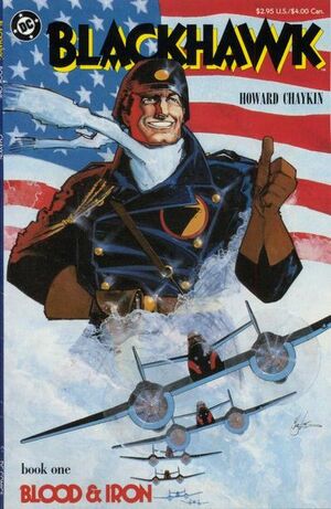
(Oliff would continue using the blue-line technique and his ?collaboration with Chaykin through 1988 with Blackhawk, from DC ?comics.)

Would you comment on this series briefly? I feel like you grew more? comfortable with the blue-line process here and created a palette and? look that was very suitable to the 1940s setting. Its a bit less? frenetic than Time2, but still very “lively.” There are also more ?instances where you are painting in backgrounds that Chaykin is not delineating on the black line.


After Time2, when Howard landed the Blackhawk series for DC, he got me signed on as colorist. All the stuff I learned on Time2, I was then able to use on Blackhawk. My painting ability got stronger and cleaner, and Howard felt confident to let me add background and design elements. I still have many of those pages, and I’m amazed at how much work I put into them.


Would you elaborate on the grey-line process used ?at Eclipse? Was this the same process that Marshall Rogers used for? his Scorpio Rose comics? Did processes change at Eclipse and Pacific ?over the years? I’ve heard that Marshall was very involved in?developing Eclipse’s color process in the early ’80s.

I don’t know if Marshall had anything to do with the development of the grey-line system or not. The grey-line process was a hybrid of the blue-line designed for drum scanning. Blue-line traditionally had the blue line printed on heavy illustration board. That meant they had to be shot photographically. The grey lines were 10% line art printed on a flexible Photostat. That was what we colored. The black line art overlay was also flexible. The pages were done at printing size, and ganged up to scan a bunch of pages at a time on a drum scanner. I don’t know whether it was four or eight pages at a time, or what. This made the separations inexpensive, which allowed them to do full color at not too much more cost than flat color.

How did you feel about the Baxter paper books ?that came out in ’84? Camelot 3000 and the New Teen Titans. I’m not? aware of any “Baxter” books that you may have worked on.

I always thought that the Epic books I colored were Baxter books. But in general the first Baxter books were a bit much. The Baxter books did allow a wider range of colors, though. It was just that no one was quite prepared for it at first.


Moebius‘s Epic graphic novels. Were they? blue-line? Were all the Marvel graphic novels blue-line? Is the? Starstruck graphic novel from ’84 a blue-line process? Do you remember? what the first blue-line process book you saw was? I mean one that you ?saw in a production office or somewhere, not the final printed book ?but the board itself with the overlay.

Moebius was definitely blue-line. I don’t know about the Starstruck graphic novel. The Marvel graphic novels I colored were the double-print black system. (I’m not sure what the official name was for that system. I’ve just always called it that.) The Death of Captain Marvel, God Loves, Man Kills, Super Boxers, Revenge of the Living Monolith were all that system.

The only one that was totally different for me was the Alien Legion graphic novel. On that one I colored directly on Frank Cirocco’s art. I’m not sure what the rest of them were.

I don ‘t remember seeing any blue-line jobs in the office until after I had done a few myself. In addition to Time2, I colored about three Classics Illustrated graphic novels for First Comics.

I asked a fairly reliable source about who ?actually interpreted the guides for the separation houses in the ’60s ?and ’70s and was told that Marvel and DC had the same separation house.? “It was little old ladies in Connecticut who made the separations.”? Have you ever heard anything like that?

Oh, yeah. That was it. Chemical Color. It was a standard line about the state of comic coloring. When it sucked, you could blame it on the “little old ladies in Connecticut.”

postscript: anyone with info on the “greyline” process, please email me. capneasyATgmailDOTcom

Labels: , ,

The Hewll


by

Tuesday, March 3, 2009


Read Comments (21)

(Sing to Denim and Leather)
Markers and Pencils, brought us all together! It was you that set the spirit free!

Okay so it doesn’t rhyme that well. Still, the idea is there. With all the full-color printing and web publishing out there I’d think there would be more full-color comics made these days with just color markers and pencils. When Deadline went full color in the early ’90s, it was amazing to watch Jamie Hewlett just go bananas with the color art. He utilized every tool in the box to create art on a board (check out the crop lines on the image second from the top). It’s funny how this fresh approach is sort of out-dated in the current Photoshop era. Anyways. Go to the art store you lazy bastards, buy a new set of markers and a lay-out pad and turn off the computer.

Labels: , ,

You Know You Need A Better Image Consultant…


by

Thursday, December 4, 2008


Read Comments (2)

… when a guy who’s known as the “Comics Reporter”* calls you a nerd. (Not that I really have an image consultant.) I mean, it’s obvious even to me that I don’t remind anybody of Justin Long. And Frank’s got such soulful green blue eyes. (I’m color-blind, by the way, and don’t really know what color Frank’s eyes are. That’s why you’ll never see me complain about a comic book’s coloring. And also maybe why I don’t get Mark Rothko.)

Strangely, I feel as if a great burden has suddenly been lifted from my shoulders.

*(Just kidding, Tom.)

Labels: , , , , , ,

Brendan McCarthy colors


by

Wednesday, November 12, 2008


Read Comments (16)

I found this 1989 Judge Dredd collection in the cheapie bin. It contains two perfect examples of late ’80s hand-painted color by one of the masters, Brendan McCarthy. (Okay, get over the fact that it’s a Judge Dredd comic, I’m riffing on COLOR here.) There are four stories in this one. Two colored by McCarthy: one drawn and colored by McCarthy (with help from Tony Riot) and one drawn by the team of McCarthy, Riot, and Brett Ewins. The other stories are by Brian Bolland and Ian Gibson, and are not colored by McCarthy. To me, it’s funny how Bolland’s art has aged poorly next to McCarthy. It’s like technically sound black and white artwork versus technically sound loose, color driven artwork. McCarthy looks fresh 20 years on. Bolland looks archaic, byzantine in comparison. But, that’s me.

McCarthy is a peculiar artist. He’ll razzle-dazzle with “effects” and color and get way loose, and then pull it in, tighten up, and play styles off of each other. He can get too loose for my tastes, but then he’ll reel his lines in and take it to the hoop, scoring points for “realism”. It’s a nutty combo that was “out there” for comics fans 20 years ago. Funny how this approach seems just right for today.

From the first story, Judge Dredd having a spell (drawn and colored by McCarthy):

This is from the third story and looks tighter because Brett Ewins was involved. I think they would switch off on each page, the styles range wildly. I really dug this spread, and believe it’s Ewins’s pencils and layouts with McCarthy’s colors.

And I think this is all McCarthy, maybe Ewins layouts(?):

For me, McCarthy’s color signaled a break in the ’80s towards a wider range of feeling. His colors are “realistic” and modern in a painterly sense, but compared to most comics coloring, he was seen as “radical”. He was utilizing a new process that allowed him to use any and all colors he could imagine, not being limited to the FOUR color process. This was also before Photoshop, so he was attempting to “expand” the palette like few before him. He incorporated (relatively new) DayGlo colors and found ways of getting around the limitations of the wonky FULL color process. The other two stories in the book use a similar color range, but they don’t look half as good. McCarthy brought to the table a painterliness that didn’t rely on black containment lines for everything that was being delineated. Nothing really all that new, even in comics, but McCarthy’s work didn’t look like other “painted” comics. His work was never muddy, but “light” and “open”. A fresh look compared to the Frazetta-like browns and ochres that dominates the “Studio” group of painter-slash-cartoonists like Kaluta and Jones.

Anyways, that’s all I got. Can’t sleep, but too tired to flesh this out anymore. Later.

Labels: , , ,